

Individually designed stickers are versatile. They can be used as a branding element on packaging, as product inserts, as promotional materials, for labeling work materials, or simply as decorative elements. In order for a successful design to become a high-quality produced sticker, some technical requirements must be considered when creating the print data.
The most important points include the contour cut, the bleed, sufficient safety distances, and the appropriate color profile. If these factors are considered during the design phase, it avoids white edges, cropped content, unexpected color deviations, and unnecessary inquiries from the printing company.
What is a contour cut?
Classic printed products like flyers, business cards, or posters are typically cut rectangularly. Stickers, on the other hand, can have almost any shape. Possible shapes include circles, rounded rectangles, logos, figures, symbols, and individual free forms.
The contour cut defines the line along which a sticker will later be cut out. This cutting contour is created in the print file as a standalone vector path. It is not a visible part of the design, but a technical piece of information for the cutting device.
A correct cutting contour should:
- be created as a closed vector path
- contain no open spots or interruptions
- not have unnecessarily many anchor points
- be on its own layer
- have a clear name
- be defined as a solid color
Many printing companies provide a specific designation for the special color of the cutting line, such as "CutContour" or "Contour Cut". This specification should be taken over exactly. If the cutting line is incorrectly named or created as a normal print color, it may, in the worst case, be printed visibly.
Simplifying the cutting contour sensibly
The cutting line does not need to precisely trace every small imperfection of a motif. Too many anchor points can slow down the cutting process and create restless edges.
For motifs with hair, fur, plants, small points, or hand-drawn structures, it is therefore sensible to use a simplified outer contour. A slightly smoothed shape often appears cleaner after cutting than an excessively detailed contour.
Very sharp angles and extremely narrow areas should also be avoided. They can tear when removing the sticker or undesirably detach from the carrier material.
Why the bleed is indispensable
When cutting printed products, there can be small, production-related deviations. Even modern cutting and die-cutting systems do not always work with accuracy to the fraction of a millimeter.
If a colored background ends exactly at the intended cutting line, fine white edges can result from a minimal shift. To prevent this, the motif is extended beyond the actual cutting edge. This additional area is referred to as bleed or trim.
Depending on the provider, the required bleed often lies between 1 and 3 millimeters. However, the specific requirements of the printing company are always decisive.
If a round sticker, for example, is to have a diameter of 50 millimeters and the printing company requires a bleed of 2 millimeters, the background must extend 2 millimeters beyond the cutting contour on each side.
Photos, color areas, patterns, and other elements that are meant to reach the edge must be completely pulled into the bleed.
Safety distances for texts and logos
While backgrounds should extend beyond the cutting line, important content must have sufficient distance to the cutting edge. This includes in particular:
- Texts
- Logos
- QR codes
- Symbols
- Product information
- Fine illustrations
The safety distance prevents important content from being cut off during cutting or appearing visually too close to the edge.
Depending on the size of the sticker, a distance of about 2 to 4 millimeters is sensible. For small stickers, the distance can be smaller, provided the printing guidelines allow it.
A simple basic rule is:
Extend backgrounds beyond the cutting line, place important content within the cutting line with sufficient distance.
Distinguishing RGB and CMYK correctly
Many designs are initially created in the RGB color space. RGB is optimized for digital displays and can represent very bright colors. In contrast, classic four-color printing works with CMYK.
CMYK stands for:
- Cyan
- Magenta
- Yellow
- Key or Black
Not all RGB colors can be reproduced accurately in CMYK printing. Especially intense green, blue, pink, and neon colors may appear significantly duller after conversion.
Therefore, the design should ideally be created early in the intended color mode. Alternatively, programs like Adobe Photoshop, Adobe Illustrator, or Affinity Designer can have a CMYK preview activated. This allows problematic colors to be identified before exporting.
Which color profile should be used?
A color profile describes how colors are represented in a specific printing process. A simple conversion from RGB to CMYK is therefore not always sufficient.
The suitable ICC color profile depends, among other things, on the substrate, the printing process, and the surface. Paper stickers, foil stickers, transparent stickers, and laminated stickers can represent colors differently.
Some printing companies specify a specific color profile in their data requirements. If a particular profile is prescribed, it should be used and embedded in the print file.
If no specific profile is required, the file should at least be consistently structured. Used images, vector graphics, and color areas should not inadvertently contain different profiles.
The right resolution for images
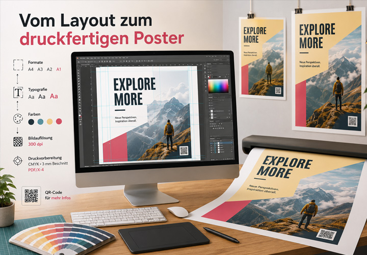
Pixel-based images should be sufficiently high-resolution in the final output size. A resolution of 300 dpi is often recommended for printing.
What matters is the actual resolution in the final format. A small image may be set at 300 dpi, but it loses this quality if it is greatly enlarged in the layout.
Logos, symbols, texts, and cutting lines should ideally be available as vector graphics. Vectors can be scaled without loss of quality and ensure clean edges.
Arranging multiple motifs on a sticker sheet
A sticker sheet contains several individual stickers on a common carrier material. The motifs can have different shapes and sizes and can be combined thematically or artistically.
Those who want to create their own sticker sheet should not only prepare the individual designs but also plan their arrangement on the overall sheet.
There must be sufficient distance between the individual cutting contours. Too closely placed motifs can make the cutting process more difficult and impair the stability of the carrier material.
For a balanced sticker sheet, the following elements could be combined, for example:
- one or two larger main motifs
- smaller icons and symbols
- short texts
- decorative shapes
- logos or brand identifiers
Aufkleberdruck24.de offers professional sticker printing for individual designs, including sticker sheets in various shapes and sizes. A properly prepared print file forms the basis for a high-quality result.
Preparing fonts and fine lines
Small fonts, very thin lines, and intricate details can lose impact in printing. Especially for small stickers, attention should be paid to sufficient font sizes and line widths.
Before exporting, it is advisable to:
- convert fonts to outlines
- avoid very thin lines
- check small texts for readability
- pay special attention to transparent effects
- check overprint settings
By converting fonts to outlines, it is prevented that fonts are missing or replaced when opening the file on another system.
However, the editable original file should still be saved separately, as fonts converted to outlines are difficult to correct later.
The appropriate file format
For stickers with contour cuts, a PDF file is often suitable, as it allows images, vectors, fonts, and cutting paths to be saved together.
Depending on the printing company, formats such as AI, EPS, or SVG are also accepted. Therefore, the data requirements of the respective provider should always be checked before exporting.
A final check should answer the following questions:
- Is the cutting contour completely closed?
- Is the contour present as a vector path?
- Has the specified special color been used?
- Do backgrounds extend into the bleed?
- Do texts and logos have enough safety distance?
- Are images sufficiently high-resolution?
- Has the correct color profile been embedded?
- Are fonts embedded or converted to outlines?
- Have unnecessary guidelines and layers been removed?
Typical mistakes in sticker printing data
Common problems include missing bleed, open cutting paths, insufficient safety distances, and incorrectly defined contour lines.
Low-resolution images and unconverted RGB colors can also affect the quality of the print result. Complex transparencies, drop shadows, and layer effects should also be checked before outputting.
Another typical mistake is defining the cutting contour as a normal visible line. The cutting line must be defined according to the specifications of the printing company and must not become part of the actual print image.
Conclusion
A print-ready sticker file consists of more than just an appealing motif. Contour cut, bleed, safety distance, color profile, resolution, and file format are crucial in determining how professional the finished product looks.
By considering the technical requirements during the design phase, you reduce inquiries, avoid unnecessary corrections, and achieve a more reliable printing result.
The design can be creative and individual. However, the print file should be clearly, precisely, and technically cleanly structured.

Comments
Register and comment.