Forms are a central part of almost every website. Their layout and design significantly influence the user experience. With CSS Flexbox, you can optimize the structure of your forms and ensure that they are both visually appealing and functional. In this tutorial, I'll show you how to use Flexbox to style form fields attractively. We will go through a practical example and learn how to effectively arrange labels and input fields.
Key Takeaways
- Flexbox allows you to make form elements flexible and responsive.
- You will learn how to improve the arrangement of labels and input fields to create a better user experience.
Step-by-Step Guide
To create a flexible form layout, follow these steps:
Step 1: Set up basic structure
Start by setting up the basic structure of your form by creating a container element. All form fields will be housed in this container.
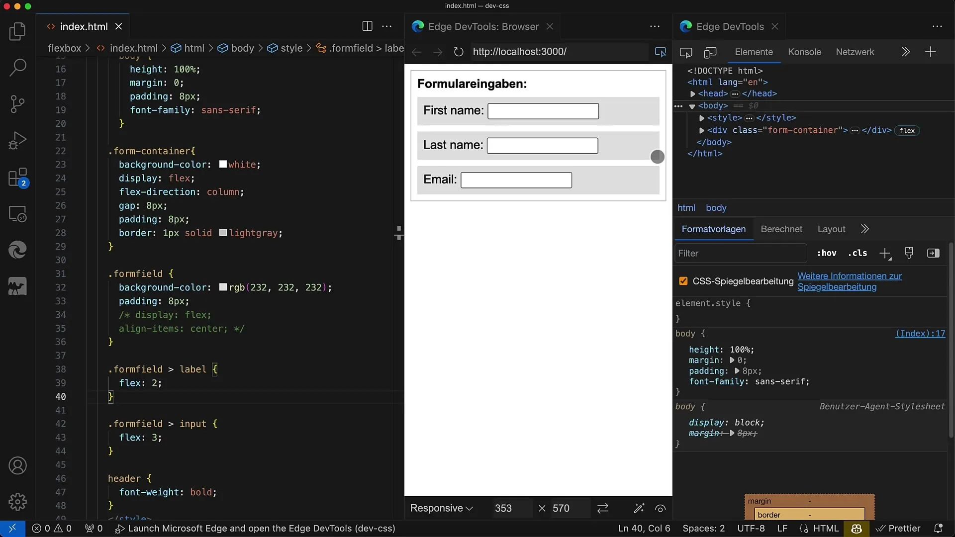
Step 2: Define labels and input fields
Add label elements and the corresponding input fields for entries. For example, you can add fields for "First Name", "Last Name", and "Email Address".
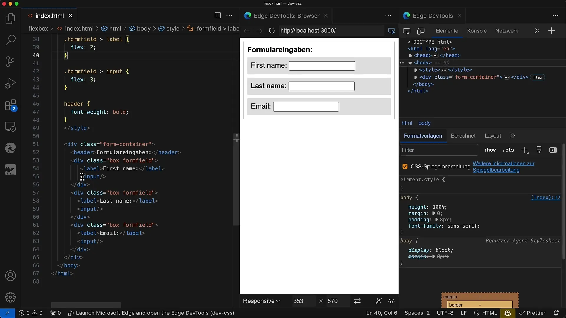
Step 3: Activate Flexbox
Apply the CSS property display: flex to the form container and define the flex direction as column to display the elements one below the other. These settings provide a clear structure.
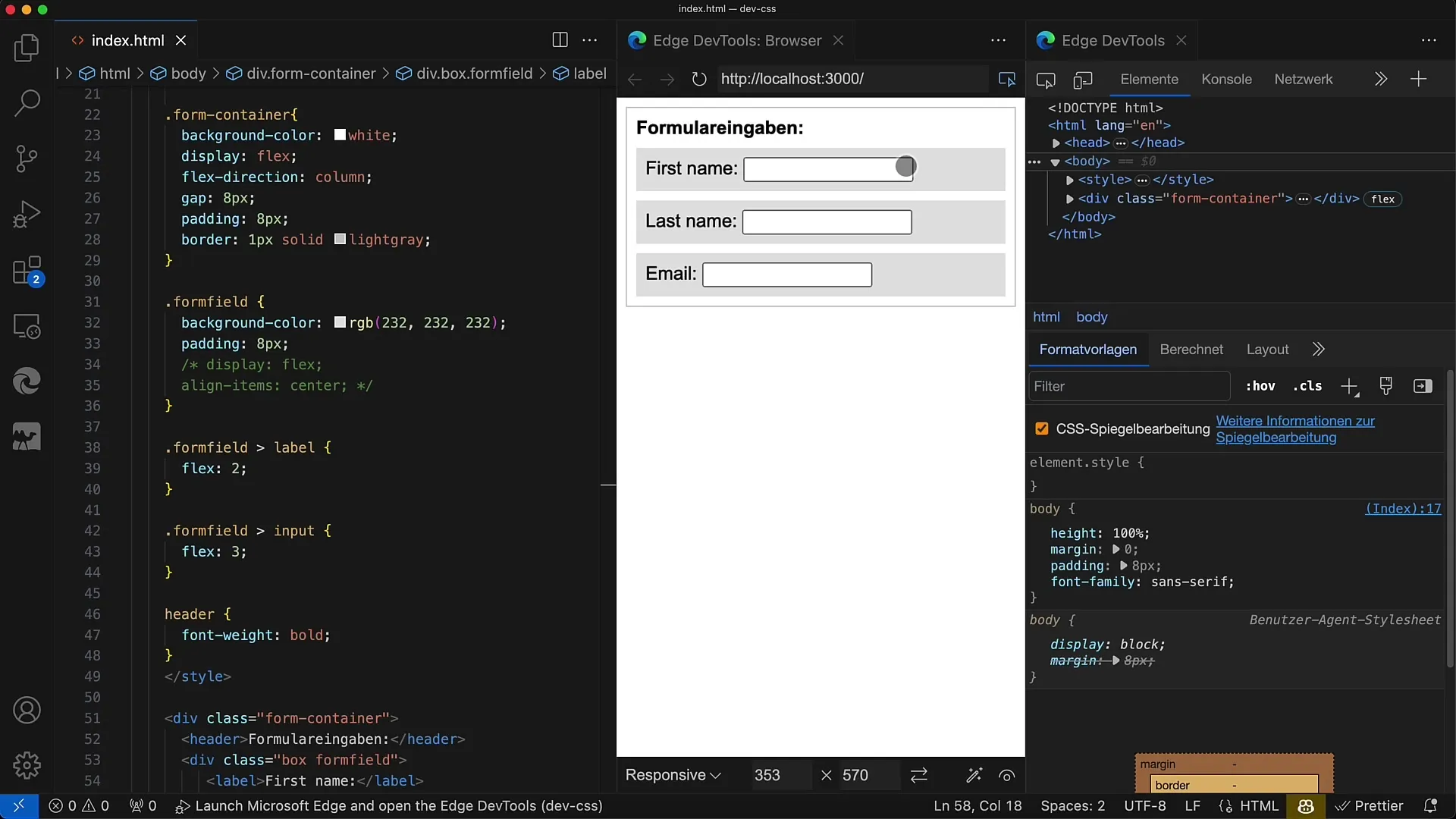
Step 4: Add spacing
To improve the spacing between individual form rows, add a gap of 8 pixels to the Flexbox. This creates a more airy layout.
Step 5: Style the form fields
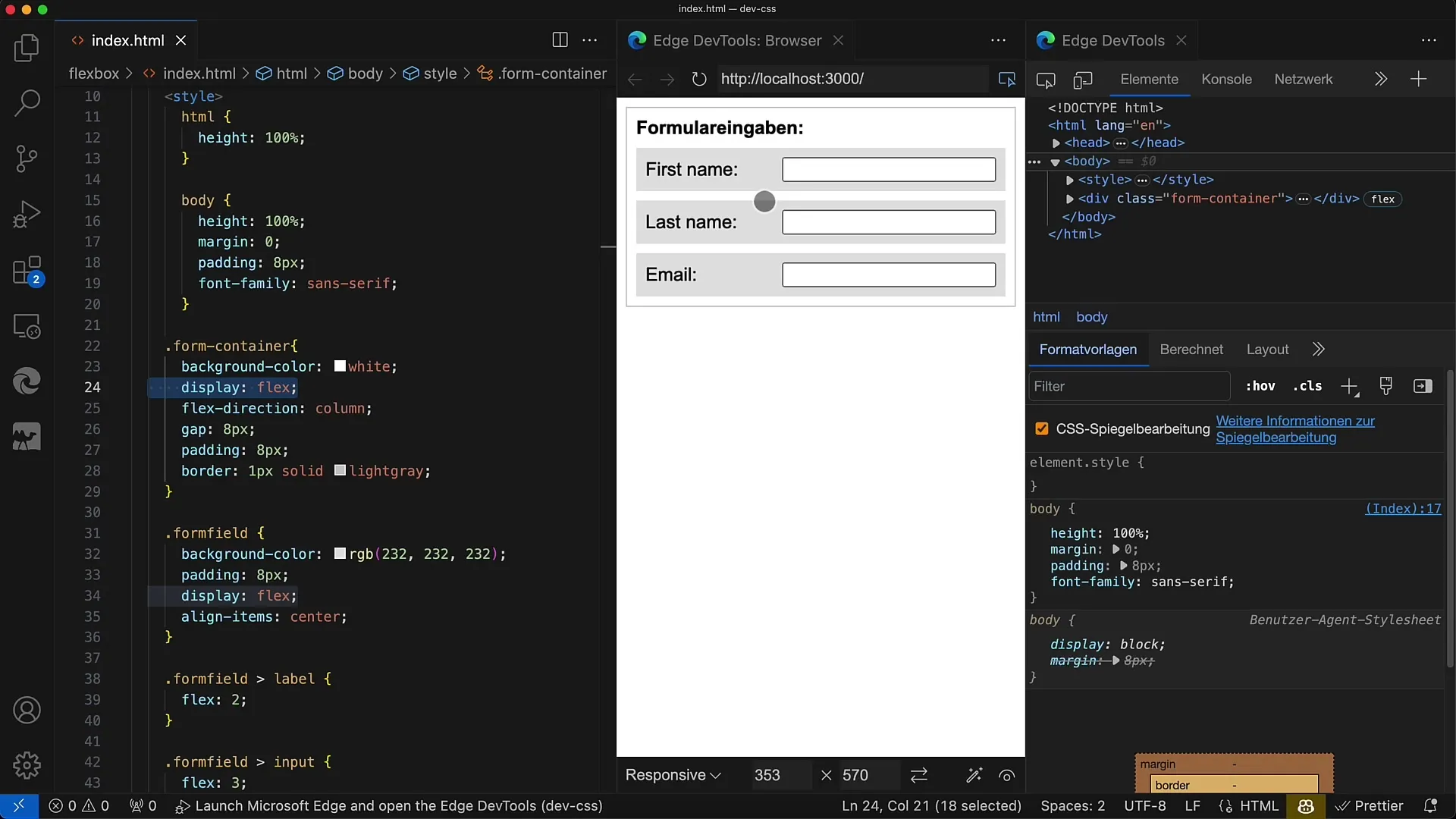
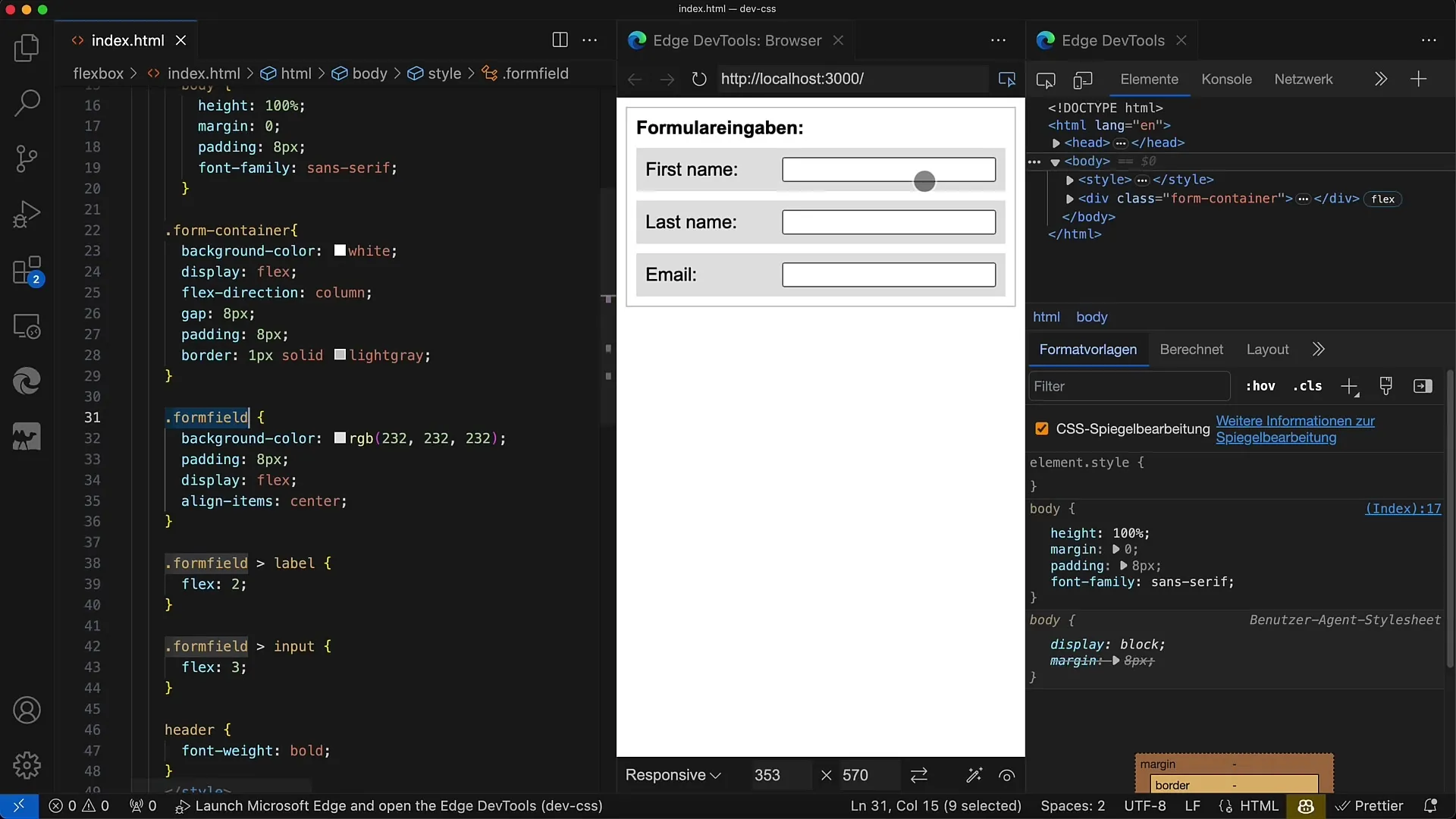
Style the individual input fields by adding the formfield class and also setting display: flex. Ensure that the input fields have the correct background color and appropriate spacing.
Step 6: Adjust proportions
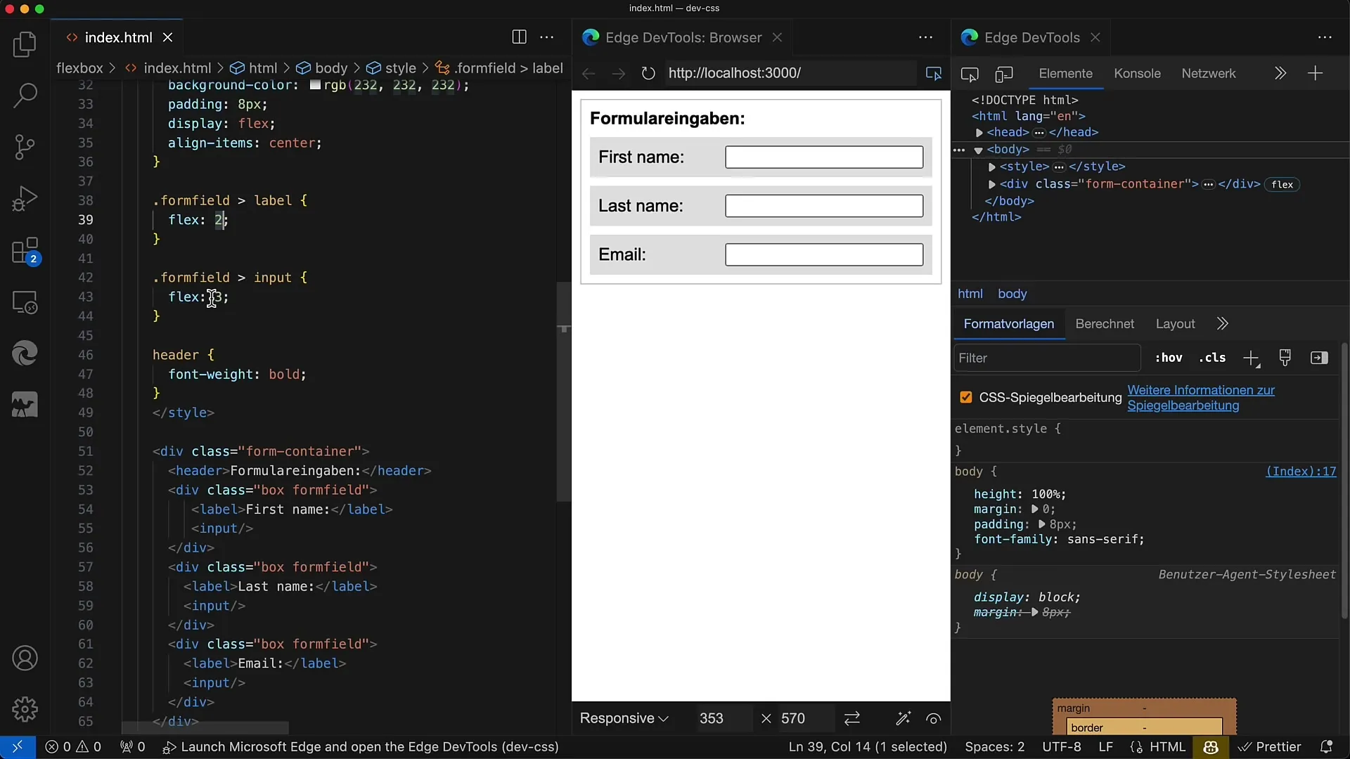
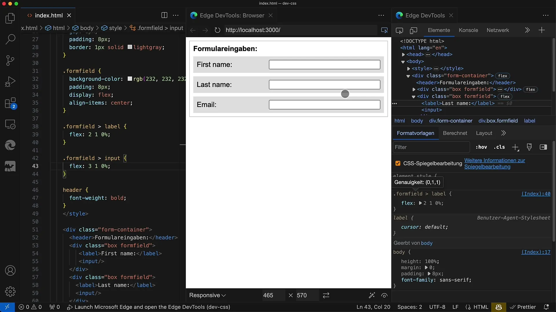
The width of the label and input can be defined using the Flex values. For example, you can set the ratio to 2:3 to ensure that the label and the input field are in the correct proportion to each other.
Step 7: Integrate responsive design
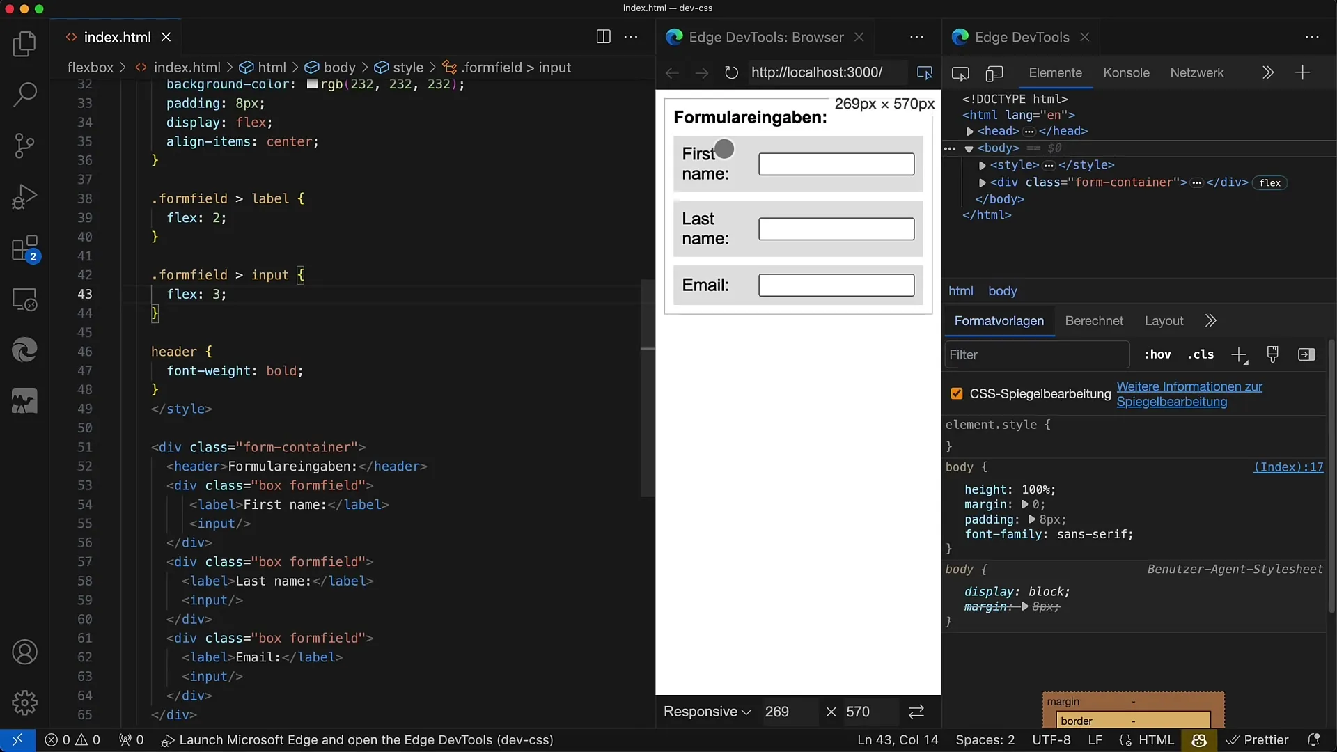
Check how the layout behaves when the browser window is resized. Ensure that everything looks good even on different screen sizes.
Step 8: Center elements
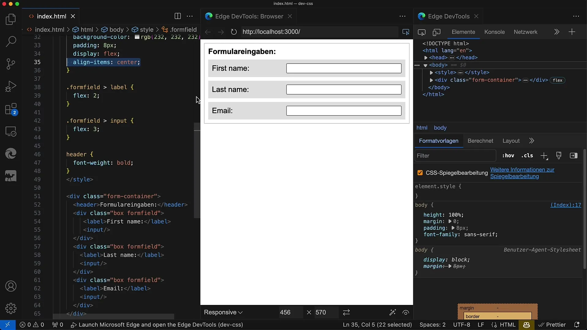
Use the CSS property align-items: center to align both the label and the input field in the center. This creates a harmonious and professional look.
Step 9: Optimize Flexbox properties
Experiment with Flex properties to further refine the design. For example, you can adjust the width of individual input fields to make them more flexible.
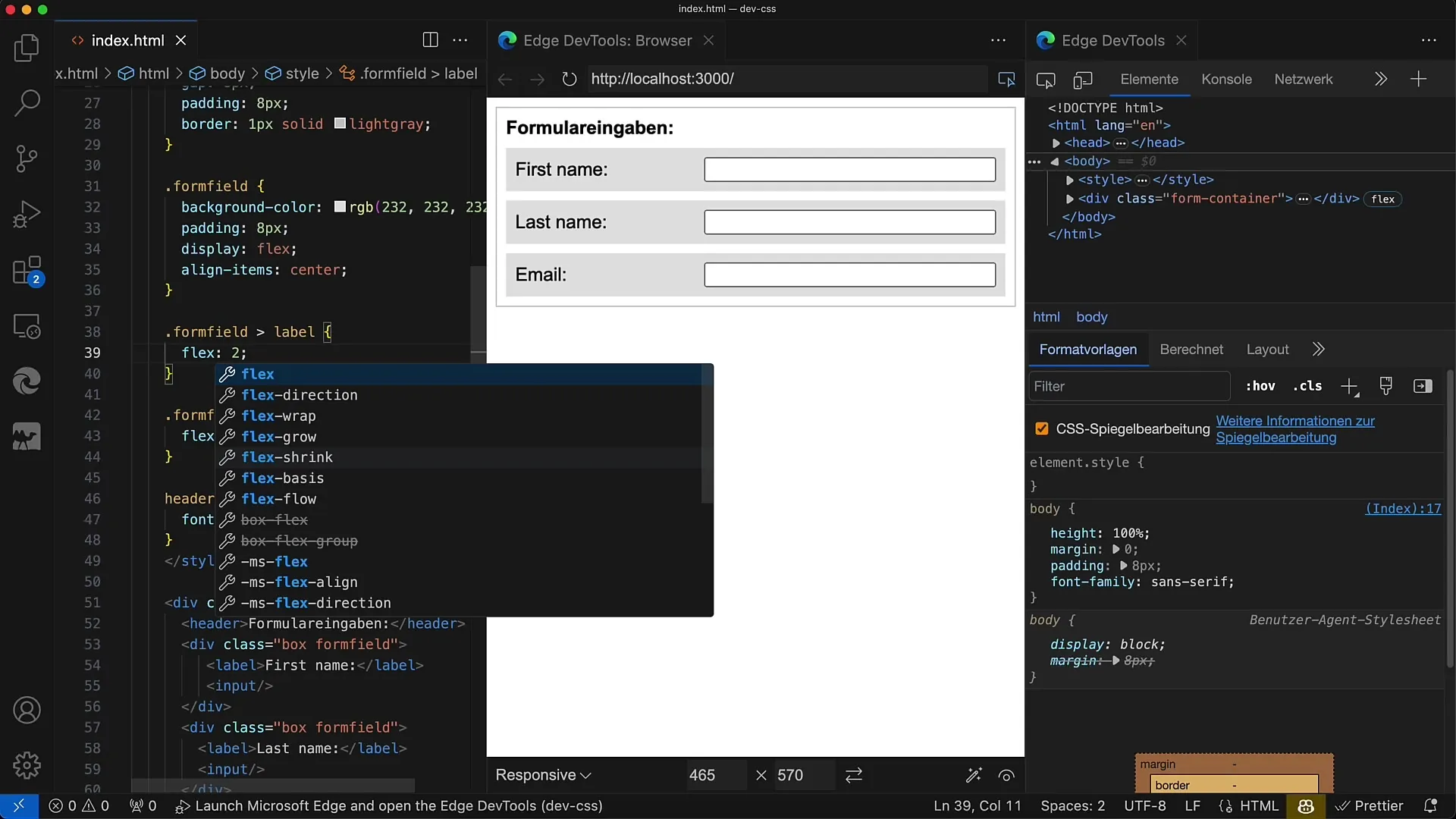
Step 10: Final adjustments
Review your changes and ensure that the layout is stable and aesthetically pleasing. There are many ways to use Flexbox, so don't hesitate to be creative!
Summary
In this tutorial, you have learned how to use Flexbox to arrange and style form fields in an appealing way. Flexbox simplifies the design of responsive layouts and allows you to significantly improve user experiences. Use Flexbox techniques to professionally and user-friendly design your forms.
Frequently Asked Questions
How do I activate Flexbox in my CSS?To activate Flexbox, you need to apply display: flex to the container element.
How can I add spacing between form rows?You can define a gap in your Flexbox container to control the spacing between elements.
How do I style the proportions of label and input field?Use Flex values to set the width of the elements in the desired ratio.
How can I ensure that my forms look good on mobile devices as well?Check the layout on various screen sizes and use responsive design practices to optimize user experience.
What are the advantages of Flexbox compared to traditional layout techniques?Flexbox allows for a much more flexible arrangement of elements and facilitates the creation of responsive layouts.
