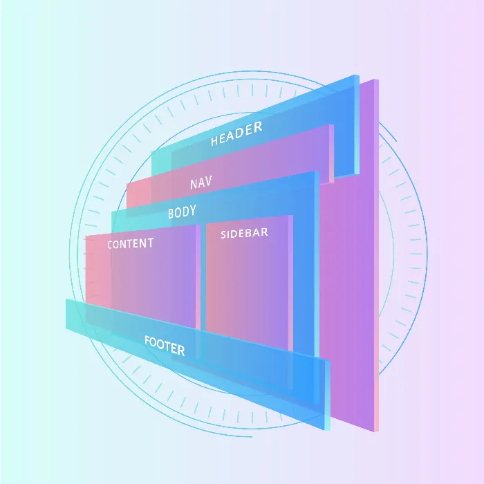
Are you planning to deepen your knowledge of Flexboxin CSSand HTML? In this course, you will learn how to effectively designthe layout of your web pages using Flexbox. Flexbox is a powerful layout module that allows you to arrange and distribute elements in a flexible and adaptable manner. Here you will find out what to expect in the course and how to utilize the various features of Flexbox.
Main insights
- Knowledge of HTML and CSS is required.
- Key topics: Arrangement, distribution, and alignment of elements.
- Practical examples for layouts such as centering, column layouts, and galleries.
Step-by-step guide
Step 1: Basics of the Flexbox module
To work successfully with Flexbox, it is important to have a basic understanding of the layout module. Flexbox allows for the flexible arrangement of elements. You will learn how to define containers and elements and which fundamental properties you need for that.
Step 2: Arrangement of elements
The arrangement of elements within a flex container is the core concept of Flexbox. You can set the direction of the elements – horizontal or vertical – making the user interface appealing. You will see how easy it is to change the order of elements without having to adjust the HTML code.
Step 3: Space distribution in the container
Another important aspect you will learn about is the distribution of available space within the container. Flexbox allows you to distribute space evenly or give certain elements more room. This is especially useful for creating responsive designs that adapt to different screen sizes.

Step 4: Alignment of elements
The alignment of elements is crucial to ensure that your content is both aesthetically pleasing and functional. You will learn how to align elements both within a container and across the entire page. These skills are necessary to create an engaging user interface.
Step 5: Working with wrap containers
The behavior of Flexbox when wrapping elements is another central topic. You will discover how to use a so-called wrap container to display content neatly, even when space is limited. Understanding this feature will help you optimize your designs.
Step 6: Spacing and order
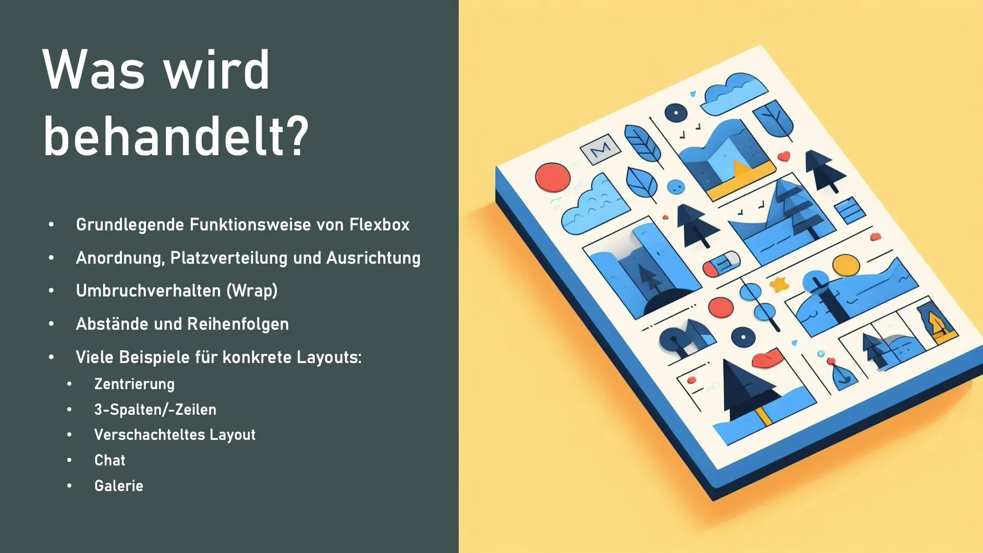
Dealing with spacing and determining order is an art in itself. With Flexbox, you can not only set spacing between elements but also the order in which the content is displayed. This allows you to dynamically adjust your page at any time without changing the underlying HTML code.
Step 7: Practical examples for layouts
In the practical part of the course, you will encounter various layout examples. These include:
- Centering elements and text: Here I will show you how to position content in the center of a container.
- Three-column layout: Learn how to create columns with Flexbox.
- More complex layouts: Here we will discuss a nested layout, similar to a chat.
- Galleries: To conclude the project, we will create an image gallery together.
Summary - Flexbox in CSS and HTML: Structured Text Guide for Effective Layout
Flexbox is an essential tool for modern web developers. This tutorial provides you with all the knowledge you need to effectively work with Flexbox and create appealing layoutsthat adapt to various screen sizes. You now have an overview of the most important concepts and can apply them in your own work.
FAQ
What is Flexbox?Flexbox is a layout module in CSS that allows for flexible arrangement of elements within a container.
What prerequisites do I need for the course?Basic knowledge of HTML and CSS is required.
Can I also create more complex layouts?Yes, the course also includes more practical and complex layout examples.
How does the alignment of elements work in Flexbox?Flexbox offers various properties that allow you to align elements both horizontally and vertically.
