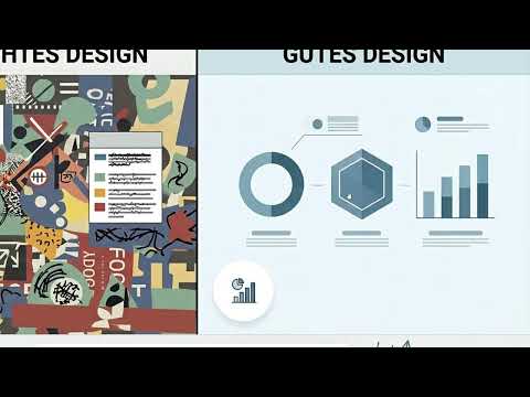
Imagine a presentation slide on which every element fights for your attention. Text blocks, buttons, arrows, and colors compete with each other, and in the end you don't know where to look first. Good design often works the other way around: it looks calm, tidy, and still clear.
The video is only loaded from YouTube when you play it – data (including your IP address) is then transmitted to YouTube/Google. More in the privacy policy
In this tutorial, you will learn about the three most important levers for professional design: spacing, typography, and visual clarity. You will find out why a clean design does not necessarily mean little content, how to recognize overload, and how to pass these qualities on to Claude in a targeted way in your prompt.
Key Takeaways
- A clean design is not empty, but deliberately reduced.
- White space is a design element and not wasted space. It gives content structure and room to breathe.
- Overload results from too much content, too many colors, buttons, fonts, and arrows.
- Simple diagrams with few labels and a calm background look clearer than overloaded variants.
- Text and image should support each other.
- Claude delivers clean results when you specify spacing, typography, and clarity concretely.
Step-by-Step Guide
Step 1: Understanding Clean Design Correctly
Before you write the first prompt, clarify for yourself what makes a good design. Many people assume that more information automatically means more value. In practice, the opposite tends to be true: a clean design is not necessarily simple, but it is neatly organized. Every element has a reason to be on the canvas.

Step 2: Deliberately Planning White Space
White space is the area between elements, and it is anything but wasted space. You need it so that content is separated from each other and the eye finds a clear direction. When a design looks cramped, what is usually missing is not design but spacing. So when prompting, make sure you explicitly request more white space instead of filling the canvas completely.

Step 3: Recognizing Overload in the Collage
A typical example of overload is the collage with numerous images, text fields, and graphics. It looks impressive at first glance, but after just a few seconds the viewer has lost all orientation. For each element, ask yourself whether it contributes to the core message. If not, it does not belong on the canvas, no matter how beautifully it is designed.
Step 4: Limiting Colors, Buttons, and Fonts
Too many colors, different button styles, and ornate fonts fragment any design. The eye looks for order but finds only unrest. So commit early to a few design tools, such as one font family and one accent color. State this limitation explicitly in the prompt so that Claude takes it into account from the start.

Step 5: Reducing Diagrams to the Essentials
Diagrams are especially prone to overload. As soon as many arrows, lines, and labels come together, nobody knows anymore where the development is actually heading. A simple pie chart with one or two labels often conveys the message much better. Before creating it, ask yourself which single message the diagram should convey, and formulate exactly that in the prompt.

Step 6: Choosing Calm Backgrounds for Data Visualizations
A bar chart with a solid-color background looks immediately tidier than a graphic overflowing with patterns and gradients. The background should not compete with the data, but move it into the center. That said, depending on the purpose, more information can certainly make sense. What matters is that you consciously decide what belongs on the canvas and don't leave it to chance.

Step 7: Coordinating Text and Image
A good layout makes use of the interplay between text and image. The text helps the image unfold its meaning, and the image helps the text stay in memory. When both compete side by side for attention, the slide loses impact. So plan both elements together: What message does the text carry, what information does the image visualize, and where is one of the two enough?

Step 8: Consciously Learning the Finer Details
Clean design is a skill that has to be learned. In this context, the instructor refers to the design handbook, because he has seen countless bad designs created with Claude. The cause rarely lies with the prompt or the AI itself. Usually the finer details are overlooked: too much on the page, too many colors, and too little spacing. Therefore, take the time to consciously internalize typical design rules before you demand them.
Step 9: Specify Spacing, Typography, and Clarity Concretely in the Prompt
The decisive step is precise wording. Claude reliably implements clean designs when you state the requirements concretely. An example of such a prompt is: "Create a slide with generous white space between the elements, a maximum of two colors, a sans-serif font in two sizes, and a simple pie chart with two labels." The more precisely you describe spacing, font choice, and number of elements, the closer the result comes to your vision.
Summary – Clean Design with Claude: White Space and Clear Prompts
A good design is characterized by order, not by abundance. White space, limited colors and fonts, and simple charts ensure that the viewer immediately understands what it is about. Text and image should complement each other instead of competing for attention. Claude can reliably produce such results if you concretely demand spacing, typography, and clarity in the prompt. The quality of your design therefore depends less on the tool than on your attention to detail.
FAQ
Does clean design mean I have to present less information?Not necessarily. What matters is that every element serves a purpose and the page is deliberately organized. Even information-rich content can deliver clean results if it is structured.
Why is white space so important?White space separates content from one another, gives the eye a rest, and directs attention to what is essential. Without it, even a well-intentioned layout quickly looks cramped.
How do I recognize that a design is overloaded?Look out for signs such as too many colors, different button styles, varying fonts, overcrowded charts, or elements that have no clear connection to the core message.
Which chart is suitable for a simple statement?Often a pie chart with one or two labels or a bar chart on a single-color background is enough. What matters is that the data takes center stage.
What is the reason if Claude creates a restless design?Usually the prompt lacks concrete specifications. If you don't state spacing, number of colors, font choice, and number of elements, overloaded results quickly arise.
How do I write a prompt for a clean design?State as precisely as possible what you want: generous white space, a limited color palette, a clear font choice, and the desired number of elements. The more concrete the details, the more precise the result.
Why should I consult the design handbook?The design handbook teaches fundamental design rules. Those who know them recognize weaknesses in drafts more quickly and can formulate more precisely what they require in the prompt.


