Imagine you see two advertising banners for the same dog toy shop. One is clear at first glance, while with the other you need a while just to figure out what it is about. This sense for good design can be trained, and it works fastest when you look at good and bad examples side by side. That is exactly what you do in this guide. You go step by step through typical design decisions, recognize why they work or fail, and learn how to apply them to your own designs.
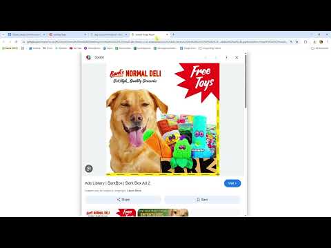
The video is only loaded from YouTube when you play it – data (including your IP address) is then transmitted to YouTube/Google. More in the privacy policy
The examples come from advertising graphics and app ads for dog toys. The topic is deliberately everyday, because principles such as hierarchy, white space, and legibility can be demonstrated particularly well with it.
Key Takeaways
Overloaded design may look lively at first glance, but it slows down perception. A clear structure with a logo, main headline, subheadline, and product conveys the message faster. White space is not wasted space, but a tool that lets content breathe. You should deliberately limit fonts, colors, and effects, because every additional embellishment competes with your actual message. And when you analyze role models, you don't just ask what you like, but why you like it.
Step-by-Step Guide
Step 1: Compare Two Versions
The simplest way to sharpen your eye is a direct comparison. Have two versions created for one motif: a colorful, overloaded one and a reduced, clean one. Make sure the content is the same, otherwise you are comparing apples with oranges. In the video, two banners for dog toys are compared, both meant to convey exactly the same message. After just a few seconds, it becomes clear that the difference does not lie in the content, but in the way that content is presented.

Step 2: Recognize Overloading as a Legibility Problem
Overloaded does not automatically mean ugly, but above all that elements compete for attention. In the overloaded banner, the headline is so ornate and squeezed in that you can hardly decipher it. In addition, the dog appears again at the bottom, even though it is already the main motif at the top. For every element, ask yourself whether it serves a purpose. If not, it is probably just ballast. A headline that cannot be read is basically no longer a headline.
Step 3: Build a Clear Hierarchy
The clean version follows a simple order: first comes the brand logo, then the main headline, below it a subheadline, and finally the product. This sequence corresponds to the path the eye typically takes. So you don't have to search long to understand what it is about. In your own designs, check whether you can recognize such a sequence when you look at the image only briefly. If not, rearrange the elements or change their size so that the most important information dominates.
Step 4: Consistently Remove Distractions
Decorative elements such as paw prints in the background or two competing background colors seem friendly at first glance, but distract from the essentials. The viewer then no longer knows where to look first. Therefore, remove everything that does not contribute to the message. A clean, single-color or clearly structured background emphasizes the product much more strongly. For every decorative element, ask yourself whether it reinforces the message or is merely decoration.
Step 5: Check Typography for Legibility
An example from a social media ad shows how it can be done: The headline is easy to read, not italic, not underlined, and not cut off. Exactly these basics are often neglected by design beginners. Italic script, underlines, or cut-off lines make reading harder and quickly look unprofessional. Test your typography by shrinking the design. If you can no longer decipher the headline on a smartphone, you need a different font, a larger display, or shorter words.

Step 6: Analyze Role Models Deliberately
An excellent method for learning is analyzing existing ads. Search in an image search specifically for terms such as "Dog Toy Social Media Ad" and look at what works. A good ad can still have room for optimization. In the video, for example, it is suggested to remove the shadows on the yellow area and omit the paws in the background of such an ad. Practice not only evaluating, but naming concrete improvements. This trains your analytical eye much more strongly than mere admiration.

Step 7: Limit the Amount of Information in App Ads
Especially with app advertising, many designers tend to cram everything in: discounts, contact details, benefits, logos, and additional notes. The result is an ad where you don't know where to look first. A single core message, such as an offer like "50% off", is often completely sufficient. Everything else belongs on the landing page. Choose one main message for each ad and consistently cut the rest. Even if a design looks minimalist at first glance, it can still be overloaded with too much information.

Step 8: Limit Fonts and Colors
Another typical mistake is using too many fonts and colors. The video criticizes an ad that uses an ornate, italic font and a multitude of colors. On top of that, there is a yellow frame with hatching that doesn't match the rest. Even if there is plenty of white space, the whole thing looks restless. Define a palette with one to two main colors and at most two fonts. Consistency looks more high-quality than variety at any cost.

Step 9: Use White Space as a Design Element
Finally, it's about the fundamental approach: clean is often better than overloaded. White space creates distance between elements, makes orientation easier, and lets important content stand out. Many templates demonstrate this principle very clearly by working with spacing and clear structures. The point is not to be perfect. Even the better examples from the video are not ideal, but they are easier to understand than the overloaded ones. So consciously give your draft some room to breathe before you declare it finished.
Summary – Recognizing Good Design: Clean Instead of Overloaded
Good design shows itself above all in how quickly you understand the message. You compare two variants, recognize overload as a readability problem, build a clear hierarchy, and remove distractions. You check the font, critically analyze role models, limit information, fonts, and colors, and use white space deliberately. If you repeat these steps with every draft, you sharpen your eye bit by bit. The result is ads that not only look good but actually fulfill their purpose.
FAQ
How can I tell that a design is overloaded?A design is considered overloaded when several elements compete for attention at the same time and you don't immediately know where to look.
Is a minimalist design always better?No, even a minimalist design can look overloaded, for example when too much information is placed in a tight space. What matters is the clarity of the message.
How many fonts should I use in an ad?One to two fonts are usually enough. More fonts quickly create restlessness and look less professional.
How can I analyze role models in a meaningful way?Ask yourself which elements stand out first, which information you recognize, and what you would improve. Concrete suggestions for improvement train your eye particularly well.
Why is white space so important?White space separates elements from one another, improves orientation, and makes important content stand out more.
How do I test the readability of my font?Shrink your draft to the size at which it will later be displayed, for example on a smartphone. If the headline remains easy to read, the font is suitable.


