The choice of the right font for your logo is crucial. It is not just a part of your corporate appearance but also a reflection of your personality and your work. In this guide, you will learn how to choose the right font for your photographer logo, which fonts pair well together, and what characters you convey with them.
Key Findings
- Choose a font that fits your personal style and your work.
- Pay attention to the readability of the font so that viewers recognize your name immediately.
- Do not combine more than two fonts to ensure clarity.
- Fonts have characters that should reflect your business.
Font Selection in Detail
1. The Fundamental Considerations
Before diving into the seemingly endless world of fonts, first consider who you are and what distinguishes your work. Every detail counts – from wedding photographers to product photographers, your font should reflect what you do.

2. The Variety of Fonts
Fonts can be categorized into different groups. Well-known categories include:
- Sans-serif fonts: These fonts are clear, straight, and modern. They are easy to read and are often the first choice for many photographers.
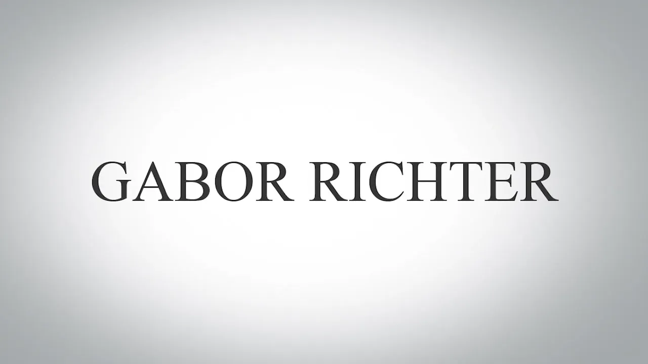
- Serif fonts: These fonts have small "feet" on the letters and enhance readability, especially in body text. They are well-suited for traditional and elegant photographer branding.

- Playful fonts: If you embody a creative, unconventional style, playful fonts might suit you. However, ensure they are not too quirky so that they remain readable despite the playfulness.
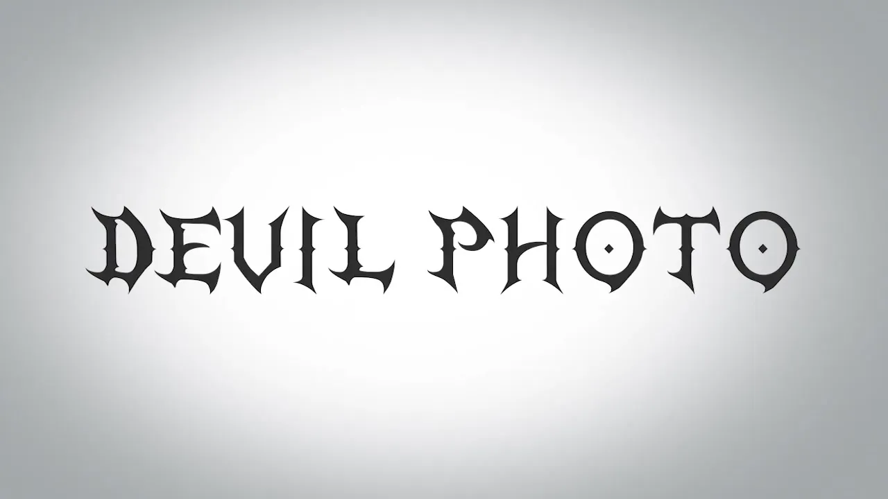
- Display fonts: These fonts are often difficult to read and are suitable only for special applications. If you want to use this type of font, choose them sparingly and carefully consider whether they really contribute to the statement of your logo.
3. The Right Font for Your Photography Style
Keep in mind that you may be asking yourself: “Which font suits me?”
- Wedding photographers: Their work revolves around emotions, details, and passion. An elegant, slightly playful script could work well here. It is important that it remains readable, even if it is stylish.
- Product photographers: These photographers often work very accurately and in a quiet environment. A clear, straightforward font could fit excellently here.
- Sports photographers: Dynamism and movement are central to sports photographers. Professional fonts that convey a sense of motion are beneficial here.
- Gothic photographers: If your focus is on very specific and harsh themes, a display or very distinctive font might work well. Ensure that it remains legible.

4. The Combination of Fonts
If you want to use multiple fonts in your logo, it is important that they harmonize. Use a maximum of two fonts: one prominent for the main heading and a subtle one for subtitles or additions.
Make sure the fonts are part of a font family. This means they can exist in different variants (such as bold or italic), which increases flexibility and makes combining them easier.
5. The Process of Selecting Fonts
Take your time when choosing fonts. Searching for and selecting the right font can be a challenge and often take more time than you might think. Sometimes it can take hours or even days to find the perfect font.
Make notes about your style and preferences. This information will help you focus on a few fonts that truly match you and your brand.
Summary – Choosing the Right Font for Your Photographer Logo
The choice of font is crucial for the first impression of your logo. Keep in mind that it is not just about aesthetics but also about readability and identity. A well-chosen font can gain customer trust and strengthen your brand.
Frequently Asked Questions
How important is font choice for my logo?The choice of font is crucial as it reflects your style and professionalism.
Can I use more than two fonts in a logo?It is recommended to use a maximum of two fonts to avoid confusion.
How do I find the right font for me?Note down what characteristics and emotions you associate with your photography style, and look for fonts that convey these.
Are all playful fonts suitable for my logo?Playful fonts can be good, but always pay attention to readability and whether they fit your style.
Should I choose my font in different variants?Yes, font families give you the opportunity to elegantly combine a main font and subtitles.


