The choice of the right graphic type for your logo can be crucial for the perception of your brand as a photographer. Here I will show you how to effectively distinguish between pixels and vectors and which variant is better suited for your logo design.
Key insights
- Vector graphics are scalable and do not lose quality, regardless of the size at which they are displayed.
- Pixel graphics are limited and can become blurry when scaled.
- Using Adobe Illustrator for vector designs is recommended, while Adobe Photoshop is ideal for pixel-based images.
- Colors and styles must be properly considered when exporting to achieve a perfect result for print and web.
Step 1: Understanding Pixels and Vectors
Let's start with the basic difference between pixels and vectors. Pixels are the small dots that make up an image. They are fixed in size, meaning that when you enlarge a pixel-based image, the quality suffers and it becomes blurry. Vectors, on the other hand, are made up of mathematical formulas that allow images to be scaled without a loss of quality. You can think of vectors as digital drawings that always remain sharp, regardless of their size.
Step 2: Creating a Design in Photoshop
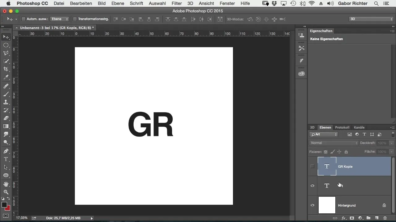
Now let's open Photoshop and create a new project. It's important to start with a clean workspace. I recommend adding the text you want to design first. In this case, your initials or the name of your photography studio could be a good start. For example, I could use “Gaber Richter” and design this text accordingly large.
Step 3: Rasterizing Pixel Graphics
Now, when you work in Photoshop and have saved your text, you will notice that Photoshop generates rasterizing file types by default, such as JPEG. This is the moment you need to rasterize your text to save the image information. To do this, select the corresponding text and rasterize the layer.
Step 4: Understanding the Difference in Scaling
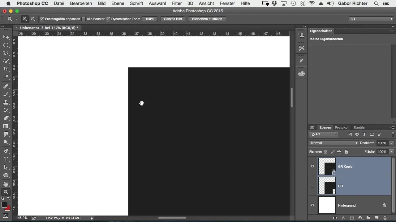
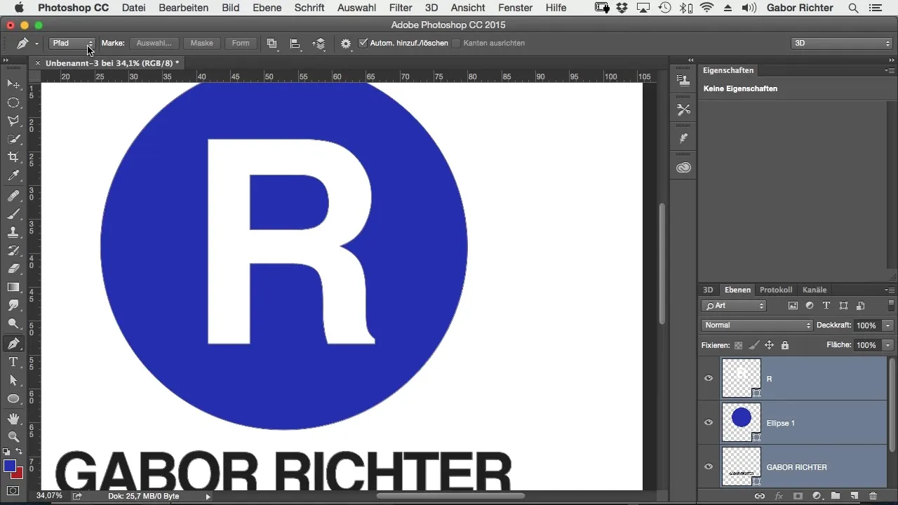
Now that you have both a rasterized image and a vector graphic, it becomes clear: when you enlarge the rasterized image, you will immediately see that the quality decreases. In contrast, the vector design remains clear and sharp when you scale it. This is a significant advantage of vectors in designing your logo.
Step 5: Converting to Vectors
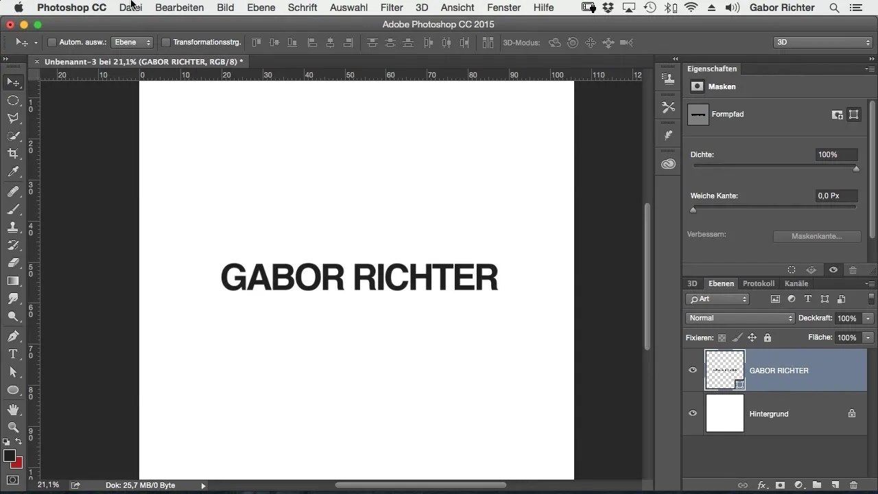
Now take a step further and convert the text into a shape to create a vector graphic. You must ensure you save the new vector layer properly. In Photoshop, you can do this by right-clicking on the layer and selecting “Convert to Shape.” This step is crucial to ensure the flexibility and adaptability of your logo.
Step 6: Exporting the Vector File
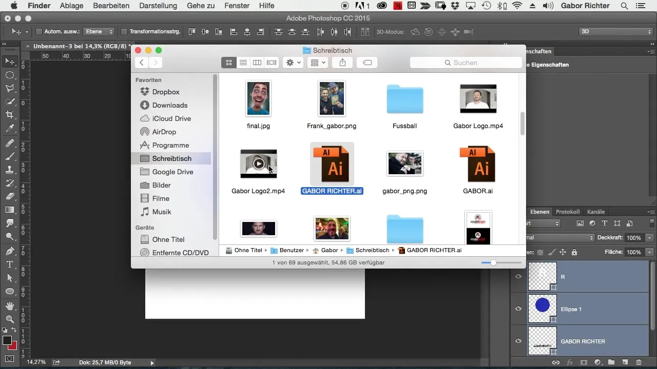
Do you want to save your logo or share it with someone? Be sure to choose the right export option. Go to “File” and select “Export,” to save the logo as a vector file. Often this will be the option for Adobe Illustrator, as this is the preferred standard for advertising technology.
Step 7: Color Management When Exporting
It's important to pay attention to the colors used when saving or exporting your logo. One way to do this is to take screenshots of your color values and send them along if necessary. Otherwise, important color details could be lost or misunderstood.
Step 8: Experimenting with Your Design
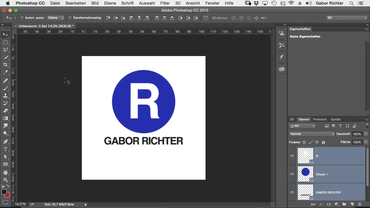
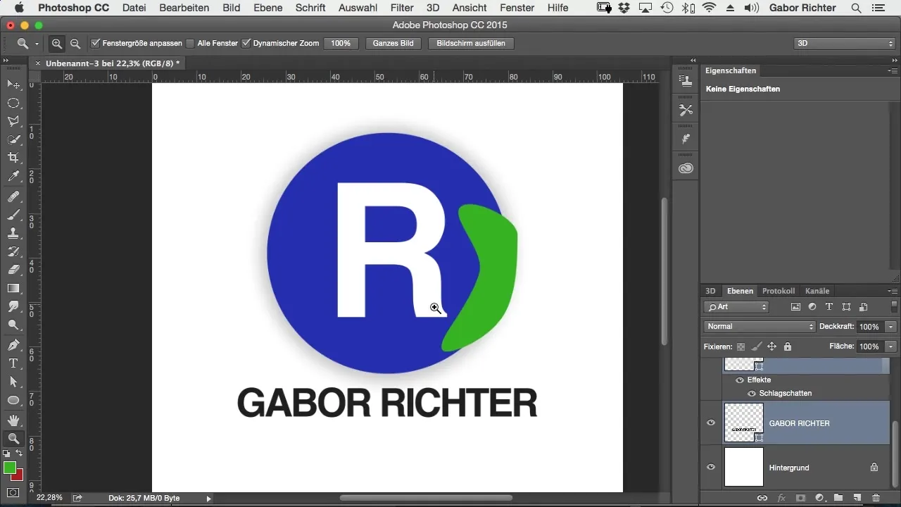
Designing a logo is a creative process. Use the available tools in Photoshop to add certain stylistic elements. For example, you can experiment with different colors and incorporate them into the design to create something unique. Be sure not to lose sight of the base of your vectors while working with shapes and colors.
Step 9: Paying Attention to Details
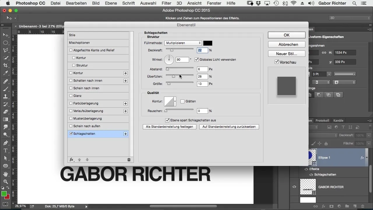
As you have seen, there are many subtleties when working with vectors and pixels. Ensure that no pixel graphics get into your vector design, as they can affect the quality of your logo. If you want to add drop shadows or other effects, you need to do this directly in the vector shape, as otherwise, it will not be recognized.
Step 10: Future Considerations
Once you have completed your logo, test it in different sizes and on different media to ensure it looks good everywhere. Remember that your logo will be used on business cards, websites, and large prints. A well-designed logo can say a lot about your brand as a photographer!
Summary – Creating a Logo for Photographers: Understanding Pixels vs. Vectors
The choice between pixel and vector graphics is crucial for the creativity and flexibility of your logo designs. Use the possibilities that vectors offer you to create a distinctive and high-quality logo for your photography brand.
Frequently Asked Questions
How can I create a logo in Photoshop?Create a new text, convert it to vectors, and save the file in the appropriate format.
What are the advantages of vector graphics?Vector graphics are scalable and remain clear and sharp at any size.
How do I save colors when exporting?Take screenshots of your color values and send them along with the vector file.
When should I use pixel graphics?Pixel graphics are ideal for photos, but you should not use them for logos.
What is the best way to prepare a logo for print?Save it as a vector file and include the corresponding color values in your communication.


