
Logo development for photographers

- 14 lessons, 90 minutes of video training
- Focused on the essentials: Emotions, colors, shapes and fonts
- Direct the focus, pay attention to the size and also work without color
- By Gabor Richter, an experienced media designer with corporate design know-how
Logically to the logo! A video training course for anyone who wants to know what really counts.
15 Videos, 102 minutes
Intro to the video training
What you can expect in the video training "Logo development for photographers"
5 minAn exciting training course on logo creation for photographers awaits you.
Develop logo for photographers
Logo development for photographers - 01 Intro
5 minThis video training is mainly aimed at photographers who want to create their own professional-looking logo. It is not a tutorial that explains step by step how to create a vector file in Illustrator, for example, but rather I deal with the basic questions about the shape and design of the logo.
In the intro video, I welcome you and briefly summarize the content of this video training. I explain why the training is mainly aimed at photographers and what I have focused on.
Logo development for photographers - 02 Name
11 minIn my opinion, the first step towards a good logo is finding a name. I have many helpful tips on this, which I have gathered over many years of experience as a media designer.
Logo development for photographers - 03 Brand
6 minIn this video, I explain the difference between a word mark and a figurative mark. In particular, I address the question of what you should look out for when choosing a trademark.
Logo development for photographers - 04 Fonts
13 minIn the fourth video, I show you how important it is to choose the right font for your logo. I use sample logos to illustrate what you should pay particular attention to when choosing a font.
Logo design for photographers - 05 Free fonts
4 minIn this video I give some useful tips and tricks on how to get suitable and free fonts. I also give a clear site recommendation for such fonts.
Logo development for photographers - 06 colors
11 minIn this video, I talk about the color choice of your logo. The most important thing for me is that the color suits you or your company.
Logo development for photographers - 07 black and white
4 minThis video is about the fact that logos for photographers in particular should also work in black and white. This is particularly important for documents and watermarks.
Logo development for photographers - 08 forms
8 minIn this video, I explain which meanings are behind which shapes. I show why it is so important to think about the shape of the logo.
Logo development for photographers - 09 Focus
3 minIn this video, I deal with focus and directing the gaze. For me, it is important that the focus is always directed to the most striking feature of the logo.
Logo development for photographers - 10 size
4 minThe size of the logo is also very important. In this video, I explain how important it can be for the logo to work both very small and very large.
Logo development for photographers - 11 Simplicity
7 minIn this video, I make it clear that simplicity is also very important in a logo. Using illustrative examples, I explain that the eye is overwhelmed by too much information and therefore quickly becomes disinterested if a logo is too overloaded.
Logo development for photographers - 12 Rating
6 minIn this video, I recommend not publishing the logo immediately after completion. It makes more sense to sleep on it for a few nights and have the logo evaluated by a professional if necessary.
Logo development for photographers - 13 pixels & vectors
13 minIn this video, I explain the difference between pixels and vectors. I also explain which of these two variants is more suitable for designing a logo.
Logo development for photographers - 14 Outro
3 minIn the last video, I thank you and give you a few final tips. I also offer you a platform where you can get feedback from other consumers of my video.
Examples of use
-
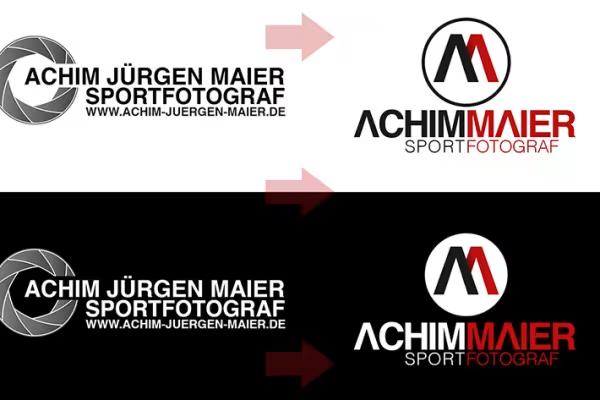 What should your logo look like? Simply design it yourself!
You might also like

Full power, more inspirations, maximum WOW effect!
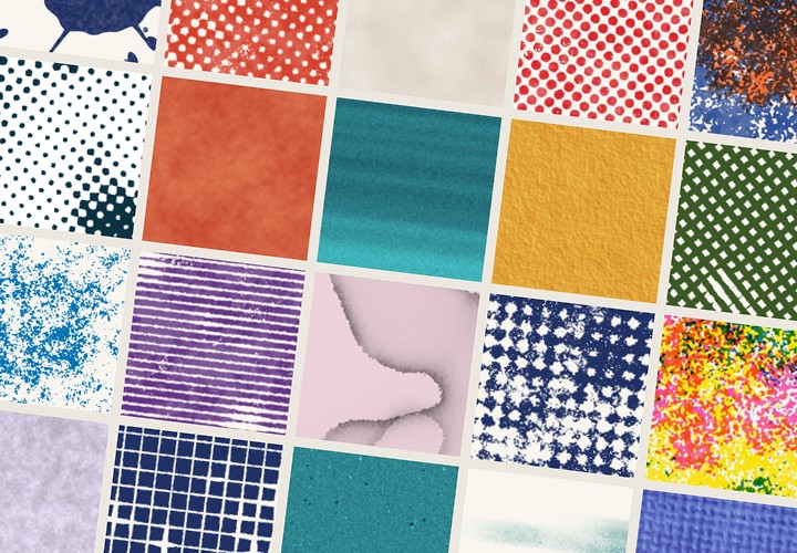
20 sets in 4K (4096 × 4096 px, 300 DPI) as JPG plus Photoshop patterns, calibrated to the fill method
More style, more power, more templates!
Live your layout now!
Comment now „Logo development for photographers“