Imagine you open a blank page and are asked to deliver a complete landing page right away. The approach in this tutorial protects you from exactly that: you don't build the website all in one go, but section by section. Each building block gets its own prompt, its own design, and its own test. That way you quickly see which part works and which still needs fine-tuning.
The video is only loaded from YouTube when you play it – data (including your IP address) is then transmitted to YouTube/Google. More in the privacy policy
Introduction
In this guide, you will learn how to create the individual sections of a landing page in Claude Design. Using the example of an online shop for dog toys, you build the hero area, the benefits, and the call to action one after another. Along the way, you will see how to formulate prompts, answer the tool's follow-up questions, and adjust the result using tweaks and edits.
Key Takeaways
Each section is created as its own prototype so that you can test it specifically. A good briefing includes content, style, colors, and behavior, such as responsive design and hover effects. The tool's follow-up questions are not an obstacle, but a checklist for everything you still need to define. Small changes such as button size or texts are handled via tweaks and edits, without having to write a new prompt every time.
Step-by-Step Guide
Step 1: Take over prompts from the preparation document
Before you write the first prompt, open the document with your prepared prompts. In it, you have already gathered in the chat which content your landing page needs. This preparatory work saves you a lot of time, because you don't have to start from scratch. Simply copy and paste the content into your prompt.

Step 2: Describe the hero area with content
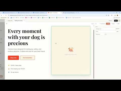
Start with a clear instruction, such as "Build a prototype of a modern e-commerce hero section for this Company". Then describe the components: a strong headline, a subheadline, a call to action like "Shop Now", and a trust element, for example "10.000+ Happy Dogs". The more specific you are, the less you have to correct later. If the chat already contains a lot of information, you can easily copy it into the prompt.
Step 3: Define style, colors, and atmosphere
Now you determine the look of your page. In this example, the design should feel warm, modern, and family-friendly. As accents, you choose orange and a warm beige on a white background. Also add "clean" and "spacious". Spacious mainly means a lot of white space. These terms shape the design more strongly than you might expect.

Step 4: Name the prototype and set it to High Fidelity
Make sure you request a prototype with a high level of detail (High Fidelity) and not a simple wireframe. A wireframe only shows the rough structure, while a high-fidelity prototype already looks like a real website. Also give the project a unique name, for example "Project 1 Hero Section". Each section then gets its own design, so you can review them independently of each other.

Step 5: Send the prompt and be patient
Once the prompt is complete, you send it. Generation takes a moment because Claude Design builds the interface completely. Use the waiting time to think about further adjustments that you can send right afterward.

Step 6: Fine-tune with a tweak prompt
You don't have to get everything perfect on the first try. With an additional prompt such as "make the primary call to action button larger and add a subtle hover animation", you adjust the call to action specifically. If the button is already large enough and has an animation, the prompt does no harm. It does, however, show you that you can keep refining at any time.
Step 7: Answer the tool's follow-up questions deliberately
Afterward, the tool asks you questions about the design. Answer precisely. For the layout, you choose an image-focused, tall hero section (Image dominant, tall). The buttons should appear as filled surfaces (Solid Fill). For the trust badges, you specify that they appear as a horizontal row below the buttons. For the placeholder images, you choose rounded corners with a hover effect and a gentle fade-in. These questions may seem detailed at first, but they prevent many revisions later.

Step 8: Define the style combination, fonts, and responsive behavior
For the style direction, you choose "Playful and Premium", meaning playful and high-quality at the same time. For the typography, you use a font pairing from Google Fonts that the tool suggests to you. Responsive design is also important. This means that the page looks just as clean on a smartphone as it does on a desktop. Additionally, ask for Tweakable Options. This allows you to change colors directly in the preview area later, without having to prompt again.

Step 9: Check the result and adjust the colors with tweaks
When the prototype is finished, you see it in the preview. Using the tweaks on the right side, you can change colors, accents, headings, and subtexts. While doing so, pay attention to the color codes. A change can cause colors to be adopted in RGB format, even though you wanted a clear orange tone. In that case, restore the original value. This way you can see directly how each setting affects the overall impression.

Step 10: Check the trust badges and responsive display
Check whether the trust badges are actually arranged horizontally. If not, state this in a message in the chat. Also note why the page looks the way it does: it is optimized for mobile devices. On desktop, the text would appear wider and the layout would look different. Reload the preview after every change if you want to see the current version.

Step 11: Enlarge buttons with a second prompt
Next, you can further improve the call to action via prompt. The button becomes noticeably larger and gets the desired hover effect. This is where the advantage of this way of working becomes apparent: you change only one element in a targeted way, while the rest of the section remains unchanged.

Step 12: Name unsuitable elements in the chat
Not all trust badges fit next to each other in one row. This is due to the width of the layout. You could delete the elements directly in the editor, but it is cleaner to describe the problem in the chat. Only then does the tool know that it should revise the arrangement in a targeted way. The display may still work on a smartphone. Decide whether to accept the current state or improve it once more.

Step 13: Create the benefits section
With that, the hero area is complete. Now create a new prototype for the benefits, again as High Fidelity and in the project "Projekt 1 Vorteile". Describe the content precisely: six benefits in cards, arranged in a 3 x 2 grid, each with an emoji, a short title, and one to two sentences of description. In terms of content, safety, durability, and the dog's happiness should be in the foreground. Finally, add the desired style.
Step 14: Evaluate the result of the benefits section
The cards appear within a short time and look high-quality. The emojis move slightly, and the cards react visibly when you hover over them with the mouse. Check whether you want to change anything. In this case, no intervention was necessary. Good results need no corrections, and you can continue right away.

Step 15: Set up the call-to-action section
For the last building block, you create another prototype, this time for the conclusion of the page. Write an emotional headline with two to three sentences and the call to action "Find the perfect toy". Also specify that you want only one design and that it should look playful.

Step 16: Answer the follow-up questions about the call-to-action section
Here, too, the tool asks questions. You decide on a single design, one dog image on the page, and well-filled button styles. The section height should be balanced, the hover effects are retained, and there is only one call to action. These answers determine how compact and focused the conclusion of your page appears.

Step 17: Adjust Texts and Details via Edits
The result already looks good, but you don't like some of the wording. Instead of writing a new prompt, you use the Edit function and change the text directly in the preview. You can also insert an additional emoji yourself or prompt again. This approach is often the fastest when it only involves individual words.

Step 18: Use the Three Prototypes as the Basis for the Complete Page
In the end, you have three tested sections: the hero area, the benefits, and the call to action. These building blocks form the foundation for the next stage, in which you combine them into a complete page. This works in a single prompt because each section has already been reviewed and coordinated.

Summary ??? Claude Design: Building Landing Page Components Step by Step
You have learned how to build a landing page not as a whole, but section by section. With precise prompts, you define content and style, with the tool's follow-up questions you refine the design, and with Tweaks and Edits you adjust details. This method makes each section individually testable and leads to a cohesive overall page.
FAQ
How long should a prompt for a section be?A prompt should state all the content, style, and functions you need. The tool's follow-up questions fill in missing details, so the prompt doesn't have to anticipate every question.
Do I have to answer all of the tool's follow-up questions?Yes, it's worth it. Every answer sharpens the result, and unanswered points often lead to revisions.
What is the difference between wireframe and high fidelity?A wireframe only shows the rough structure of a page. A high-fidelity prototype already contains colors, fonts, and spacing and looks like a finished website.
When do I use Tweaks, and when a new prompt?Tweaks are suitable for colors, font sizes, and other simple values. For larger changes to the layout or structure, a new prompt makes more sense.
Can I change texts afterwards?Yes, using the Edit function in the preview you can overwrite texts directly. This is faster than writing a new prompt.
Why do I see placeholders instead of real images?The tool generates placeholders in the prototype. You insert real images yourself later.


