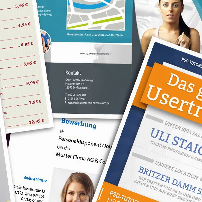
In this tutorial, I would like to show how easy it is to create such a title cover in InDesign. I would like to start with the airplane, the main motif of this cover page.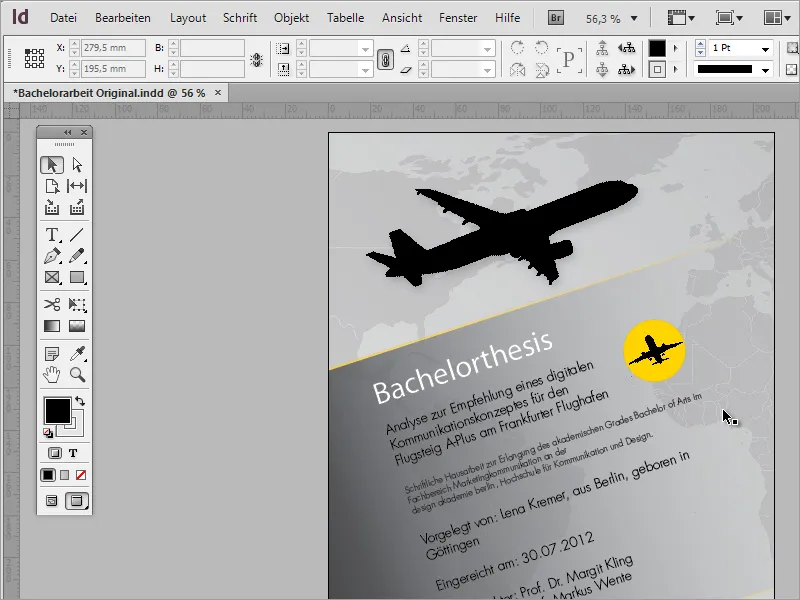
Those in need of graphics are often faced with a resource problem. After all, few ready-to-use graphics are stored on the home hard drive. One option is to search online image databases and purchase graphics for use. The Internet offers several portals for this purpose. One of these portals is for example Fotolia.de.
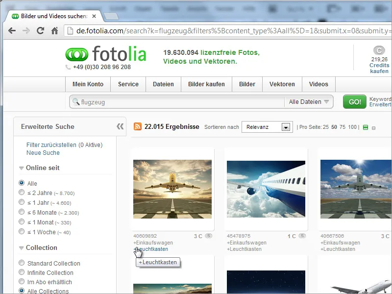
This image database contains approximately 20,000,000 images on all kinds of topics. Since it is difficult to view all of them, the search input and search options on the left side are helpful. For print products, it is important that the graphics and photos can be displayed in high resolution. The higher the resolution of a photo, the higher the costs. To prevent these from exceeding the budget, the use of vector graphics is recommended, which can be filtered specifically through the left navigation.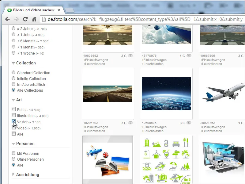
The filtered results can be displayed enlarged. By clicking on the preview, you can go to the detail page with the price information. The vector graphic costs approximately 4 euros here, making it an inexpensive product. Depending on the intended use, a different license may need to be purchased. It is helpful to inform yourself about the licensing conditions on this page: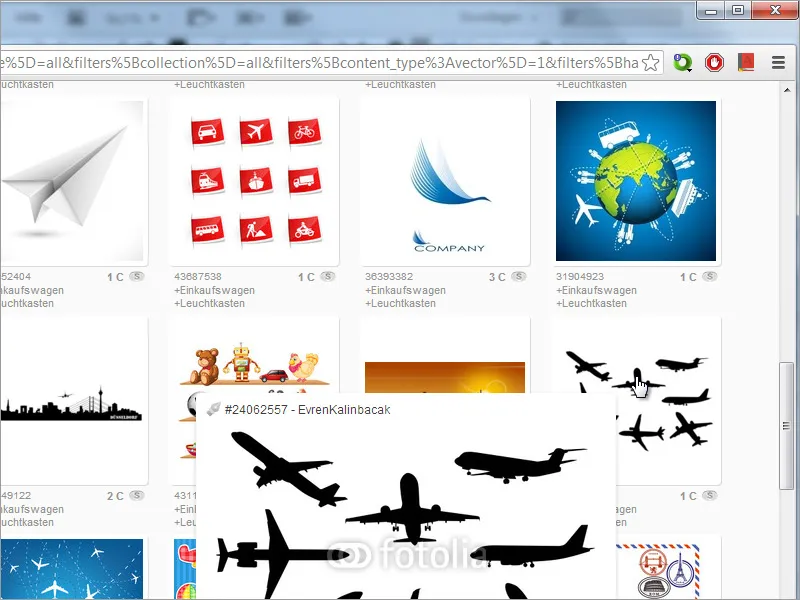
Another option, for example, is to obtain corresponding graphics through fonts on the system. A popular provider of such font collections is dafont.com. However, when searching, you may need to use English terms.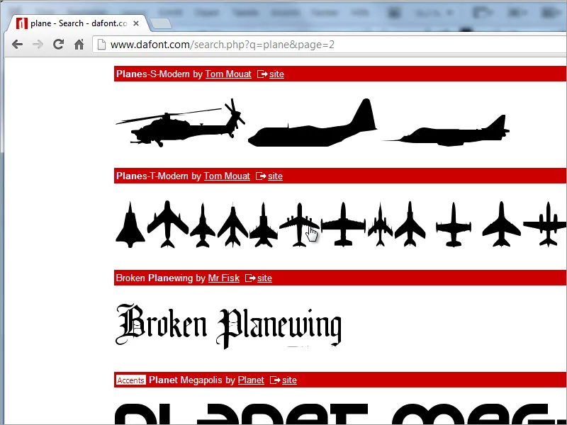
So let's start with a blank document. For the cover page, you only need a simple page. You may need to consider a bleed allowance in the document size.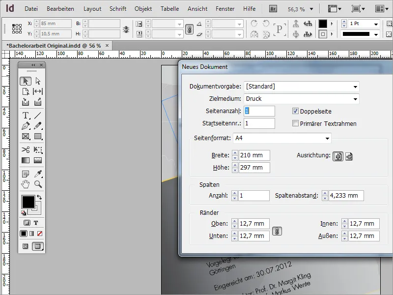
It is important to mention that one should pay attention to the image formats downloaded from image services. Since Adobe InDesign cannot read all formats, it may be necessary to edit a graphic in advance with a suitable program or convert it to a compatible format. This may apply, for example, if you have downloaded an SVG graphic. However, in our case, the airplane graphic is in a compatible EPS format.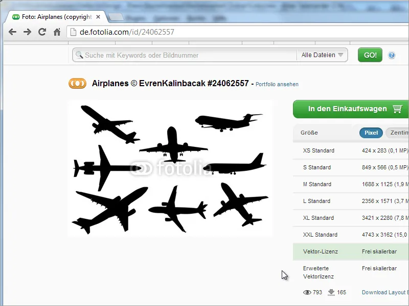
Once the graphic has been converted if necessary, it can be dragged and dropped into the new document to place it.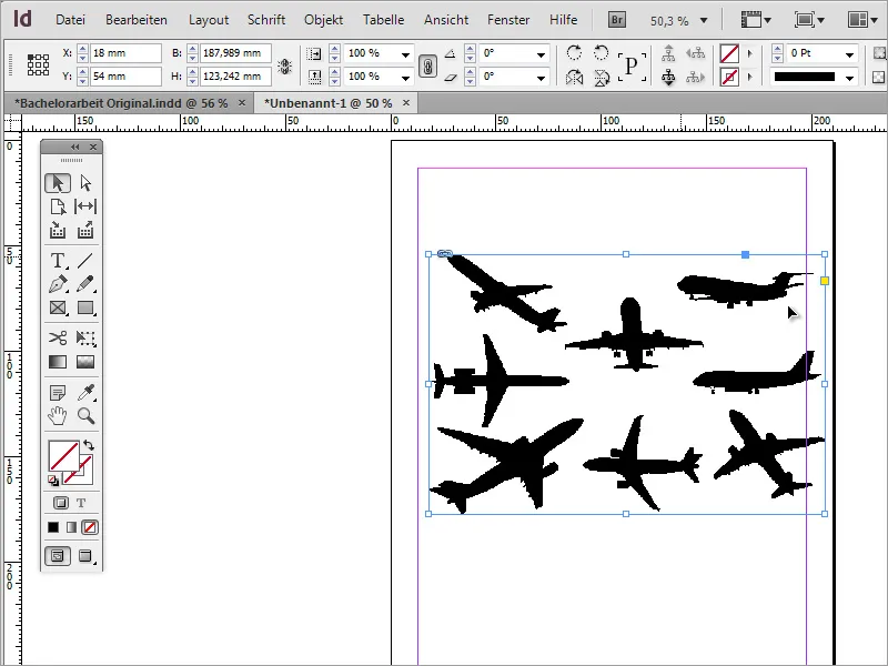
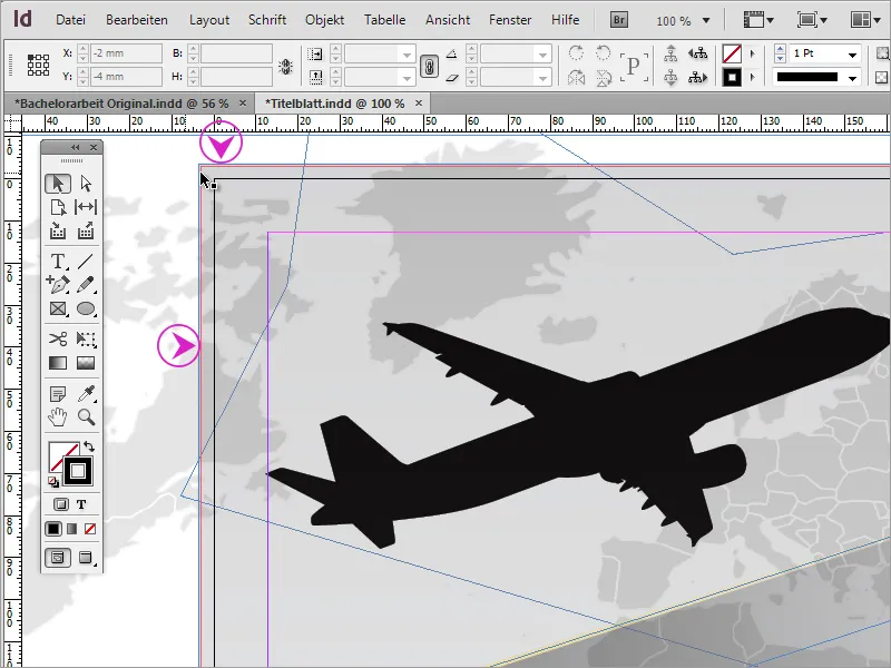
Now this imported graphic contains several airplane models, with only one of them needed. However, this is not a problem for InDesign. The image does not need to be cropped. It is sufficient to shrink the frame of the image so that only the object to be retained is visible.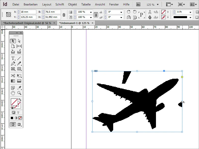
However, there may still be visible image areas that should also be hidden. In this case, you can use the pen tools, particularly the add anchor point tool, for help.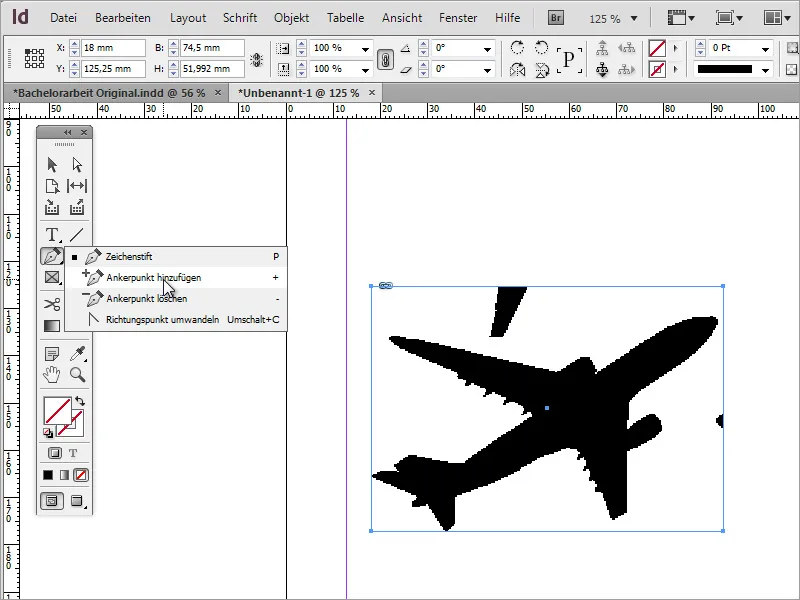
With this tool, you can set anchor points on the object frame, enabling you to further shape the surrounding envelope. By pressing the A key, you can easily switch to the direct selection tool and select the node by holding down the Shift key. It will then take on a light color.
The activated node can now be moved so that the unwanted parts of the image are hidden from view within the frame.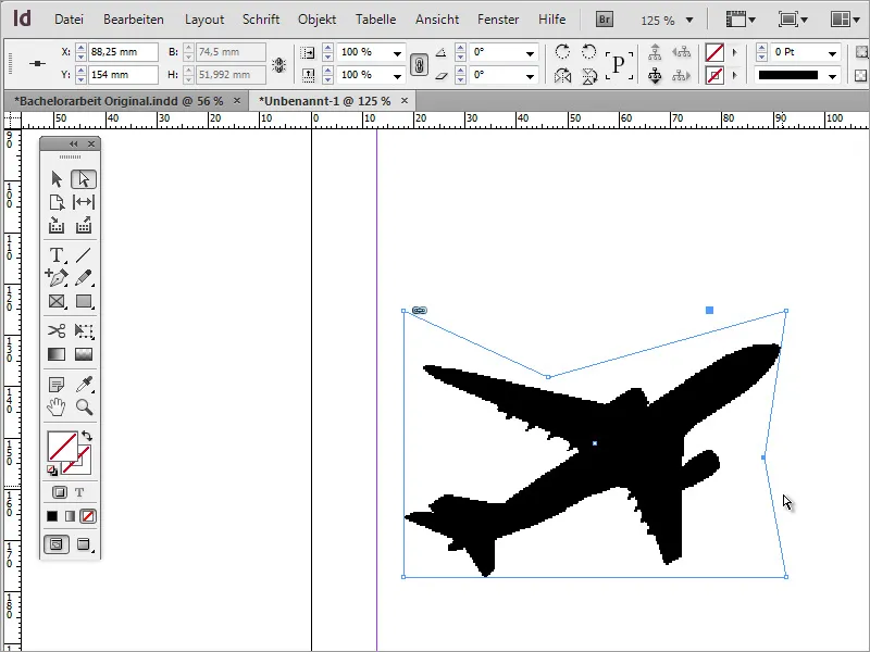
If you are wondering why the display looks somewhat pixelated, it is because InDesign works with a reduced display for performance reasons. This view can be set so that the contents are displayed in higher quality. To do this, go to the menu item View> Display Performance> High Quality Display.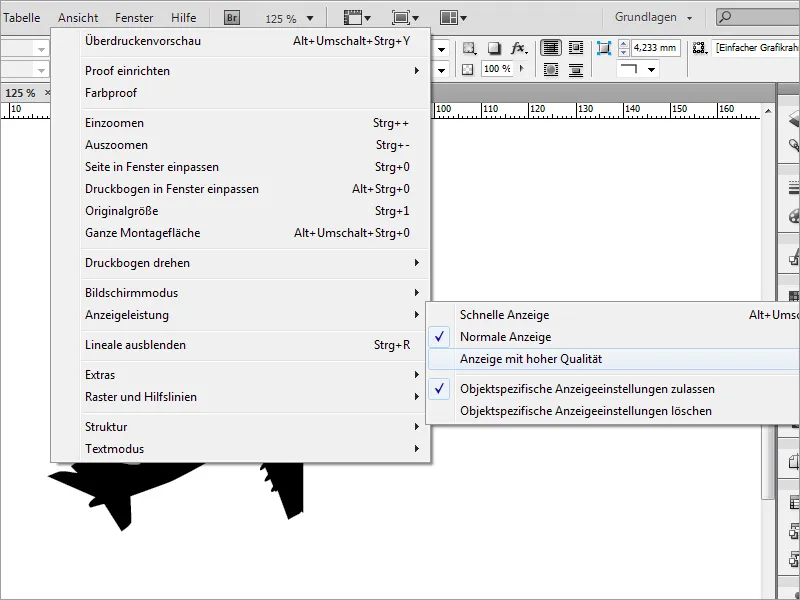
With Shift and Ctrl, you can now scale this graphic, then move and potentially rotate it. Since it is a vector file, this works seamlessly at this point.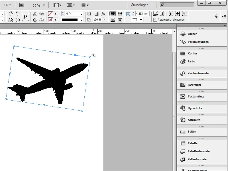
If you are not quite sure if you have released the right image section, you can also switch to normal view in InDesign and then move the image section. Switching to normal view will make the graphic frame visible.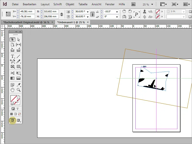
Then you can move the image section.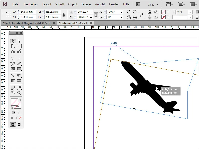
The airplane is in an unfavorable position. Therefore, it is advisable to modify it by mirroring the object. Using the context menu and the entry Transform> Horizontal Mirror, the object can be adjusted in the presentation.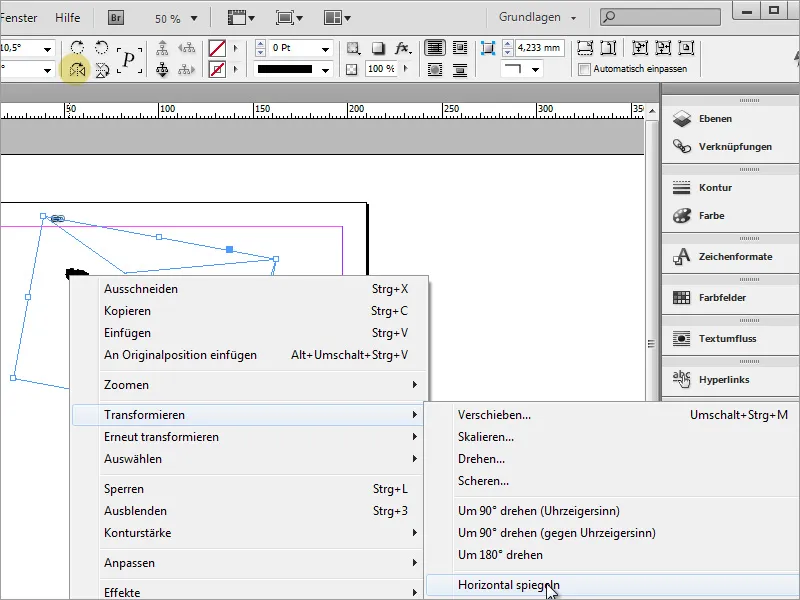
One should not forget to regularly back up the document.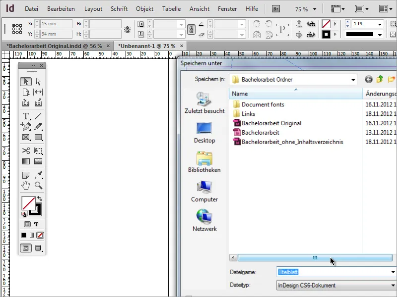
Next, a vector motif depicting a world map was sought for the cover page. Such motifs can be found in corresponding image databases.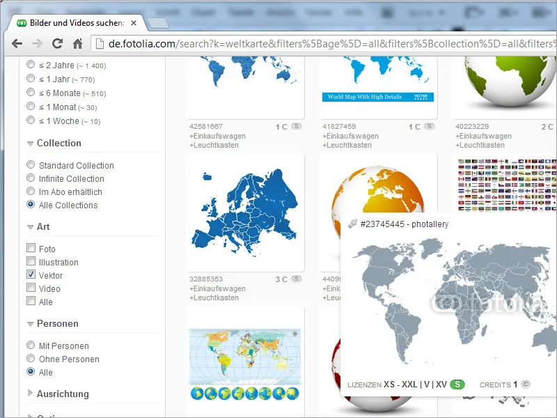
Such an image only grants rights of use, but does not transfer ownership to the paying customer. The terms of use should be read before downloading. In addition, there are various ways to store these files on the PC or online storage.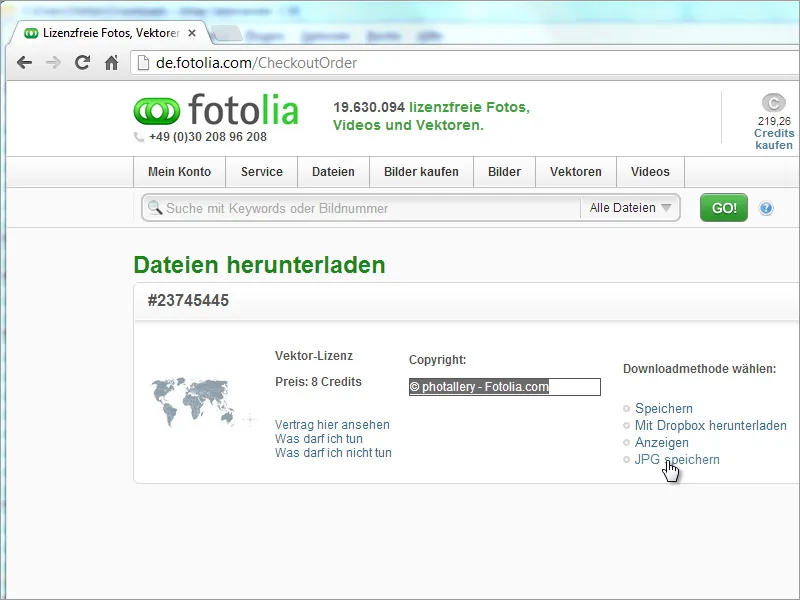
The selected vector file does not yet have the correct format for the project. In the download folder, there may only be an SVG file. However, when attempting to place such a file in InDesign, it does not load the image, but only a text format similar to source code.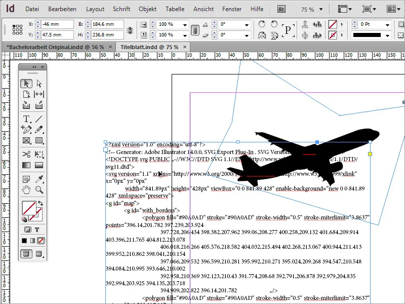
Therefore, it is best to open such files in advance with a suitable third-party program.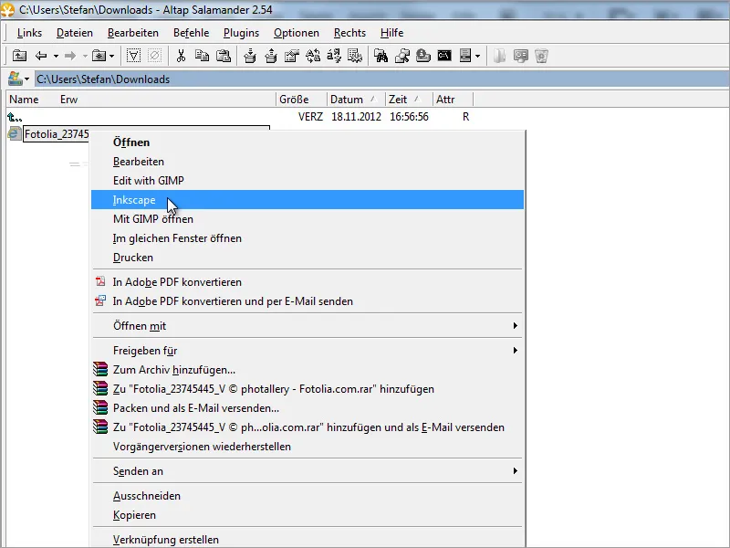
Once this graphic is opened in a suitable vector editing program, you can influence its appearance by assigning new color schemes or making shape changes.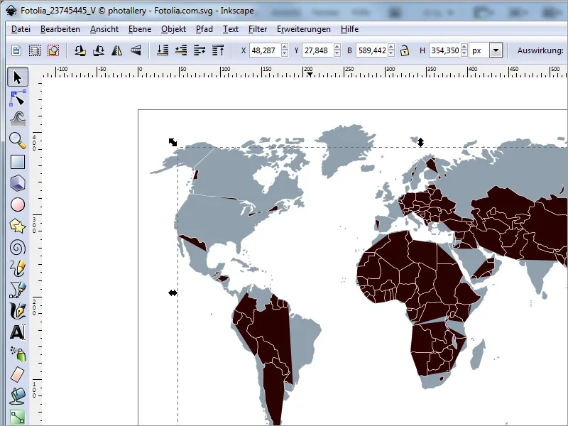
After ensuring that the color settings match the required color space (for example, CMYK), you can export the document in an appropriate format.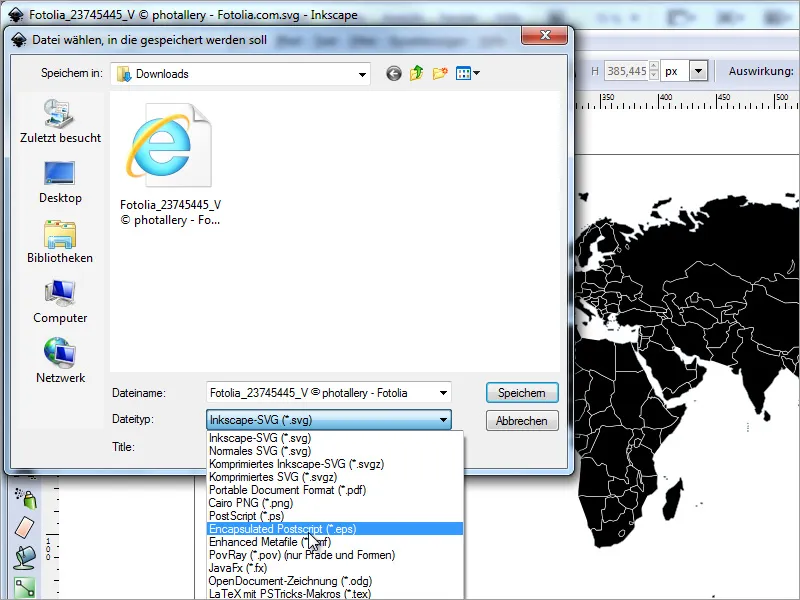
Now this graphic can be easily inserted and scaled in Adobe InDesign.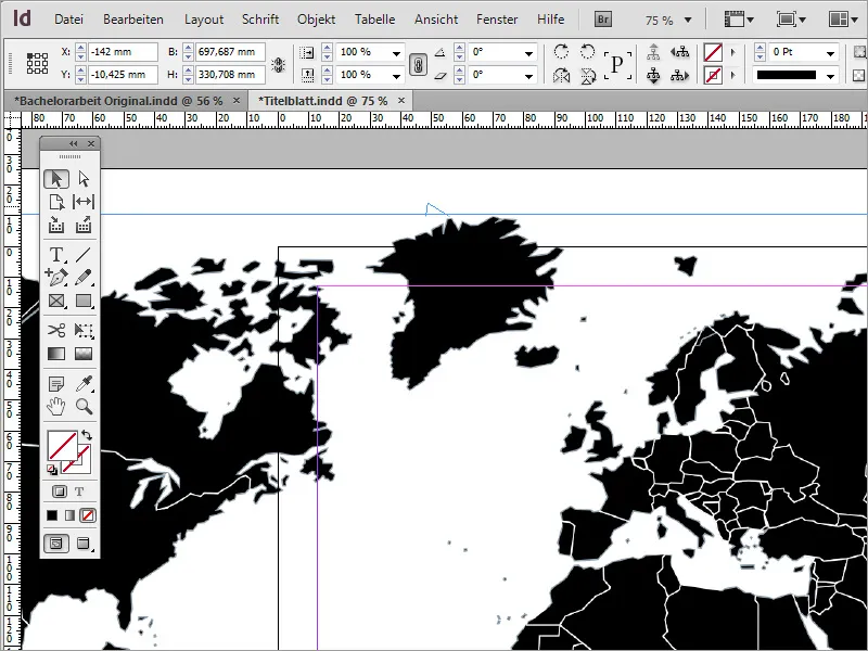
Since the graphic appears too dominant with the black color, you can reduce the opacity of this image file to a suitable value through the options bar.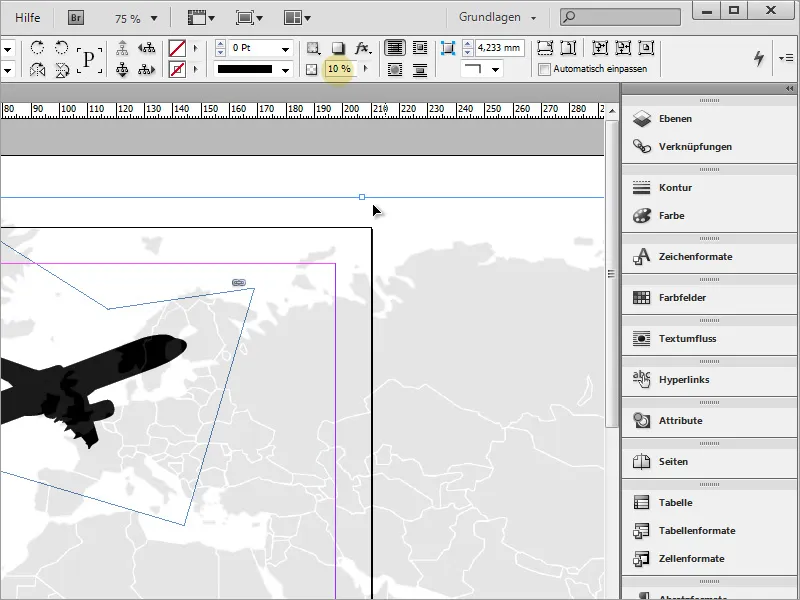
Now you simply need to place this world map behind the airplane. To do this, use the context menu and rearrange the graphic by moving it to the background.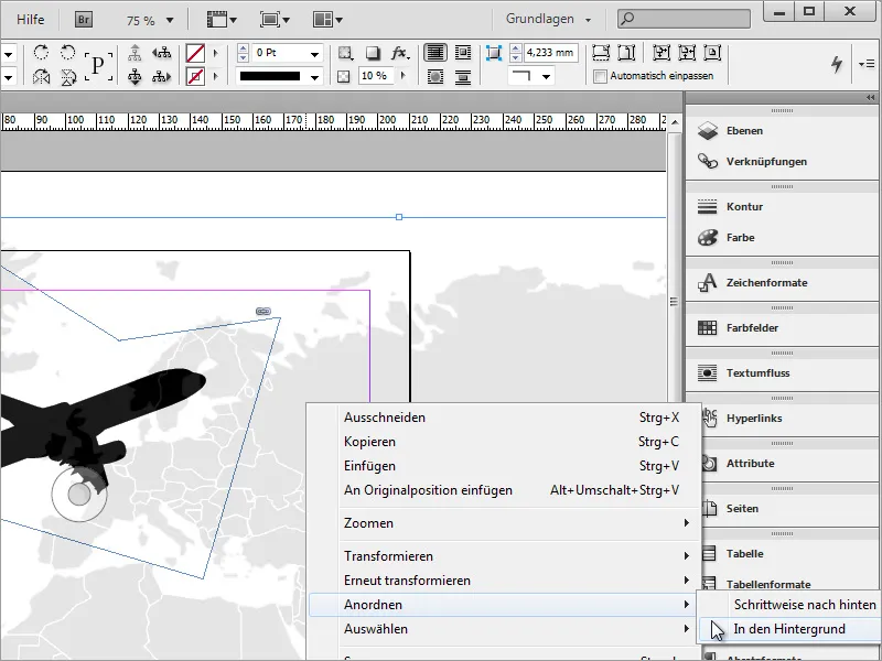
Next, apply a slight gradient to the document. For this, it is best to use the Rectangle Tool and draw a rectangle frame around the entire document.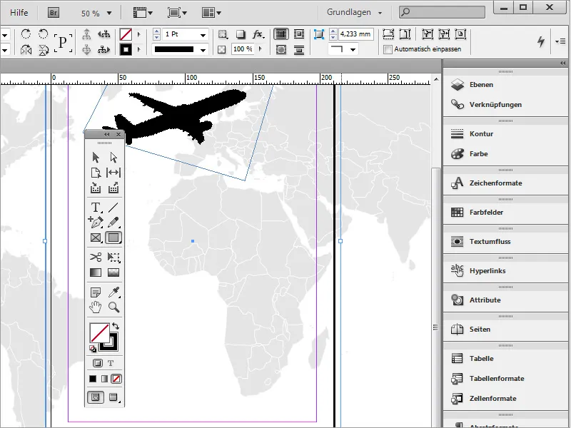
You can fill this frame with a gradient.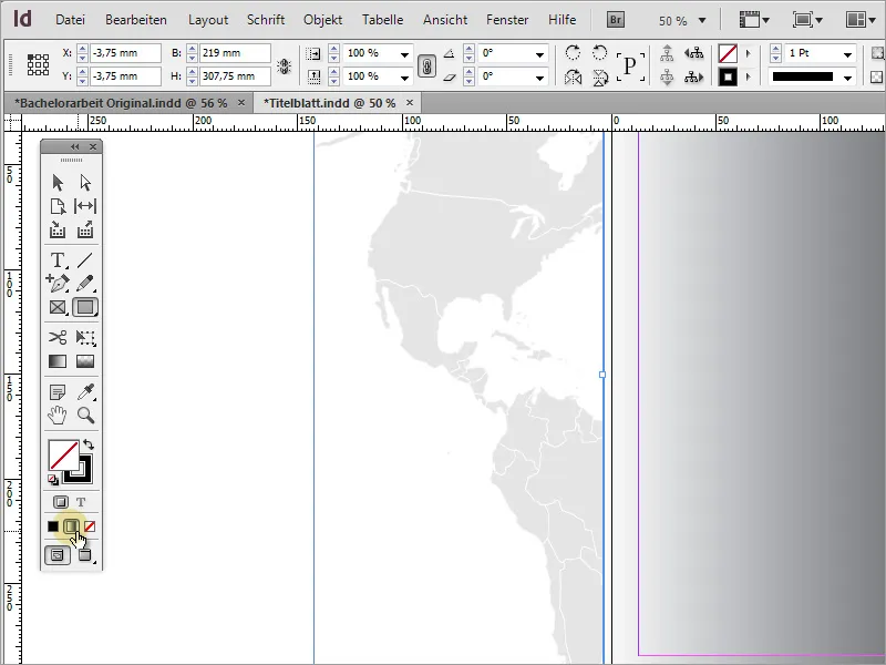
Now the gradient can be further edited. Simply open the Gradient panel via the menu entry Window> Color> Gradient.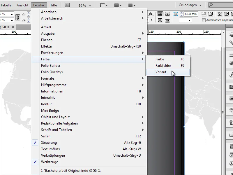
In this small window, you can edit the gradient. For the linear gradient, I set the color from a very dark gray to black and changed the angle to 90 degrees.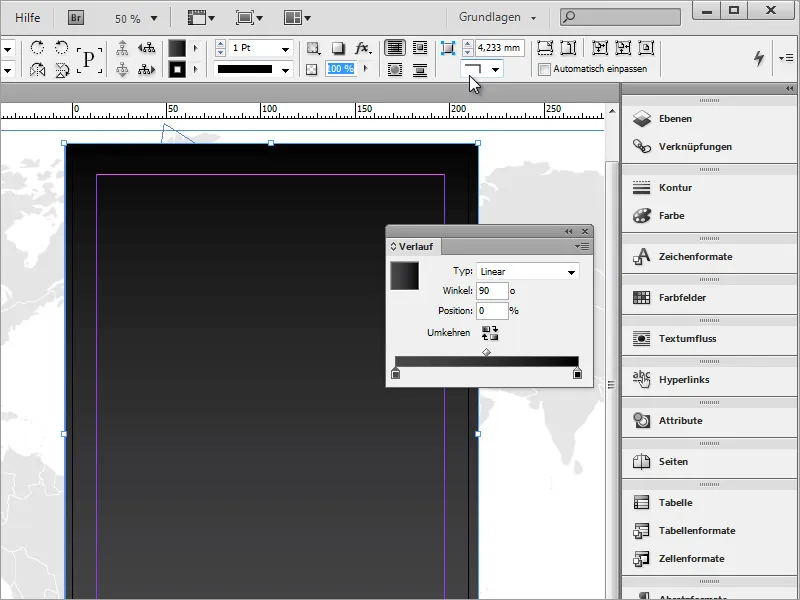
Since this gradient overly covers the image, here too, I reduce the opacity to 20 percent through the options bar.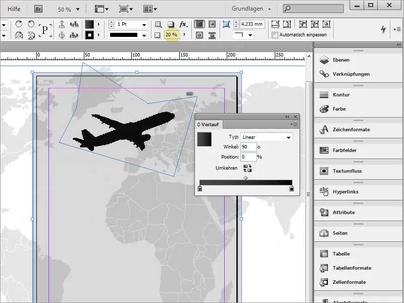
You can save this gradient as a new default using the Swatches palette. Simply click on the lower symbol for a New Swatch.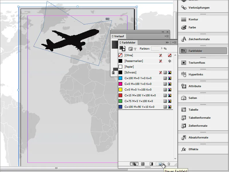
By double-clicking on the new swatch, you can access the gradient options. Here, you can modify the preset gradient if desired. In our example, the left color stop was first activated, then the black value was set to 41%.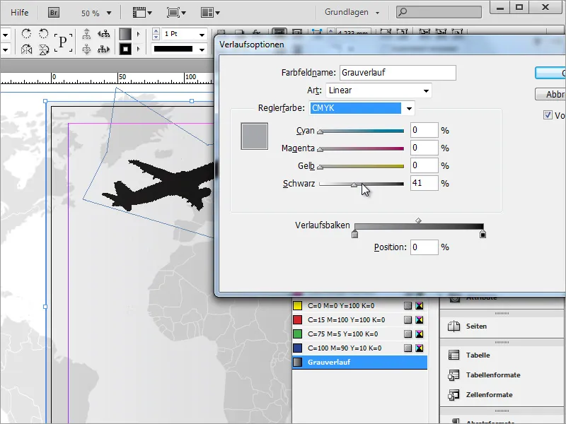
Before focusing on the text frame with the document information, create the background graphic for this area. It is best to use the Rectangle Tool and draw a rectangle above the cover page. You can already color this.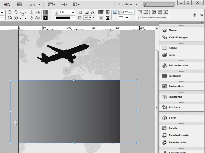
Next, rotate this rectangle into a better position. Use the Selection Tool and the transformation options with the rectangle selected. Rotate it about 15-20 degrees. You should remember the degree as it will be needed again later.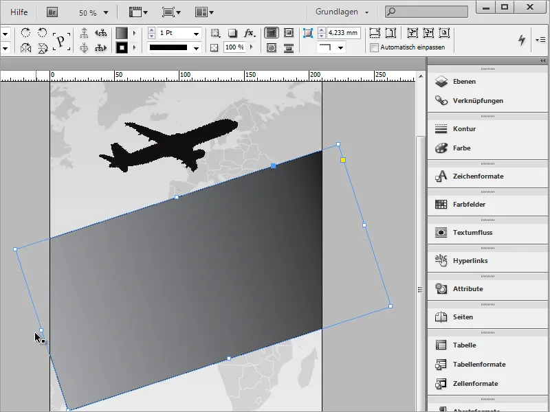
Then, stretch the rectangle on the left side so that it significantly extends beyond the printing area.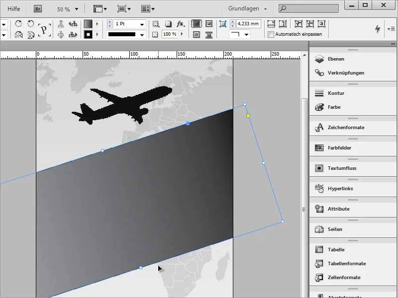
For this rectangle, you now need a customized gradient. The opacity is then reduced so that the background can still shine through slightly. You can either use the opacity slider in the options bar or use the Soft Gradient Edge Tool.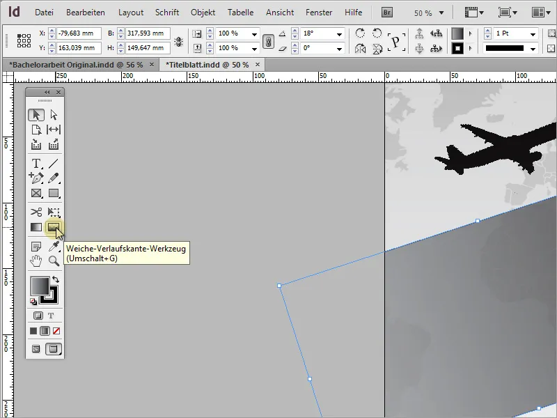
With the Soft Gradient Edge Tool, draw a line along the direction of the gradient, determining which side the gradient should soften towards. I drew the line from the middle of the left short side to the right short side.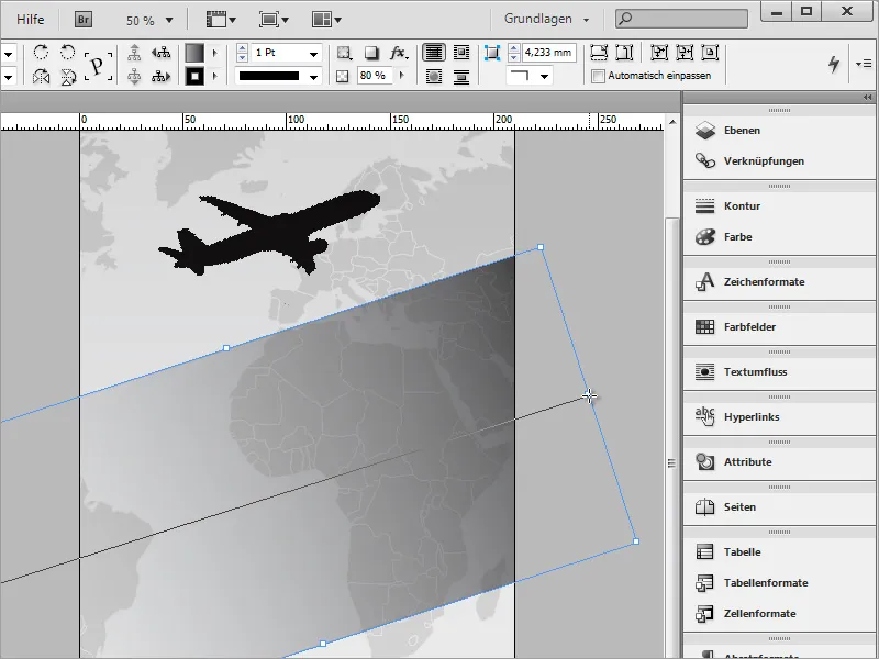
In the options bar, you can now readjust the opacity if desired. For our project, I set the value back to 100 percent.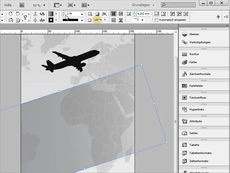
The Soft Gradient Edge Tool also works with a solid fill of an object. In our project, we only applied a gradient to the rectangle to make this effect even more spectacular in the end.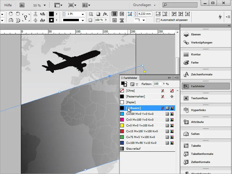
After the basic objects have been inserted, they can be rearranged and aligned. Perhaps the airplane should be a bit larger and the middle rectangle should protrude further down.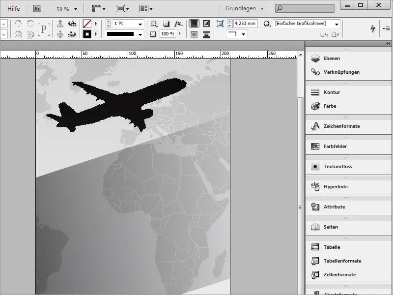
Then the text can already be inserted into the rectangle. There are fundamentally two ways to do this. The first is based on inserting a Text Frame, while the second method involves using the rectangle shape you just inserted as a Text Frame. The latter method, however, has a significant disadvantage: As soon as I start typing the text into the existing shape, it initially starts far outside the intended printing area. Control over text positioning would be difficult, and each line would need to be indented manually.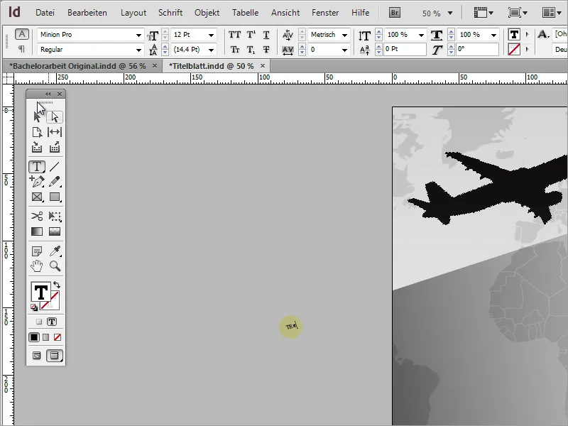
Therefore, I recommend using a separate Text Frame that you can position as needed. Simply draw a rectangular text frame with the active Text Tool.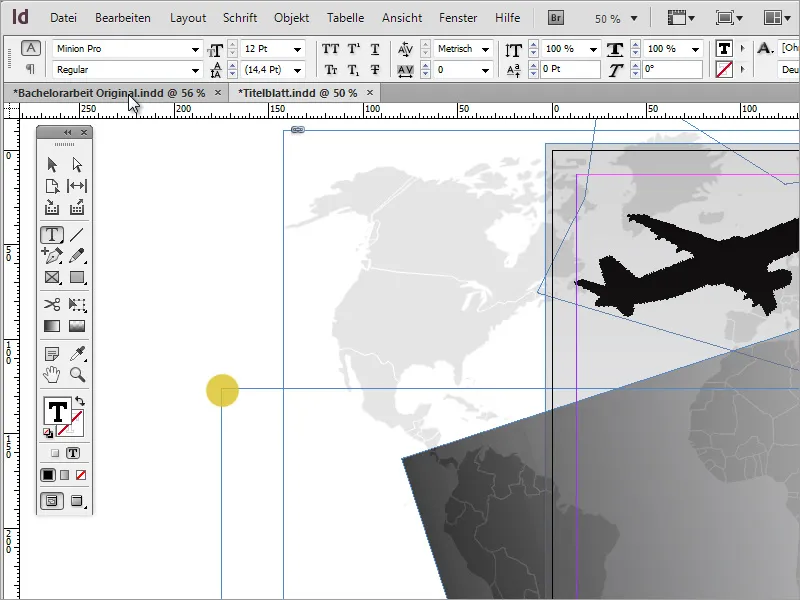
You can paste a copied text into this Text Frame. Since I do not want to rewrite it at this point, I use a copy of the existing text. To do this, I first have to select it and copy with Ctrl+C.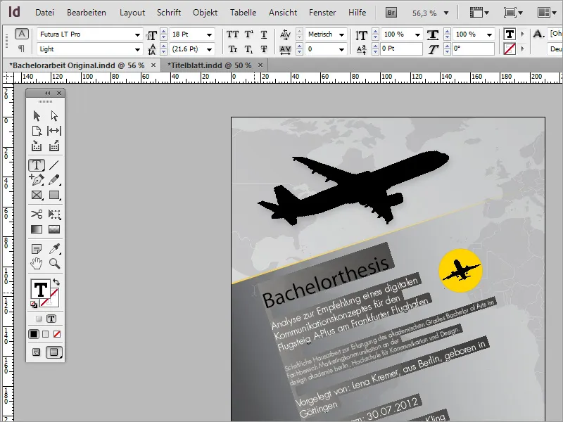
Now paste this copied text into the still empty Text Frame with Ctrl+V.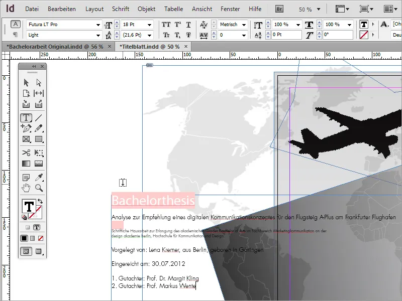
First, move this text area so that it is roughly centered above the cover page.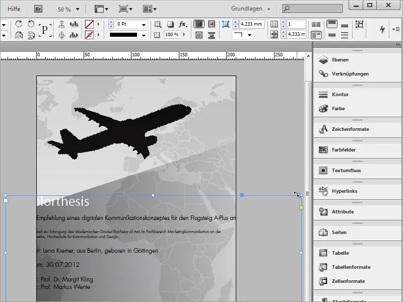
Then you need the same angle settings that you have already used for the graphic frame so that this text area can be rotated parallel to this graphic area. Manual rotation is imprecise and often leads to drifting alignment lines.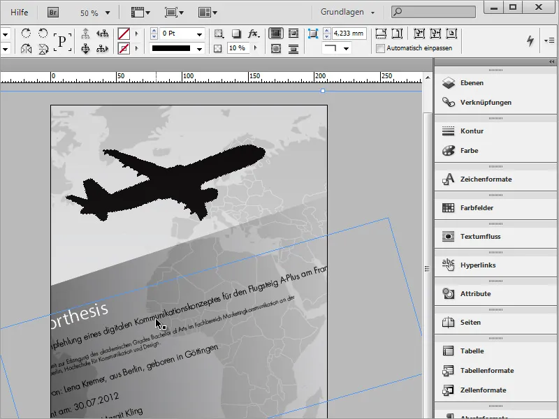
You can also view the angle by selecting the graphic frame behind and reading the angle values from the options bar. Then select the Text Frame again and enter the same angle values in the options bar. Then the text will be in the correct direction.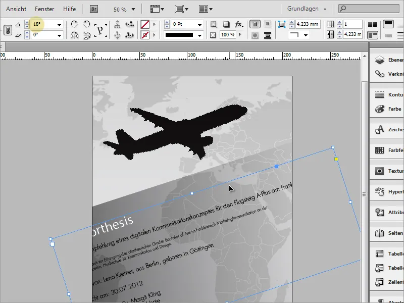
Once the text direction is correct, you can scale the Text Frame. This is to move the text into the visible and printable area.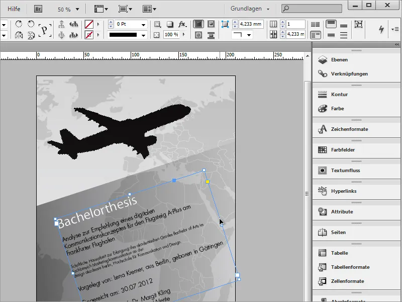
You can copy the large airplane graphic to use it for a small additional illustration in the Text Frame. However, it may be difficult to select this graphic. This is because multiple layers are stacked on top of each other, with this graphic being covered by another one. To still access and select this graphic, use the Ctrl key in addition. Keep it pressed and select the desired layer.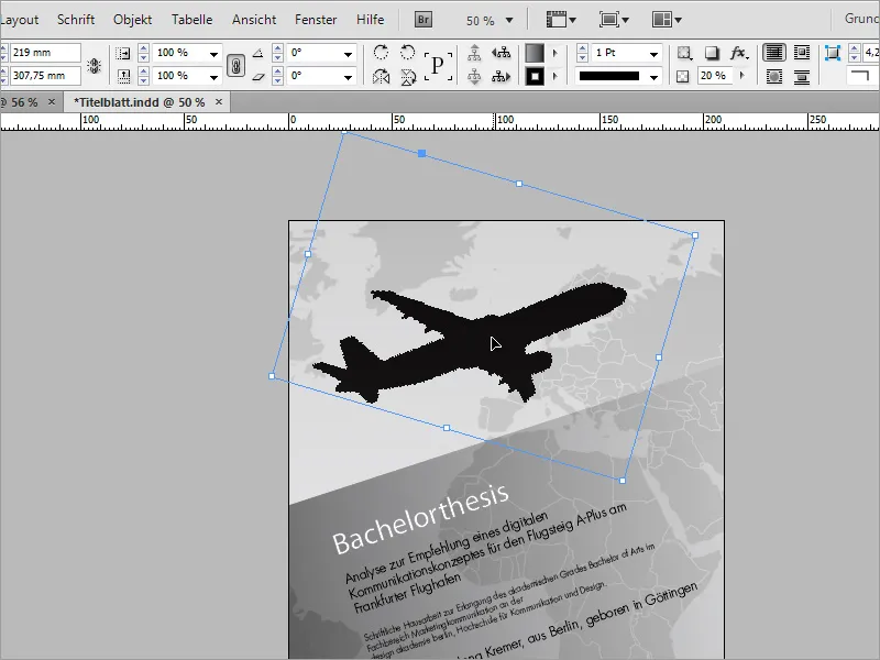
Using Ctrl+C and Ctrl+V, create a copy of the object. By activating the small gray circular area within the frame, you can move the graphic within the viewport.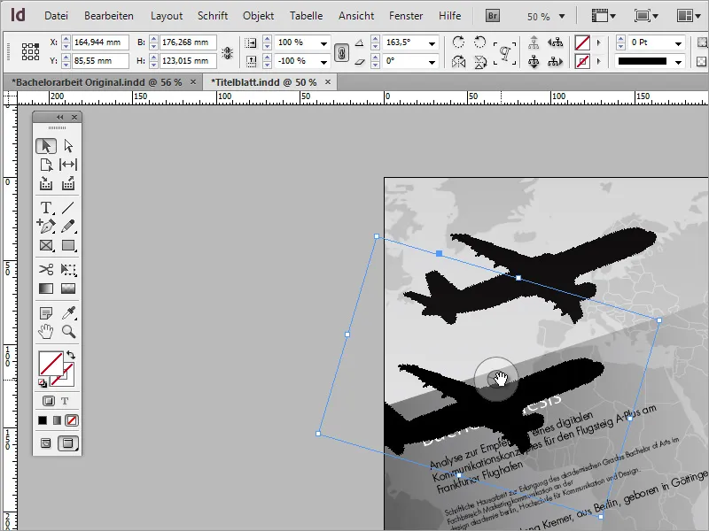
Simply move the image section until the desired motif is visible in the viewport.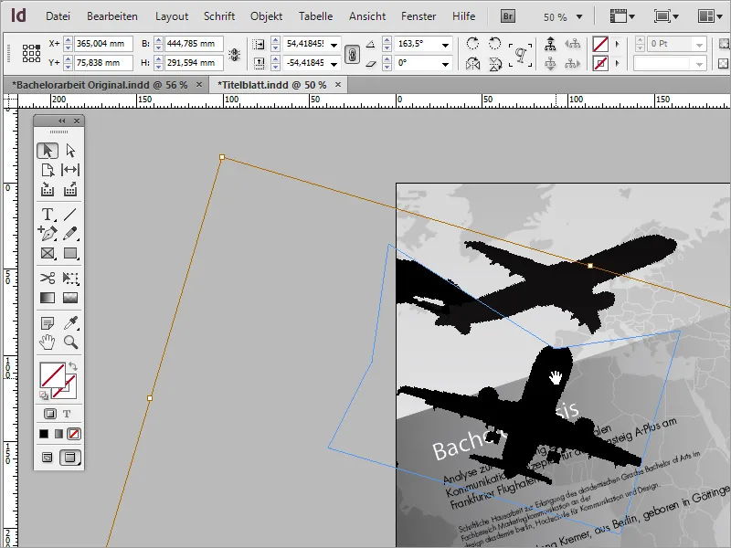
Using the Direct Selection Tool, you can now edit the viewing frame. By holding down the Shift key, you activate the individual anchor points and can then move them to hide unwanted parts of the image.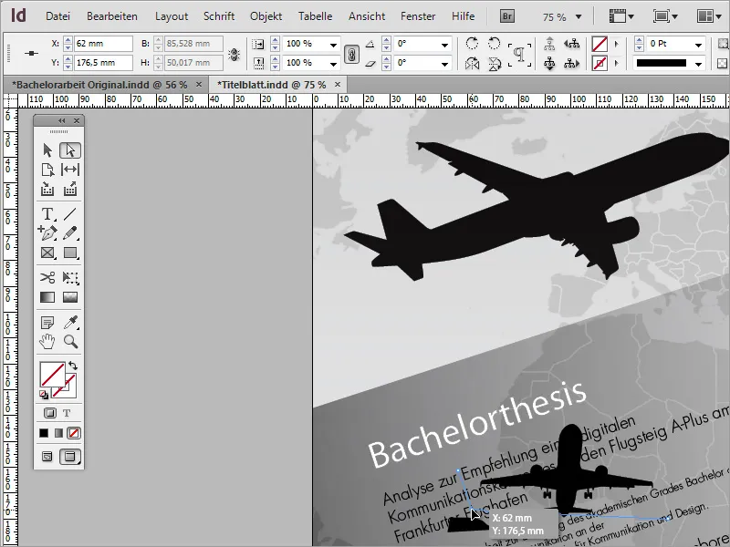
The plane still has a slight tilt. For better visualization, you can draw a guideline from the ruler in the document and then rotate the object accordingly if desired to match the line.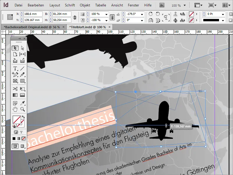
For our project, we needed a smaller graphic that didn't necessarily have to be straight. So, I resized the plane and rotated it so that the wings followed the text direction.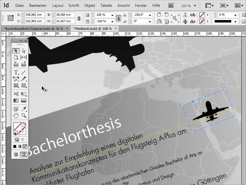
To enhance the visual impact, you can place an additional element under such an object. Simply select the Ellipse Tool.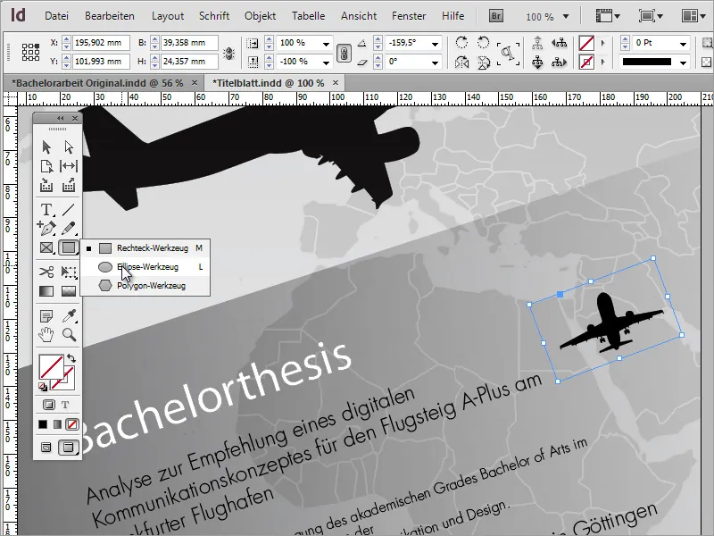
With the Alt+Shift keys pressed, you can now drag a circle outwards from the center of the plane.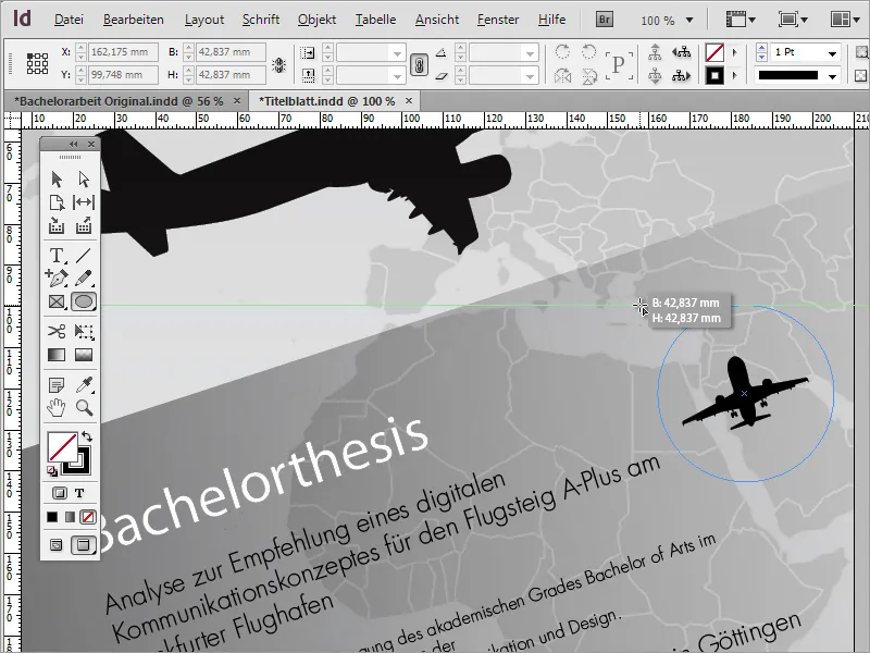
You can color this circle. In our project, I initially used a rich yellow.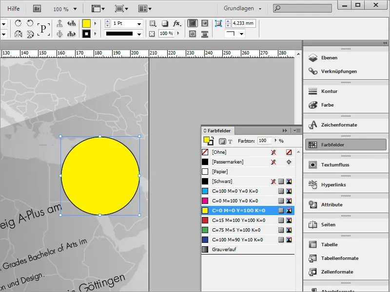
To give this an even greater visual impact, you can also modify the color a bit. Simply double-click on the yellow color in the Color Fields Palette and in the following dialog box, adjust the color values according to your preferences. To achieve a light orange, add some magenta.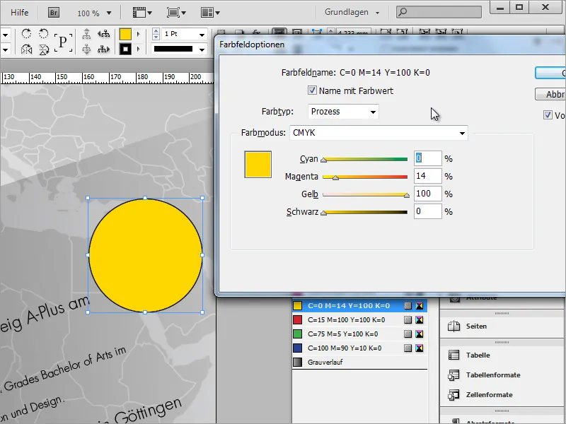
The outline is removed from the circle. To do this, switch in the Color Fields Palette to the outline color and set the value to None.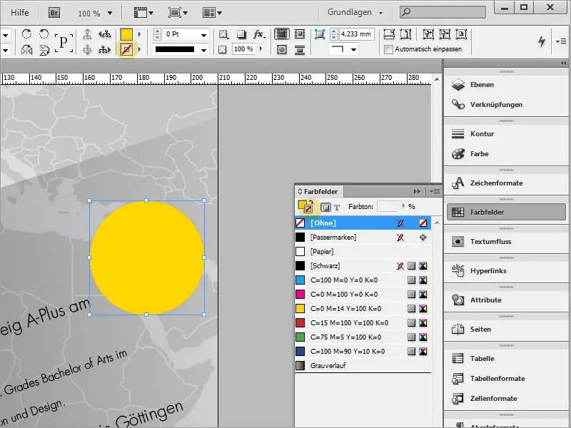
Now the circle needs to be placed behind the small plane graphic. You can either use the Context Menu and choose Arrange then Send Backward - or move the object directly through the Layers Palette.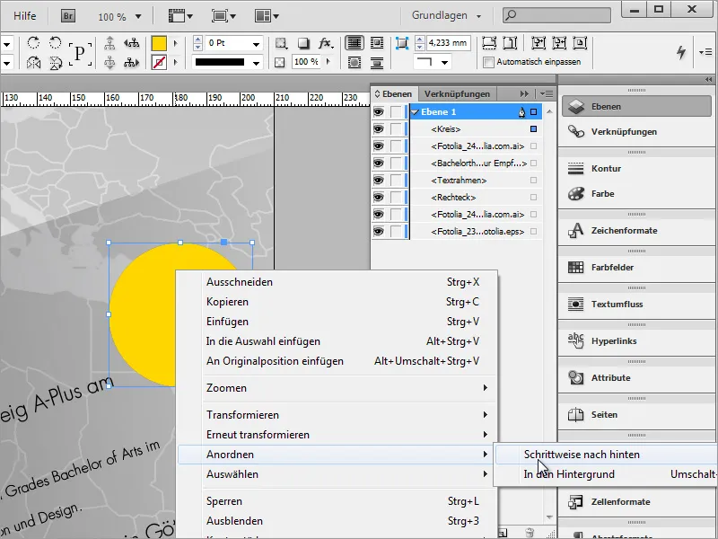
You can adjust the circle to match the plane size by proportionally scaling it with Ctrl+Shift. Then, realign it.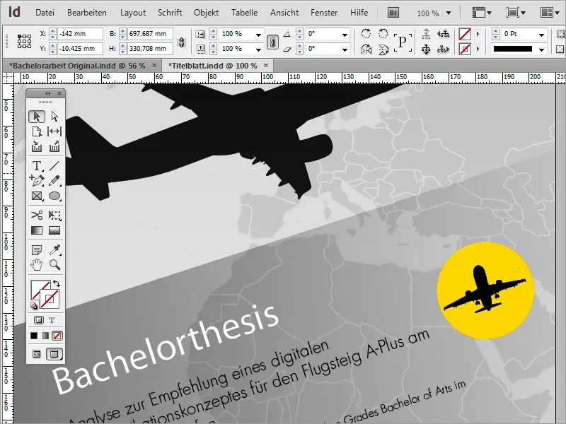
As a finishing touch, further refinements can be made. For instance, the graphic area behind the text with the gray gradient can receive a small contour. To do this, first select the graphic area to be adjusted, then choose the Color Fields and set an orange or yellow outline. The outline thickness may need to be adjusted through the options bar.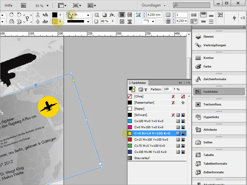
The outline adopts the same gradient properties as the object because we applied a corresponding gradient using the Feathered Gradient Tool on this object.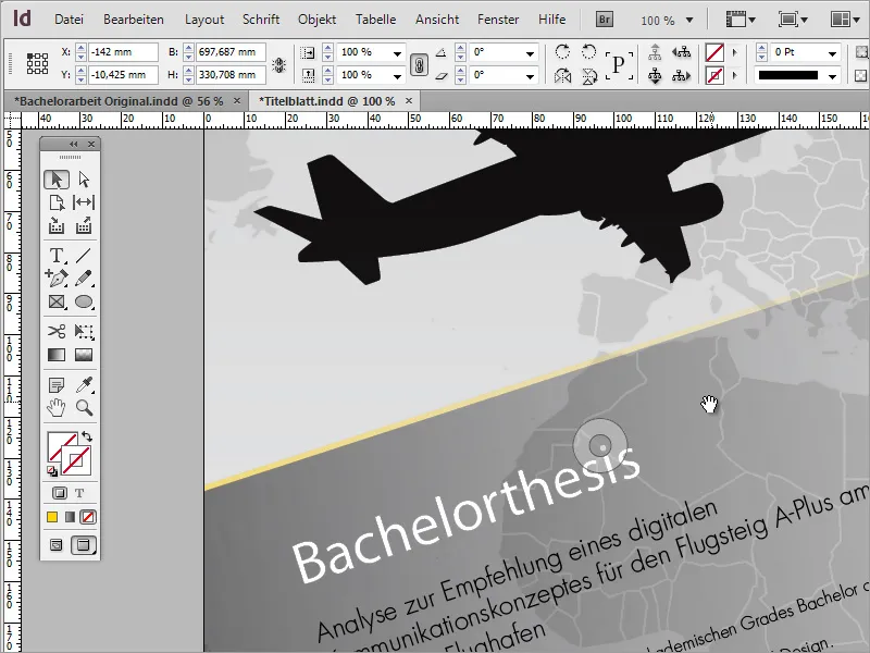
One small additional tip at this point: Under File>Document Setup, you can access a dialog box where in advanced view you can set a bleed. Normally, this is done when creating a document. The document will be exported with this bleed. In most cases, around 3 mm is considered as tolerance on all sides.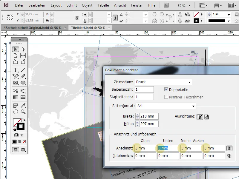
Anything extending beyond or falling short of this bleed will be trimmed off later by the cutting machine. Please ensure that the relevant graphics do not come too close to this area and background graphics do not extend into this area to avoid what is known as "blitzes," which are white, unprinted areas of paper.