If you want to composite an image with multiple elements in Photoshop, it is crucial that all parts come together harmoniously. Often, the color design of these elements does not reflect this, which gives the overall image an unbalanced impression. In this guide, you will learn how to efficiently adjust the colors and create color harmony. We will go through each step together so that you can take your composing to the next level.
Key Insights
- Color correction is fundamental for harmony in an image.
- The use of adjustment layers allows for targeted adjustments that only affect selected areas.
- A harmonious overall image requires individual settings for each element to achieve the perfect color impression.
Step-by-Step Guide
Before you start color matching, make sure you have placed all elements in your image. Ensure that they are well masked to allow for easy editing.

Step 1: Selecting Elements
First, select the element you want to adjust. For example, you have already masked areas of grass. Make sure you have the right layers selected before proceeding.

Step 2: Creating Smart Objects
To gain more control over the adjustments, create your selected element as a Smart Object. This gives you the ability to undo or change the adjustments at any time without damaging the original file.

Step 3: Adjusting with Adjustment Layers
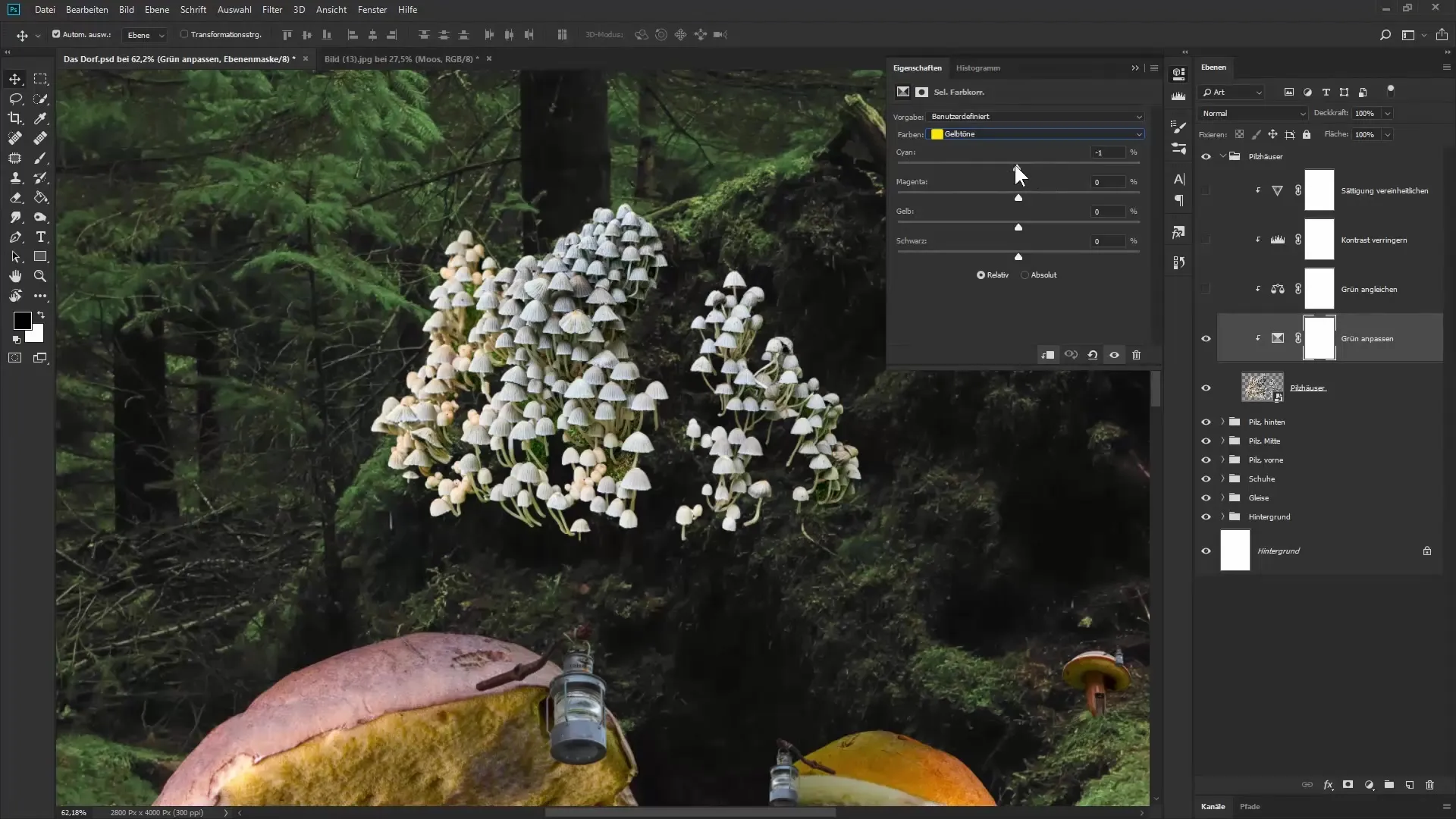
After you have converted your element into a Smart Object, you can use various adjustment layers. Start with the “Selective Color Correction.” Here you can adjust specific colors in your image and change the color values deliberately.

Step 4: Make Custom Adjustments
With the “Selective Color Correction,” you can, for example, make the reddish-yellow areas appear a bit greener. Slide the Cyan and Magenta sliders to make the desired changes and create the necessary green tint.

Step 5: Using Color Balance
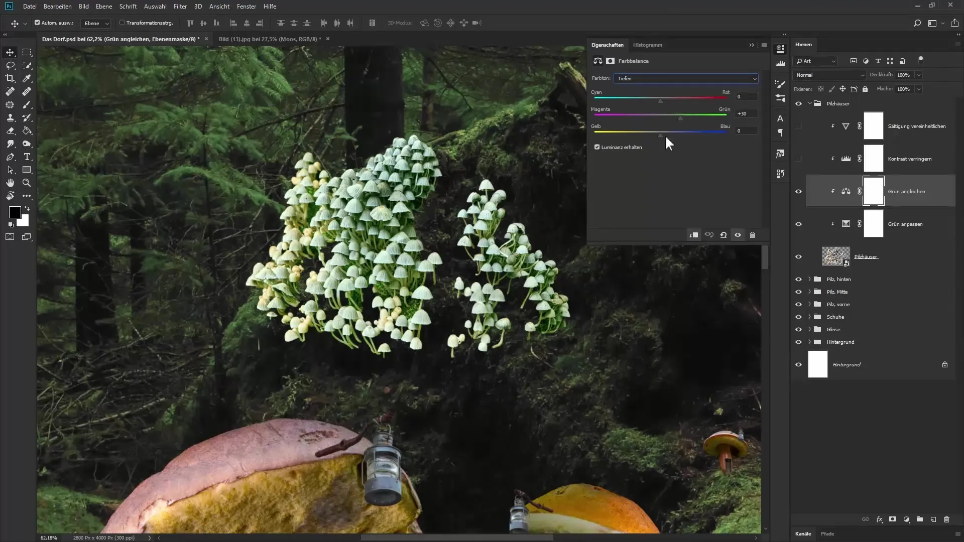
To achieve a deeper color effect, apply a “Color Balance” adjustment layer. Here you can independently adjust the hues in the shadows, midtones, and highlights. This helps make the colors appear more vibrant and harmonious.

Step 6: Adjusting Contrast and Saturation
To avoid exaggerated contrast, reduce the tonal range. Pull the white slider to the left to bring the brightest areas in the image to a pleasant level. Then, you should evenly adjust the saturation so that the colors do not appear exaggerated.

Step 7: Checking Individual Elements
Apply the aforementioned techniques to all other elements in your image. As you progress, regularly check if the adjustments of the individual elements harmoniously match the background. Also consider the individual properties of each element.

Step 8: Making Final Adjustments
Once all elements are color adjusted, make the final tweaks to ensure that the entire image looks like a cohesive whole. You may need to make additional color corrections in some areas to achieve perfect harmony.

Summary – Color Matching for Harmonious Composings
With these steps, you will be able to optimally coordinate the various elements of your image in Photoshop in terms of color. Through the targeted use of adjustment layers and smart adjustments, you can highlight the characteristics of each individual part while maintaining the consistency of the overall image.
Frequently Asked Questions
How can I perform color corrections for specific areas?Use the Selective Color Correction and apply it as a clipping mask to the respective element.
What are Smart Objects and why should I use them?Smart Objects allow you to make adjustments non-destructively, meaning you can leave the original graphic untouched at any time.
How do I ensure that all elements appear harmonious?Individual adjustments of each color and the use of adjustment layers are crucial for harmony in the image.
Which adjustment layers are the most helpful for color matching?The Selective Color Correction, Color Balance, and Tonal Adjustment are highly efficient for color matching.

