
A lettering looks alive when the lines don't run evenly. You can create exactly this effect in Affinity Designer with the Width Tool. In this tutorial, you will learn how to shape your own handwriting from an ordinary font, using the word "Coffee" as an example.
The video is only loaded from YouTube when you play it – data (including your IP address) is then transmitted to YouTube/Google. More in the privacy policy
Introduction
You already know some basic techniques from the previous lessons: text, curves, nodes and shapes. In this tutorial, you combine them into a unique logo or lettering. The starting point is a completely normal text, which you gradually transform into an individual design. In the end, you will have an E that doesn't appear in any standard font.
You don't need any drawing skills for this. It is enough if you use the tools purposefully and take some patience for the fine-tuning.
Key Takeaways
The most important points of this tutorial at a glance:
- Text must first be converted to curves before you can edit the individual letters.
- With the Node Tool, you can deliberately deform each subpath of a letter.
- With the Pen Tool and the "Subtract" function, you remove parts of a shape.
- The Width Tool (stroke width) makes individual stroke areas thicker and gives the lettering its handmade look.
- If the tool is not visible, you can find it by right-clicking "Customize" in the toolbar.
Step 1: Prepare the text and choose the font
To begin, you write the word "Coffee" with a lowercase initial letter and two lowercase e's at the end. Writing in lowercase looks more playful and is well suited to a handwritten character.
The choice of font is crucial. Fonts that look more handwritten offer you a good basis because their shapes are already slightly curved. The video shows two variants: a brush font that already looks very dynamic, and a more ordinary font like Berlin Sans. Feel free to start with the second variant, because you will understand the technique better with it. The brush font, on the other hand, shows you what finished-looking results can look like, which you can recreate with the same methods.


Step 2: Convert the text to curves
So that you can edit the individual letters, you must first convert the text to curves. To do this, select the text, open the "Layer" menu in the top bar and choose "Convert to Curves".
Afterwards, the layer visibly changes. Instead of an editable text object, you now have a group with individual curves. Each letter now consists of paths that you can freely deform. The text can no longer be changed with the Text Tool afterwards, so check the spelling once more beforehand.

Step 3: Adjust individual letters with the Node Tool
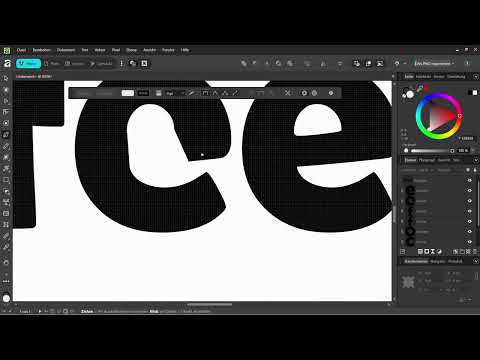
Now you can work with the Node Tool. Select the letter you want to change, and drag the nodes until the shape matches your vision. In the example, the E is edited. You can pull individual parts of the shape so that the lines swing upwards or downwards.
In this way, an ordinary E can be turned into a smiling E. That sounds like a small detail, but it significantly changes the overall impression of the lettering. Proceed carefully and move only a few points at a time. That way you keep control over the shape.


Step 4: Cut out the middle of the E with the Pen Tool
Another option is to deliberately remove parts of a letter. To do this, choose the Pen Tool and draw an irregular shape over the middle of the E. It doesn't have to be perfect, since in the next step you will combine it with the result anyway.
Then select both the E and the drawn shape. The selection is easy with the Move Tool. Then choose the "Subtract" function. The overlap is cut out of the letter.
The first attempt often turns out too timid. If needed, you can repeat the process and remove even more area. Make sure the lettering remains legible. The E must still be recognizable as an E.

Step 5: Draw a new line for the lost look
If the letter looks too angular after cutting out, an additional line helps. Place the Pen Tool at the front end of the letter, guide it to the end of the stroke, and make a curvy movement. A stroke with some swing looks more alive than a straight line.
You can then readjust this path with the Node Tool. Drag it back and forth until the curve blends harmoniously into the letter. If a part seems superfluous, simply delete it.

Step 6: Group the lines and find the Width Tool
After you have worked out the shape, you group the individual parts so that they can be edited together. Then you select the line that you want to modify with the Width Tool.
The Width Tool is sometimes not displayed by default in the toolbar. In this case, you right-click on the toolbar and choose "Customize". There you can search for the "Stroke Width" tool and drag it into your toolbar. After that, it is permanently available to you.

Step 7: Create dynamic stroke widths with the Width Tool
Now comes the actual core of the technique. The Width Tool works like a pen that applies more thickness at certain points. You click on an anchor point of the line and pull it outward. The stroke becomes wider at this spot, and the thickness is distributed smoothly along the path.
You can pull the area as wide as suits your design. A strong area in the middle of the stroke looks like a real brush stroke that experiences pressure when it is applied. Then adjust the width so that it looks balanced with the other strokes.
With this method, you get an E that looks significantly more individual than the original lettering. The result can be applied to other letters just as well. This also allows you to design complete logos with text.


Step 8: Align the lettering and develop your own lettering elements
When the letter is finished, you can rotate it until it fits into the overall lettering. Feel free to try different angles. Even a slight tilt changes the character of the lettering.
The E is now an independent element. You don't have to limit yourself to the existing letters of a typeface. You can redesign individual characters and use them as personal lettering elements. Other functions you have already learned about are also suitable for this, such as distortion groups or splitting curves.

Step 9: Deliberately develop a typeface further
The Width Tool shows its strength above all with typefaces that you like but that don't quite fit yet. If you find a typeface particularly beautiful but want it to be different in one spot, you can change exactly that spot with the Width Tool or the Node Tool. This way the basic character is preserved, and you still end up with something of your own.
Experiment with different fonts. Each typeface offers different starting points, and some give you more room to maneuver than others. Especially with bold typefaces, impressive effects can be achieved with just a few interventions.

Summary ??? Designing a coffee lettering with the Width Tool
In this tutorial, you learned how to turn ordinary text into an individual, handmade lettering. You converted the text to curves, adjusted individual letters with the Node Tool, removed parts with the Pen Tool and the "Subtract" function, and created dynamic stroke widths with the Width Tool. In addition, you customized the toolbar so that the Width Tool is available to you at any time.
The technique can be applied to any words and fonts. With a little practice, you can create logos, lettering for packaging, or your own type elements for projects.
FAQ
Do I absolutely have to convert the text to outlines before editing it?Yes, this is the only way you can edit the individual letters as paths, whereas a text object does not offer this option.
What do I do if the Width tool is missing from the toolbar?Right-click on the toolbar, select "Customize," and search for "Stroke Width." Then drag the tool into your toolbar.
Which font is best suited for this technique?Handwritten or slightly curved fonts such as a brush font work well, but regular fonts can also be changed in interesting ways with this method.
How do I remove part of a letter?Use the Pen tool to draw a shape over the area, select the letter and shape together, and then choose the "Subtract" function.
Can I still change the lettering afterwards?As long as you haven't converted the text to outlines, you can edit it as text. After the conversion, you continue working with the individual paths.


