Text that runs across the full page width becomes tiring faster than you might think. The lines get long, the eye loses its place when jumping back, and reading becomes laborious. This is exactly where columns, grids, and white space come in. In this tutorial, you will learn in Affinity Publisher how to use multi-column layouts, the baseline grid, and guides to make text look calm, orderly, and pleasant to read. The steps build on one another, so it is best to try them out in order on your own document.
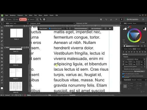
The video is only loaded from YouTube when you play it – data (including your IP address) is then transmitted to YouTube/Google. More in the privacy policy
Key Takeaways
- Long lines across the full page width make reading harder. Multi-column layouts shorten the lines and maintain reading flow.
- The baseline grid ensures that lines of text in all columns sit at exactly the same height.
- Guides help you with alignment, but they are only visible during editing and do not appear in export or print.
- White space, meaning sufficient distance from the page edge, page number, and column gutter, makes a document look more professional.
- Justified text looks more orderly than left-aligned text in many layouts.
Step-by-Step Guide
Step 1: Show the baseline grid
Begin by making the baseline grid visible. To do this, open the "View" menu and select "Show"; you will find the baseline grid there. It consists of invisible horizontal lines to which the text will align later. Showing it is important because otherwise you cannot see where the lines are, even though the function is already working in the background.

Step 2: Activate the ruler and set guides
Next, activate the ruler via "View" or with the keyboard shortcut Ctrl+R. With a left click on the ruler at the top or left edge, you drag a guide into the document. Use it, for example, to check whether a heading is aligned evenly on both sides. You can move the line to the desired position and let it snap into place until the heading and guide match exactly.


Step 3: Understand what is only visible during editing
The thin blue lines on the screen are purely working aids. These include guides, the outlines of text frames, and the link indicators. They are no longer present when printing or exporting. So you do not have to remove them, but you should keep them in mind so that you are not irritated while designing by lines that will disappear later anyway.

Step 4: Align the paragraph to the baseline grid
Select the paragraph you want to align to the grid. In the Paragraph tab on the right side, you will find the option to align the paragraph to the baseline grid. You can also see there whether this setting is active. In the example, it is first left deactivated so that the difference becomes clear later, and then switched on again.

Step 5: Create a text frame
Select the Frame Text tool and drag out a frame on the page. This frame forms the area into which your text will flow later. A tip to get started: if you don't have any text yet, you can use the function for inserting placeholder text under "Text". Affinity then directly generates a Lorem Ipsum text in the layout, without you having to search for a placeholder online.

Step 6: Set the text in two columns
In the editing area of the text frame, you will find the number of columns. Set it to two if you are laying out the text across a whole page. The columns then run from top left to bottom right and continue into the second column. The result is shorter lines that the eye can find more easily. This is exactly why you rarely see body text running across the entire page width in brochures and magazines.

Step 7: Set the column gutter
In addition to the number of columns, you can adjust the width of the gutter. This white space in the middle separates the columns from one another and ensures that the eye doesn't lose its place. Adjust the value to the font size and the overall width so that the gutter looks neither too narrow nor too wide.

Step 8: Plan page margins and spacing generously
White space doesn't only concern the middle, but the entire document. In the example, 15 mm of space is planned on both the left and the right, and about 12 mm is given for the column gutter. The text also shouldn't extend all the way to the edge at the top and bottom, nor should it stick directly to the page number. A document without enough spacing quickly looks unprofessional, even if the text technically fits completely.

Step 9: Link text frames across multiple pages
If your text becomes longer than one page, you don't have to paste it in again. Hold down the Shift key and click the small triangle on the text frame that indicates a text overflow. Affinity then automatically creates a following page with a linked text frame. This takes over the column layout, so the second page also has the same gutter and the same column structure.

Step 10: Activate the baseline grid in the document
So that all lines of text in all columns sit at the same height, you activate the grid via "View" and "Baseline Grid". As soon as you turn it on, an even network of lines appears in the background. The text aligns to it. This step prevents a line in one column from hanging between two lines of the other column, which happens easily when you move paragraphs by hand.

Step 11: Set the start position and grid spacing
In the baseline grid settings, you set two values. The start position determines where the grid begins. The default value is 0, but you can also choose a later starting point, for example 10 points. The lines then shift downward accordingly. The grid spacing is the distance between the lines; in the example it is initially 12 points. The color of the grid doesn't matter, since it only serves as a guide anyway.

Step 12: Align paragraphs exactly to the grid
Select your paragraph and activate the "Align to Baseline Grid" option in the Paragraph tab. Note the difference: if the paragraph isn't on the grid because of an unfavorable start position, it sits between the lines. After activating it, it aligns exactly to the lines. With a grid spacing of 10 points, the text then sits exactly on the lines with even spacing.

Step 13: Coordinate line spacing and grid spacing
Often the default line spacing doesn't fit the grid perfectly. You can reduce the line spacing slightly, in the example by one point. In addition, the grid spacing itself can be reduced. A value of 6 points, for example, works well when the font is small, since the text then aligns to the lines more densely and yet in an orderly way. The result looks much more structured than text that only partially sits on the grid.

Step 14: Hide the grid for the design
The grid has no place in the finished layout. Therefore, turn it off again via "View". It remains active and continues to influence the alignment, but is no longer visible. When designing, make sure not to fill the entire page with text. A layout in which every centimeter is printed looks restless, even if it is technically correct.

Step 15: Align headings to the grid as well
You can use the same alignment for headings too. Select the headline and activate the "Align to Baseline Grid" option. This way, larger fonts also stay cleanly anchored in the overall picture and don't disturb the rhythm of the body text lines. With these small refinements, you create a document that looks like a professional brochure.

Step 16: Justified text for an orderly overall impression
Finally, you can align your text as justified instead of left-aligned. To do this, select the text and choose the justified option under alignment. As a rule, justified text looks more orderly and somewhat more elegant than left-aligned text. In print, an orderly appearance is usually an advantage. With narrow columns, however, watch out for unsightly word spacing, because justified text can create gaps there.

Summary ??? Improving readability: columns, grids and white space in Affinity Publisher
Readability comes from several adjustments working together. Multi-column layout keeps lines short, the baseline grid brings order to all columns, and guides ensure precise alignment while you work. Sufficient white space at the margins, between the columns and around the page number gives the layout calm. With justified text, you round off the overall look. If you apply these steps consistently, your document no longer looks like a wall of text, but like well-designed editorial work.
FAQ
Why are long lines across the full page width problematic?Long lines make it hard for the eye to find the right spot again when moving to the next line, which makes reading tiring.
Are the guides visible in the finished document?No, guides, frame outlines and link indicators are only for editing and appear neither in the export nor in print.
Does the baseline grid have to stay visible for it to work?No, you can hide it. It remains active and continues to align the text, but is no longer visible.
How do I quickly fill a text frame with placeholder text?Under "Text" and "Insert" you will find the option for filler text, which inserts a Lorem Ipsum text directly into the layout.
What should I do if my text runs beyond a page?Hold down the Shift key and click the triangle on the text frame, and a following page with linked text in the same column structure is created automatically.
Why does my paragraph not sit on the grid lines?This is often due to a different starting position of the grid or because the option "Align to baseline grid" is not activated for the paragraph.


