Creating layouts for documents can often be a challenge. Especially without a clear structure, chaos and disorder can arise. A well-considered gridhelps you to arrange the elements on your page harmoniously and neatly. In this guide, I will show you how to set up an effectivebaseline grid and a column grid in AffinityPublisher, so that your layout not only looks professional but also greatly facilitates working with it.
Main Insights
- Setting up a grid is essential for a well-kept layout.
- Use even numbers for the number of columns to promote readability.
- A baseline grid ensures that the text is evenly distributed and well arranged.
Step-by-Step Guide
First, let’s take a look at how to set up the column grid in your document.
To configure the guides, go to View and select Configure Guides. Here you will find the dialog where you can set the column settings. Simply enter the desired number of columns in the column guide input field. I recommend starting with 12 columns, as this provides an excellent foundation for your layout.
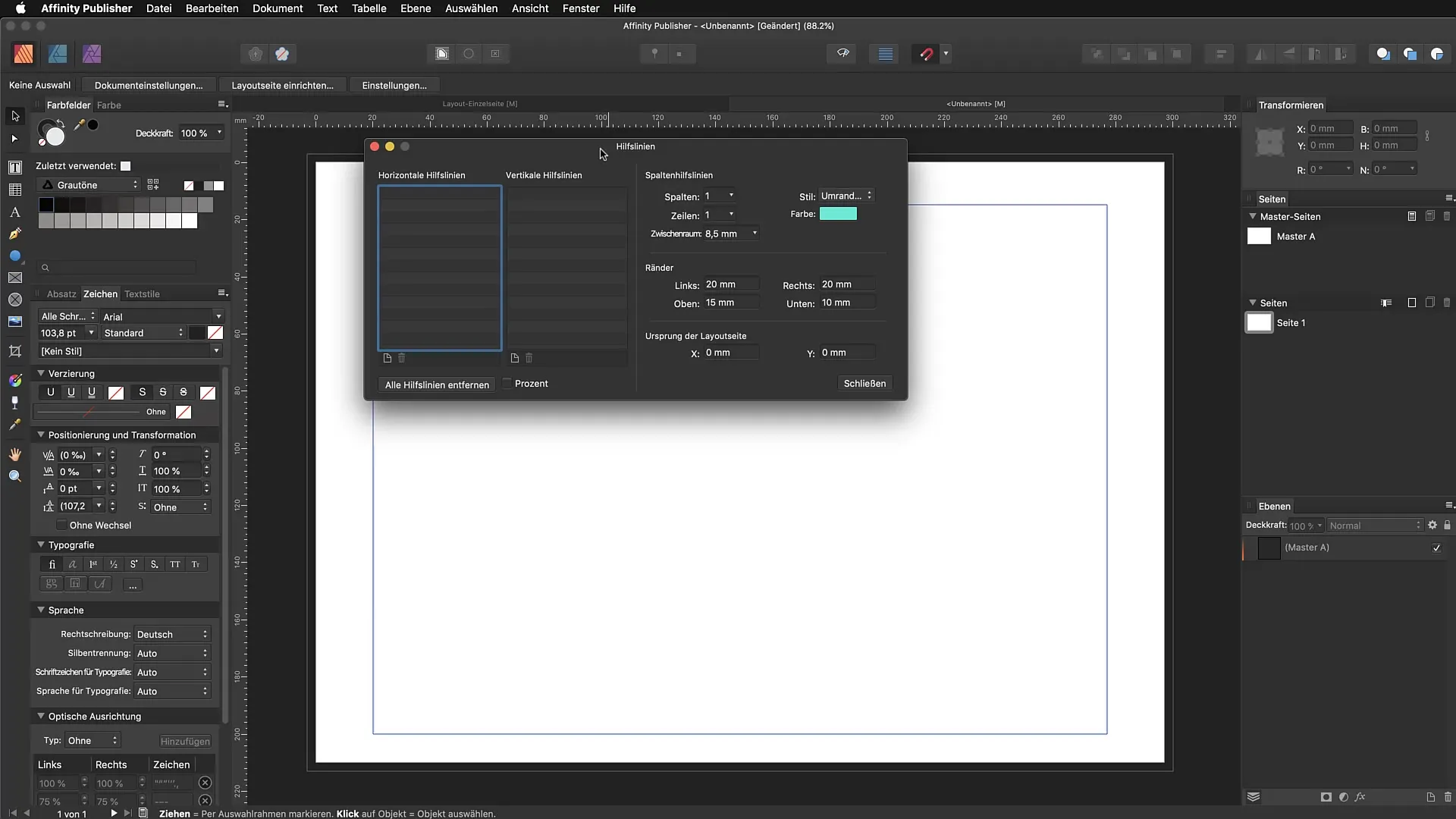
Next, you should set the space between the columns to 4 mm. This setting gives your objects enough "breathing room" and ensures that your layouts appear more professional.
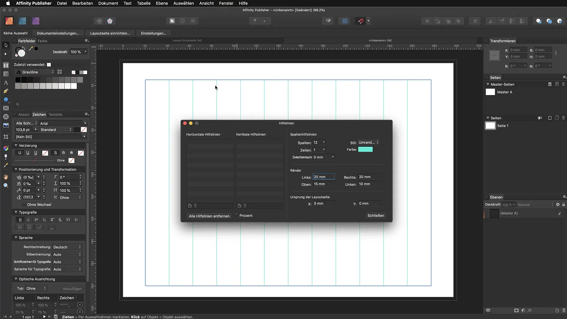
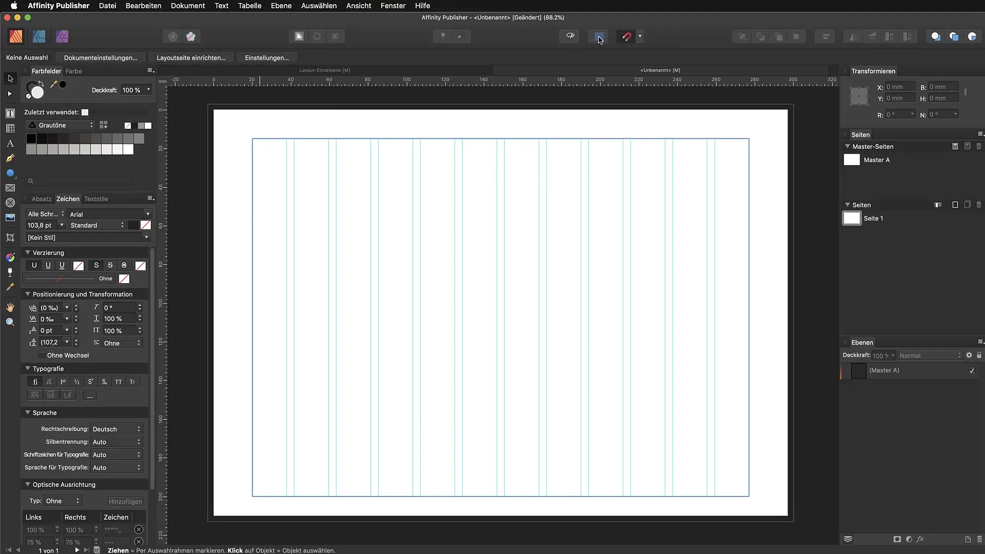
Now you have a grid of 12 columns that helps you have a clear orientation when placing texts and images. If you later find that you need more columns, you can always go back to this dialog and make adjustments.
Here you can also choose the color of the guides. I chose a bright cyan because that comes from my experiences with Adobe InDesign and I feel most comfortable with it.
The columns you have created now always refer to your text area. Anything outside the margins remains disregarded. This is important to ensure that all elements are well placed within the layout.
The next step is to set up the baseline grid. To do this, go back to View and select Configure Baseline. You can also use the Baseline Assistant to make the settings easier. Check the checkbox for the baseline grid.
After you have activated the baseline grid, you need to define the starting position. In the dialog, you can specify where the grid should start. For example, if you want to start 20 mm from the top edge of the page, just enter this. The advantage is that you can specify exactly where your grid should start, giving you more precision when laying out.
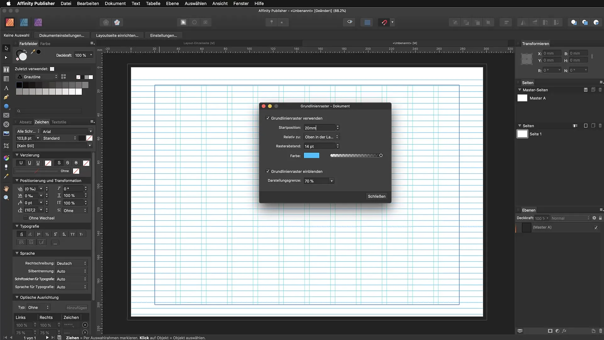
An important point is the spacing for the grid. I recommend entering a spacing of 16 points. This prevents the text from appearing too cramped and allows it to spread out nicely on your page. The letters thus have more space to expand.
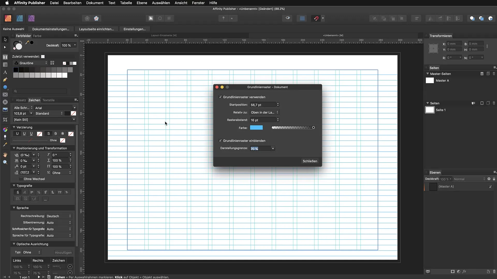
When choosing the color for your baseline grid, make sure not to make it too dominant. A reduced opacity ensures that the grid does not distract from the design but remains visible.
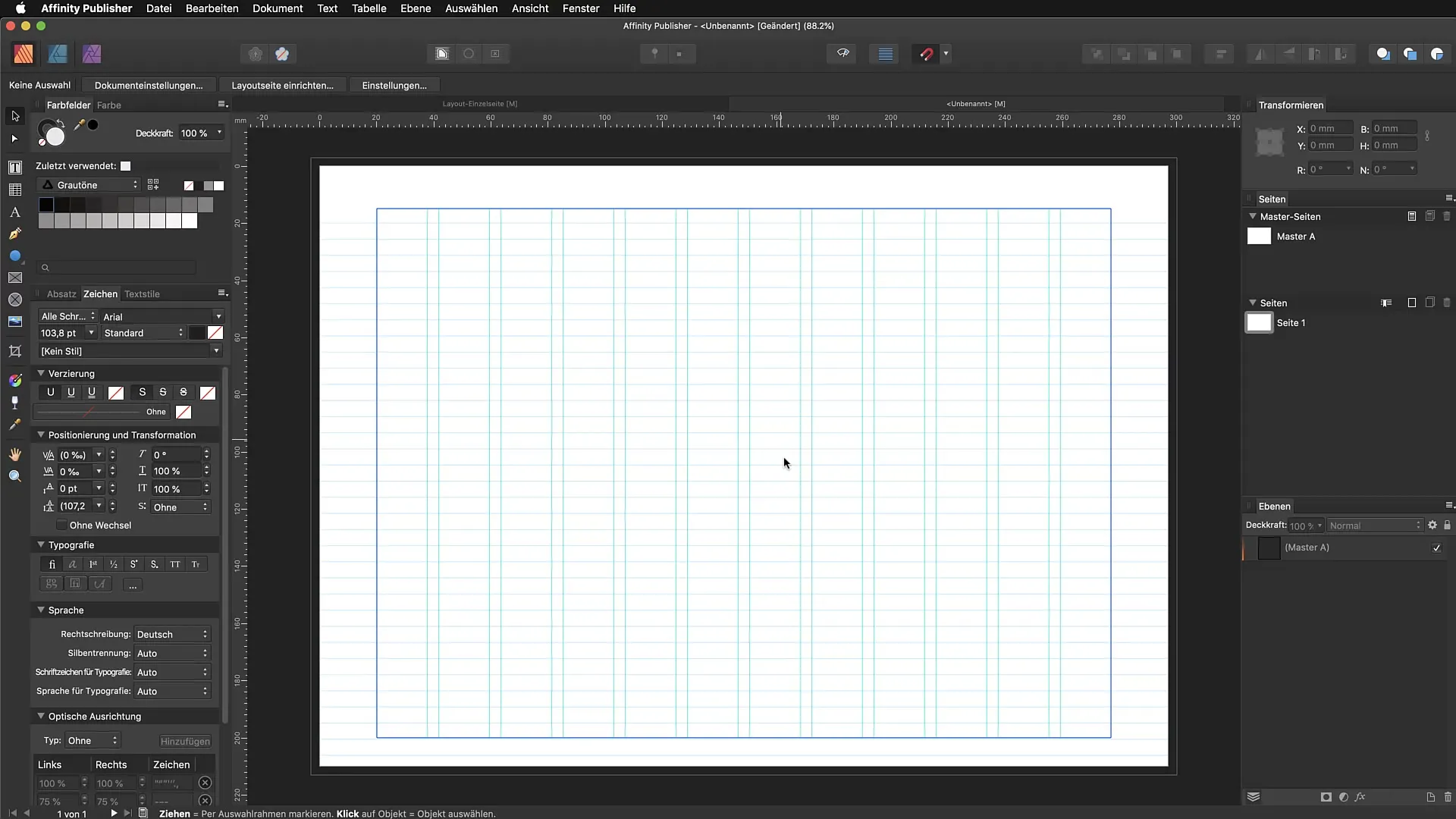
With all these settings, you have now created an effective layout that saves you a lot of time when working with texts and images. It is best to apply these grids in more complex layouts, such as in multi-page brochures or text-heavy documents. This keeps everything neat, and you can utilize the guidance of the grids.
Summary - Affinity Publisher: Step by Step Guide to Creating Baseline Grids and Columns
In this guide, you learned how to set up a column grid and a baseline grid in Affinity Publisher. These steps will help you createa professional and tidy layout.
FAQ
How many columns should I use for my layout?It is recommended to work with even numbers. A number of 12 columns provides a good orientation.
How do I set up a baseline grid?Go to View -> Configure Baseline or use the Baseline Assistant and follow the instructions in the dialog.
What spacing should I choose for the baseline grid?A spacing of 16 points is ideal to prevent the text from appearing too cramped.
What color scheme can I choose for the guides?Choose a striking color, but be careful not to make the opacity too high to not disrupt the design.
Do I always need a grid when laying out?A grid is very helpful for complex layouts, especially in multi-page brochures and text-heavy documents.


