The handling of text in AffinityPublishercan be both challenging and rewarding. With the right understanding and effective use of the various text tools, you can significantly enhance your designs. In this guide, we will look at the basics of graphic text and frame text, how to create fields, adjust content, and design typography according to your needs. Let's get started!
Key Takeaways
- There are two main types of text in Affinity Publisher: graphic text and frame text.
- Graphic text is well-suited for headings, while frame text offers more flexibility for breaks.
- The use of fonts should be careful and targeted in order to achieve optimal results.
Step-by-Step Guide
1. Select the Text Tool
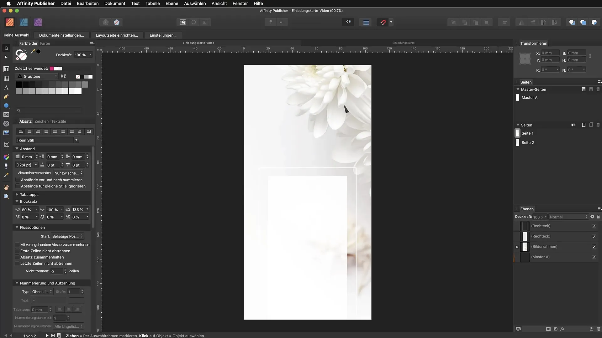
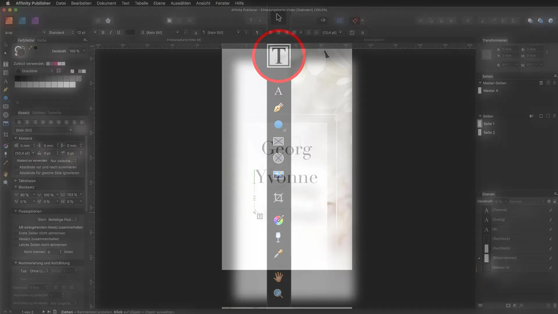
To begin designing text, you need to activate the text tool. You can do this in the text panel on the left side of Affinity Publisher or simply press the T key on your keyboard. The text tool provides two main functions: graphictext and frame text.
2. Create Graphic Text
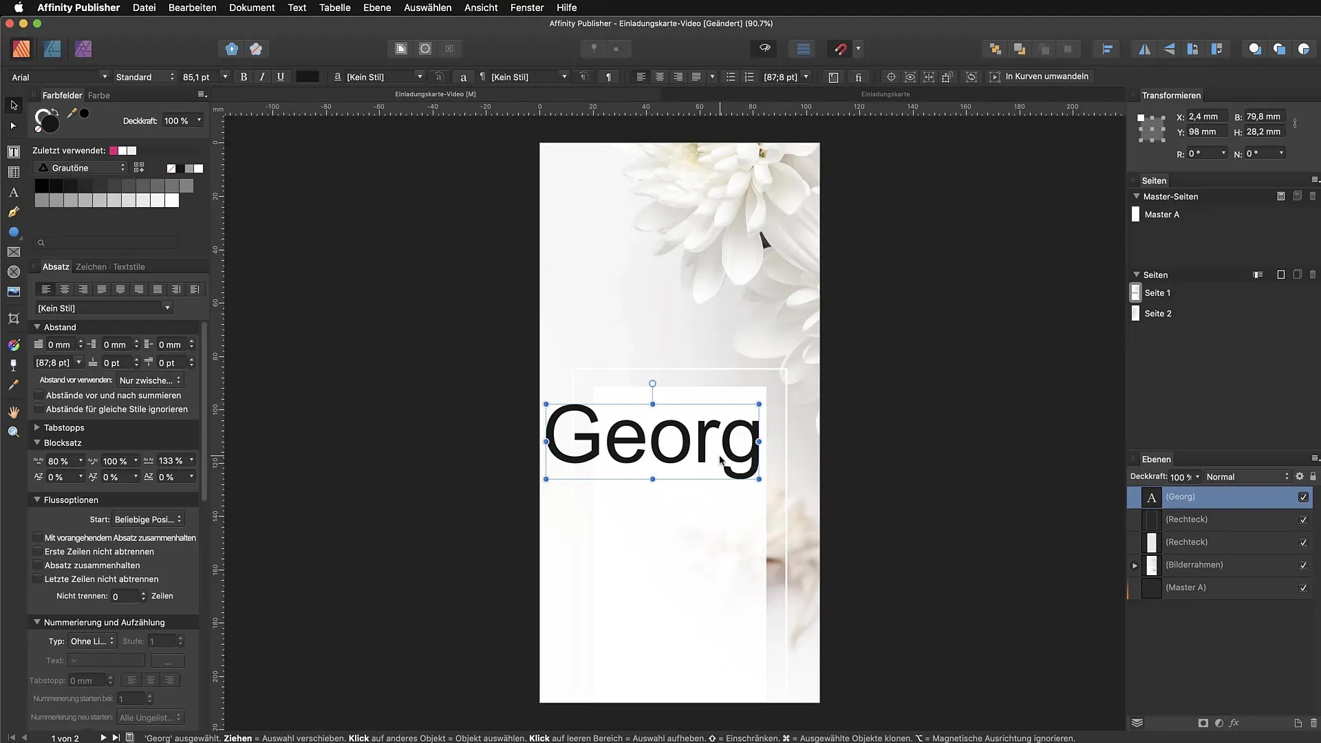
Select the graphic text tool and drag a text box. Immediately, you can start typing your desired text, for example, "Georg". Graphic text is excellent for headings because you can scale it proportionally, which means the text box adjusts to the size of the content.
3. Select Fonts
At the top of the interface, you will find the font options. Click on it and choose a suitable font from the list. Your selected text will be updated immediately with the new font, so you don’t have to change each letter manually. This keeps you organized and saves time.
4. Adjust Font Size and Color
You can easily adjust the font size by using either the mouse or directly entering the point size. Color choice is important for the design of text boxes. Choose an appealing color that matches your design by using a color palette or preset.
5. Copy and Adjust Text
If you want to adjust the name, simply copy the text box and change the text as desired. For example, to use "Ion" instead of "Georg", secure the copy and modify the text. This allows you to quickly create different elements on your invitation card or document.

6. Use Frame Text
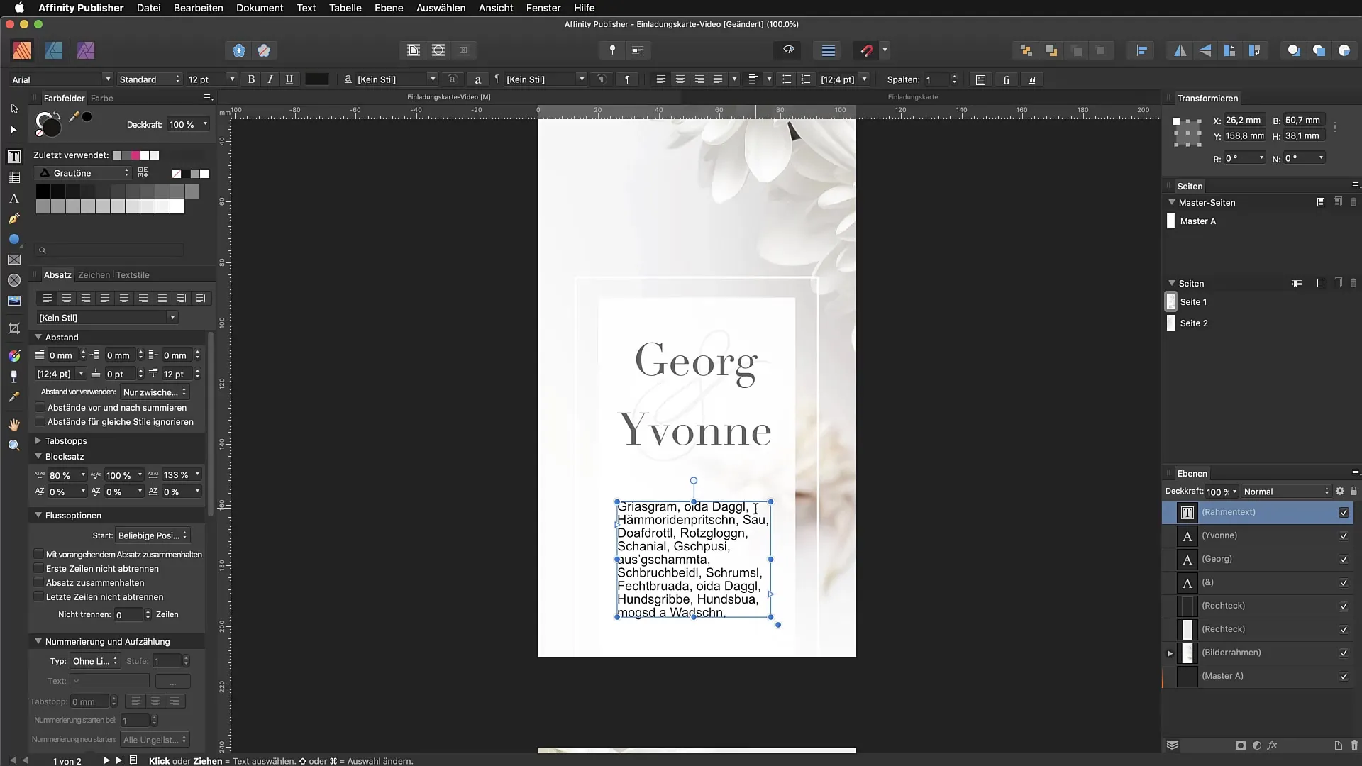
To insert frame text, select "Insert Fill Text" from the "Text" menu. This allows you to place longer texts into predefined containers. It is important to note that the frame text automatically adjusts when the width of the frame is changed.
7. Standardize Fill Text
For fill texts, you have the option to set a new standard fill text. You can replace simple alternatives like "lorem ipsum" with your own texts to maintain more control over the design. This is done in the settings under the "Fill Text" tab.
8. Typography Adjustments
To ensure your texts look good, play with typographic options like paragraph and character spacing and capitalization. For example, you can convert all letters to uppercase by selecting the character panel and adjusting the corresponding option there.
9. Working with Font Styles
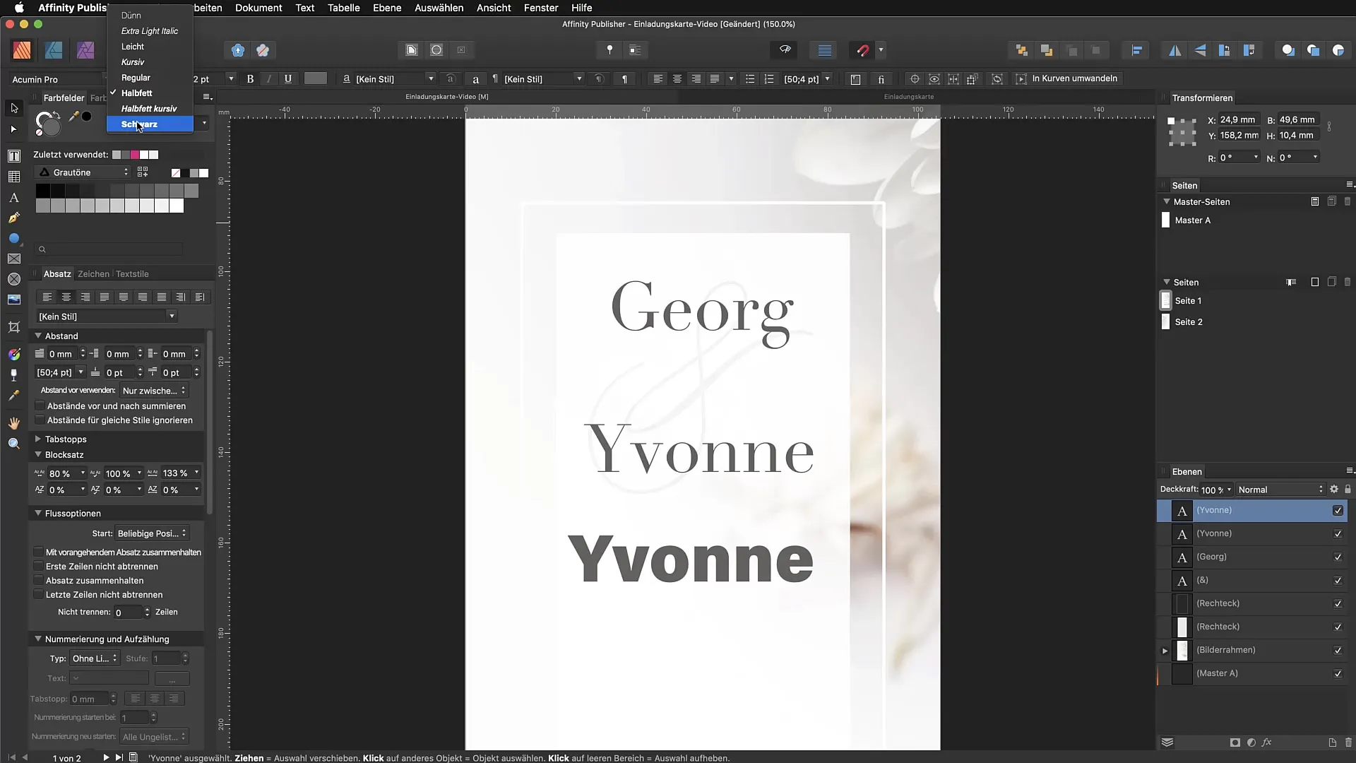
Be careful when using the bold and italic font features. Select the specific style from your font family instead of using the buttons in the panel to avoid misleading results.
10. Layout Adjustment
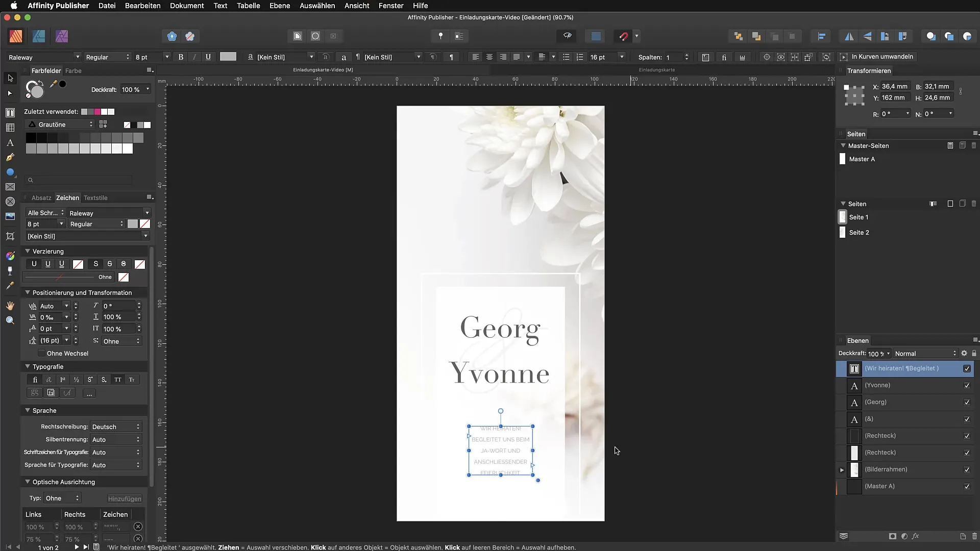
Finally, after setting up your texts, make sure everything fits well together and looks appealing. Move the text boxes to optimally position them and ensure that the overall layout is harmonious.
Summary - Efficiently Using Graphic Text and Frame Text in Affinity Publisher
In this guide, you have learned how to effectively use graphic text and frame text in Affinity Publisher. By properly applying the tools and making typographical adjustments, you can create an engaging design.
FAQ
Why should I use graphic text instead of frame text?Graphic text is better suited for headings and smaller text segments as it is easier to scale and adjust.
What is frame text and when should I use it?Frame text is ideal for longer content and allows breaks and flowing text within a container.
How can I add fonts in Affinity Publisher?You can add fonts through the font menu by installing them into your system fonts and then selecting them in Affinity Publisher.
How can I ensure that my texts are easy to read?Make sure to choose sufficient contrast between the text color and background and use an appropriate font size and style.
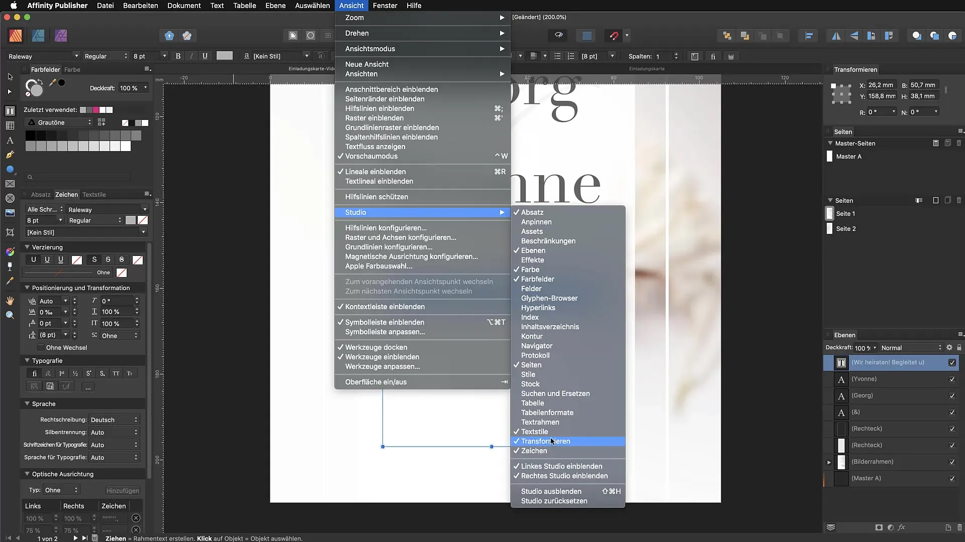
Where can I find most options for typographical adjustments?You can find most options in the character panel, which you can activate through the "View" menu and then "Studio".


