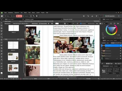
Imagine your body text doesn't just run bluntly past an image, but nestles against its contours as if it were made exactly for that. You know this effect from printed magazines and periodicals, and it can be achieved in Affinity Publisher without any detours. You don't have to cut up a paragraph or create additional text boxes. The function behind it is called Text Wrap, and it determines how text is routed around an object.
The video is only loaded from YouTube when you play it – data (including your IP address) is then transmitted to YouTube/Google. More in the privacy policy
In this tutorial, I'll show you step by step how to place an image frame over a placeholder text, activate the wrap, fine-tune the spacing, and use the different wrap types. We'll also look at how cut-out logos behave and when the effect also works in two-column layouts.
Key Takeaways
- The image frame must be above the text box in the stacking order, otherwise the wrap has no effect.
- The text wrap is always set on the selected object, that is, on the image or image frame itself.
- With the modes Jump, Tight, Square, and Inside, you control how closely the text hugs the object.
- You set the distances to the object individually. For an image, a distance of about 6 mm at the top and 3 mm at the bottom has proven effective.
- Tight is especially suitable for round images and cut-out subjects, because the text nestles against their shape.
Step 1: Prepare the placeholder text
Before you insert an image, you need a text on which you can test the effect. It's best to use a longer placeholder text so that you can see the effect of the wrap over several lines. Put the text into a text box and select the spot where the image should sit later.
In the past, you would have had to split the paragraph at this point, but that is needlessly cumbersome. The text wrap does the work for you as soon as you have placed the object correctly.

Step 2: Place the image frame over the text
You can insert an image directly or first create a simple frame. The frame is a good choice because you can move and adjust it at any time. So draw a frame box over the spot in the text and place your image there.
Be sure to pay attention to the order in the layers. The image frame must be above the filler text. If it is below, the text remains visible through the image, and the wrap looks, quite literally, wrong. To fix this, open the Layers panel and drag the image frame's layer upward if necessary.

Step 3: Activate the text wrap
Now we get to the actual function. First select the image or the image frame. This is an important point, because without a selection the text wrap doesn't take effect. Once you have selected the object, open the Text section in the menu and choose Text Wrap there. Alternatively, you can also find the setting directly in the Layers.
A settings window opens in which you define the wrap type. Without a wrap, the text simply lies beneath the image, which is exactly what you want to avoid.

Step 4: Set the wrap to Jump
Next, choose the Jump option. The text now jumps above the image to the edge of the object and continues below it. So you no longer have any text behind the image, and the area remains free. This is the simplest and at the same time the most reliable variant when you want to place a rectangular image in body text.

Step 5: Set the distance to the image
An image that sticks directly to the text quickly looks restless. That's why you define distances. In the text wrap settings, you enter the values for top, bottom, left, and right. Left usually doesn't play a big role for an image at the edge. At the top you need a bit more breathing room so that the last line doesn't stick to the edge of the image. In my example, 6 mm at the top and 3 mm at the bottom turned out to be pleasant.
Of course, these values are not dogma. Adjust them to the size of your image and the style of your layout. A large photo can handle more spacing than a small graphic.

Step 6: Moving the image within the text
A big advantage of this method becomes apparent as soon as you move the image. The text adapts to the new position in real time. So you can drag the image to wherever it looks best from a design standpoint, for example to the end of a sentence. The body text then continues with the spacing you set previously.
This behavior makes working surprisingly smooth because you don't have to reformat every time. Feel free to try out several positions and observe how the type area changes.

Step 7: Replacing the image or text
If you later want to replace the image frame or the placeholder text, you don't have to click your way through the document. Simply select the desired element in the Layers panel. This way, you can, for example, insert a different image into the existing frame without having to readjust the text wrap.

Step 8: Tight wraps for small images
For very small images, the Tight mode is worthwhile. Here you use, for example, just 1 mm of spacing on all sides. This moves the image closer to the text, and you can even squeeze it directly into a line. Reduce the size of the image if necessary until it fits harmoniously into the text flow.

Step 9: Text wrap in two-column layouts
Text wrap also works when your document has two columns. You can adjust the size of the image and position it between the columns so that the text distributes itself cleverly. Especially in magazine layouts, this is a very useful trick because you can integrate images into the text flow without losing the column structure.

Step 10: Comparing Tight and Square
Besides Jump, there are the modes Tight, Square, and Inside. Square encloses the image with a rectangular area that follows the shape of the object but always remains rectangular. Tight, on the other hand, follows the actual contours of the image. This distinction is crucial when you work with round or irregularly shaped subjects.
With a rectangle the difference is hardly noticeable, but with a round image it is very noticeable. If you choose Tight there, the text hugs the curve almost organically, and there is no longer an unsightly frame. Try out the modes and decide by eye which effect suits your layout best.

Step 11: Incorporating cut-out logos and PNG files
The effect becomes particularly appealing with cut-out graphics, that is, subjects with a transparent background, such as logos or PNG files. Here you don't need an image frame but place the graphic directly in the document. Simply drag the file into your layout and then activate the text wrap.
For transparent logos, the Tight or Inside mode is recommended. The text then follows the shape of the subject and can even slip into gaps and bulges. This works particularly well with icons with clear outlines. If, on the other hand, you have a full-surface graphic without cut-outs, Tight adds hardly any value, and Jump is the better choice.

Step 12: Adapting the wrap type to the graphic
With logos, the shape determines success. Tight follows every edge and curve, Square places a rectangular area around the subject, and Jump cuts the text off above and below the graphic. Try out all the variants and observe which solution guides the text most beautifully. In some cases, the text can even be pulled into the middle of a logo if there is free space there. This looks very decorative, but you should use it deliberately.

Step 13: Placing the Text Wrap Precisely in the Middle of Text
If an object is meant to sit in the middle of the text flow, some wrap types are indispensable. With them, you ensure that the text continues evenly to the left and right of the image. Especially with larger illustrations or quote graphics, this is a useful design approach.

Step 14: Checking the Effect in Two Columns
Finally, a quick test in two-column layouts is worthwhile. Switch between Tight and Square and observe how the image moves within the columns. The white space stays the same, and yet the object looks different depending on its position. Make sure your layout doesn't become restless, because not every position looks good. The effect is strong, and you should use it deliberately and sparingly.

Summary ??? Text Wrap in Affinity Publisher: Letting Text Flow Elegantly Around Images
With text wrap in Affinity Publisher, you let text flow around images, frames, and logos without cutting up paragraphs. First you place the image frame over the filler text, select the object, and then choose the appropriate wrap type. Jump is suited to rectangular images, Tight and Inside to round or cut-out subjects. Spacing gives your layout room to breathe, and in two-column documents you create a lively page with the image in the middle. Use the effect with feeling, and your document will look like a professionally designed magazine.
FAQ
Does the image have to be selected for the text wrap?Yes, the text wrap only takes effect if the image or the image frame has been selected beforehand.
Why does the text run through my image despite the wrap?Usually the image frame lies beneath the text. Check in the Layers panel whether the image is above the filler text.
What is the difference between Tight and Square?Square encloses the object with a rectangular area, while Tight follows the actual contours of the subject.
Which wrap type is suitable for round images?For round images, Tight is usually the best choice because the text nestles against the curve.
Which spacing values make sense?As a guideline, 6 mm at the top and 3 mm at the bottom have proven effective. Adjust the values to the size of your image.
Does text wrap also work in two-column layouts?Yes, you can place the image between the columns and work with Tight or Square.
Can I replace an image later without readjusting the wrap?Yes, select the element in the Layers panel and replace it. The settings are generally retained.


