A text that consists only of uniform paragraphs is rarely read in full. A pull quote is a highlighted quotation, usually a concise sentence from the body text, that is set larger and more eye-catching. It loosens up the page and gives the eye a first anchor. In this tutorial, you will learn how to create a pull quote in Affinity, emphasize it with lines, save it as a paragraph style, and reuse it via the assets. I will also show you why all of this is part of visual hierarchy and how you can deliberately guide your readers' eyes through the page.
The video is only loaded from YouTube when you play it – data (including your IP address) is then transmitted to YouTube/Google. More in the privacy policy
Key Takeaways
Key Takeaways
- A pull quote is a short, concise sentence from the text that is set large and eye-catching.
- For individual, freely placeable text elements, the artistic text tool is completely sufficient. You don't need a frame tool for this.
- With paragraph styles, you save font size, alignment, and capitalization, so you can format the quote the same way at any time.
- Lines or rectangles used as markers cannot be saved as a paragraph style. Instead, store them in the Assets panel in a category of their own.
- Visual hierarchy arises when you decide what catches the eye first: headings, images, bold passages, or quotes.
Step-by-Step Guide
Step 1: Choose the right quote
Before you even open a tool, find a sentence in the text that sparks curiosity without context. Ideal are statements that show attitude or sum up a central message. In my example, I take a quote from our managing director about daily coffee as a source of energy and about his role as a leader. A quote like this works well because it is short and has an immediate effect. Make sure you don't shorten it arbitrarily, but keep the meaning intact.

Step 2: Select the artistic text tool and place the quote
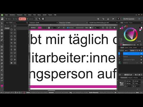
For a pull quote, you usually don't need a frame. Choose the artistic text tool, with which you create freely placeable text elements. Drag out a text box and paste the quote into it. The artistic text tool is so handy because you can move it around the page without being tied to columns or text frames. First position the element roughly where it should later sit in the layout.

Step 3: Adjust font size and weight
Now comes the part that sets the quote apart from the body text. Increase the font size significantly, to about 15 points in the example, and adjust the weight if you want to use a bold variant. The size difference is decisive: a quote that is only minimally larger than the text looks more like a mistake than a deliberate emphasis. Afterwards, move the text box to a spot where it loosens up the page, for example between two paragraphs or next to an image.

Step 4: Check position and space on the page
Next, drag the quote to a calm position and make sure it doesn't get lost in the text flow. You can first place the quote at the bottom edge of the page to check the overall impression, and reposition it again later. Also delete superfluous parts of the text that distract you while designing, so that you can better judge the effect of the quote.

Step 5: Mark the quote with a line
To emphasize the quote further, you can place a thin line above or below it. Use the rectangle tool or the pen tool for this. Draw a line that extends from the start to the end of the quote. The width and thickness of the line can be adjusted afterwards. In the example, I work with about 1.5 millimeters. If you copy the line and place it below the quote, a second accent line is created. A thickness of about 1 millimeter is usually enough here. Make sure the lines don't look stronger than the quote itself.

Step 6: Save the quote style as a paragraph style
So that you don't have to reformat the quote every time later, you save its formatting as a paragraph style. Set the paragraph to justified, the font size to, for example, 14.5 points, and, if needed, everything to appear in capital letters. Then open the text styles management, select Paragraph Style, and give the new style a clear name, for example with the abbreviation "Quote". Note that lines are not part of the paragraph style. You have to save them separately.

Step 7: Storing Lines and Quotes in the Assets Panel
You cannot save lines via a paragraph style, but you can store them in the Assets panel. To do this, open the Assets tab on the left side. Create a new category there, such as "Quotes". Then drag the line into this category field using drag and drop. From now on, you can drag it back in at any time without redrawing it. This is especially worthwhile if you use several quotes in a brochure. Incidentally, you can also use this area to store logos or recurring shapes that don't necessarily need to be on the master page.

Step 8: Checking the Visual Hierarchy
A pull quote is only good if it works in interplay with the rest of the page. On every page, ask yourself what catches the eye first. Do headings, images, bold words, lines, and quotes stand in a clear relationship to one another? A layout with too many emphasized elements loses its effect because nothing stands out anymore. A layout without any emphasis, on the other hand, looks like a newsletter from the internet. With each element, you decide which area gets the attention and which stays more in the background. This decision is the heart of visual hierarchy.

Step 9: Analyzing Role Models and Developing a Feel for It
The best way to train your eye is to flip through magazines and brochures. Take a magazine or a catalog and, on every double page, ask yourself which point appeals to you first. Pay attention to headings, page numbers, the arrangement of images, and the placement of quotes. Make a note of what you like and why. You need this sensitivity before you create your own brochure with a cover and inside pages. Theoretical knowledge alone is not enough. Only by comparing with successful layouts do you develop a sense of what really looks good.

Summary – Designing Pull Quotes: Highlighting Quotes in Affinity
A pull quote is a simple but effective design tool. You choose a concise sentence, set it large and eye-catching in the artistic text, mark it with a line, and save the formatting as a paragraph style. You store lines in the Assets panel so that you can reuse them at any time. The real core lies in the visual hierarchy: you decide what is seen first and thereby guide the reader safely through the page. Practice this regularly with role models and with your own layouts, and over time you will develop a reliable sense for it.
FAQ
What is a pull quote?A pull quote is a highlighted quote or a concise sentence from the text that is set larger and more eye-catching in order to draw the reader's gaze.
Which tool do I use for a pull quote in Affinity?You usually use the artistic text, because it lets you create freely placeable text elements without a frame.
Can I save the line under the quote as a paragraph style?No, lines are not part of the paragraph style. You save them in the Assets panel in their own category, for example "Quotes".
How large should the font be for a pull quote?The quote should be significantly larger than the body text. In the example, a value of about 15 points is used, while the text remains smaller.
What does visual hierarchy mean?Visual hierarchy means that you determine which elements of a page stand out first and which stay more in the background, for example through size, weight, images, or markings.
How many highlights make sense?A few, purposefully used highlights have the strongest effect. If everything is highlighted, nothing stands out anymore.
How can I improve my feel for good layout?Regularly flip through magazines and brochures and pay attention to which points catch your eye first and why.


