

The front of your invitation card is done, and you already know the basic techniques for text, fonts, and alignment. Now you apply this knowledge to the back. It holds the most important details about the celebration: the "Save the Date" notice, the time, the location, and the ornaments that tie everything together. At the end, you match lines, spacing, and colors to each other and learn a trick with color palettes that will save you a lot of time later.
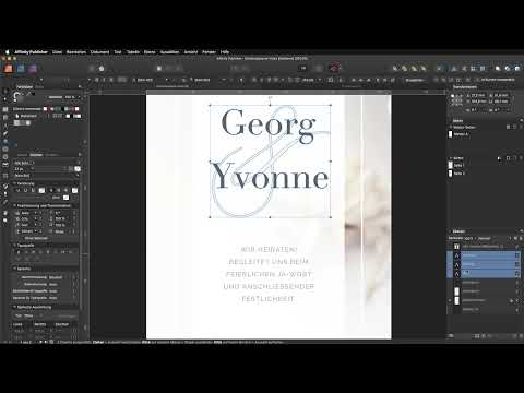
The video is only loaded from YouTube when you play it – data (including your IP address) is then transmitted to YouTube/Google. More in the privacy policy
The guide follows the flow of the video. You can follow each step directly in your own document.
Key Takeaways
- Layout mode enables the precise placement and alignment of objects.
- With line spacing, tracking, and all caps, you design text with impact.
- The "Paste Without Formatting" command prevents foreign formatting from the clipboard.
- A font combination of sans-serif and serif looks harmonious when you use it deliberately.
- With color palettes, you change colors across the whole document at once.
Step-by-Step Guide
Activate Layout Mode and Choose the Text Tool
Start at the top of the toolbar by switching to layout mode. It allows you to place and align objects exactly. Then choose the text tool. For the foreground color, you use a shade of gray. Test two or three shades of gray side by side until one fits the overall look of the card, and decide by feel.

Write and Format "Save the Date"
Click once on the page and type the text "Save the Date". Then select it and set the font to Raleway Regular at 10 pt. This font forms the basis for the entire back, so you should use it consistently right away.
Activate All Caps and Rotate the Text
Activate all caps so that the text appears entirely in capital letters. Then rotate the text box by 90 degrees so that the lettering runs vertically along the edge. Place it on an edge of the card where it works without competing with the rest of the content.
Create the Address Text as a Frame Text
Your guests need to know where the celebration takes place. To do this, drag out a frame text and choose left alignment. So that the text ends cleanly, you set the right margin to the existing guide. Then you switch to right alignment. It is rare in everyday use, but creates a special character. For the font style, you choose Raleway Light at 10 pt.
Type the First Line and Increase Tracking
Type the first line, for example "Ihr seid herzlich eingeladen". Zoom into the document a bit so you can see details better. Then activate all caps again and increase the tracking to 20. Tracking determines the space between the individual letters. In Microsoft Word, this function is called "Spacing". A value of 100 stretches the text visibly far apart. A value of 20, on the other hand, looks elegant and readable.

Adjust the Text Box and Paste Text Cleanly
Reduce the text box to the appropriate size with a double-click. Then hold down the Alt and Shift keys and drag a duplicate downward with the mouse. This way, the format of the original is preserved. Then you select the text in the duplicate and replace it with text from the clipboard. This text brings its own formatting; in the video, it is the font "Apple System UI". That font does not fit your document. Use the "Edit" command and choose "Paste Without Formatting". This way, the text adopts the formatting of the text box, and you don't have to laboriously reset anything.

Fine-Tune Line Spacing
Increase the line spacing so the text looks airier. In the video, the value 20 appears too large, so you choose 16 pt. Note that Affinity Publisher only displays the change after you press the Enter key. So wait a moment after each input and confirm with Enter before you judge the result.

Add the Time as a Separate Frame Text
The time is still missing between the address and the date. To add it, create a new frame text and type "Saturday 9 AM" into it. Set the font to Raleway Regular at 16 pt and choose a dark black tone as the font color. Position the text between the two existing text blocks, at approximately the same height.

Font Mix with Ornaments and Serif Font
For the font mix, you combine the sans-serif Raleway with a classic serif font. In the video, this is the font P22 Seer. This combination works because a modern, clear font and a playful font complement each other. However, make sure not to use more than two to three fonts. Then copy an ornament from the front side. To do this, hold down the Shift key, select the element, and paste it on the back side. Scale it down, set the font to P22 Seer, and align the ornaments harmoniously. You place the flourish ornament on the right, and the second character goes below it. A third decorative element stays faintly in the background between the two.

Drawing a Line with the Pen Tool
To structure the design, you draw a line. Activate the layout mode, select the Pen tool, and remove the fill color, since you don't need it. Set the stroke color to a light gray tone and the width to 0.5 pt. Set the start of the line and hold down the Shift key while dragging downward. The Shift key forces an exactly straight line. For the start and end points, you choose the filled circle. The result is a clean, subtle dividing line.

Aligning Lines and Texts on One Axis
The line should be at the same height as "Save the Date". Move it by eye until it looks centered. Then hold down the Alt key and drag a copy upward. Place another copy downward as well, positioning the text slightly higher. Copy the line one last time and place it with the same spacing. This creates an even rhythm.

Checking and Adjusting Color Palettes
Finally, you check the readability. If a gray value seems too light to you, open the color palette and change the value, for example from 40 to 60 percent. All objects to which this color is assigned adjust automatically. This is particularly clear in the video: after switching to blue, all correspondingly marked elements changed at the same time. For extensive documents, this is an enormous advantage. Therefore, always work with color palettes so that you can adjust colors later with just a few clicks.

Outlook on Data Export
With the back side, the invitation card is finished in terms of content. The next step is exporting it as a PDF. This process is covered in Chapter 4 of the basics tutorial. There you will find further tips and tricks on how to export your document cleanly.

Summary – Finishing the Invitation Card: Designing the Back Side in Affinity Publisher
You have completely designed the back side of your invitation card. You formatted "Save the Date" and the address with a suitable font, tracking, and alignment, and added the time. With a font mix of Raleway and P22 Seer as well as ornaments and lines, you have achieved a balanced design. Working with color palettes makes later changes quick and uncomplicated. In the next step, you export your card as a PDF.
FAQ
Why doesn't the line spacing change immediately when I enter a new value?Affinity Publisher only applies the new value after you have pressed the Enter key. Therefore, confirm every entry with Enter.
What exactly does tracking do?Tracking determines the spacing between the individual letters. A value of 20 ensures elegant readability, while high values spread the text far apart.
Why does the pasted text look different from the rest of my text?The text brings along the formatting of the program it was copied from. Paste it via "Edit" and "Paste Without Formatting" so that it adopts the formatting of the text field.
How do I create a straight line with the Pen tool?Hold down the Shift key while drawing. This produces an exactly straight line instead of a crooked or wobbly one.
What are color palettes used for?With color palettes, you change a color in one central place, and all objects with this color are adjusted automatically. This saves a lot of time, especially with extensive documents.
How many fonts should I use for a font mix?Two to three fonts are usually enough. Make sure that a sans-serif and a serif font complement each other well.

