

A good layout rarely comes about by chance. Before you place text and images, you need a clear structure that defines where images, headings, and body text belong. In this guide, I'll show you how to plan a rough structure with image placeholders, work with the grid, and link text frames together. You'll also import a color palette and set a two-line heading with two high-contrast fonts.
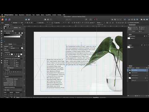
The video is only loaded from YouTube when you play it – data (including your IP address) is then transmitted to YouTube/Google. More in the privacy policy
This guide is based on the basics tutorial for Affinity Publisher (Part 14). All you need is the program and an empty or prepared document. Adjust dimensions, images, and texts to your own project.
Key Takeaways
Key Takeaways
- An image placeholder defines the size and position of an image early on and keeps the layout flexible.
- Locking the background with Command plus L prevents accidental shifting while you work.
- The baseline grid ensures that lines in different columns sit exactly on a common line.
- Linked text frames let the body text flow automatically from one box into the next.
- A color palette from another document can be imported and saves you time for recurring designs.
- If you combine no more than three fonts with clear contrast, a heading looks lively yet orderly.
Step-by-Step Guide
Step 1: Create and enlarge an image placeholder
Start with the background of your layout. Create an image placeholder that fills the area where your main image will later appear. To do so, simply drag out a frame and then choose the "Replace Image" option via the context menu. Then pick your suitable image. The placeholders help you check the overall effect before you do the fine-tuning.

If desired, an image can be flipped so that it fits the overall composition better. To do this, use the "Transform Layer" command and choose "Flip Horizontal". Then drag the corners of the frame until the image reaches the desired size. Make sure you work with the corner points so that the aspect ratio is preserved, unless you deliberately want to distort it.


Once the image is placed, lock the background with the keyboard shortcut Command plus L. This allows you to edit the rest of the layout without accidentally moving or selecting the image.

Step 2: Set placeholders for heading, body text, and additional images
Now think about the remaining elements. Place a zone for the heading, an area for the body text, and a second image placeholder. You don't have to define the size of these placeholders perfectly. It's enough if you roughly know how much space each element needs. This way you get a rough sketch of the document structure, which you refine later.

Next, you insert several text boxes that mark the columns of your document. The grid helps you here by specifying the spacing and positions.

Step 3: Use frame linking for the body text
Now the goal is to let the text run across several boxes. Insert placeholder text into one text box. Then click the small arrow icon at the bottom edge of the text frame. After that, click the target box, and the text flows on to it. This technique is called frame linking.
To check the linking, you can insert two paragraphs. You'll then immediately see how the text ends at the bottom edge of the first box and continues in the second box. If the result doesn't fit, simply undo the change.

Make sure that linked fields have the same width and text style logic so that the reading flow remains pleasant. In a document with three columns, all text fields should therefore each span three grid columns.
Step 4: Working with the grid without overdoing it
The grid gives you orientation. However, you don't have to follow it slavishly. Sometimes a text field looks better if you drag it a little wider or narrower. Whether you use three, four, or five columns depends on your layout. What matters is that you use the grid deliberately.
Next, also place images into the structure. Replace the placeholder with the appropriate image, enlarge it, and position it so that distracting crops such as cut-off body parts are avoided. Small shifts up or down can noticeably improve the overall picture.


Step 5: Exporting and importing a color palette
To make your layout look consistent, you work with a fixed color palette. You can export a palette from another document. To do so, use the "Export Palette" function. Then you import it into your current document via "Import Palette". Choose the "Document Palette" option so that the colors are available directly in the document. The file has the format of an Affinity palette and can be selected via the Open dialog.

The palette in this example includes six colors. You already know four of them as the basis for character and paragraph formats, which you will later create as text styles. For these first colors, always use the same ones whenever possible so that your document remains consistent. The remaining colors serve as accents. The choice of colors is free, but complementary pairs such as red and green quickly create an exciting contrast.
Step 6: Understanding and using the baseline grid
The baseline grid ensures that all lines in your document sit on a common line. This is especially important when you work with multiple columns, because lines from different columns stay at the same height. If you move a text field, the text remains aligned to the grid.


Test the behavior yourself: Select the text and set it to a different font size, such as 13 point. As long as the grid is set to 16 point, the alignment hardly changes. Only with larger values such as 32 point will you notice a visible change. However, the grid can be switched off if needed, in case you need deviations in certain places.


Step 7: Designing a headline with two fonts
For the headline, first select the Artistic Text Tool and click once on the workspace. Write the first word there, for example "Kultur". Then select the text and choose the font Roboto Slab at 30 point. For the color, use the medium gray from your palette. Using the Character panel, set the text to uppercase.


Next, create a second text field for the word "Grünen". Use the green color from the palette here and set the font size to 73 point. For the second font, choose a handwritten or calligraphic font, in the example Barbershop Thailand. The combination of a strong slab serif font and a playful script font creates an appealing contrast that makes the headline lively.


Finally, you check the layer order in the Layers panel. Place the layer that should be in front above the first word so that the fonts do not cover each other. The result is a heading that attracts attention and fits the topic at the same time.
Summary – Affinity Publisher: Building a Layout Structure with Image Placeholders and Frame Linking
You have now learned the most important basics for building a layout. You have placed image placeholders, locked the background, and connected text boxes through frame linking. In addition, you have imported a color palette and worked with the baseline grid. With the two-line heading, you have also seen how two contrasting fonts work together. The next step is about text styles, with which you apply this design permanently and consistently throughout the document.
FAQ
Why should I place image placeholders first?Placeholders show you early on how the layout looks and prevent you from placing text in an unfavorable spot.
What does the keyboard shortcut Command plus L do?It locks the selected layer or the background so that you do not accidentally move it while continuing to work.
Do I always have to stick to the grid?No. The grid serves as orientation. You can freely adjust text boxes if needed.
How does frame linking work?You click on the arrow icon at the bottom edge of a text box and then on the target box. The text then continues to flow there.
Can I take over a color palette from another document?Yes. Export the palette in the original document and then import it as a document palette into your current project.
Why are four colors of the palette particularly important?You use the first four colors for character and paragraph styles. If you use them consistently, your document stays uniform.
When does the baseline grid offer an advantage?It ensures that lines from different columns are at the same height. This looks orderly and calm.
Which font combination is suitable for headings?A bold slab serif font combined with a calligraphic or handwritten font creates an exciting contrast.

