A cover only has a single glance to convince. That is exactly why it deserves the most design energy within your brochure. The good news: you don't need any new tools for it. You already know inserting images, layer effects, adjustment layers, and text formatting. In this tutorial, you combine them into an eye-catching cover that looks better in real life than on screen.
The video is only loaded from YouTube when you play it – data (including your IP address) is then transmitted to YouTube/Google. More in the privacy policy
Key Takeaways
- A cover must be designed generously and strikingly. It should jump out at you immediately.
- The 3 mm bleed ensures that no white edge appears when cutting.
- With Levels and Split Toning, you give an unremarkable photo contrast and mood.
- A gradient over a rectangle improves the readability of the title without covering the image.
- Shadows look high-quality when you use them subtly. An intensity of around 5% is usually enough.
- A logo that you design in the same color and with the same shadow as the text ties all the elements together.
Step 1: Check the frame and bleed
Before you place anything, check the margin and the bleed in the settings. Pay particular attention to the 3 mm bleed. Backgrounds and images should extend beyond the trim so that no light strip appears when cutting. Important motif details such as faces or lettering, on the other hand, belong in the inner area, otherwise they may be cut off.

Step 2: Set page 1 as the cover
Mentally lay out your brochure like a real booklet. The first page at the very front right is the cover, and the inside pages begin after it. In the video, a master page with the numbering is still on this page. A master element cannot simply be deleted. Therefore, remove the master page via right-click. The page number then disappears from the cover, which is exactly right for the title page. Alternatively, you can adjust the page numbering in the settings. In this brochure, however, page 2 simply keeps its count.

Step 3: Place the cover image
Select the Rectangle Picture Frame Tool and drag the frame out to the bleed. Then you place the image in the frame. Ideal is an eye-catching portrait-format image that fills the space well. With a double-click in the center of the image, you can fine-tune the image crop. Make sure the subject begins at a sensible spot. In the example, it works well that the coffee cup touches the bottom edge.

Step 4: Correct the image in the Pixel Persona
Switch to the image and open the Pixel Persona. With an adjustment layer via the half-circle button in the Layers panel, you can make corrections non-destructively. Select Levels and pull back the white value slightly. The image becomes darker at the bottom and gains contrast. The effect should remain subtle, because too strong an intervention quickly looks artificial.

Step 5: Split Toning for the Hollywood look
Add another adjustment layer and select Split Toning. Tint the highlights slightly orange and the shadows a strong dark blue. Both saturations are at about 40%, and you shift the balance slightly toward the shadows. The result looks warm in the highlights and cool in the depths. Compare the view with and without the adjustment, and you will clearly see the difference.

Step 6: Gradient for better readability
Back in the Layout Persona, place a black rectangle over the image. With the Gradient Tool (key G), drag a line from top to bottom. At the top, choose black with about 40% opacity, at the bottom white with zero percent. Move the gradient point so that the dark area mainly covers the upper part. This gives the title a calm background. You should, however, avoid using the opacity of a simple gray rectangle, as that quickly looks flat.

Step 7: Set the title as artistic text
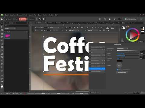
For the title, you use the graphic text and not the frame text, because the frame text is intended for body text. Write your title, for example "Coffee Festival", and color it white. Then choose a font that suits the theme. In the video, the choice falls on a sans-serif font that looks bold and modern. Try out several fonts and compare them directly on the cover.

Step 8: Coordinate line spacing, line, and colors
Select the text elements and adjust the spacing. In the example, you set the value to 64 points so that the title has room to breathe and doesn't look cramped. Then you add a horizontal line. This can be done quickly with the Pen Tool or the Rectangle. Use the Color Picker to pick up a color from the image, such as a warm brown, so that the cover matches in color.

Step 9: Shadow for text and line
Select the title and open the Outer Shadow in the layer effects area. The radius determines how soft the shadow looks, and the offset defines the direction. You should keep the intensity low, around 5%. Stronger values quickly look cheap, and shadows are demanding in print anyway. You can apply the same effect to the line. Make sure the line and text get similar values, then the whole thing looks harmonious. By the way, you can color the line white, which fits the title better.

Step 10: Add date, location, and logo
Copy the title, reduce the copy to about 15 points, and enter the location and date, for example "Vienna" and "27.07.2027". Then select all texts and the rectangle while holding the Control key and group them. This way the group can be moved together. Next, you insert the logo via the clipboard, color it white as well, and give it an outer shadow. Adopt the values from the text and line; you may need to adjust the radius and offset slightly. Finally, you use the guides to check whether everything is neatly aligned.

Summary – Designing a brochure cover with Affinity Publisher: Step by step
You have learned how to build a brochure cover that attracts attention. You checked the frame and bleed, refined an image in the Pixel Persona with Levels adjustment and Split Toning, and used a gradient for legibility. In addition, you combined title, line, date, and logo with subtle shadows into a harmonious overall picture. The design thus remains easy to follow and can be transferred to other pages. In the end, a test print is worthwhile, because on screen shadows and colors often look different than on paper. You can complete this fine-tuning with your export.
FAQ
Why should I remove the master page on the cover?Otherwise the master page shows a page number, which has no place on the cover. If you remove it via right-click, the title page stays clean.
How much shadow makes sense in print?A low intensity of about 5% usually looks high-quality. Stronger shadows quickly look cheap and are difficult to reproduce in print.
Why do I use the graphic text and not the frame text for the title?The frame text is intended for body text. Graphic text is better suited for short, designed titles with an individual look.
Can I put a simple gray veil over the image?That is possible, but it quickly looks flat and gray. A gradient from black to white creates a calm area without weakening the whole image.


