Imagine the cover is done and the rest of the brochure still looks like a pile of loose sheets of paper. This is exactly where this practical example comes in. You will see how a unified brochure gradually emerges from placeholders, fonts and images, and how you build each page with a clear grid and fixed text styles.
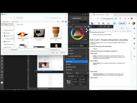
The video is only loaded from YouTube when you play it – data (including your IP address) is then transmitted to YouTube/Google. More in the privacy policy
The guide follows the structure of the video. You start with the preparation, define page numbers and fonts, and then design page by page. At the end comes the quality control, which is often neglected.
Key Takeaways
- Good preparation saves a lot of time later. Collect images, fonts and texts in a folder beforehand.
- The page numbers in the master should be small and discreet at the edge.
- Save font, color and size as a paragraph style so that you can apply headings and body text quickly and consistently.
- A single-column layout with generous margins looks calm and clear. A large mood image at the top brings atmosphere to the page.
- For two-column pages such as the program, you should set times and days in bold and align the blocks to the margins.
- At the end comes the check: consistent styles, clean images, consistent margins and proofreading of the text.
Step 1: Preparation and Collecting Materials
Before you create the first object, plan the brochure. Write down which texts, images and fonts you need. It is best to create a separate folder for this and save all images, fonts and texts there. That way you can insert everything directly into the document and don't have to constantly search. In the video, the instructor shows this approach as the fastest way to design a brochure.

Step 2: Adjusting Page Numbers in the Master Page
The page numbers are often too large and disturb the overall look. Therefore, open the master, i.e. the master page, and adjust the page numbers there. To do this, download free fonts from Google Fonts beforehand, for example Playfair Display and Source Sans 3. Install them and then select them for the page numbers.
Reduce the size of the page numbers significantly, for example to 12 point, and move them to the edge. Make sure they have sufficient distance from the text area. This change makes the pages look calmer and more professional immediately.

Step 3: Defining the Grid for Pages 2 to 8
Before you insert content, divide up the pages. Page 1 is already the cover. You will now design pages 2 to 8. For the content pages, you define a single-column layout with generous margins. At the top goes a large mood image with about half the page height, followed by the text below.
Drag the image across the full width of the page. You can also let it run to the bleed, that is, beyond the page edge. With a double-click you move the image section until the motif fits. For the example, use a festival image and drag the image so that it takes up about half of the page.


Step 4: Designing the Heading
Take the Artistic Text tool and place the heading "Willkommen beim Urban Coffee Festival" on the image. The first draft with 65 point is too large, so you reduce the size to 20 point. Change the font to Playfair Display and let the line run over two lines. You reduce the line spacing slightly so that the block looks compact. Also set the alignment to default and the spacing to 24 point.

Step 5: Defining Color, Bold Type and Paragraph Style
So that the headings don't always have to be reformatted, choose a brown color for the heading. You have already saved the color beforehand, so you can quickly call it up again. Also set the font to bold.
Then you save all properties as a paragraph style, that is, font, color and size. Name the style clearly, for example "Überschriften Festival Coffee". When you design further headings later, you simply apply the style and save yourself the individual steps.

Step 6: Insert the body text in a single column
For the body text, drag out a frame with the Frame Text Tool and insert the text. Make sure the text frame has only one column. You should decide on the columns before inserting the text so that you don't have to rebuild later. A size of about 11 points usually works well. If the text doesn't fit in the space, first reduce the heading to 18 points or move the image up a bit.

Step 7: Balance the page
Pay attention to the available space when inserting. If you want to insert more paragraphs, you have to reduce the text size or move the image further up. Careful planning is crucial here, because small changes affect the entire page. Move the text frame down until the page looks harmonious. Then page 2 is complete.

Step 8: Design the "Festival in Numbers" page
Page 3 is an airy layout with large numbers as an eye-catcher. Set the heading as artistic text again, for example "Three Days Full of Flavor", and apply the saved paragraph style. Align the heading to the margin and use guides so that it is positioned consistently with the other pages.
Below that come four highlight blocks. Each block consists of a large number and a short description. Set the number at 18 points and in bold, and the description text at 11 points. Copy the block several times and change the numbers, for example to 30 or 12. This way all blocks remain formatted identically.


Step 9: Pull Quote and image placement
A pull quote, that is, a highlighted quotation, can also be used on the page. To do this, copy the style of an existing heading and color the text brown. The sentence "Coffee is the language we understand" works well for this.
Also add an image in the middle of the page, such as a coffee picture, and place the quote below it. This makes the page varied without becoming busy.


Step 10: Build the program across two pages
Pages 4 and 5 form a double-page spread with a two-column layout, that is, two columns per page. The schedule is well suited for this. Take over the "Program" heading and align it to the margin. Below it, you define subheadings for the individual days.
Insert the placeholder text into a frame and divide it into two columns. In the first column, for example, is Friday, and in the second, Friday evening. On page 5, Saturday follows on the left and Sunday on the right. Make sure the blocks are evenly distributed. Set times and day names in bold so that the structure is recognizable at a glance.

Step 11: Photo spread and captions
Pages 6 and 7 show a photo spread. The images don't all have to have the same format. You can use one photo in landscape and another in portrait, complemented by a short descriptive text. The caption sits in a single-column frame. If you use several images, it makes sense to plan a separate text block with a caption and short body text for each photo.
On page 7, you then insert another quote in the familiar style and add images, such as one with a game motif.

Step 12: The final page with directions and tickets
The last page contains directions, tickets, and further info. Design it in a single column with a headline. It's best to copy the heading from another page for this. Afterwards, you insert the info blocks that you prepared beforehand.

Step 13: Transfer and unify font styles
Now it's all about consistency. You have downloaded two fonts, one of which is Source Sans 3 for the body text. Create a new paragraph style "Fließtext Festival" with the right size for it. Then select all body texts in the document and assign this style to them. This way the body text will be the same everywhere. The headings remain in Playfair Display.

Step 14: Quality control
The last step is often the most important. Go through every page systematically. Check whether all headings have the same style and all body texts look the same. Make sure that no page uses a different font. Check the images: Are they distorted, sharp, and cleanly cut out? If necessary, edit them beforehand in an image editing program.
Also pay attention to the spacing. Do the page margins match on all pages? Are the headings aligned the same way? And finally: proofread the entire text. Typos happen quickly, and they are exactly what readers notice right away.

Step 15: The finishing touches
With just a few minutes, the brochure is not yet ready for print. The instructor shows in the video that you can put the result together roughly in about ten minutes. For a truly clean brochure, however, you should plan around two hours to refine the details. This investment of time is especially worthwhile before printing.

Summary – Brochure in Affinity Publisher: Designing and checking content pages
You have seen how to build up the content pages of a brochure in Affinity Publisher in a structured way. With good preparation, consistent paragraph styles, clean grids, and a thorough quality check, you get a result that looks professional. Go through every page once more before printing, because care determines the final result.
FAQ
Why should I collect images, fonts, and texts before designing?If all materials are in one folder, you can insert them directly and save a lot of search time.
Why should I adjust page numbers in the master?In the master, you change the page numbers once for all pages. This ensures a consistent appearance.
What is the benefit of a paragraph style?A paragraph style saves the font, color, and size. You can apply it later with one click and avoid inconsistent formatting.
Why do you work with a single-column layout on content pages?A single-column layout with generous margins looks calm and is easy to read. Especially in brochures with a lot of image material, this helps keep the pages clear and organized.
Does the photo spread always have to have uniform image formats?No, the images may have different formats. What matters is that the overall look remains coherent.
Why shouldn't I skip the quality control?During the check, errors such as inconsistent styles, blurry images, or typos are spotted. These errors are easy to fix before printing, but only with great effort after printing.


