
A portrait quickly looks flat if the light and color aren't right. Fire, flames, and sparks can give it a dramatic, artistic touch. In the video, Stefan from Row Exchange shows how to incorporate high-resolution fire textures against a black background into a composite. The material comes from a fire pack whose shots were taken directly in the fire. The images are sharp enough for large formats and contain the natural softness that makes real flames look so alive.
The video is only loaded from YouTube when you play it – data (including your IP address) is then transmitted to YouTube/Google. More in the privacy policy
In this tutorial, you'll learn how to place a texture appropriately, remove distracting elements with a mask, add embers to the eyes, and immerse the entire image in warm tones with a curves adjustment layer. Finally, I'll show you how to protect the highlights of the original so the portrait doesn't look muddy.
Key Takeaways
Fire textures work best on a black background because the Screen blend mode simply hides dark areas. With a mask, you can selectively pull back the texture where it is distracting, such as on the skin. Coloring via a curves adjustment layer connects the portrait with the fire mood. With the Blend If slider in the blending options, you preserve the highlights of the original image. The Alt key helps you make the transition smoother.
Step-by-Step Guide
Getting to know the fire pack and choosing the right texture
Before you get started, you should know what's in the pack. Stefan explains that the shots were created with charcoal, wire mesh, and moving rods. The pack contains ten textures, from which he chooses one for his example. When making your own selection, pay attention to the image composition: a texture with many bright sparks is suitable for backgrounds, while a calmer flame is better for targeted accents on the face.

Placing the texture and aligning it to the head
Place the texture as its own layer over your portrait and initially scale it larger so you can see the details. Position it so that the area of the head and face is cleanly covered and the flames are not in the wrong places. You need to make sure that you can work with a cutout later. So the texture should completely overlay the head, but not appear evenly everywhere.

Removing distracting areas with a mask
In the next step, you create a layer mask. Take a soft, black brush and paint over the areas of the face where the texture is too visible, such as skin blemishes or overly dominant sparks. Black on the mask hides the texture at that spot without destroying the original. If an area seems too harsh to you, use a larger brush with lower opacity. This creates soft transitions.

Toning down the texture
Stefan notices that some areas still look too strong. Here, a somewhat larger brush helps, with which you weaken the texture in these spots. So you don't work with hard edges, but with gentle gradations. What matters is that the face remains recognizable and the embers only serve as atmosphere.

Adding embers to the eyes
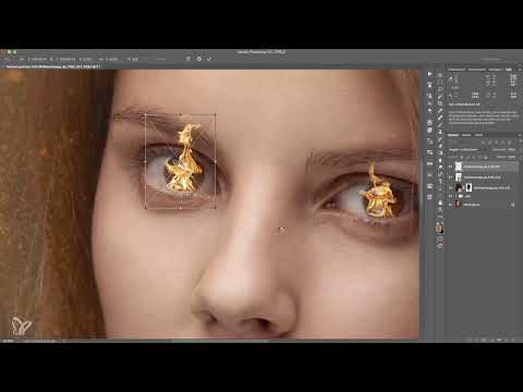
For a special look, Stefan deliberately places fire in the eyes. To do this, he chooses a smaller fire texture, places it over the eye, and adjusts its size and position. Typically, you place the texture at the edge of the eyelid, because the light looks natural there. With a quick adjustment of the size, you can prevent the flames from appearing too large.

Setting the Screen mode
Set the layer with the eye texture to the Screen blend mode. This mode makes the dark areas of the texture disappear and keeps only the bright flames visible. The result is a glowing accent that doesn't look pasted on. Make sure you don't accidentally confuse the layer with the main layer, as otherwise the entire face will be altered.

Designing the Second Eye
For the second eye, Stefan chooses a different texture and adjusts it to the same size. Here too, he uses the Screen mode and places the texture on the eyelid. Since the second eye appears a bit larger, he uses a slightly larger scale for this layer. This way, the two eyes look differently alive, which gives a natural impression.

Fine-Tuning Opacity and Position
After both eyes are filled, you group the layers and adjust the opacity. A lower opacity takes the sharpness out of the embers and makes them look more harmonious. Sometimes it works better to move the flames up a little so that they don't start directly at the eyelid. Stefan notes that the sharpness isn't right at this point yet. You will correct that later with the overall coloring.

Tinting the Entire Image with a Curves Layer
Now Stefan immerses the whole image in fire colors. To do this, you place a curves layer above all layers, except the ember accents in the eyes. With the Red, Green, and Blue channels, you shift the hues until a warm, red touch emerges. Stefan increases red, reduces blue and green, and adds some orange until a golden tone emerges. Don't overdo it: if the orange component is too strong, the portrait quickly looks artificial.

Refining the Hue
After the first pass, Stefan notices that it has become too orange. He pulls the color back a little until the face looks natural. If you don't like a color, you can reopen the curves layer at any time and readjust the curves. The layer stays flexible as long as you don't lock it.

Protecting the Highlights with the Blending Options
The coloring also affects the bright areas of the original, and that is exactly what you usually don't want. Right-click the curves layer and open the blending options. There you will find the Blend If slider. It blends the layer with the layers below based on luminance. Drag the right slider to the left, and the highlights of the original are preserved and not affected.

Avoiding Hard Breaks with the Alt Key
When moving the slider, a hard edge sometimes appears in the tonal values. That looks unclean. Hold down the Alt key while dragging the slider, and the slider splits into two halves. You can move both halves independently of each other and thus create a soft transition between highlights and edited areas.
Evaluating the Result
Now your portrait has the fire mood without losing its highlights. Take a calm look at the result and check whether the eyes, skin, and hues go well together. Stefan sums up that this look is particularly suitable for artistic portraits in which a figure is to be transformed or placed in a fantastical scene.

Discovering Further Uses
Fire textures can be used in many ways. Stefan mentions examples such as snow textures, burning hands, or a fire-breather. The high-resolution motifs are also helpful for knight composites in which a figure stands in fire. Experiment with different textures and blending modes, and you will quickly find your own style.

Summary ??? Using Fire Textures in Portraits: Step-by-Step Guide
You have seen how to apply a fire texture to a portrait without it looking unnatural. Place the texture, remove disruptive areas with a mask, and use the Screen mode to put targeted embers into the eyes. With a curves layer, you tint the image warm, while you protect the highlights via the blending options and the Alt key. With this sequence, you can achieve a glowing, artistic look that you can transfer to many other subjects.
FAQ
Which texture is best for getting started?For getting started, a texture with calm flames and few sparks is suitable, because this lets you concentrate on the technique.
Why should I use the Negative Multiply mode?This mode hides the dark areas of the texture. Only the bright flames remain, glowing against a black background.
Can I also use the texture without a mask?That is possible, but then the embers often look equally strong everywhere. With a mask, you can selectively tone down areas and spare the face.
What do I do if the colors look too strong?Open the Curves adjustment layer again and reduce the orange or red component. Even a small correction can significantly improve the look.
What is the Blend If slider in the blending options for?It ensures that the color change only affects certain brightness ranges. The bright highlights of the original remain unchanged.
What does the Alt key do with the slider?By holding down the Alt key, you split the slider into two halves. This creates a soft transition instead of a hard edge in the tonal values.
Can the textures also be used for other subjects?Yes, you can use them for hands, backgrounds, snow effects, or fantasy composites, for example for a knight in fire.

