
When creating a landing page, newsletter, or any other type of content designed to encourage a purchase or action, you can't avoid Call-to-Actions (CTAs). But be careful! Too many CTAs can have the opposite effect of what you are trying to achieve. In this guide, you will learn how to strategically and effectively use Call-to-Actions to maximize your conversion rate.
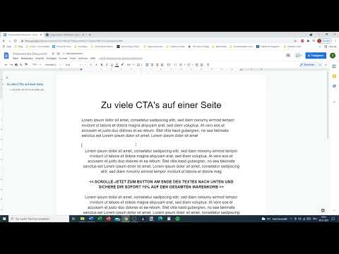
The video is only loaded from YouTube when you play it – data (including your IP address) is then transmitted to YouTube/Google. More in the privacy policy
Main Insights
- Too many Call-to-Actions on one page can be confusing and decrease willingness to purchase.
- Use a maximum of two Call-to-Actions to communicate clear action steps.
- The placement and wording of CTAs should be carefully considered to ensure a positive user experience.
Step-by-Step Guide for the Effective Use of Call-to-Actions
1. Identify Your Goal
Before you start designing your Call-to-Actions, you should clarify the goal of your page. Do you want the user to buy a product, sign up for a newsletter, or inquire about a service? A clearly defined goal will help you align the CTAs accordingly.

2. Avoid Overloading with CTAs
Less is more, especially when it comes to CTAs. Don't be guided by the assumption that more CTAs lead to more sales. In fact, a variety of studies show that too many Call-to-Actions destabilize users' purchasing decisions. Stick to the rule of thumb: maximum of two Call-to-Actions per page!
3. Place the Call-to-Actions Strategically
The placement of your CTAs is crucial. A meaningful location is at the end of the main section or a clear section outlining the offer. But a targeted placement within a long text is also possible, as long as you indicate that the user can scroll down. An example would be: "Scroll down for your special offer!"
4. Maintain Consistency in CTAs
When promoting a product, ensure that all CTAs are kept in a clear, consistent style. Different designs or wording can confuse the user and distract them from the actual action. Stick to a consistent color palette and similar wording to provide clarity.


