
Text on the artboard often looks flat until you give it a little depth. That's exactly what layer effects are for. They apply shadows, edges, or 3D effects directly to a layer, without you having to draw additional shapes. In this tutorial, I'll show you how to set up outer and inner shadows, which controls really determine the effect, and why some effects quickly look cheap. By the end, you'll be able to give text for thumbnails and social media graphics more dimension.
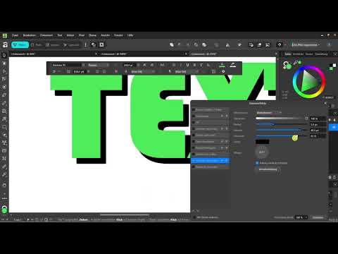
The video is only loaded from YouTube when you play it – data (including your IP address) is then transmitted to YouTube/Google. More in the privacy policy
Key Takeaways
- You can find layer effects in the Layers panel via the FX icon or in the Layer menu.
- Radius, opacity, and offset together determine how a shadow looks.
- High intensity with a small radius looks almost like an outline.
- Inner shadow, 3D effect, and blend modes enhance the spatial impression.
- Too many effects at once quickly look overloaded and unprofessional.
Step-by-Step Guide
Step 1: Create and select text
Use the Text tool to write a short text on the artboard. It doesn't have to be big or perfectly formatted, because this is about the effects and not the typography. Then make sure the text layer is selected in the Layers panel. Effects always apply to the selected object. You can refine the font choice later at your leisure.

Step 2: Find the FX icon in the Layers panel
Look at the right side of the program, at the Layers panel. There you'll find the FX icon. Alternatively, open the Layer menu and choose the Layer Effects entry. Both ways lead to the same dialog with all available effects. Layer effects are one of the most practical tools for creating depth without having to create additional shapes.

Step 3: Activate outer shadow
Select the outer shadow in the effects list. Before you move the sliders, it's best to change the shadow's color first. The default is usually black, and this tone quickly gets lost on dark backgrounds. As soon as the effect is selected, its settings become active, and you can see the effect directly on the text.

Step 4: Control the radius
The radius determines how softly the shadow fades out. A large value creates a diffuse, extended shadow with soft transitions. A small value produces clear, hard edges. Try a few values and watch the preview until the shadow fits the style of your design.

Step 5: Use opacity for intensity
With opacity, you determine how strong the shadow appears. The higher the value, the more the shadow stands out from the background. Low values are often enough for subtle depth. If you need an eye-catching look for a thumbnail, you can deliberately go higher.

Step 6: Set the offset
The offset determines in which direction the shadow is shifted. This lets you simulate a light source. A slight offset toward the bottom right looks natural, while an extreme offset looks more like a deliberate stylistic device. With a text offset, you can make the lettering truly stand out from the background, which works especially well for headlines.

Step 7: Create the outline look
If you combine a high intensity with a small radius, the shadow looks almost like an outline. The text thereby gets a clearly defined edge. Then add a small offset so the effect doesn't look flat. This way you achieve an outline appearance without needing a separate outline effect.

Step 8: Using the Inner Shadow
The inner shadow sits inside the shape and makes the object look sunken in or embossed. You can activate it in addition to the outer shadow. Combining both effects creates a spatial impression that works especially well on larger lettering. However, don't overdo the values, otherwise the text will look busy.

Step 9: Testing the 3D Effect and Bevel/Emboss (Smoothing Edges)
Among the available effects you will also find the 3D effect. It creates a sculpted look with a single click. In combination with some blur and a larger radius, it can deliver exciting results, but it quickly looks overloaded. The Smooth Edges effect softens hard edges and creates gentler transitions. Both effects are easy to experiment with, since you can undo every step at any time.

Step 10: Understanding and Applying Blend Modes
Blend modes determine how the effect interacts with the colors and the design underneath. Usually the mode is set to Normal. Alternatively, you can choose Multiply, for example, which often barely differs from the default with simple designs. For colored motifs, it is worth testing the Negation mode, which inverts the colors and thereby makes the shadow appear less dark. Simply hover the mouse over the modes to see the preview.

Step 11: Adjusting the Fill
At the bottom right of the dialog, you can adjust the fill. This changes how strongly the object itself remains visible. In this way, you can achieve custom looks that go beyond the default settings. Here too, try out several values until the result fits your design.

Step 12: Showing Restraint and Transferring the Effect to the Post
Layer effects only work well in moderation. Used incorrectly, they quickly look cheap or trashy. Therefore, use them deliberately when they serve a clear purpose, such as better readability or more depth. In the next step, you will apply the effects to a complete social media post, and then it will become clear how well your interplay of text and effect works.

Summary – Layer Effects in Affinity Vector: Using Shadows and 3D Effects Deliberately
Layer effects give your texts depth when you use them in measured doses. The outer shadow can be finely controlled via radius, opacity, and offset. With high intensity and a small radius, a contour-like look is created. Inner shadow, the 3D effect, and smoothing edges round out your repertoire. Blend modes and fill give you additional control over the interplay with the design. Moderation remains decisive: fewer effects usually look more professional than too many.
FAQ
Where do I find the layer effects in Affinity Vector?You can find them in the Layers panel via the FX icon or in the Layer menu under the item Layer Effects.
Why is my shadow not visible?Often it is because of the color. The default shadow is black and disappears on dark backgrounds. Change the color so the shadow becomes clearly recognizable.
How do I create a contour-like effect?Choose a high intensity with a small radius and add a slight offset. This creates a clearly defined edge around the text.
What does the Negation blend mode do?The mode inverts the colors of the effect in interaction with the design underneath. With colored motifs, the shadow can therefore appear less dark.
Can I remove an effect again?Yes, you can deactivate the effect or revert it with the Undo command, as long as you haven't taken a new step yet.
Are layer effects suitable for YouTube thumbnails?Yes, they are well suited for bold titles. However, make sure the text remains legible even when displayed small.


