
A gradient can instantly give a flat design depth, without you having to add extra objects. That is exactly why gradients are among the most important tools for logos, social media posts, and graphics. In this tutorial, you'll learn in Affinity Vector how to select colors, create linear and radial gradients, move midpoints, and build textured backgrounds with hatching and mesh gradients. Finally, I'll show you how to apply gradients to text as well.
The video is only loaded from YouTube when you play it – data (including your IP address) is then transmitted to YouTube/Google. More in the privacy policy
Key Takeaways
- The Fill Tool (shortcut G) is the central starting point for all gradients. Be careful not to choose the "Flood Fill" tool.
- Each color stop controls which color appears at a certain point of the gradient. You can add, move, and recolor stops at any time.
- The midpoint determines where two colors mix in equal parts. Moving it changes the entire look of the gradient.
- With linear, radial, and elliptical gradients you achieve different lighting effects. The gradient type therefore determines the visual impact.
- Hatching and mesh gradients are especially suitable for backgrounds. You control density and effect via scaling.
Step-by-Step Guide
Step 1: Choose Colors Deliberately
Before you create a gradient, you should know which colors you need. In the right area of the interface you'll find the color palette with the swatches. The hue itself is usually chosen on the outside of the color wheel, while in the middle of the color wheel you determine brightness and saturation. For example, choose a yellow and then decide whether it should be darker, lighter, or more vivid. This combination of circle and triangle allows you to mix a wide range of shades without searching for long.

Step 2: Activate the Fill Tool
The actual gradient is created with the Fill Tool, which you call up with the G key. The icon shows a rectangle with two points connected by a line. If the tool is missing from the toolbar, right-click on the bar and choose "Customize". Search there for "Fill" or "Area". Be careful not to choose "Flood Fill", because that doesn't create a gradient but only fills an area with one color.

Step 3: Drag Out the First Linear Gradient
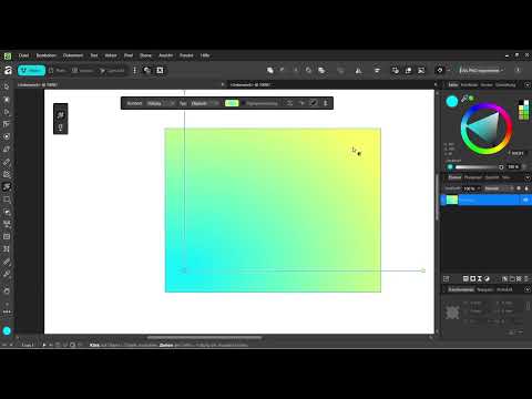
With the Fill Tool activated, click at the spot where the gradient should begin, for example in the top left corner of a shape. Hold down the left mouse button and drag to the opposite corner, for example to the bottom right. The line that is created determines the direction and length of the gradient. The shorter you drag it, the faster the colors change.

Step 4: Set Colors at the Stops
The gradient has a color stop at each of its endpoints. Click on the upper point and choose a vivid blue. Then click on the lower point and set a vivid yellow. As soon as both colors are set, a transition is created automatically. The middle often looks green, because blue and yellow mix here in equal proportions.

Step 5: Move the Midpoint
The midpoint marks the position at which both colors are mixed at exactly 50 percent. If you click on the color and keep the midpoint in view, you can move it. If you set it at 75 percent, for example, the upper area stays blue longer, and the green moves further toward the bottom edge. In this way you can deliberately set focal points in your design without changing the colors themselves.

Step 6: Create Radial and Elliptical Gradients
Besides the linear gradient, other gradient types are available to you. To do this, draw a new rectangle and select the elliptical gradient in the gradient type. It spreads outward from a center and thus creates a light-like effect. You can move the points as well and also set new colors there, for example yellow for one point and blue for the other. Make sure the points go together, because otherwise the gradient quickly looks unsettled.

Step 7: Further refine the gradient with color points
When you set multiple color points, you create a gradient with more gradations. For example, you can leave blue in the upper area, use green in the middle area, and choose yellow at the bottom. The transitions then no longer run only between two colors, but pass through several stations. With a linear gradient, you can also set stops directly on the line by simply clicking on a free spot. This way you design the gradient precisely, even if it already looks complex.

Step 8: Design backgrounds with hatching
It gets especially exciting when you apply gradients to hatching. For this, you use two colors: one for the lines and one for the background. Hatching is particularly suitable for social media posts because it creates an eye-catching background with minimal effort. The scaling is set very high by default. A value of 15,000 percent is therefore usually too much. If you reduce it to about 60 percent, a great many fine lines appear. At 120 percent, the pattern looks looser. This way you add a structure across the entire background with one click.

Step 9: Use mesh gradients for complex backgrounds
A mesh gradient works similarly to a grid. Each grid point can receive its own color, and the transitions between the points are calculated automatically. If you extend the lines between the points, the color spreads further, for example the yellow up to the next point. You can also move points, color a point red, for instance, and add new points. This creates vibrant, organic-looking backgrounds that are well suited for presentations or posters.

Step 10: Adjust gradients and set new points
If a gradient still seems too uniform to you, simply create new points. To do so, click on a spot on the line, and an additional color stop is created. You can color it blue, for example, while the point at the lower end stays yellow. With each additional point, you gain more creative freedom. Feel free to experiment, because you can undo any change at any time.

Step 11: Apply gradients to text
Gradients work not only on shapes, but also on text. Select the Text Tool with the letter T and write your text, for example for an icon or a shop lettering. If you select the text and then drag a gradient over it with the Fill Tool, the entire text takes on the color gradation. You can also design it with your own color points, such as in green and light blue. However, keep in mind that very colorful gradients on text can quickly look overloaded. Therefore, use them rather selectively.

Summary – Color gradients in Affinity Vector: Design modern backgrounds
You have learned how to create linear, elliptical, and radial gradients with the Fill Tool, set color stops, and move midpoints. You also now know how hatching yields structured backgrounds through scaling and color selection, and how mesh gradients create vibrant surfaces. With these tools, you give your designs depth and a contemporary look. It's best to practice on simple shapes before building complex backgrounds.
FAQ
How do I activate the Fill Tool in Affinity Vector?Press the G key or find it in the toolbar, and if it is missing, customize the toolbar via right-click under "Customize".
What is the difference between "Fill" and "Flood Fill"?With "Fill" you create gradients, while "Flood Fill" only places a uniform color in an area.
What is the midpoint of a gradient used for?The midpoint determines where two colors mix in equal parts, and you can move it to adjust the gradient.
Which scaling is suitable for hatching?A value of about 60 to 120 percent usually gives good results, while the default value of 15,000 percent generally produces too many lines.
Can I also apply gradients to text?Yes, select the text and then drag a gradient over it with the Fill Tool to style it with color.


