Brightness and contrast often determine whether an image looks flat or gains depth. In this tutorial, you will get to know the two most important tools for this: Levels and Curves. I will show you how to use both as adjustment layers, when you should choose which tool, and how to use a gentle S-curve to bring more dimensionality to your portrait.
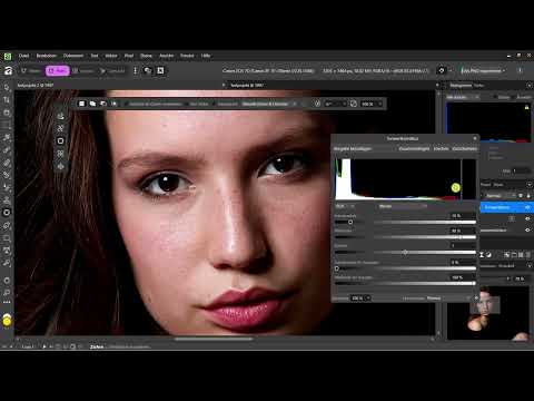
The video is only loaded from YouTube when you play it – data (including your IP address) is then transmitted to YouTube/Google. More in the privacy policy
Key Takeaways
- Levels is suitable for quick, rough contrast adjustments using the black point, midtones, and white point.
- Curves work more precisely because you can control each brightness range individually.
- A slight S-curve darkens the shadows, brightens the highlights, and increases contrast in a natural way.
- You should always apply both tools via an adjustment layer so that your original image remains untouched and you can readjust at any time.
- Don't overdo it. Edits that are too strong quickly look artificial and unconvincing.
Step-by-Step Guide
Step 1: Create an adjustment layer for Levels
Before you change the brightness values, you should make sure that your original image is not altered. To do this, click the half-circle icon in the Layers panel, which stands for adjustment layers. This layer sits over your image like a transparent film, and you can hide or delete it again at any time later.

Next, select Levels from the menu. Pay close attention to the name, because the tools are named differently in English. Levels is the tool you need here. Posterize, on the other hand, is a function for color areas and has nothing to do with what you are planning. It is easy to mix them up here, so it's worth taking a second look.

Step 2: Understand the three sliders
At its core, Levels consists of three sliders: the black point, the midtones, and the white point. The black point determines which value in the image counts as pure black. The white point defines which value counts as pure white. The midtones control the brightness of the middle range. With these three sliders, you can build contrast very quickly without searching for long.

Step 3: Deepen the shadows using the black point
Move the black point to the right. This makes the dark areas deeper, and the image gets more shadow. The shadows consequently look more engaging and striking. You don't have to drag far, because even a small movement has a clear effect.

Step 4: Brighten the highlights using the white point
Now move the white point to the left. The bright areas in the image become brighter as a result, and the highlights gain more weight. Combined with the deepened black point, this creates a contrast that makes the subject stand out much more clearly.

Step 5: Dose with a sense of proportion
Proceed carefully with both sliders. In this example, I shifted the black point and the white point by about ten percent each. That is often enough to breathe life into the image. It is important that you regularly compare your result with the original. The adjustment layer prevents you from going astray here, because you can switch it on and off at any time.

Step 6: Critically check the result
Once you are satisfied with the result, take a close look at the details. In my example, the model's eyes were too dark after the adjustment. So I pulled back some of the black. A typical beginner mistake is to darken the shadows as much as possible because it looks spectacular. However, the result then quickly looks unnatural and is reminiscent of AI-generated images. As a rule of thumb: if an image looks too much like AI, it is usually not particularly successful either.

Step 7: Open Curves
The curves give you more control than the levels adjustment. Here too, you create a new adjustment layer so that your original image stays protected. Hide the previous layer beforehand so that you can judge the effect of the curves in isolation. Then select Curves from the adjustment menu. In English the tool is called "Curves", so pay attention to the correct name here as well.

Step 8: Using the Curve
You now see a diagonal line. It represents the relationship between the brightness values. While holding down the left mouse button, you can set points anywhere on the line and drag them up or down. A point in the upper area brightens the highlights, a point in the lower area darkens the shadows. The big advantage over the levels adjustment is that you can target each area individually.

Step 9: Creating a Gentle S-Curve
An S-curve is one of the classic tricks for more depth in an image. To do this, you pull the shadows down slightly and the highlights up slightly. The midtones remain largely unchanged. The curve thereby takes on the shape of the letter S. The result is a contrast that looks elegant because it doesn't intervene harshly in the tonal areas. It's best to set your points sparingly and move them only a few millimeters. This keeps the effect subtle.

Step 10: Fine-Tuning and Moderation
With additional points you can refine the curve. You can edit highlights and shadows separately and thereby put together many variations. But make sure to keep it in moderation. A slight S-shape is enough in most cases. If you notice you're going too far, drag the points back or reset the curve. Both work at any time, as long as you're working with adjustment layers.

Step 11: Comparing Before and After
It's best to zoom in directly on the subject, such as the face, and toggle the layer on and off alternately. This way you can see which changes actually make a difference. In the example, the curve adjustment looked finer and more detailed than the pure levels adjustment. With the levels adjustment I could have created similarly dark shadows, but not as differentiated. That's why I like to work with curves for finer tasks.

Step 12: Targeting Individual Color Channels
At the top in the dropdown menu of the curves, in addition to the overall channel "Master", you can also choose individual color channels: Red, Green, and Blue. If you raise the red channel, for example, the face becomes warmer. If you lower it, it looks cooler. With this method you can deliberately introduce or correct color casts. If you no longer need a curve, simply remove it again.

Step 13: Outlook on Cinematic Color Grading
The steps so far served primarily to enhance the image and improve brightness and contrast. On this basis, you can develop a cinematic look in the next step. Small color shifts in shadows and highlights are often used for this. The foundation of clean tonal values and a subtle S-curve is indispensable for this.

Summary ??? Levels Adjustment and Curves: S-Curve for More Depth
You have now seen how to quickly control shadows and highlights with the levels adjustment and work precisely with curves. The most important technique is the gentle S-curve, which gives your image depth without looking artificial. Always work with adjustment layers, compare regularly with the original, and dose your edits with feeling. Then your image stays lively and natural.
FAQ
When do I use the levels adjustment and when the curves?The levels adjustment is suitable for quick, rough adjustments with a few sliders. The curves, on the other hand, offer you more precision because you can control each brightness range individually.
Why should I use adjustment layers?Adjustment layers protect your original image. You can hide, change, or delete them at any time and thus check your results flexibly.
What does the black point do?If you move the black point to the right, the shadows become deeper and the image looks higher in contrast.
What does the white point do?If you move the white point to the left, the highlights become brighter and stand out more strongly.
What is an S-curve?An S-curve pulls the shadows down slightly and the highlights up slightly. This creates more contrast and depth without the image looking harsh.
How do I know if I'm overdoing the contrast?Pay attention to details such as eyes or skin tones. If they look too dark or unnatural, you should scale back the settings.
Can I change individual colors with the curves?Yes, via the dropdown menu you can edit the Red, Green, and Blue channels individually and thus deliberately introduce or correct color casts.


