A good photo often still looks flat because highlights and shadows have the same neutral color. With split toning, you separate the two and give each its own color. This creates the depth we know from the cinema. This tutorial shows you the principle, the right color combination, and how to implement it in Affinity Photo in Pixel Persona.
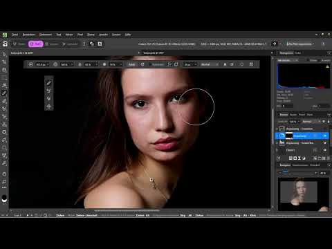
The video is only loaded from YouTube when you play it – data (including your IP address) is then transmitted to YouTube/Google. More in the privacy policy
Key Takeaways
- Split toning tints highlights and shadows separately. The basic rule is: warm highlights, cool shadows.
- Orange and teal are opposite each other on the color wheel. This contrast looks intense but remains harmonious if you use both colors with restraint.
- The color combination has to match the message of the image. Warm feels nostalgic, cold feels like a thriller, and winter images tolerate little warmth.
- In Affinity, you work via an adjustment layer with the Split Toning tool. Hue and saturation always work together, so you should balance both together.
- The Balance slider decides how much of the image's area appears warm or cool.
Step-by-Step Guide
Understanding the Principle Behind the Cinematic Look
Before you reach for the software, it is worth looking at the idea. With split toning, the bright areas of the image get a warm color cast and the dark areas a cool one. This looks like the light of a film scene in which the sun falls warmly on the face and the background in the shade looks bluish. The colors orange and teal are the classic choice here because they sit opposite each other on the color wheel. As a result, they reinforce each other without you having to force a strong effect.

Choosing the Right Color Combination
Orange and teal are not the only option. Warm and nostalgic works with a golden yellow in the highlights and an umber tone in the shadows, which is reminiscent of older films or flashbacks. A cold combination suits thrillers, while a vintage look likewise demands its own tones. What matters is that you first ask what mood the image should convey. A portrait with autumn foliage, for example, tolerates a gentle warmth, while a wintry scene looks out of place with a lot of warmth.

Creating the Adjustment Layer
Now create an adjustment layer so that the change remains non-destructive and you can correct it at any time. In the adjustments menu, you will find two ways: Curves or Split Toning. With curves, you can shift individual color channels in a targeted way. For this tutorial, you will use Split Toning because it controls the highlights and shadows separately and directly, and it shows you how to work with a new tool.

Tinting the Highlights Warm
First adjust the highlights. Here you add a light, warm orange tone. In the example, the hue is at about 13 degrees and the saturation at around 50 percent. Make sure you do not consider hue and saturation in isolation. If you increase the saturation too much, the image quickly looks garish and unnaturally orange. Therefore, work in small steps and watch the result directly on the image. A light touch is often enough to make the photo look warmer and more inviting.

Tinting the Shadows Cool
Then switch to the shadows area and give them a cool teal. You find the right hue by moving the hue slider until the blue-green range is reached. A value in the range of around 180 to 200 degrees serves as a guide. Here, too, the saturation should remain moderate. Make sure the coolness does not spill over the rest of the image and that the skin tones in the brighter areas do not become dull. Especially with studio photos with few shadows, this effect is hardly noticeable at first, which is why you should check the settings on an image with real shadow zones.

Fine-Tuning the Balance
The Balance slider determines how strongly the highlights and the shadows shape the look of the image. Move it a bit toward the highlights if the image looks too cool, or a little toward the shadows if the warmth is too dominant. In the example, the image becomes more harmonious with a bit more orange instead of yellow and a slightly reduced shadow area. Feel free to try out several variants, because every subject reacts differently. Keep in mind that the color should support the message of the image and not overpower it.

Compare the result with the original
Finally, briefly turn the adjustment layer off and on again. In comparison, the original image often looks pale and colorless, while the edited version clearly looks like film. You should make this direct comparison with every color correction, because your eye quickly gets used to a color change. Only this way can you tell whether the effect actually works or has simply turned out too strong.

Summary – Split Toning in Affinity: Creating a Cinematic Look with Orange and Teal
Split toning is the key to a cinematic look. You tint the highlights warm and the shadows cool, choose a color combination that suits the mood of the image, and work with hue, saturation, and balance in small steps. At the end, you use a before-and-after comparison to check whether the effect is right. Restraint in particular decides whether the look appears refined or overdone.
FAQ
Why do orange and teal work so well together?Orange and teal are opposite each other on the color wheel. This creates a strong contrast that still looks harmonious when both colors are used subtly.
Can I also use split toning with other colors?Yes, for example for a nostalgic look with golden yellow and brown or for a cool thriller look. What matters is that the choice of colors suits the message of the image.
Why should I adjust hue and saturation together?Both values work together. Too high a saturation quickly makes the color look garish or unnatural, even if the hue is right.
What does the balance slider do?It shifts the influence of the colors between highlights and shadows. This way you determine which area of the image appears more strongly tinted.
Why should I use split toning instead of curves?Split toning separates highlights and shadows directly and is often quicker to control for this look. Curves, on the other hand, offer finer control over individual color channels.
Why is a studio image not ideal for this example?Studio images usually have hardly any shadows and no background. As a result, the effect of the cool shadows is weaker than it would be in a real scene.


