
You took a portrait in poor light at a high ISO, and now the image in the Develop module looks more like a problem than a result? That's exactly what this practical example is for. I'll show you how I edit a photo that was taken in a hotel at ISO 1600 and an aperture of 1.6. The subject is challenging because noise, blur, and a dark room all come together. But that's precisely how you learn which sliders matter and where you'd better not overdo it.
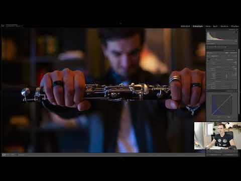
The video is only loaded from YouTube when you play it – data (including your IP address) is then transmitted to YouTube/Google. More in the privacy policy
Key Takeaways
- Before editing, choose the sharpest image by working in the Compare view.
- Start with the white balance, because the color impression influences all further decisions.
- Set the exposure and tonal values so that the image looks coherent, even if the histogram doesn't look ideal.
- Always sharpen before denoising, so you don't have to denoise again afterwards.
- Only crop if you are cropping significantly, and leave enough space when shooting.
Selecting the Image with the Compare View
Before you touch any sliders at all, it's worth taking a close look at your series. With blur, the difference between two shots is often bigger than you'd expect at first glance. Open the Compare view by clicking the icon or pressing the N key. There you can check several images side by side. With my subject, the hands were noticeably sharper in one of the images, and the clarinet in the background looked more even. Mark the best image with the P key.

The Workflow in the Develop Module
In the Develop module, you can rearrange the panels. Personally, I keep the default order, because it suits the way I work. I start with the white balance because that lets me best judge the look of the image. A photo that is too red or too blue is hard to evaluate if you're already working on contrast and sharpness.

The Background as an Aid
Before you set the white balance, it can be helpful to set the background to a dark gray. It distracts less, and you judge the colors more clearly. Black was too strong for me; a neutral dark gray worked well in this case.

Adjusting the White Balance
The automatic setting often delivers a usable starting point, but in this case the result looked too cold. In a warm room with wood and bookshelves, you want to preserve the atmosphere. I therefore shifted the temperature slightly toward warm until the image no longer looked so red. Overdoing it quickly looks like an incorrectly exposed basement room. With a small step, the character is preserved.
After that, you can use the tint. This is the color shift between green and magenta. I pulled it minimally toward magenta because the light source in the background looked slightly reddish. The value here was about plus three. So in the end I made the white balance a bit warmer once more, because I had previously chosen it a bit too blue.


Optional: Black and White
If you decide on a monochrome rendition, you can edit the image in black and white first. Then you don't have to think about color. The white balance can always be added later.

Exposure and Tonal Values
Now comes the exposure. I reduced it slightly so that the image doesn't blow out. With high ISO values this is important, because noise and loss of detail can appear very quickly if you pull a slider too far. Also make sure that the dynamic range is still there.
For the shadows, I pulled the Blacks slider down a bit so that the dark areas regain contrast, and then eased it back a little. With the Whites slider, I slightly darkened the bright areas. This keeps the highlights from looking overexposed.


Vibrance and Saturation
When you increase vibrance, you often see the white balance more clearly. In my image, there was a lot of blue from the side and a lot of orange from the room. I therefore corrected a little bit warmer again. In the end I reset the vibrance, because the image looked too colorful with it. White balance at high ISO values is precision work, and sometimes less is more.


Straightening and Cropping
If you have a clear line in the image, such as the clarinet, the Crop tool is worthwhile. Use the Angle tool to draw a line along the instrument. With prominent lines, even a few millimeters of tilt are noticeable. Either the image is exactly straight or deliberately tilted; anything in between looks flawed.

Contrast, Clarity and Dehaze
For this subject I skipped Clarity because it looks too strong. Dehaze would also amplify the noise. Instead, I worked with the Contrast slider and chose a value of around 10. Keep in mind that this makes the image darker.

Exposure for Mood
The histogram probably looks unusual for this photo, and that is not a problem. If you made the image correctly bright, the mood would be destroyed and the noise would become extremely visible. With low-key photos, an image may be darker, as long as the most important part in the foreground is correctly exposed. I eventually raised the exposure by about plus one, until the image looked right.

Reducing Noise and Sharpening First
When it comes to noise, there is a clear order. I sharpen first, because afterwards I have a better basis for noise reduction. If you reduce noise first and sharpen afterwards, noise quickly reappears, and you have to edit again.
Increase the luminance noise reduction slowly until the background no longer looks very grainy. Make sure the image does not become too soft. In my case, the background quickly looked like butter, and the hands lost their texture. The photo may keep a little grain, because otherwise it looks artificial.


Cropping with Sufficient Margin
In this composition, the hands should be centered, and the clarinet was previously slightly cut off. When you crop, crop clearly. A millimeter of cut-off edge looks like a mistake. It is better to leave more space when shooting and then crop generously.

Color Corrections in Highlights and Shadows
Finally, I fine-tuned the colors. Yellow and green dominated in the highlights, which looked unappealing. I therefore chose a more bluish tone with the color values in the highlights, but only minimally. Hold down the Alt key so that you can see the saturation on the slider. In the shadows, I added a slight yellow-green. The effect is subtle, and that is exactly what is crucial.

Vignette and Conclusion
A slight vignette emphasized the center of the image. Here too: only minimally. At high ISO values, the image reacts sensitively to every slider. What works without problems at 100 percent in sunlight can quickly look exaggerated here.

At the end, I tried the transformation with the Upright function to straighten the background. However, it rather ruined my crop, and the edges were not detected cleanly. That's why I decided against it.

Finally, you mark the finished image green with the key 8. This helps you keep track in large catalogs. A before-and-after comparison shows you at the end how much has changed. With this photo, the difference is not huge, but the mood feels more coherent.


Summary ??? Editing a High-ISO Portrait in Lightroom Classic: Step by Step
A portrait shot at high ISO and in poor light requires patience and restraint. First choose the sharpest image, then correct the white balance so that the atmosphere is preserved. Exposure, tonal values, and contrast follow, before you deal with the noise. Sharpen first, denoise afterward, and crop cleanly. Every slider has a stronger effect at a high ISO value, so it pays to work in small steps.
FAQ
Why should I sharpen first and then denoise at high ISO values?If you denoise first, the image becomes soft, and sharpening afterward amplifies the remaining noise. If you sharpen first, you have a better foundation and can then denoise in a more targeted way.
How can I tell if I have gone too far with noise reduction?Pay attention to the background and to skin tones or structures such as hands. If they look like butter or lose all detail, you have reduced too much.
Is it okay for a photo to sit to the left in the histogram for low-key shots?Yes, as long as the main subject is correctly exposed and the mood suits the image. A dark touch is intended in low-key photos; underexposure is something else.
Why is white balance so difficult in this photo?The room contains mixed light sources, such as blue side light and warm orange from the wood. This mixture makes an exact correction a matter of fine-tuning.


