Diagrams are more than just visual aids; they are the key to a clear and convincing presentation. With the right diagrams, you can present data clearly and inspire your audience with your ideas. In this guide, you will learn how to efficiently use various types of diagrams in PowerPoint to optimize your presentations and convey your message persuasively.
Key Insights
- Diagrams help to present complex information understandably.
- PowerPoint offers various types of diagrams, including pie charts, line charts, and bar charts.
- Customizing diagrams is intuitive and allows for quick editing of data.
Step-by-Step Guide
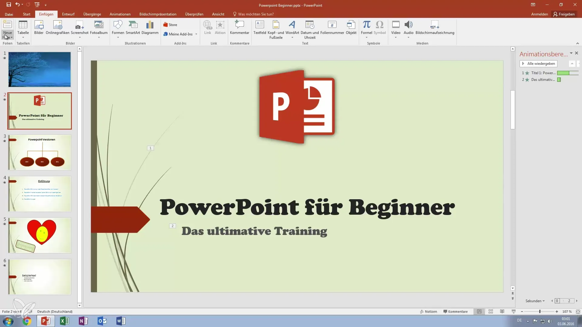
First Step: Create a New Slide Start by creating a new presentation slide. You can choose a blank slide to provide space for your diagram. Make sure the design of the slide matches your presentation topic.

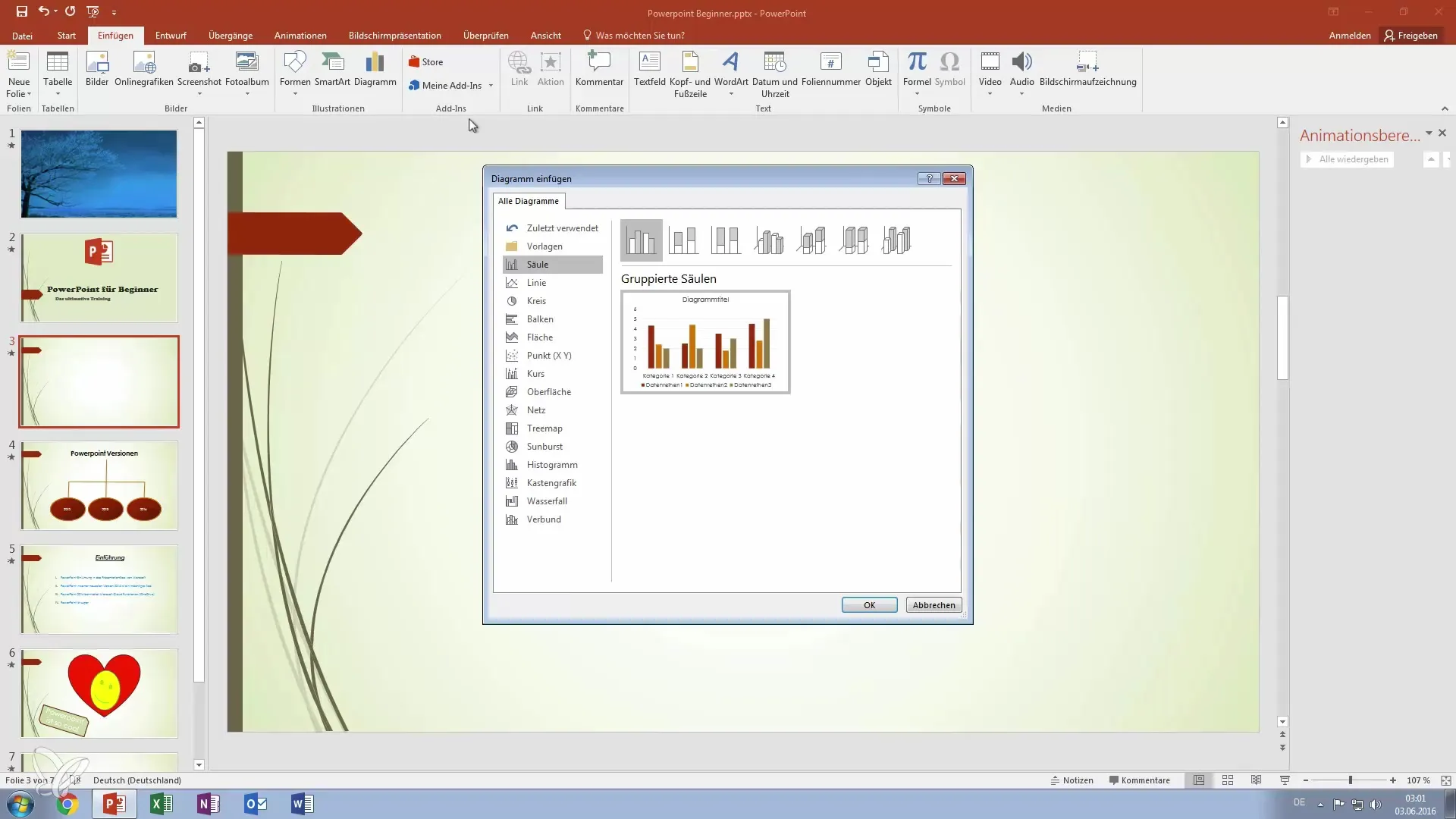
Second Step: Insert Diagram Navigate to the "Insert" tab. There you will find the option to insert diagrams by selecting "Illustrations." Click on "Diagram" to open the diagram window. Here, you have various types of diagrams to choose from, which you can customize according to your content.

Third Step: Choose Diagram Type Decide on the desired type of diagram. PowerPoint offers you various options like pie charts, bar charts, or even 3D charts. Each of these diagrams has its own strengths, depending on the type of data you want to present.

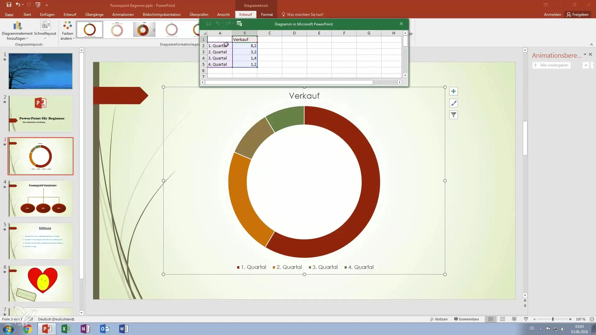
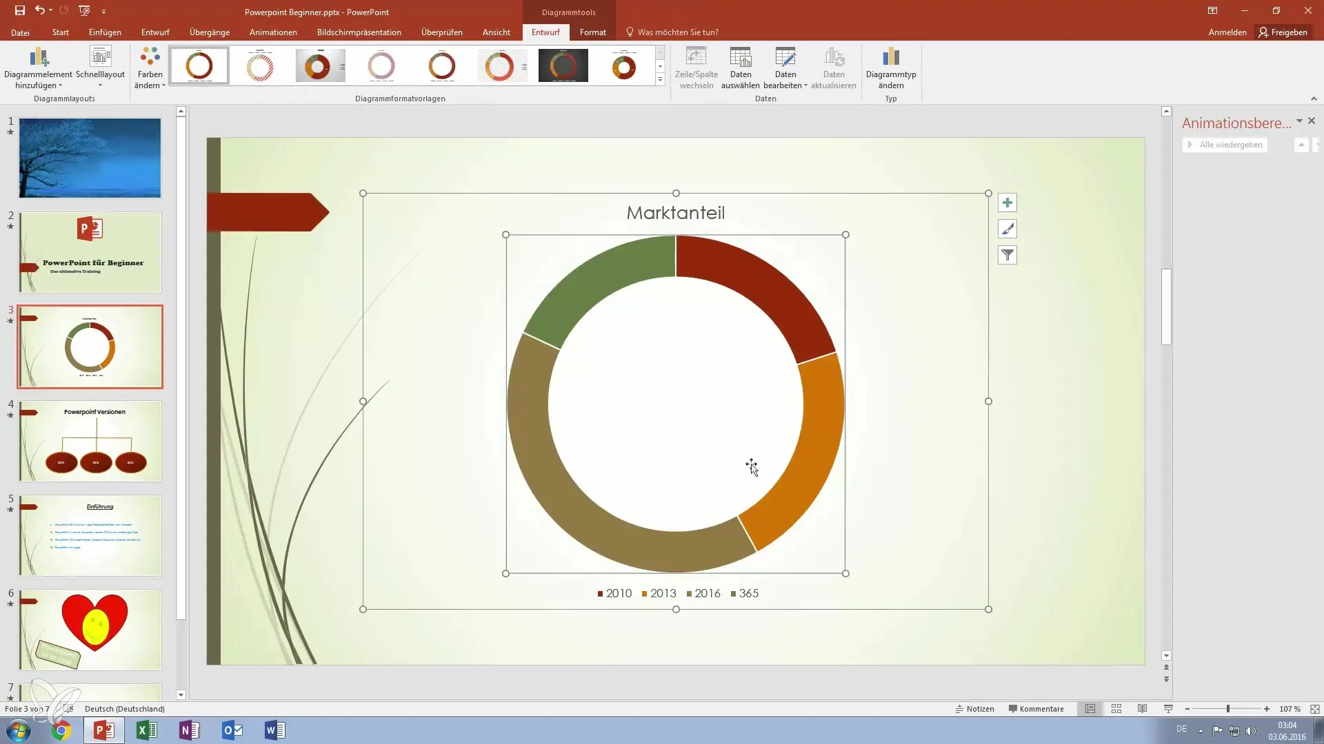
Fourth Step: Enter Data After selecting a diagram type, a small Excel window will open where you can enter the data for your diagram. For example, you can enter the market share of different PowerPoint versions to achieve a clear visual representation. Be sure to capture the relevant data for the desired quarters.

Fifth Step: Adjust Data As you enter the values, the diagram will update in real-time. You do not have to worry about the exact sum of 100% – PowerPoint automatically calculates the shares and adjusts the colors accordingly. This makes your work easier and enhances the user experience.
Sixth Step: Customize Diagram Once you are satisfied with the data, you can customize the diagram as you like. Resize the diagram to better fit into the existing slide. An appealing layout increases the interest of your audience.

Seventh Step: Make Further Adjustments If you want to make changes to the data later, simply click on the diagram and use the "Diagram Filter" option to access the Excel table again and make changes. This allows you to flexibly adjust your presentation even at the last minute.
Summary – Master PowerPoint Diagrams: Step-by-Step Guide for Impressive Presentations
In this guide, you have learned how important diagrams are in presentations and how to use them in PowerPoint effectively. From creating the slide to customizing the data, you now have all the steps at hand to make your presentations impressive.
Frequently Asked Questions
How do I insert a diagram in PowerPoint?Go to the "Insert" tab, select "Diagram" under "Illustrations," and choose your desired diagram type.
Can I change the data in the diagram later?Yes, click on the diagram, go to "Diagram Filter," and open the Excel table to update the data.
What types of diagrams are available in PowerPoint?PowerPoint offers pie charts, bar charts, line charts, area charts, and more.
How can I adjust the size of the diagram?Click on the diagram and drag at the corners or sides to change the size as desired.
Are the changes in the diagram immediately visible?Yes, changes in the Excel data are automatically and in real-time reflected in the diagram.


