Color brings life to every digital art. In this tutorial, you will learn how to give your character design in Photoshop the right color dynamics. We will focus on how to make your color choices diverse and avoid monotonous moods. We will work from dark to light colors. Let’s jump straight into the creative process.
Main insights
- Always start with the base color before adding details.
- Vary the color intensity and saturation to create depth.
- Use references to achieve realistic color tones.
- Consider light sources to define shadows and highlights.
- Ensure to adjust opacity and blending mode on layers.
Step-by-step guide
Open your current project in Photoshop and work with multiple layers for optimal flexibility. We will start with the base coloring of the astronaut.
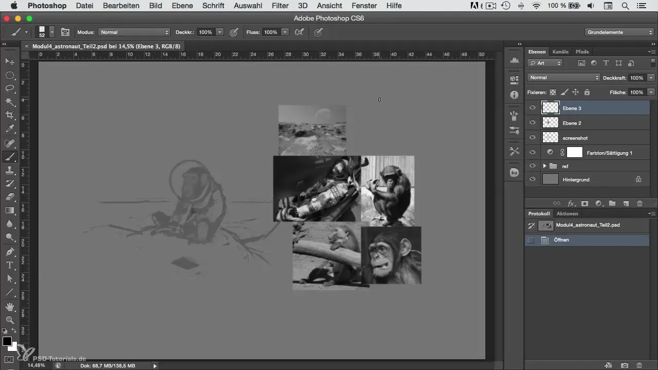
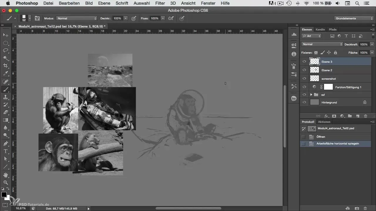
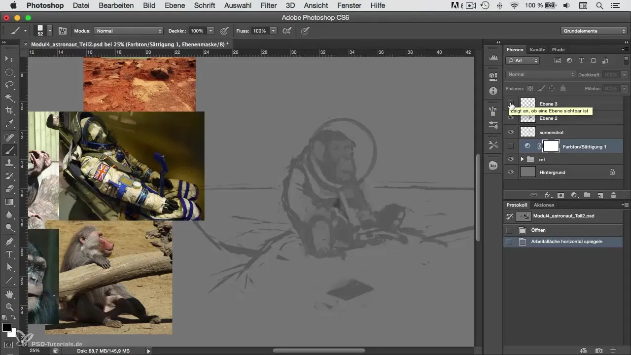
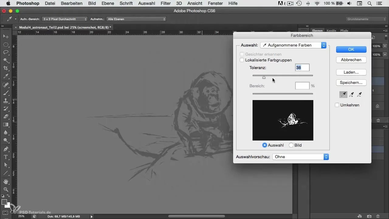
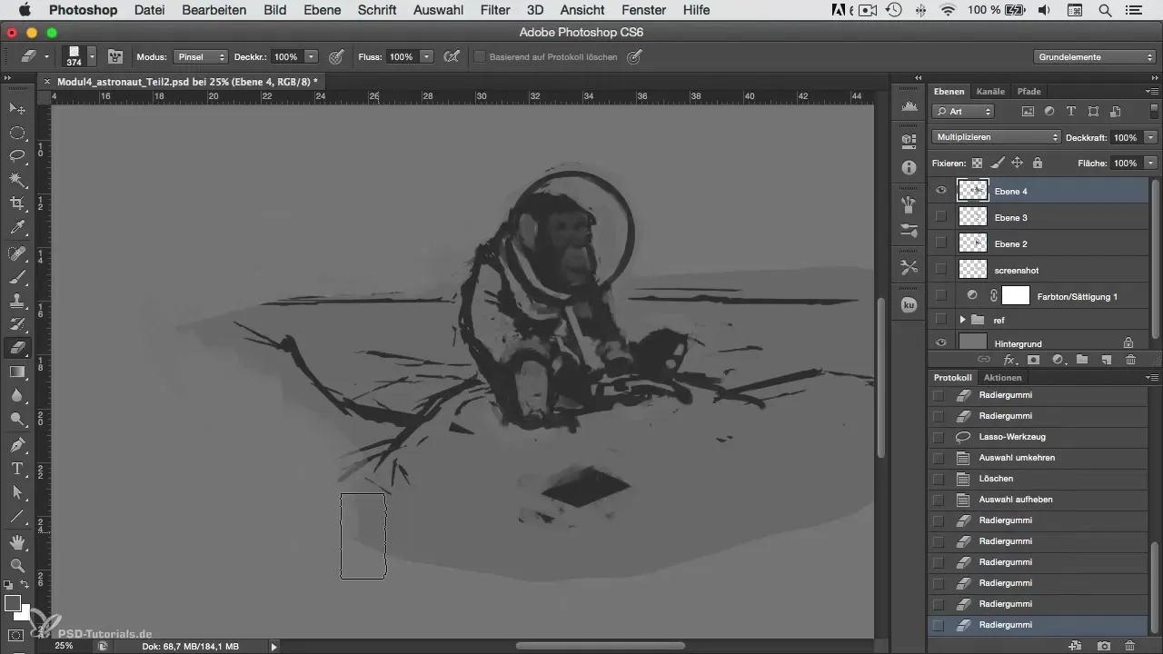
First, hide the background layer to focus on the color selection. Then, consolidate the relevant layers to make them easier to edit. Ensure that the blending mode is not set to "Normal," as this affects the color representation.
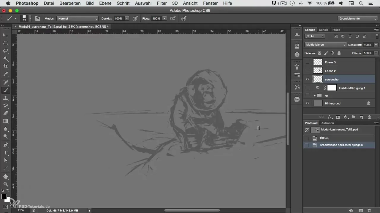
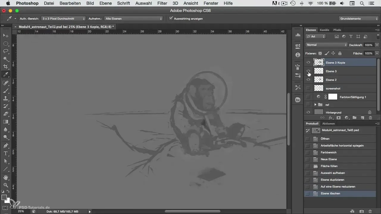
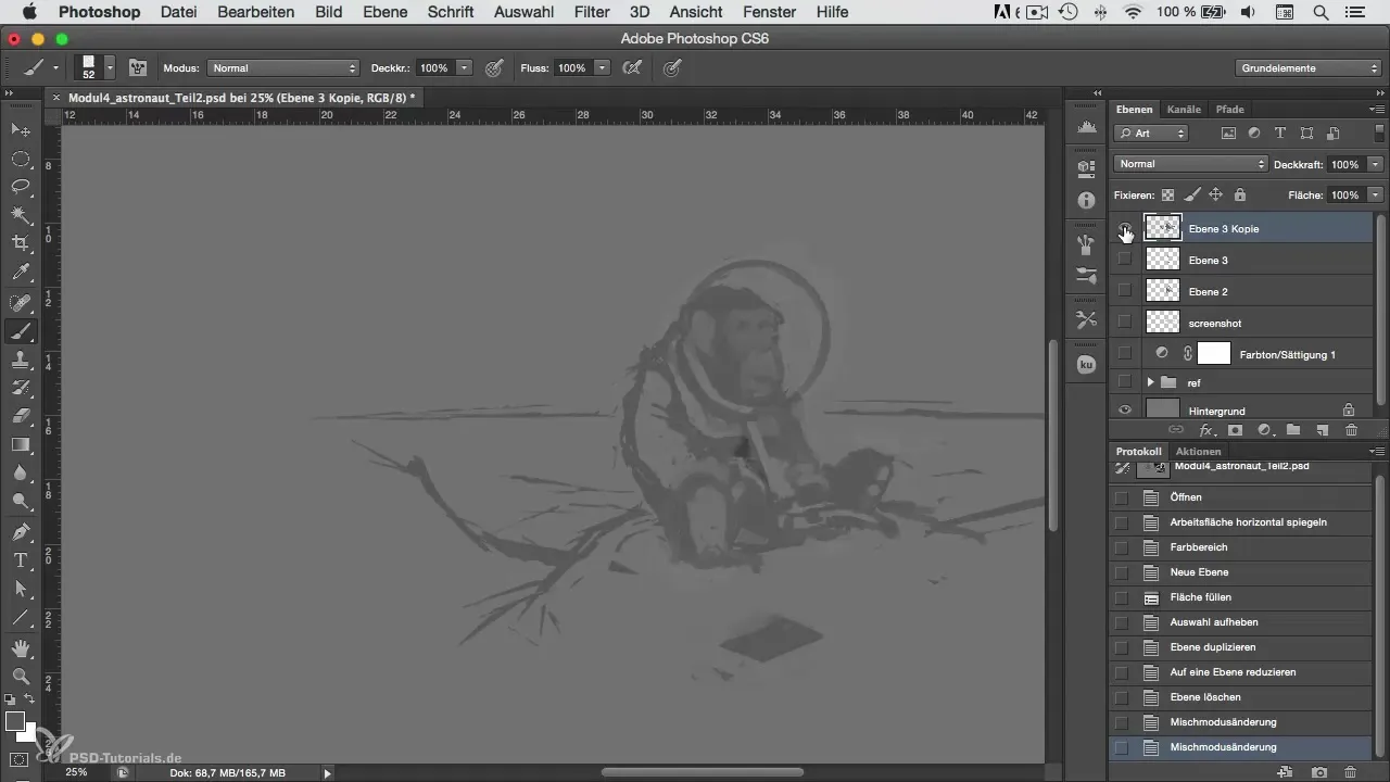
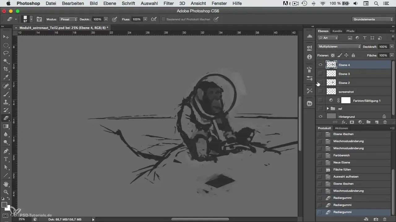
Set the blending mode to "Multiply." Ensure that the background color tone in the image does not shine through too strongly, as this can negatively affect the impact of the chosen colors. It may be helpful to reduce the opacity of the color layer to keep the underlying details visible.
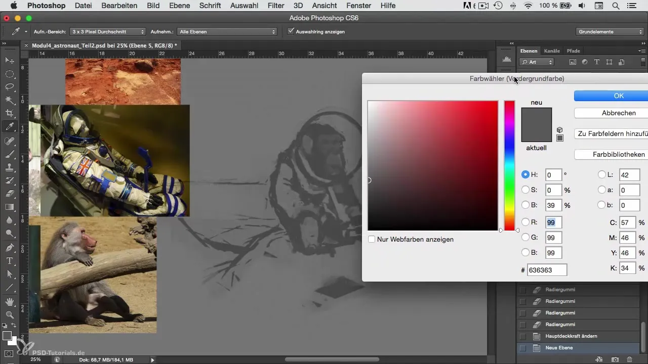
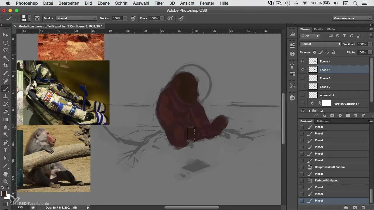
Now, you want to start coloring the astronaut. Choose a base color that you want to use for the suit. Perhaps a bright orange, like real space suits. Fill the base area with this color to create a solid foundation for further color layers.
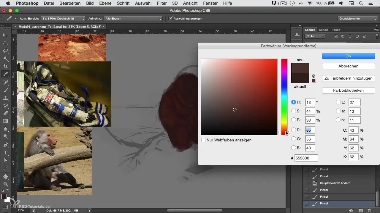
The head of your character should have an appropriate brown to achieve the recognizable monkey look. The color intensity can be increased at this point to create better contrast.
Avoid simply choosing lighter shades of the same color to represent shadows and light moods. Instead, shift the color values in all directions to achieve a varied and realistic color palette.
Consider where the light source will be. A soft light from above can help illuminate certain areas and cast others in shadow. Lightly sketch these light and shadow areas and ensure that the transitions are soft to shape.
Now it’s time to add details. Shadows and wrinkles greatly enhance the depth of your image. Use references of a real space suit to better understand the flow of wrinkles.
For the astronaut's shoes, consider a dark color. White draws a lot of attention and could distract from the main subject. A dark gray or black can work well here to maintain uniformity.
Remember that the wrinkles in the suit should follow the movement. Consider where tension forms in the fabric and how light and shadow interact in those areas. Be careful not to draw too small details as we are not yet in the realm of intricacies.
Once the base colors are set, we can refine the metallic elements, like the helmet or rings. Choose a slightly grayish-green hue for this. This reflects light well and conveys a metallic look.

To add more dynamism to the image, play with the color intensity and brightness here too. A slight variation can make a significant difference in the vibe of your artwork.
Once you have colored all areas, review your color choices and ensure that the colors harmonize well together. When it comes to transitions, pay attention to them and adjust the color tones if necessary.
Summary – Colorful and Diverse – Creating Astronaut Motifs in Photoshop
With a thoughtful approach to colorizing the astronaut, you now have a solid starting point to further enhance the foundational structure of your composition. Choosing colors, considering light and shadow, and playing with the elements make your work more lively and engaging. Use the techniques and tips from this tutorial to refine your coloring process!
Frequently Asked Questions
What should I consider when choosing colors?Make sure the colors are harmonious and support the mood of your work.
How can I increase the depth in my image?Use varied color tones and light-shadow effects to create dimension.
When should I start with the details?Start with details once the base colors and layers are established.
How do I avoid monotonous colors?Experiment with saturation and shift color tones in different directions.
How important are references in coloring?References help you achieve realistic colors and textures and are an indispensable tool in digital painting.


