A RAW photo often looks flat, too dark, or color-shifted right after import. This is exactly where development comes in. In this tutorial, you'll learn how to adjust white balance, exposure, shadows and highlights, as well as clarity and texture step by step. A portrait serves as the example, allowing you to easily follow each slider. In the end, you'll have a clean foundation on which any further editing can build.
The video is only loaded from YouTube when you play it – data (including your IP address) is then transmitted to YouTube/Google. More in the privacy policy
Key Takeaways
- White balance determines whether an image looks too warm or too cool. With the eyedropper, you set a neutral reference point.
- Exposure brightens or darkens the entire image. The histogram shows you how the tonal values shift.
- Shadows bring back hidden details from dark areas, while highlights tame overexposed spots.
- Clarity and texture emphasize details. Used in moderation, they look natural; overdone, they look artificial.
- Only after clicking "Develop" do you switch to the Pixel Studio. Your original RAW file remains unchanged.
Step-by-Step Guide
Step 1: Open the photo and keep an eye on the histogram
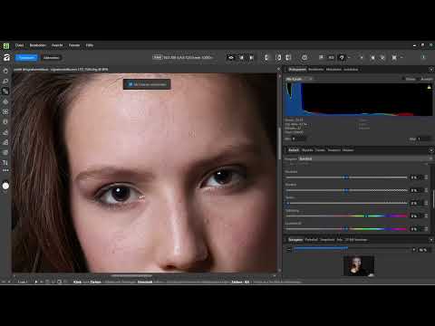
Open your RAW photo in the Develop Studio. The histogram and numerous editing modes immediately appear on the right side. The histogram is your most important control tool, as it shows you how the brightness values are distributed in the image. Enlarge the histogram if necessary so you can see the curve better. To zoom into the image, hold down the Ctrl key and use the mouse wheel. This way you can check details in the face without losing the overview.

Step 2: Set the white balance with the eyedropper
In the right-hand area, open the white balance. Activate the eyedropper, which you can also reach with the shortcut W. Now look for a spot in the image that is as neutral as possible, ideally a gray or white surface. If there is no such spot, choose a slightly gray area, for example in the background. One click is enough, and Affinity automatically adjusts color temperature and tint. Caution is required with skin tones: if you click there, the image quickly looks bluish because the software interprets the skin as neutral. Therefore, always choose an area that is actually color-neutral.


Step 3: Fine-tune temperature and tint manually
The eyedropper provides a good starting point but doesn't replace your eye. When clicking on the skin, in this example you get a tint of about -18 and a temperature just under 4000 Kelvin. Clicking on a gray area, on the other hand, yields a tint of around +5 and 5500 Kelvin, so significantly warmer. You can also enter the values yourself. A value around 5400 Kelvin looks pleasantly balanced in this portrait. With the tint, you should work with feeling. A value of about 10 percent is usually enough. If you go too far, the image tips into pink, yellow, or green. Afterwards, readjust with the sliders if a color cast is still bothering you.

Step 4: Adjust the exposure
In the Exposure area, you move the slider to the right if the image is too dark. The entire image then becomes brighter. If you pull it to the left, it becomes darker. In the example, you increase the exposure to about +0.46 because the photo looked somewhat flat overall. Watch the histogram as you do this, because the curve shifts with every change. You can also adjust the black points, but they react very subtly. To begin with, it's worth working only with the exposure at first.


Step 5: Control shadows and highlights selectively
With the Shadows and Highlights area, you bring back details that disappear in the dark. The Shadows slider brightens dark areas and reveals hidden structures. In the example, you set it to about 5 percent because the original photo was heavily darkened. If you only want to focus on the face, you can also lower the value. The person's black sweater would then, however, disappear more strongly into the darkness. A value around 2 percent preserves the contours of the sweater and still keeps a calm overall impression.
The Highlights slider below it acts on areas that are too bright. It is especially helpful with shiny skin or reflections. If you drag it to the left, blown-out areas become more subtle, and the skin looks softer. In the example, values between -10 and -15 are enough to make the reflections disappear while the image stays natural. If you overdo it, the area quickly looks flat.


Step 6: Use Clarity and Texture in Moderation
In the Details section, you will find Clarity, Texture, and Contrast. Clarity enhances micro-contrast and makes structures more distinct. With a portrait, however, this is tricky, because skin blemishes become visible as well. Usually a negative value, such as -5, is recommended here so that the skin looks calmer. At the same time, you should keep in mind that Clarity also emphasizes the background.
Texture has a finer effect and can be made more focused with a slightly positive value, for example +10. If you set it to 100, truly every pixel and every skin irregularity becomes visible. The image then quickly looks artificial, almost as if it were generated by AI. That is why you use these sliders sparingly. You should also raise Contrast carefully, since it reduces details.


Step 7: Check the Remaining Sliders and Develop the Photo
You can experiment with Saturation and Vibrance. In the example, they remain unchanged because the image is already harmonious. Other options such as Profile are also available and worth a look. Once you are satisfied with the result, click the "Develop" button at the top left. In older versions, it was called "Early Output". After clicking, you switch to the Pixel Persona, and all tools are available to you. Your original RAW file is preserved in the process. You can open it again at any time and adjust the development.


Summary ??? Developing a RAW Photo in Affinity: Setting White Balance and Exposure Correctly
You have learned how to develop a RAW photo step by step. You begin with the white balance and place the eyedropper on a neutral point. Afterwards, you correct Temperature and Tint manually. Exposure brightens or darkens the image, while Shadows and Highlights reveal dark details and tame blown-out areas. You use Clarity and Texture in moderation so that the result stays natural. By clicking "Develop", you hand the image over to the Pixel Persona. The original remains untouched in the process, and you have a solid basis for all further steps.
FAQ
Which point is best suited for the white balance eyedropper?A gray or white area is best suited. If there isn't one, take a slightly gray area such as the background. Skin tones, on the other hand, are unsuitable.
Why does my image look bluish after the white balance?This often happens when you click on the skin. The software then interprets the skin color as neutral, and the correction turns out too cool. Choose a truly neutral spot instead.
How do I know whether my exposure is correct?The histogram shows you the distribution of brightness values. Make sure the curve is not cut off at the edges, because otherwise details are lost.
What does the Shadows slider do?The slider brightens dark areas and makes hidden details visible. However, if the shadows are raised too much, the image looks flat.
When should I reduce the highlights?Reduce the highlights when skin or other bright areas are blown out or shiny. A moderate value such as -10 to -15 usually produces a natural result.
Why should I use Clarity sparingly on portraits?Clarity emphasizes structures and can thereby make skin blemishes visible. For portraits, a slightly negative or restrained value is therefore often more suitable.
Is my RAW file lost when developing?No. The original photo remains unchanged. The development saves your settings separately, so you can adjust them at any time.
What happens when I click "Develop"?The image is transferred to the Pixel Persona and is available there for all further editing. Before that, only the tools of the Develop Persona are available.


