
A logo doesn't always need a symbol or an elaborate graphic. Sometimes a single word that you skillfully distort is enough, and you already have a mark that sticks in people's minds. That is exactly what this tutorial shows you in Affinity Vector. You place text over an existing icon, distort it with a distortion group, and then cut it out of the icon. In the end, you have a standalone logo that can easily be used for social media and other applications.
The video is only loaded from YouTube when you play it – data (including your IP address) is then transmitted to YouTube/Google. More in the privacy policy
Key Takeaways
Key Takeaways
- Text can be adapted to the shape and orientation of an icon via a distortion group.
- Only once you convert the text to curves can you edit the individual letters as vectors.
- With the Subtract option, you cut the letters out of the icon, resulting in a clear, reduced mark.
- Even a simple typeface works as a logo if the shape and distortion are coherent.
Step-by-Step Guide
Step 1: Place the text over the icon
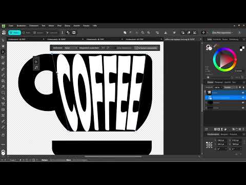
Start with an icon that is already in your document. Select the Text tool and write your word directly on the icon, in this example "Coffee". Since the icon is black, you color the text white so that it stands out clearly. In the example, you set the font size to 100 pixels. This is a good starting value that you can adjust later.


Step 2: Choose the font and fine-tune the position
You probably don't like the default font yet. In the video, Berlin Sans is used, which was already used in the social media post. Make sure you use the same font consistently throughout your entire project. Then you drag the text to the right place so that it sits where it should be on the icon. Using the corner points of the text box, you can adjust the size a bit more until you are happy with the result.


Step 3: Create a distortion group
Now comes the actual trick. The text is still normal text and must first be converted into a distortion group. In older versions of Affinity, this function was found under the effects in the layers. In current versions, you find it via the Vector tab at the very top. There you select the new distortion group and choose the variant with four corners, which is referred to in the video as "Vierer" (the "four").


Step 4: Distort the text
Once the distortion group is active, a frame with corner points appears around your text. Drag the corners up or down until the text follows the shape of the icon. You can also add new points by simply clicking on the frame. These points can then be moved so that you can create curves and bends. This technique is quick to learn, but depending on the desired precision, the fine-tuning can take some time. So don't be discouraged if the first attempt doesn't look perfect.


Step 5: Assess the distortion and adjust if necessary
If you like the deformation, you can leave it as it is. If you are unsure or want to correct some details, select the text again and keep editing the distortion. Make sure the text looks harmonious on both sides of the icon. A slip on one side is particularly noticeable later.

Step 6: Convert the text to curves
So that you can process the individual letters further, you have to convert the distortion group to curves. Select the text, open the Vector tab again and click the Convert to Curves option. After that, the text is no longer a distortion group, but a group of individual vector letters. You can now edit this group like any other vector object.
Step 7: Combine letters into one path
In the layer overview, select all the letters of the group. Since they are vectors, you can combine them into a common path using the Add option. This simplifies the next step considerably, because you then treat the lettering as a single shape.

Step 8: Subtract the lettering from the icon
Now, in addition to the text path, you also select your entire black icon. In the video, overlapping is mentioned at first, but then the Subtract option is used. This is exactly the option that ensures the letters are cut out of the icon. Make sure that you mark the group with the lettering as the object that is subtracted, and not the other way around. The result is an icon in which the letters appear as a cutout.

Step 9: Group the result and reuse it
Combine all elements into one group. You now have a finished icon that you can drag into the document or into other projects. In the video, the result looks rather thin at first, which you should keep in mind. A light variant in white on a dark background can enhance the effect. In addition, shadows and other effects can be added to make the logo look more vivid. Such designs are especially common for social media, even if they do not correspond to the classic approach to icon creation.


Summary – Creating a text logo with distortion in Affinity
You have learned how to place text over an icon, shape it with a distortion group and convert it to curves. Then you combined the letters with the icon and cut them out using Subtract. This creates a standalone text logo that gets by with few means. Experiment with different fonts, distortions and colors, because often it is exactly this fine-tuning that decides how strong the result looks.
FAQ
Do I have to create the icon before the text?No, you can also start with the text. What matters is only that you have both elements in the document before subtracting and that you align their positions exactly.
Why does the text have to be converted to curves?A distortion group is a special form of editing. Only after converting to curves can you process the individual letters further as vectors and combine them with other shapes.
What is the difference between Subtract and Overlap?With Subtract, the selected lettering is cut out of the icon so that a cutout is created there. With Overlap, on the other hand, the shapes are placed on top of each other without anything being cut out.
Can I still change the distortion later?Yes, as long as you have not yet converted the text to curves, you can reopen the distortion group at any time and move the corner points.
Which font is suitable for such logos?In the video, Berlin Sans is used. In general, fonts with clear, bold shapes are especially well suited, because distortions then remain clearly recognizable.


