A pasted-in sky often looks like a foreign object, and most of the time that's not down to resolution, but to light and color. With just a few adjustment layers, you can match inserted elements so that they look as if they came from the same shot. In this tutorial, I'll show you how to match color temperature, saturation, brightness and contrast, and finally tie everything together with a subtle color veil.
The video is only loaded from YouTube when you play it – data (including your IP address) is then transmitted to YouTube/Google. More in the privacy policy
Key Takeaways
- Every adjustment belongs on an adjustment layer, not directly on the pixel layer. That way everything stays editable.
- The adjustment layers must be attached as a clipping mask to the layer you want to edit. Otherwise you change the entire image.
- Color temperature and hue determine whether an element blends into the scene.
- With the eyedropper for the HSL slider, you pick up the color directly from the image instead of guessing it.
- A color veil with very low opacity ties all layers together into a coherent overall image.
Preparing the adjustment layer
Before you move any sliders, you create an adjustment layer. To do so, go to "Adjustments" in the menu and select White Balance. We haven't covered this step yet, but it's the ideal starting point because it sets the basic mood of the colors.


Attaching the adjustment layer to the sky
Now comes the most important step. Hold down the left mouse button on the adjustment layer and drag it directly onto the sky layer. Release it there, and it will be attached to that layer as a clipping mask. You can tell by the fact that it collapses in the layer list and is assigned to the sky, but not to the person layer or your main image.
This binding is crucial. If you leave the adjustment on the wrong area, you change the entire subject, and in the end nothing fits together again. So always make sure the layers are grouped correctly before you continue.

Matching the color temperature
In the next step, you open the color temperature settings. Here you can make the sky warmer or cooler. Move the slider slowly and watch every change. In my example, after a slight cooling the sky looks more plausible against the rest of the image. In addition, there is a somewhat stronger tint that moves the sky closer to the lighting mood of the scene.
Compare your result regularly with the original. To do this, briefly switch the visibility of the adjustment layer off and on again. Often you only notice in a direct comparison that the change is a little too strong. Then it's enough to dial the slider back a bit.


Matching hue and brightness with HSL
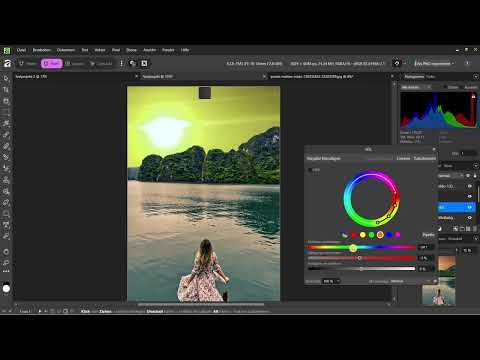
For finer tuning, you use the HSL slider. To do so, select the eyedropper and click with it on a typical spot in the sky. This way you take its color as a starting point, and you don't have to guess which color range is meant.
Then you adjust hue, saturation and brightness. In this example, you increase the saturation and raise the brightness slightly. The sky looks more vibrant as a result and harmonizes better with the colors in the foreground. Switch the adjustment off in between to check the difference. Especially with saturation, it's easy to overdo it.

Setting contrast with a subtle S-curve
If brightness and contrast still aren't quite right, you can additionally use a curves adjustment. A small S-curve lifts the highlights slightly and darkens the shadows. This gives the sky more depth. However, use this step very sparingly, because even a strong curve can make the sky look artificial.

Adding the unifying color veil
The last trick is a color veil over the entire image. To do this, create a new layer, not a rectangle on an existing layer, because otherwise the color ends up in the wrong place. Fill the layer with a color that suits the mood of your scene. In my example, I use a light orange.
The crucial point is the opacity. Set it very low, about five percent in the example. Such a subtle color overlay is barely visible at first glance, but it ensures that all elements share the same hue. This makes the last differences between the inserted element and the original disappear.


Checking the result
Now it's worth taking a look at the overall image. Compare the original sky with the new one. You will often notice that the new sky fits the composition better because it picks up the hues of the foreground.
Also test the effect by switching off all adjustment layers one after another. This way you can see which step really makes a difference and which one only costs computing time. Only when you are sure that every layer contributes something is the composite coherent.

Specifically checking distracting details
Not everything can be solved with color. In my example, the mountain in the background still stands out because its edges don't match the new sky. In such a case, you can consider removing the element entirely. I'm skipping that here, but it is the next logical step. With such spots, pay particular attention to the selection and the edges, because that is where a composite is most likely to give itself away.

Refining the selection
Finally, go through the selection of the inserted sky once more. Messy edges or transitions that are too hard give away any color correction. Refine the mask until the transition looks soft and natural. Only then does the color adjustment look completely convincing.
Summary – Matching a composite: Light and colors in Affinity Photo
A believable composite is created when the color, brightness, and mood of the inserted elements match the scene. You start with the white balance on an adjustment layer, attach it to the sky as a clipping mask, and adjust color temperature, HSL, and contrast. Then you tie everything together with a color veil that has only a few percent opacity. Always check the result by comparing it with the original, and make sure that every layer serves a clear purpose.
FAQ
Why should I use adjustment layers instead of editing directly?Adjustment layers remain editable at any time, and you can correct settings later without loss of quality.
What does the clipping mask do for an adjustment layer?It limits the effect to the layer below, so that, for example, only the sky and not the entire image is changed.
How do I tell whether color temperature and hue are right?Keep switching the adjustment off and comparing the result with the original until the difference looks coherent.
How much opacity does the unifying color veil need?A few percent are usually enough, about five percent in the example, so that the color works subliminally without standing out.
What do I do if an element stands out despite the color adjustment?Check the edges of the selection and consider whether the element should be removed entirely or reworked.


