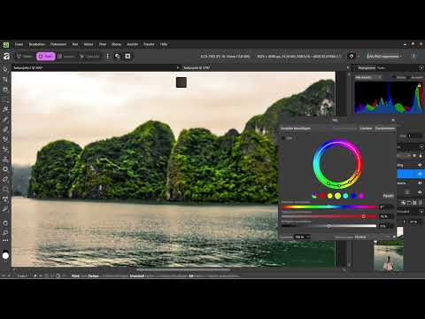
An image only looks like it comes from a movie when light, colors, and contrasts work well together. That is exactly what this practice project is about. You bring together the techniques from this section into a complete look. You won't learn any new tools along the way. Instead, you will see how Levels, HSL, and Split Toning work together to transform a gray starting image into an atmospheric evening scene. Afterward, you can apply the steps to any photo of your own.
The video is only loaded from YouTube when you play it – data (including your IP address) is then transmitted to YouTube/Google. More in the privacy policy
Key Takeaways
- A cinematic grade is created from several adjustment layers that work together.
- Levels bring brightness and contrast out of a flat image.
- HSL allows targeted adjustments, for example to trees, without tinting the whole image.
- Split Toning places the color mood in the highlights and shadows.
- All adjustments remain editable as long as you don't flatten the project into the image.
- Saving the project is not the same as exporting.
Step-by-Step Guide
Step 1: Understanding the Layer Stack
Before you change anything, take a look at the layer stack. Your original image sits at the very bottom. The adjustment layers are stacked above it: Curves, Levels, HSL, and Split Toning. Each of these layers affects everything beneath it, and that is exactly what makes the look flexible. In this project, Curves is switched off because Levels takes over the same task. Duplicate adjustments would only cause confusion.

Step 2: Checking the Effect of Individual Layers
Switch adjustment layers off as a test to see what they actually do. If you disable Split Toning, the image quickly looks boring and flat. If you then also switch off the HSL layer, it becomes noticeably less reddish and has fewer colors overall. This control check shows you how much each layer contributes to the overall result. Afterward, switch the layers back on.
Step 3: Setting Light and Contrast with Levels
The starting photo looks gray because the tonal values are not fully used. So open Levels. It is located further up in the Properties panel, so you may have to scroll. Pull the brightness up significantly to bring light into the image. Then adjust the black levels slightly to gain contrast. Even with these few sliders, the image looks noticeably more vibrant. A quick look at the before-and-after comparison shows you how much a single step already makes a difference.

Step 4: Enhancing Trees Selectively with HSL
Instead of saturating the whole image, you work with HSL with pinpoint accuracy. In the HSL settings, activate the eyedropper and click on a tree in the scene. Affinity then marks exactly the color ranges that belong to it. Now drag the saturation slider to the right and watch which areas change. In the example, mainly the trees react, while the rest of the image remains untouched. You can shift the brightness of the selected range slightly, but you shouldn't overdo it. The hue shift would also be possible, but is deliberately not used in the example. That's why you then reset the values to zero.

Step 5: Split Toning for the Evening Mood
Now the cinematic character comes into play. Open Split Toning and work separately with hues for highlights and shadows. In the example, a warm tint is chosen for the bright areas, reminiscent of dusk. Feel free to try different colors until the mood suits your scene. The effect seems subtle at first, but changes the overall image greatly.

Step 6: Readjusting HSL After Split Toning
After the warm color cast, the vegetation often looks too strong. So return to the HSL layer and use the eyedropper on the trees again. Reduce the saturation to a value around 65 until the green looks natural. Only in the interplay of all layers does it become clear whether the settings are coherent. So always look at the overall image and not just the layer you are currently editing.

Step 7: Fine-Tuning the Cinematic Look with Shadows and Balance
A classic film look often thrives on cool, bluish shadows. If you want a cooler mood instead of the sunset, shift the shadows toward blue in Split Toning. The look then recalls cinema productions like Jurassic Park. Next, shift the balance slightly toward the bright tones and reduce the intensity until the effect doesn't look exaggerated. This fine-tuning determines whether the image looks natural or artificial.

Step 8: Check the Result Layer by Layer
To finish, hide the layers one after another: first the Split Toning, then the HSL layer, and then the Levels adjustment. This way you can see how much each layer contributes to the finished image. This check is always worthwhile before you finish the project, and it is a good exercise for your own work.

Step 9: Save the Project as an Intermediate Step
Save your project before you continue. For a new document, choose File in the menu and then Save. If the project has already been saved, Ctrl+S is enough. With Ctrl+Shift+S you open Save As. Please note: saving only secures your editable Affinity project including all layers. The finished image has therefore not yet been exported as a PNG, PDF or JPG and cannot be uploaded directly to Instagram. A separate section shows you how to export.

Summary – Cinematic Grade in Affinity Pixel: Film Look Step by Step
You have seen how individual techniques become a coherent overall look. The Levels adjustment gives the image light and contrast, HSL makes targeted color corrections possible, and Split Toning sets the mood. The interplay is important: check each layer by switching it on and off, adjust values step by step, and keep the overall picture in view. Save your project regularly, because that is the only way all adjustments are preserved and remain changeable at any time.
FAQ
Do I have to use Curves and Levels at the same time?No, both layers perform similar tasks in the project, which is why one of them is switched off.
Is saving the same as exporting?No, saving secures the editable project, while exporting creates an image file such as PNG or JPG.
Why do I work with the eyedropper for the trees instead of using the saturation slider for the whole image?The eyedropper selects only specific color ranges, so the rest of the image remains unchanged.
Can I still change the color of the trees later?Yes, the HSL layer remains editable as long as the project is not flattened.
How do I check which layer really changes something?Switch it off briefly and on again, as shown in the video with Split Toning and HSL.


