
A flat photo with milky shadows and gray highlights quickly looks lifeless. With just a few steps in Affinity Photo, you can bring more depth and luminosity back to the image. This guide shows you several ways to do it: blend modes, the Develop Persona, an auto correction, and adjustment layers with Levels and Curves. You will also learn when each method is worthwhile.
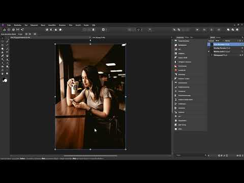
The video is only loaded from YouTube when you play it – data (including your IP address) is then transmitted to YouTube/Google. More in the privacy policy
Introduction
Before you adjust the contrast, you should know how your image is currently structured. This is exactly where the histogram helps you. It shows you where the tonal values lie and makes visible whether the image lacks deep blacks and pure whites. The example in this tutorial is typical: the tonal values sit in the middle, and the dark areas look more milky than rich.
Key Takeaways
- The histogram shows you the tonal distribution and thus the starting point for your contrast correction.
- Blend modes such as "Soft Light" increase contrast quickly and without altering the original image.
- With the Develop Persona, you control black point, brightness, and contrast precisely using sliders.
- Auto correction does the adjustment with one click, but offers less control.
- Adjustment layers such as Levels and Curves can be readjusted at any time. With the "Luminosity" blend mode, you prevent the colors from becoming oversaturated.
Step 1: Use the Histogram as a Starting Point
Open your image and, in the "View" menu, select the "Studio" area and then the histogram. The window shows the distribution of tonal values from black through the midtones to white. If the values lie only in the middle, the image lacks depth and brilliance. Close the histogram panel again afterwards if you don't need it constantly.

Step 2: Create a Copy of the Background Layer
Before making changes, always work on a copy. To do this, select the background layer and press Ctrl + J. Then give the new layer a meaningful name, for example "Blend Mode". This way your original remains untouched, and you can undo or hide each step at any time.
Step 3: Increase Contrast with a Blend Mode
With a layer blend mode, you can increase contrast particularly quickly. Open the blend mode menu and look at the options. They are divided into groups: modes for darkening, modes for lightening, and modes for increasing contrast. For increasing contrast, "Overlay", "Soft Light", "Hard Light", and "Vivid Light" are suitable, for example.
In the example, "Overlay" already delivers a good result, and "Hard Light" looks similar. "Vivid Light," on the other hand, goes too far: the contrast is exaggerated, and the colors become strongly saturated. For this image, "Soft Light" fits best, since it works more subtly and still brings a noticeable increase. Hide the layer once and show it again for comparison to check the effect directly.

Step 4: Strengthen the Effect with a Second Copy
If the first increase isn't enough for you because you're still missing a deeper black and a brighter white, duplicate the layer in "Soft Light" mode again with Ctrl + J. The contrast rises further as a result. If the effect is now too strong, reduce the opacity of the new copy until the result fits.

Step 5: Group the Layers
To keep your layers organized, combine them into a group. Select the top layer, hold down the Shift key, and click the layer beneath it. Then press Ctrl + G and name the group, for example "Soft Light". Afterwards, hide the group completely once so that you can test the next method unaffected.

Step 6: Adjust the Contrast in the Develop Persona
With the Develop Persona, Affinity Photo offers another option that gives you more control. To do this, create a new copy of the background layer, drag it to the top position in the layers palette, and name it "Develop Persona". With the layer active, you then switch to the Develop Persona. On the right side, you'll find sliders for exposure, black point, brightness, and contrast.
The black point determines how deep the dark areas become. Move the slider to the right while watching the histogram. The dark areas move toward deep black. However, don't go too far, because a completely black area looks undesirable in most photos, since details are lost. In the example, it's enough to pull the slider back as soon as the area almost touches the left edge.

Brightness, on the other hand, controls the light areas. Drag the slider to the right so that the light gray tones move toward white. Here too: keep an eye on the histogram.

The "Contrast" slider works differently. It shifts both dark and light areas, but gives you less control over exactly where the tonal values end up. Compared to Black Point and Brightness, you cannot set the tonal values as precisely with it. With the reset icon, you can return to the original image at any time.

In the example, you note down the values of 13 percent for Black Point and 18 percent for Brightness. Then apply the settings via "Develop". The changes then affect the currently selected layer, which is why you worked with a copy.


Step 7: Use Auto Correction as a One-Click Solution
If you need to be quick, Auto Correction helps you. Create a copy of the background layer again, drag it to the very top, and name it "Auto Correction". With the layer active, click the Auto Contrast icon in the toolbar. With a single click, Affinity Photo adjusts the contrast: dark areas become darker, light areas become lighter.

A look at the histogram via "View", "Studio" and "Histogram" shows you what happened. The tonal values were shifted to the left and right, so that the dark values are close to black and the light ones close to white. The method is practical, but you have hardly any influence on the result. It is ideal for quick corrections, but not so much for fine adjustments.
Step 8: Work with Levels as an Adjustment Layer
Adjustment layers offer you the advantage that you can change them at any time. Hide the previous layers and click "Levels" in the adjustment layers menu. The layer appears at the very top of the layers palette. In the background you see the current histogram. Drag the black level slider toward the dark tonal values and the white level slider toward the light tonal values until the histogram sits between the two lines.


The contrast increases significantly as a result, but the colors often become more intense as well. If you want to avoid that, switch the blend mode of the adjustment layer from "Normal" to "Luminosity". The contrast increase then affects only the brightness, not the colors.

Step 9: Fine-Tune the Contrast with Curves
Curves give you the finest control. Add a curves layer via the adjustment layers menu and hide the Levels layer if necessary. Drag the lower handle to the right to darken the dark areas, and the upper handle to the left to brighten the light areas. This compresses the tonal values and increases the contrast.

The big advantage of the curve is that you can set points. Clicking on the line locks the midtones so that they remain unchanged. You can then lower the lower part of the curve further and raise the upper part. This way the midtones stay stable while shadows and highlights are adjusted in a targeted way.

With curves too, saturation often increases. So also set the blend mode to "Luminosity" if you do not like the result with the subdued color intensity. In the example, however, a slight increase in saturation is pleasant, so you can adjust the setting there as you like.
Step 10: Readjust Saturation via a Vibrance Layer
If the colors seem too strong to you after the contrast increase, a "Vibrance" adjustment layer helps. Move the slider a bit to the left to specifically reduce the saturation. This way you keep the contrast you have gained and only reduce the color intensity.

If the combination of Curves and Vibrance belongs together for you, select both layers, press Ctrl + G, and name the group, for example "Curves". This keeps things organized even in more complex projects.
Conclusion: Choosing the Right Method for Your Image
Affinity Photo offers you many ways to adjust contrast. Blend modes and auto correction are quick, the Develop Persona and Levels provide targeted control, and Curves allow the finest adjustment. Which method you choose depends on whether speed or precision matters more to you. It's best to practice on one of your own images to get a feel for the effect of each technique.
Summary ??? Adjusting Contrast in Affinity Photo: Step-by-Step Guide with Layers, Develop Persona, and Curves
You start with the histogram to check the tonal values of your image. Then you work on layer copies so that the original stays protected. With blend modes such as "Soft Light" you increase contrast quickly. In the Develop Persona you control black point and brightness precisely. Auto correction delivers a result with one click. For the finest control, adjustment layers such as Levels and Curves are used, which you link to brightness with the blend mode "Luminosity".
FAQ
Why should I always work with a copy of the layer?A copy allows you to work non-destructively, so the original image remains unchanged and you can undo or hide changes at any time.
When is the "Soft Light" blend mode a good choice?It is suitable for a subtle but noticeable contrast increase without strongly oversaturating the colors.
What is the difference between black point and contrast in the Develop Persona?The black point specifically controls the dark areas, while the contrast slider shifts dark and light together, giving you less control.
Why does saturation often increase when contrast is increased?Many contrast methods also intensify color strength, which is why you can set the blend mode to "Luminosity" to affect only brightness.
How can I reduce saturation after a contrast increase?Add a "Vibrance" adjustment layer and lower the slider until the colors match the desired level.
What advantage does auto correction have over manual methods?It is done with one click, but gives you little influence over the result.


