
Converting a photo to black and white looks like a single click at first glance. But if you want more control over brightness and contrast, you should invest more time. In this tutorial, I'll show you how to create a custom conversion with the Black and White adjustment layer in Affinity Photo. Afterwards, you'll use a layer mask to create a color-key effect in which only a single subject stays in color. The example is a sunflower in front of a portrait.
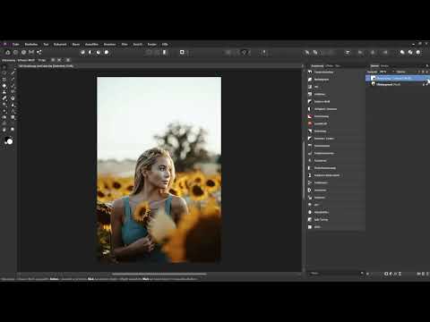
The video is only loaded from YouTube when you play it – data (including your IP address) is then transmitted to YouTube/Google. More in the privacy policy
Key Takeaways
- The Black and White adjustment layer gives you more control than simply desaturating with the HSL layer.
- Each color slider affects specific areas in the image. The red slider, for example, has a strong effect on skin.
- The green slider has hardly any effect in this example and can usually stay at the default value.
- With a layer mask and the selection brush, you can show a single subject in color again.
- Small corrections at the edges with a soft paintbrush ensure a clean result.
Step-by-Step Guide
Step 1: Understanding the Starting Point
Your photo is in the layers panel as a background layer. Before you begin, it's worth looking at the approach you should avoid. Many users simply remove all color from an image. The result usually looks flat and low in contrast, and you have no influence over which areas appear dark or light. To check this, create an HSL adjustment layer and move the saturation slider all the way to the left.

You can see immediately that the sunflower in the image has almost the same brightness as the model's skin. The subject therefore disappears into the overall picture. Delete the HSL layer again before you continue.

Step 2: Creating the Black and White Adjustment Layer
Now create an adjustment layer of the type Black and White. Your image is immediately displayed in grayscale, and the dialog shows you the sliders for the individual color ranges. You will see the colors red, yellow, green, cyan, blue, and magenta. Each slider determines how much the respective color is lightened or darkened in the grayscale version.

With every image you convert, I recommend first moving each slider back and forth briefly. This way you can see directly in the image which areas can be influenced with it.
Step 3: Using the Red Slider for Skin
Start with the red slider. In this example, it has a strong effect on the model's skin tones. Drag the slider to the left to make the skin darker, and to the right to make it lighter. Pay attention to the overall image and not just the face. The sunflowers react as well.

I left the red slider at about 60 percent, because otherwise the background blossoms become too bright. It's a matter of trade-offs here. There is no single correct setting.

Step 4: Using the Yellow Slider for the Blossoms
The yellow slider mainly affects the petals of the sunflower. If you drag it to the right, the petals become very bright and can tip into pure white. You should avoid this, because detail is lost. I therefore moved the slider only slightly to the right, until the petals remained clearly recognizable.

The adjustment with the Black and White layer is much more precise here than with the HSL layer. You can now clearly see the difference between the blossom and the skin color.
Step 5: Deliberately Ignoring the Green Slider
The green slider has hardly any visible effect in this subject. It only changes some edge areas and the background. If you overdo it, unattractive outlines appear. Therefore, leave it at the default value of 100 percent. It's perfectly fine not to use every slider.

Step 6: Controlling the top with the cyan slider
The cyan slider mainly affects the woman's top. With it, you decide whether the garment should appear dark or light. In the example, I first pulled the slider to the right so that the top looks like a light garment. Afterwards, you can use the blue slider to fine-tune the brightness. The magenta slider plays no role in this image, because magenta does not appear in the picture.
In this step, think about which effect you want to achieve. A dark top looks calm and reserved, while a light one looks friendlier.
Step 7: Adjusting color ranges directly in the image
The eyedropper in the black-and-white layer is a practical aid. Click on the eyedropper, then on a desired area in the image, and drag the mouse to the left or right. Affinity Photo automatically detects which slider is responsible for it and moves it accordingly. Personally, I prefer to work manually with the individual sliders, but the eyedropper is a good way to quickly get an overview.
Step 8: Darkening the blossom and fine-tuning the values
Now it's time for the fine-tuning. The blossom stands out better if the cyan range is slightly darkened. To do this, pull the cyan slider to the left and check the result. If you additionally pull the blue slider to the left, the background becomes darker and the subject calmer.

If you like the overall result, check each slider once more. In the example, the yellow slider ended up at about 103 percent. With this value, more detail was visible in the petals, and pure white was avoided. You don't have to reset your values to 100 percent if the image improves as a result. Trust your eye.
Step 9: Comparing the result with the HSL layer
Finally, a comparison is worthwhile. Briefly hide the black-and-white layer and show the image with a quick desaturation via the HSL layer. Then show the black-and-white layer again. The difference is clear, and the individual approach looks considerably more pleasing. Afterwards, delete the HSL layer, because you no longer need it.

Step 10: Creating the color key effect with a mask
Now comes the actual color key effect. An adjustment layer always comes with a mask. A white mask means that the layer affects the entire image. If you paint with black on the mask, the effect is canceled at that spot, and the original colors come back.
For the blossom to stay colored, it must become black on the mask. The easiest way to do this is with a selection. Therefore, briefly hide the black-and-white layer, switch to the background layer, and activate the Selection Brush. You can also reach it with the keyboard shortcut W.

Step 11: Marking the blossom with the Selection Brush
Set the width of the Selection Brush appropriately. In the example, it was 16.3 pixels. Then paint over the blossom. The brush automatically detects the contours and contrast edges of the area. Reduce the brush tip size for details and work your way forward step by step.
If an area you don't want gets included, hold down the Alt key and paint over it. This removes that spot from the selection again. With the space bar, you can navigate in the image without switching tools. Keep checking the edges until the selection sits cleanly around the blossom.

Step 12: Transferring the selection to the mask
Click the mask of the black-and-white layer and show the layer again. The selection remains active. Then choose Edit in the menu, then Fill. Set the color to black and confirm with Apply. The blossom now appears in its original colors. Afterwards, deselect with Control and D.


Step 13: Refining the transitions with the Paint Brush
Now zoom into the image and check the edges. There you will often still find spots that aren't quite right. Choose the Paint Brush, set the color to black, and reduce the hardness so that the transitions become softer. You can leave the opacity at 100 percent. Reduce the size of the brush for fine areas and paint carefully over the edges.

In this way you can also bring smaller color remnants, such as orange areas at the edge, back into the image. Manual work gives you more control than the selection alone.
Step 14: Carefully bring back surrounding colors
In the last step, you can integrate the blossom even better into the image. Select the mask again, reduce the opacity of the Paint Brush, and set the hardness to zero. Enlarge the brush a little and paint with black over the area directly around the blossom. This way you bring a few surrounding colors back into the image, such as some shades of green on the finger. The blossom then looks more harmoniously embedded.

Finally, compare the result with the original image. The difference shows how much control you gain with the right tools.

Summary ??? Black-and-White Conversion with Color-Key Effect in Affinity Photo
You have learned that a black-and-white conversion can be much more than the push of a button. The Black and White adjustment layer, with its color sliders, gives you control over which areas appear light or dark. With the red slider you control the skin, with the yellow slider the blossoms, and with the cyan slider the top. The green slider mostly remains untouched in this example. Afterwards, with a layer mask, the Selection Brush, and the Paint Brush, you created a color-key effect in which the sunflower stands out as the only colored element. Practice the steps on your own photos, and you will quickly get a feeling for which sliders you need for which image effect.
FAQ
Why is the Black and White adjustment layer better than simple desaturation?The Black and White adjustment layer lets you weight each color individually. This allows you to determine specifically how light or dark individual areas appear, whereas simple desaturation removes all colors evenly and often produces flat results.
What happens when I drag a color slider to the right or left?A slider to the right brightens the areas dominated by that color. A slider to the left darkens them. You can see directly in the image which areas are affected.
What is the eyedropper used for in the Black and White layer?With the eyedropper, you click on an area in the image and drag the mouse to the left or right. Affinity Photo then automatically moves the matching color slider, so you can quickly adjust the brightness of that area.
Why shouldn't I drag a slider to the maximum value?Extreme values can cause areas to become pure white or black and lose detail. Unattractive outlines can also occur if you overdo individual sliders.
How does the color-key effect work?You place a Black and White layer over the image and paint black on its mask in the places that should remain colored. This cancels the effect of the layer in those places, and the original colors reappear.
How do I create an accurate selection for the subject?Use the Selection Brush with the W key. Hold down the Alt key to remove areas from the selection again, and the space bar to navigate in the image. A suitable brush size makes working on fine edges easier.
Why should I refine the edges with a soft brush?A hard brush edge often creates visible edges between the colored and black-and-white areas. With reduced hardness, softer transitions are created, and the subject blends better into the overall image.


