
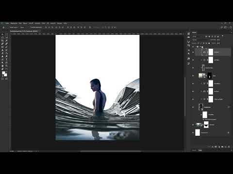
The groundwork is done, and now it gets exciting: woman, façade and skyscrapers come together on a shared canvas. In this tutorial, I will guide you through placing the elements in the composing "The Big City", matching the reflection with a tilt-shift effect, and coordinating the colors using adjustment layers. You need an open composing file with the prepared woman, the façade and the buildings. It is best to recreate the individual work steps in exactly this order, because many decisions depend on each other.
The video is only loaded from YouTube when you play it – data (including your IP address) is then transmitted to YouTube/Google. More in the privacy policy
Key Takeaways
- The canvas is 3936 pixels wide and 596 pixels high. Place all elements on this format before you begin the fine work.
- Hard, bright edges of a reflection can usually be removed without a mask using the Darken layer mode.
- The Tilt-Shift filter on a smart object creates a soft sharpness gradient that makes the reflection look realistic, and it remains editable at any time.
- Color adjustment works via adjustment layers as a clipping mask. Curves, Color Balance and Vibrance allow you to match elements to each other step by step.
- You distort buildings with the smart object via "Edit, Transform, Warp". You remove surplus buildings with a layer mask painted in black.
Step-by-Step Guide
Step 1: Place the façade on the canvas
Start with the white background of the canvas, on which everything important should already be visible on the right. Copy the façade together with its mask into the composing using copy and paste. If necessary, briefly hide and show the mask again while holding the Shift key to check whether the crop is correct. With Ctrl/Cmd + T you can see the frame of the layer and position the façade exactly as it should look in the image later.


Step 2: Organize the reflection in a group
Create a new group above the façade and move the woman, including the hair correction and reflection, into it. This keeps your layers panel tidy and makes later adjustments easier. Then show the group to see the overall image. Nothing matches in color yet, and you will see that the reflection has a rather hard outline with bright edges.
You remove these bright edges by clicking on the reflection layer and switching the layer mode from Normal to Darken. The edges almost completely disappear as a result. Then you reduce the opacity of the reflection to about 80 percent so that it does not look too dominant in the image.

Step 3: Soften the reflection with Tilt-Shift
The reflection should be sharp at the top and become increasingly blurry toward the bottom. To do this, with the reflection layer active, use the "Blur Gallery" filter and select "Tilt-Shift" there. Since the layer is a smart object, the filter remains editable at any time.
In the Tilt-Shift panel, you drag the circle to place the sharpness gradient. The area within the solid line stays sharp, the transition to the dashed line becomes increasingly blurry, and everything outside of it is completely blurred. A value of about 15 pixels has proven suitable for the strength. You can move the lines until the gradient fits your subject exactly.

Confirm with OK. Using the eye icon next to the filter, you can temporarily hide the effect if needed to check the difference. Double-clicking the filter entry opens the settings again.

Step 4: Match the reflection to the image in color
For the color adjustment, you work with three adjustment layers, each as a clipping mask above the reflection. First, apply a Curves adjustment and lift the reflection slightly by raising the shadows minimally. Name the layer meaningfully, for example "Lighten shadows", so that you keep track.

Next comes a Color Balance adjustment layer. Here you edit shadows, midtones and highlights separately. In the shadows, you move the sliders slightly toward cyan, a little toward magenta and clearly toward blue. For the midtones, you shift toward cyan and blue, and for the highlights only subtly toward cyan and somewhat more strongly toward blue. Compare the before and after states by showing and hiding the layer.

Finally, use a Vibrance adjustment layer (also as a clipping mask) to reduce the saturation to about 60. This way, the reflection no longer looks like a separate element but belongs to the scene.
Step 5: Matching the woman's colors
The woman gets the same treatment, but above the hair correction layer. Start with a Curves layer as a clipping mask, with which you raise the bright areas slightly and lower the dark areas slightly. Name the layer, for example, "Brighten".

Next comes another Color Balance layer. In the shadows, you again move toward cyan and strongly toward blue. You leave the midtones at zero, and in the highlights you choose softer values and also move somewhat more toward blue than toward cyan. A final comparison shows you how well the woman fits into the scene. Desaturating via a Vibrance layer to a value of about 60 rounds off the result.

Step 6: Inserting and warping the building
Open the building file, copy the corresponding layer, and paste it into your composite. Place it below the facade layer so that the woman and the facade stay in the foreground. With Ctrl/Cmd + T, you can see the boundaries of the image.

So that the skyscrapers bend toward the center, convert the building into a Smart Object if it isn't one yet, and choose "Edit, Transform, Warp". Using the grid, pull the outer handles so that the buildings look almost circular. Make sure the middle buildings stay rather central and relatively straight.

To bring the tops of the two buildings to a common height, activate the rulers via "View, Show Rulers". Drag out a guide and align the tops with it. Buildings you don't need, you hide for now. With a mask, they can be removed cleanly later. If you no longer like the shape, open the Smart Object again and adjust the grid.


Step 7: Removing distracting buildings and adjusting saturation
You remove a superfluous building on the left side with a layer mask. Choose black as the foreground color, take a brush with medium hardness, and paint over the area. This way, the building disappears without changing the original layer.

Compared to the foreground, the buildings still look too saturated. So you use a Vibrance adjustment layer as a clipping mask again and pull the saturation to about minus 50. The result looks somewhat cooler but retains a subtle blue tone.

Step 8: Creating a white gradient for more depth
So that the foreground stands out better from the background, create an empty layer and name it, for example, "Gradient". Set white as the foreground color, choose a very soft brush in a suitable size, and paint from left to right through the desired area. Holding the Shift key keeps the line straight.

With Ctrl/Cmd + T, you can then distort the gradient further and position it appropriately. Confirm with Enter. Reduce the opacity of the layer to about 95 percent so that a little texture of the background buildings remains visible in the bright areas.
If individual areas look too dark, paint over them selectively using the building's layer mask and a soft, transparent brush with about 25 percent opacity. If you make a mistake, simply correct it with white.
Step 9: Final balancing of the overall image
Finally, you correct the overall picture. A curves adjustment layer at the very top brightens the shadows. To do this, first fix the midtones and highlights before you raise the shadows. A levels adjustment also helps you brighten the right side in a targeted way. Set the darkest black point a bit lighter, for example to a medium gray, and focus only on the building on the right.

Then invert the layer mask of the levels adjustment so that the change is initially invisible. With white and a lower opacity, you now paint specifically over the areas that should be brightened until the building fits harmoniously with the rest of the image.

Summary – Urban Image Montage in Photoshop: Placing and Matching Woman and Building Perfectly
You have now placed the woman, facade and skyscrapers on a common canvas, cleaned up the reflection with the Darken layer mode and transformed it into a natural focus gradient with Tilt-Shift. Using curves, color balance and vibrance layers, you have matched all elements to each other in color. You have distorted the buildings, masked unnecessary parts and strengthened the depth of the subject with a white gradient. With these techniques, you can also build your own composings and readjust individual settings at any time.
FAQ
Question: Why do the bright edges of the reflection disappear after switching to Darken?Answer: The Darken layer mode only shows the darker pixels of the reflection, so bright edges in the image are no longer visible.
Question: Can I change the Tilt-Shift filter afterwards?Answer: Yes, since the reflection layer is a smart object, you open the filter by double-clicking and adjust the gradient or strength at any time.
Question: Why do you work with adjustment layers as clipping masks?Answer: The adjustments only affect the element beneath, so you can color-correct the woman, reflection and building separately from one another.
Question: How do I remove a building without destroying the original layer?Answer: You add a layer mask, paint over the relevant area with black, and can undo the change at any time with white.
Question: What is the guide used for when distorting the buildings?Answer: With a guide that you drag from the activated ruler, you align the tops of the buildings to the same height.


