You use Adobe InDesign to create great documents. Professional typography is essential, especially in long texts. This guide shows you how to optimize effective typography through the use of special characters and specific spaces. Let’s dive in and explore the key features that help you keep your documents clean and reader-friendly.
Key Insights
- Special characters like ellipses and dashes are essential for appealing typography.
- The use of non-breaking spaces prevents unwanted line breaks.
- The "Find and Replace" function in InDesign allows for quick adjustments of special characters throughout the document.
Step-by-Step Guide to Typography Optimization
Start by finding the right tools and characters in InDesign. You have a variety of special characters available that you won't find in other programs. This is the first step to refining your typography.
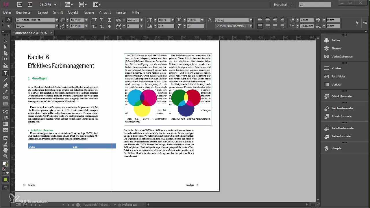
First, you should prepare a snippet that you can insert into your document. A snippet is a small text excerpt that you can use as a template. Place the snippet at the end of your document to integrate it right away.
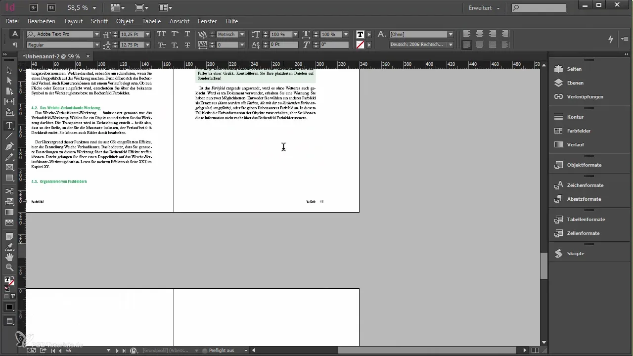
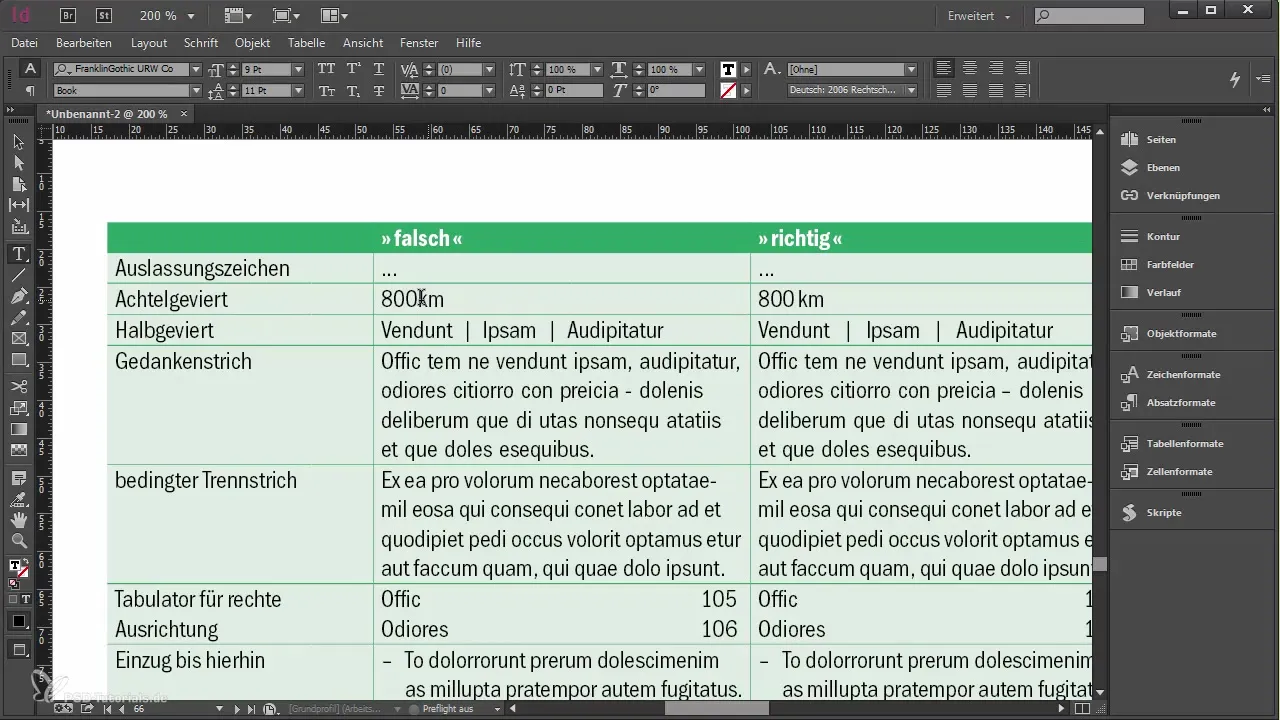
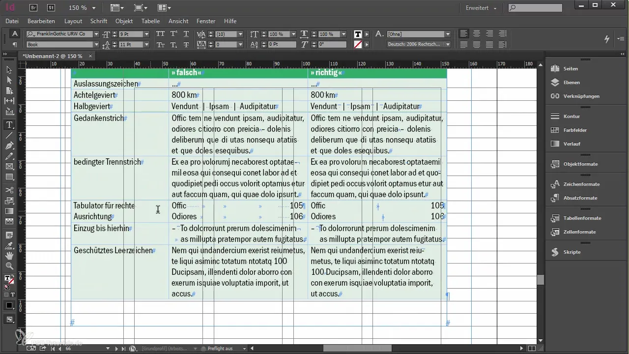
Now you can use the different types of characters you know, including your examples of "wrong" or "right." This helps develop a better understanding of the importance of the right characters.
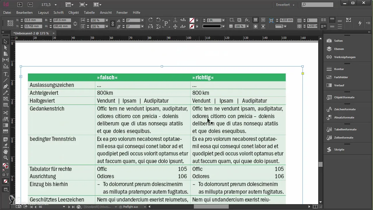
Let’s start with the ellipsis. When you use three dots as an ellipsis, it's important to use the correct character. In forums or when writing, it's easily overlooked, but InDesign offers you a real character for it that looks more elegant.
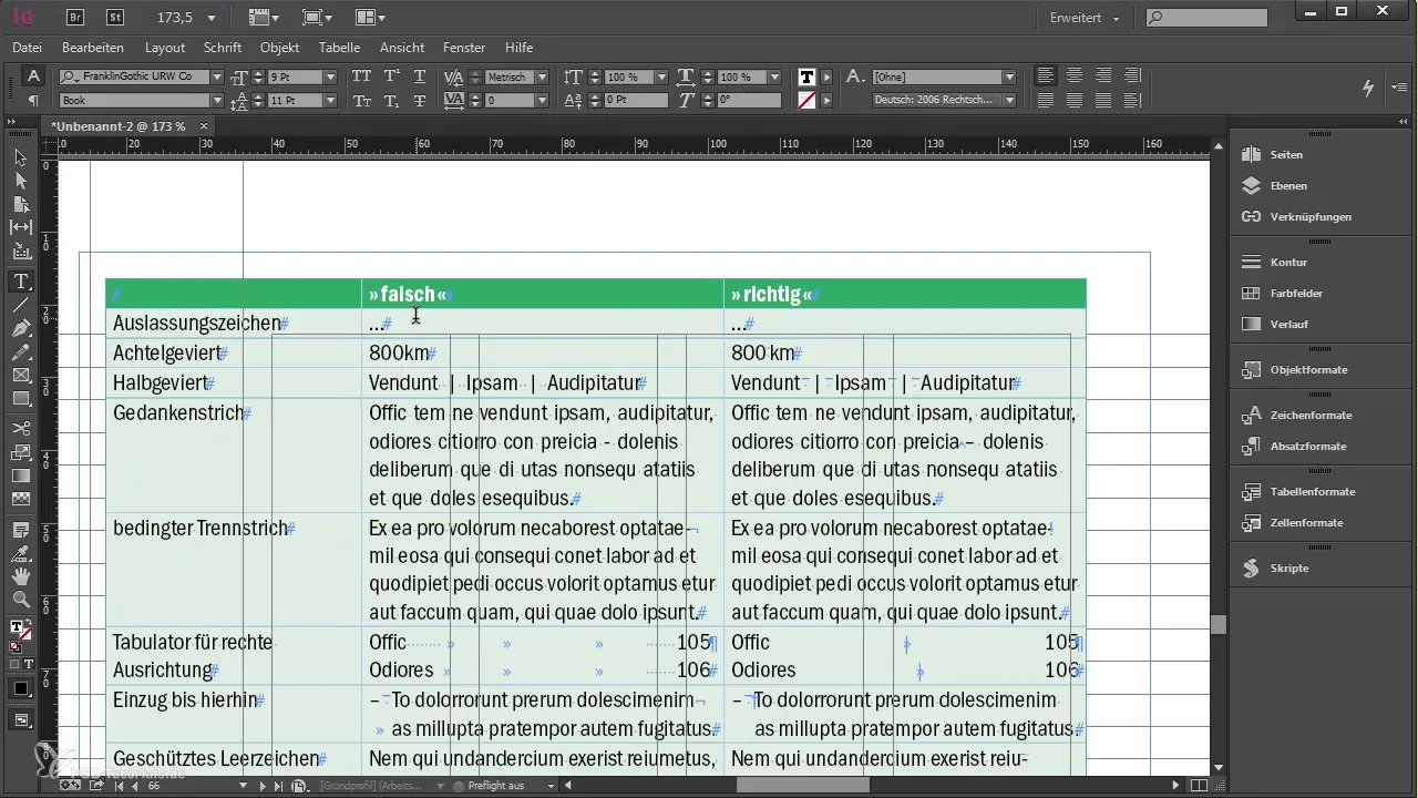
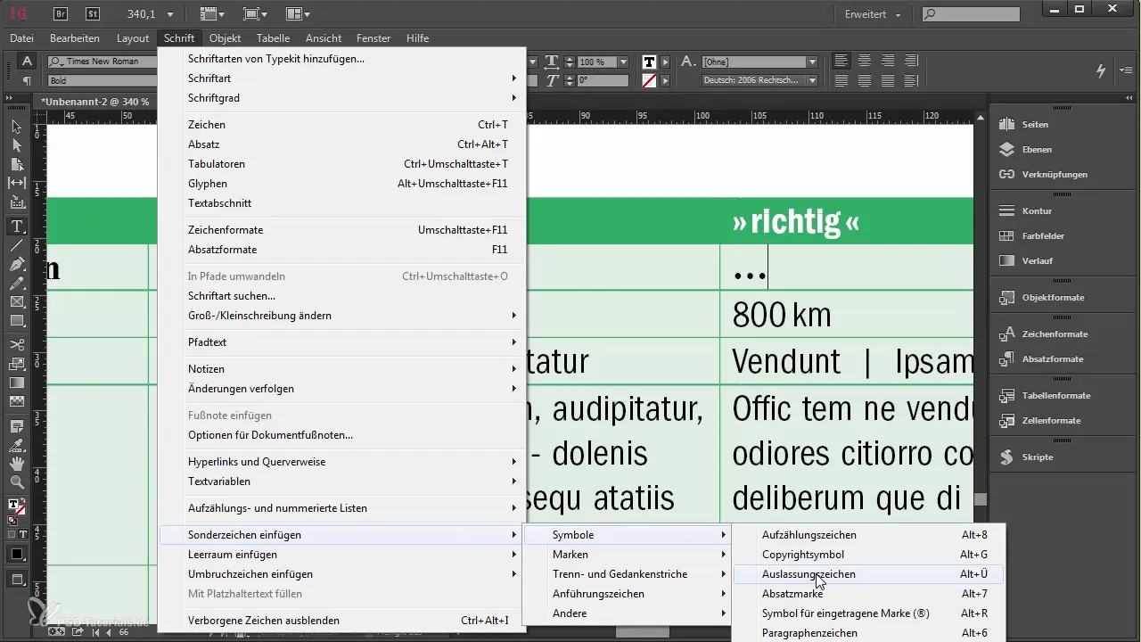
To insert the ellipsis into your text, go to Type > Insert Special Character. Here you will find the option to select the correct ellipsis character.
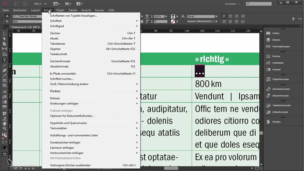
If you don't remember the keyboard shortcuts for this, a quick search in the menu will help. InDesign always shows us the corresponding key combinations that speed up the work.
Another important character is the special spaces. Use a thin space to optimize the distance between numbers and units. This ensures an appealing and clear font when presenting units.
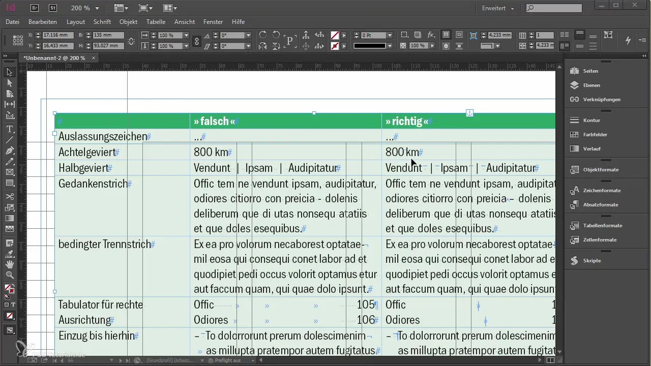
Show the hidden characters again to see where you can use the correct character and adjust the spacing accordingly.
The dash is another important character that appears in many texts. If you can’t avoid using a minus sign, you should replace it with the correct dash to improve your typography.
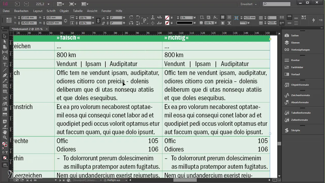
To use the non-breaking space, navigate to Type > Insert Special Character and select the corresponding menu item. The non-breaking space ensures that texts do not break, which enhances readability.
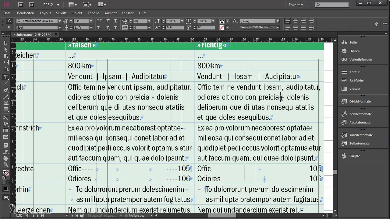
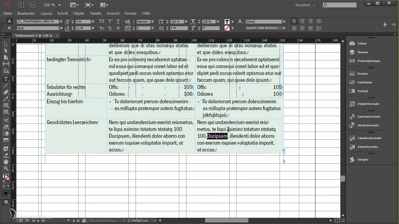
Be aware that the non-breaking space maintains perfect spacing, especially when it comes to phrases that belong together like "100 children".
You can also use the discretionary hyphen to separate words at specific points without cutting them unsightly. This allows for a more appealing layout.
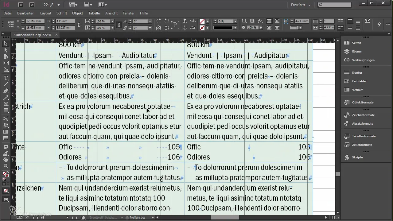
For a special tab for right alignment, make sure to insert the right tab in your text to ensure a clean alignment.
The use of these characters is particularly important for your major project. While you apply the correct special characters, ensure that your work remains both functional and aesthetically pleasing.
Summary
If you consider these steps and tips for typography, you can create a harmonious and professional document in Adobe InDesign. The targeted use of special characters and spaces will elevate your texts to a new level.
Frequently Asked Questions
How do I find special characters in InDesign?You can find the special characters under the menu item Type > Insert Special Character.
What is the difference between a regular minus sign and a dash?A dash is longer and should be used for correct typography, while the minus sign is shorter.
How can I ensure that words do not break into new lines?Use non-breaking spaces to prevent words from being separated.
What is a discretionary hyphen?A discretionary hyphen allows you to split a word at a desired point without it being fixed in the text.


