Color Management can often be overlooked when creating print materials, but it is essential for the quality of recognized printed products. The right color selection and the correct settings contribute significantly to ensuring that the final product meets expectations. In this guide, you will learn how to make effective color settings in Adobe InDesign to achieve optimal printing results.
Key Insights
- The selection of the right color profile is crucial for print quality.
- ECI profiles provide a solid foundation for color management in graphic work.
- Synchronization of the color settings between Adobe applications ensures consistency.
Step-by-Step Guide
Begin your color management journey in Adobe InDesign by first checking and adjusting the basic settings.
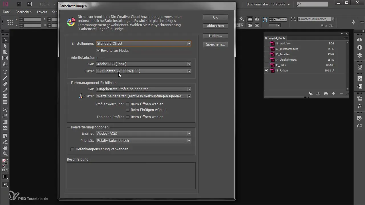
Open Adobe InDesign and navigate to the color settings found in the main menu under "Edit." If you start a new project or open an existing one, it is advisable to consider these settings from the beginning.
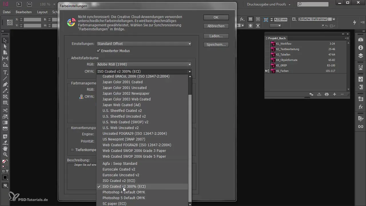
In the color settings, you can make various presets. This includes selecting the working color space. For projects with a high color coverage, for example, you can use the profile "ISO Coated V2 300%." This profile is not included in Adobe by default, so be sure to download it beforehand.

To obtain the necessary color profile, visit the website eci.org. There, you will find a zip file with various ICC files in the download section that you can use for your projects. It is recommended to use the ISO Coated V2 300% profile in case of doubt, as it is widely used and recognized.

After downloading the zip file, you should copy the profiles into your profile folder. For Windows users, this is usually located under "C:\Windows\System32\spool\drivers\color," while macOS users can find the folder under "Library/color/Sync/Profiles."

Once the profile has been successfully placed in the corresponding folder, return to InDesign. In the color settings, you should now be able to access your new profiles. Here, you can also set how InDesign behaves when opening documents that use other color profiles.

An important step is adjusting the conversion options. If you feel that your settings are not sufficient to ensure precise color management, you can also make corresponding adjustments in Photoshop.
The synchronization of your settings across Adobe applications allows you to maintain consistent color management. If you have saved your color settings in InDesign or Photoshop, you can synchronize them via Adobe Bridge.
In Bridge, you have the option to use color management settings that have been saved once in other Adobe applications. When you confirm the changes in Bridge, the new settings are applied globally.

To ensure that you are always working with the same guidelines, you should regularly check the synchronization of your color profiles, especially if you are working on different projects. Ideally, your client or the printing company provides concrete specifications.
Overall, the default settings should serve as a starting point to have a base for your projects. Often, you can achieve good results with the presets already.
Summary
Through the following steps, you have learned how to make the right color settings in Adobe InDesign to achieve the best possible results for your print projects. Be sure to check your profiles regularly and make adjustments if necessary.
Frequently Asked Questions
Question: What is an ICC profile?Answer: An ICC profile defines how colors are represented in digital media and is important for consistency between different devices.
Question: Why should I synchronize my color settings?Answer: Synchronizing color settings ensures that all Adobe applications work with the same color management guidelines, resulting in consistent color results.
Question: Where can I find color profiles for my projects?Answer: You can download color profiles at eci.org. There are various profiles suitable for different printing requirements.


