Passion for photography can often lead you to experiment with different image editing techniques. One of them is the Color-Key effect – a method that is both appreciated and polarizing. While many photographers find Color-Key to be redundant or cheesy, with the right application you can achieve surprisingly aesthetic results. In this guide, I will show you how to create an appealing Color-Key effect with Lightroom, where the play with colors and contrasts takes center stage.
Key Takeaways
- Color-Key doesn’t always have to be black and white with a single color; it can also include subtler color nuances.
- The use of saturation and luminance in Lightroom plays a crucial role.
- You can personalize your color looks to achieve the desired effect.
Step-by-Step Guide
Let’s get started with your image. I will show you step by step how to proceed.
Step 1: Prepare Image Editing
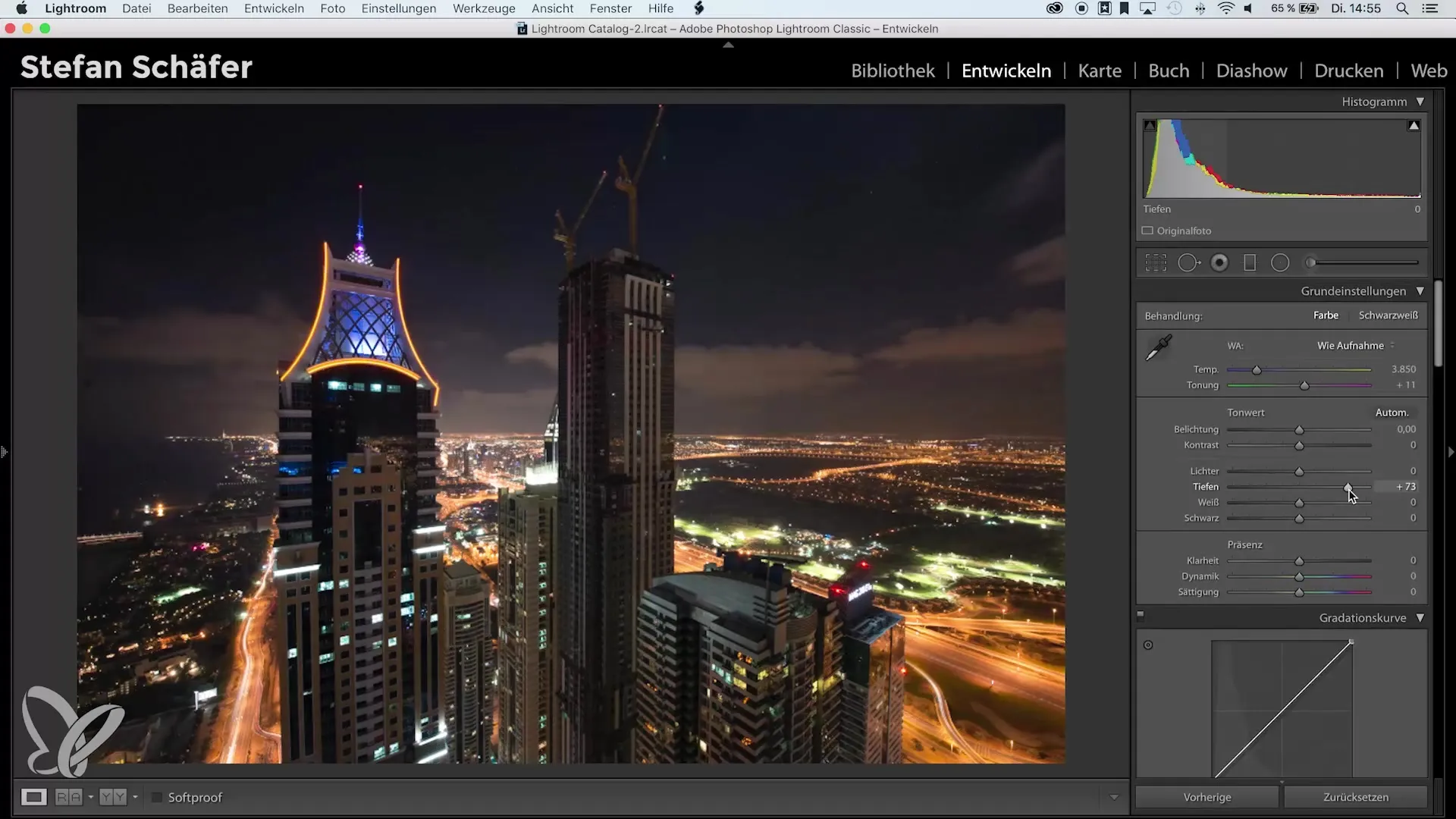
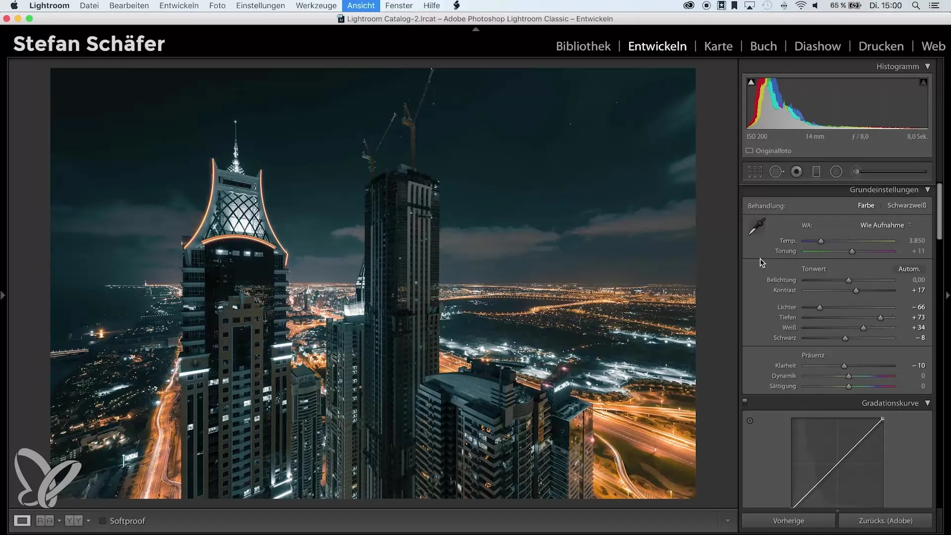
First, open the image in Lightroom and go to basic image editing. Since your image comes from a slightly brighter environment, start by adjusting the shadows and highlights.
Lower the brightness of the highlights to avoid overexposure and raise the shadows to gain more details. A value of -66 for the highlights and a moderate increase in the shadows will help you achieve a balanced image.

Step 2: Adjust White Point and Black Value
To give your image more depth, now focus on the white point and black value. Hold down the Alt key while adjusting the white point to identify the 100% white pixels. The histogram should touch the right edge during this process.
Continue with the black values by pulling them slightly into the negative to achieve true 100% black.
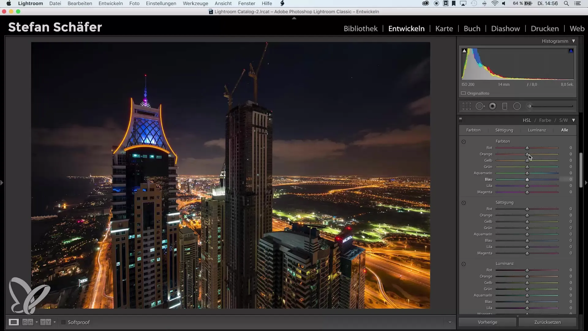
Step 3: Basics in the HSL Table
Now to the heart of the Color-Key: the HSL (Hue, Saturation, Luminance) table. Navigate to this option and start desaturating the colors in the image. Focus mainly on the hues that you do not want to highlight.
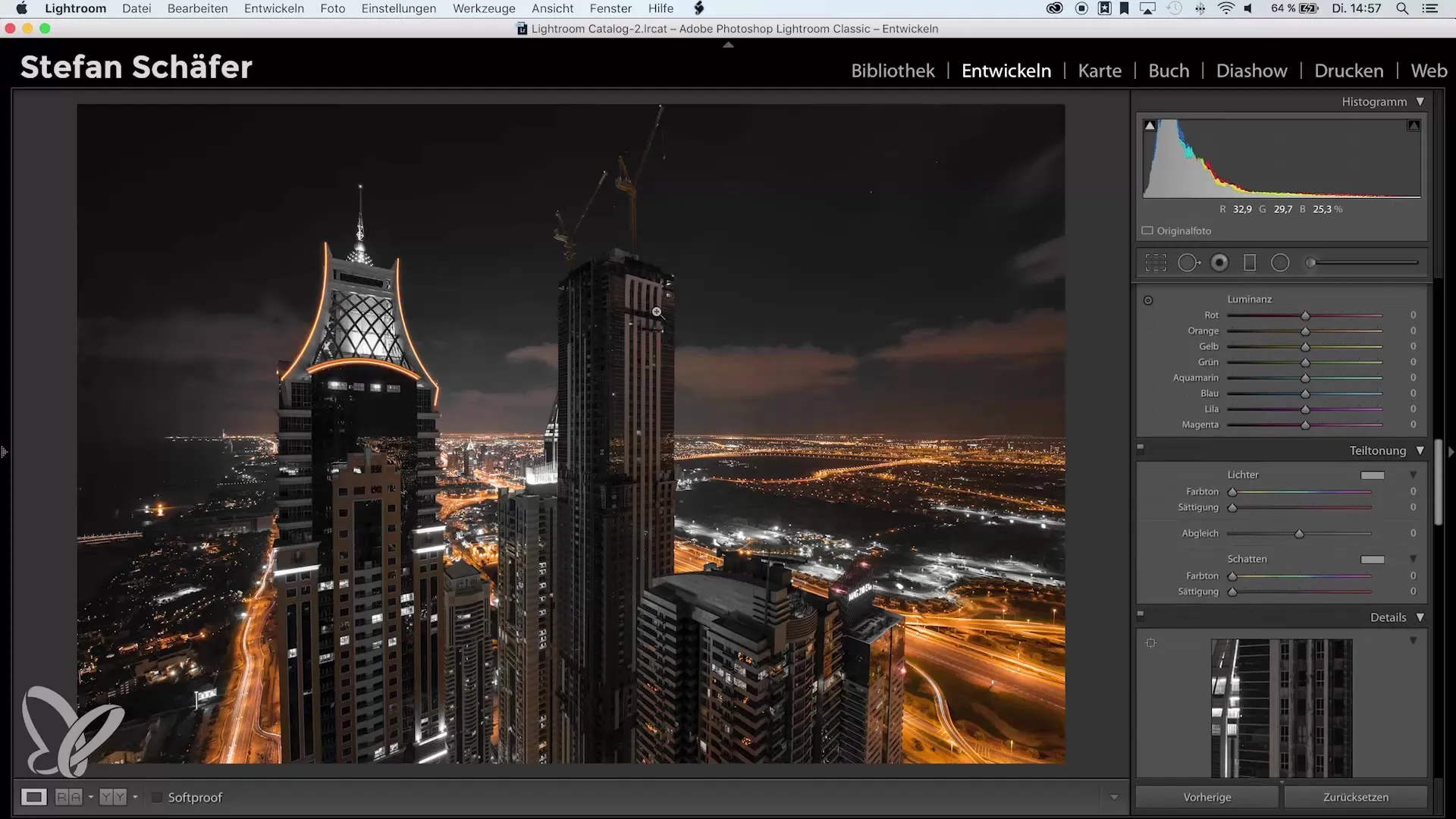
If orange stands out in your photo, decrease the saturation of all other colors such as red, yellow, green, blue, and magenta. Make sure to let the orange tones pop a bit while everything else is muted.
Step 4: Use Split Toning for Cool Effects
Next, we come to split toning. This feature allows you to add specific colors to certain areas of the image. Click on the shadows and select them.
To make your selection easier, hold the Alt key to see which color you are choosing. Select a blue tone with a value around 214 for the shadows and increase the saturation to about 30 or 35. This brings an interesting nighttime look to your image.
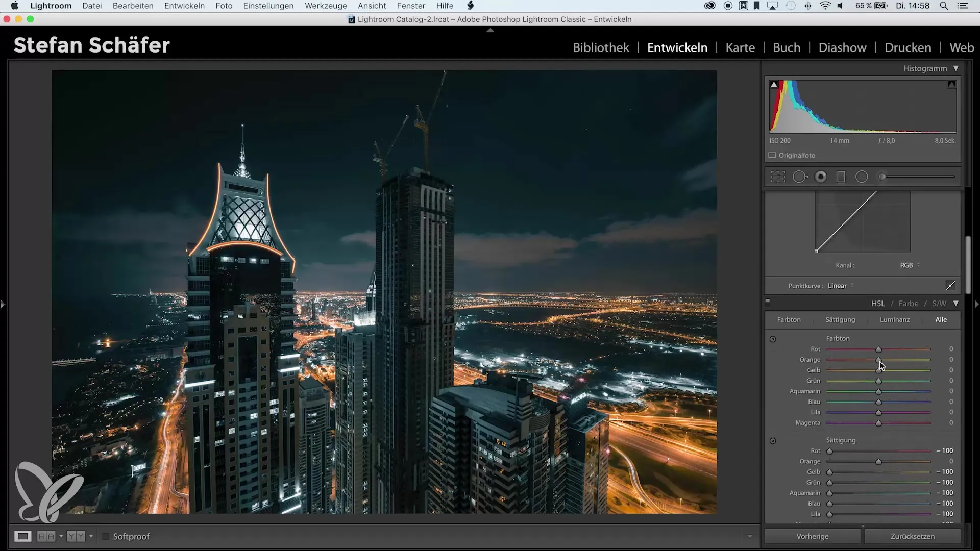
Step 5: Make Fine Adjustments
You can now adjust the orange color so it might have a touch more red or yellow – according to your taste.
The look you have created so far should already please you. Now carry out the standard amount of sharpening and ensure to remove chromatic aberration and enable profile corrections.
Step 6: Adjust Color Temperature
If the clouds appear too orange, you can use a brush tool to pull the color temperature towards blue and reduce the saturation. Play around with these settings until you are completely satisfied.
This way, you can make the clouds appear a little less orange and fresher.

Step 7: Compare the Results
To see the progress you’ve made, look at the before-and-after view. One unedited and then your cool, color-blocked image.
So much more atmosphere and character - and the image receives a futuristic city and nighttime scene aesthetic. This Color-Key is a creative approach that is far from the overly familiar clichés.
Summary – Color-Key with Lightroom: Achieving Impressive Results
In this detailed guide, you have learned how to create a unique Color-Key effect with Lightroom that is not just limited to the contrast between black and white and a single color. You have learned how to adjust colors, set saturations, and customize the look.
With the right tools and a bit of experimentation, you can truly achieve impressive results that will elevate your photography to a new level. Dare to play with colors and find your own style!
Frequently Asked Questions
How does the Color-Key effect work?The Color-Key effect isolates one or more colors in an image and leaves the rest in black and white or reduces their saturation.
Why is Color-Key not always popular?Some photographers find the effect exaggerated or untrendy, as it is often seen as clichéd.
How can I edit my colors in Color-Key?With the HSL table in Lightroom, you can desaturate and adjust colors to achieve the desired look.
What are the best colors for Color-Key?Complementary colors like blue and orange go well together and can create unique contrasts.
Can I use the Color-Key effect for any image?Yes, however, it works best with images that have clear color combinations and contrasts.


