If you are editing a creative motif in Photoshop and looking for ways to make it visually more appealing, you are in the right place. In this tutorial, I will show you how to change its character and tell stories by adding text. With a few simple tools and techniques, we will transform a simple image into an almost cinematic poster. Get ready, because we are about to start!
Key Insights
- The importance of text in image composition
- Using text tools to customize the font
- Color selection and its impact on aesthetics
- Ways to improve readability
- Creative effects for text design
Step-by-Step Guide
To effectively design the image with text, start by creating a new group. This makes it easier to organize your work in Photoshop and gives you a better overview.
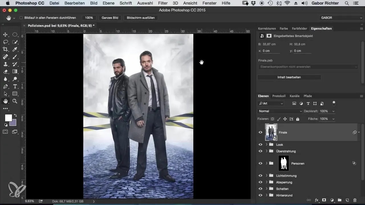
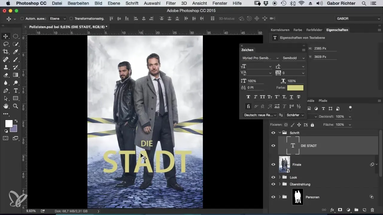
Now focus on the text tool. Select it and draw a selection on your image. Name the text, for example, "The City," and choose a suitable font color. The choice of color should harmonize with your image while providing enough contrast.

Once you have inserted your text, continue to style it. The current text looks a bit boring, so change the size and layout. Highlight the different words by making them different sizes. This way, the viewer can immediately see what the focal points are.
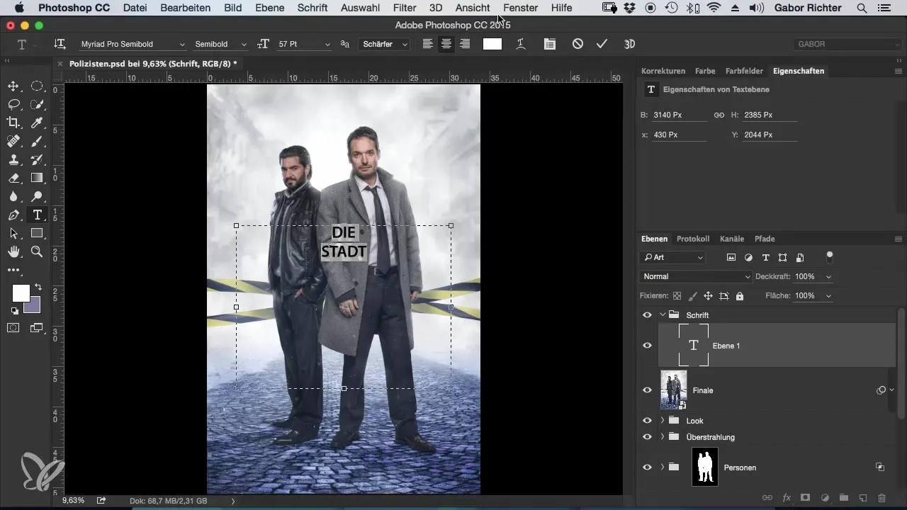
Make sure that the spacing between the words is consistent. You can adjust the line spacing to achieve a more harmonious representation. Experiment with different spacings to see what works best.
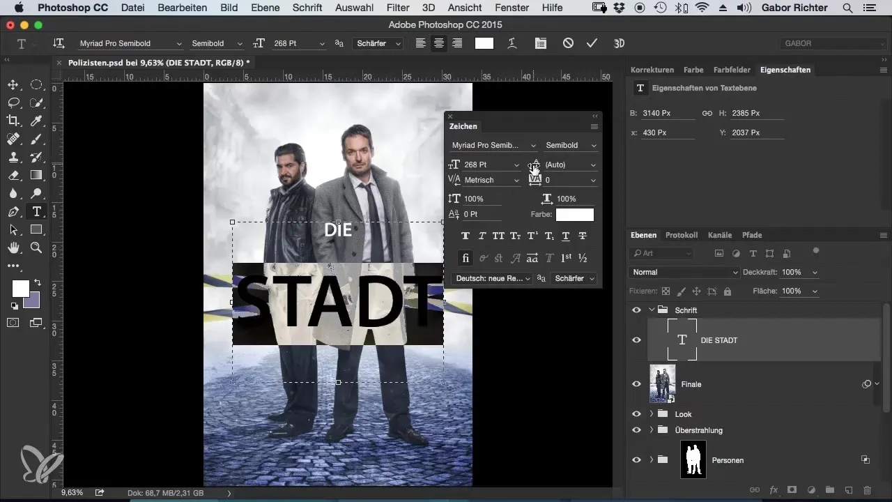
Now comes the exciting part: choosing the color. Choose a color that already exists in the image to create a harmonious look. Use the eyedropper tool to select a suitable color from the motif. It can be a complementary color or a similar hue.
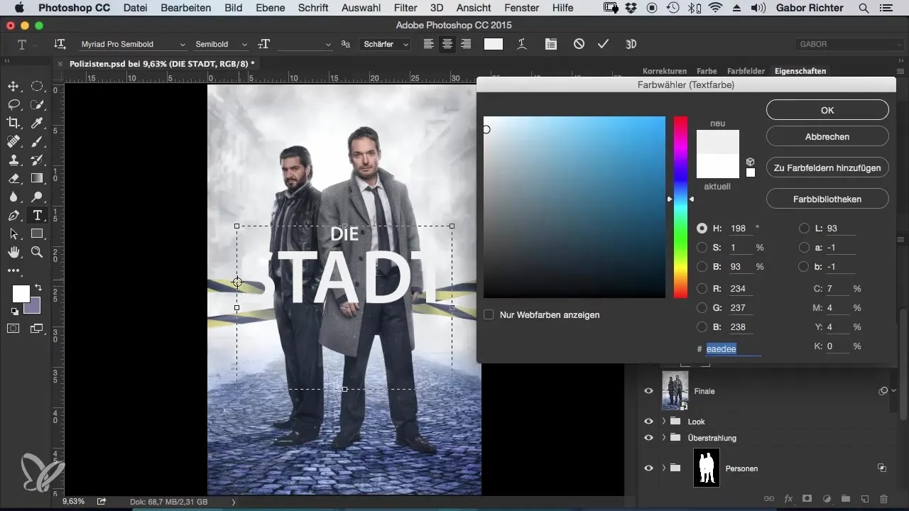
Consider where you want to position your text on the image. The placement can affect the overall impact of the image. Instead of using the usual lower third, place the text in a more interesting spot that balances the image.
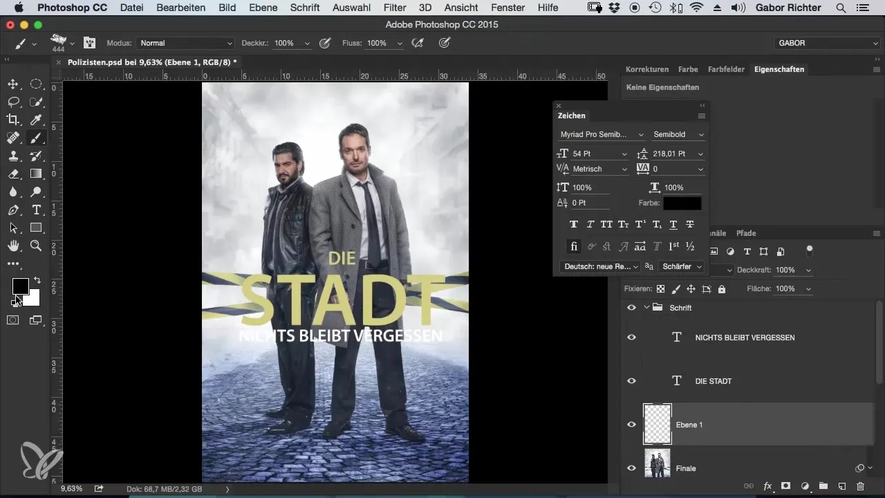
If the text is hard to read, simply add a new blank layer underneath. Select a brush with low opacity and paint over the areas where your text is located. This will increase the contrast and improve readability.
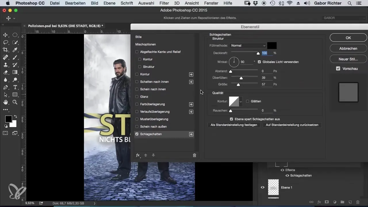
Another effective trick is using drop shadows for your text. This gives the text depth and makes it stand out more from the background. Through the layer style menu, you can adjust the drop shadow to achieve the desired effect.
Now that your text structures are in place, you can get creative. Add a broken effect to the text to create a dynamic look. Use the polygon lasso tool to mask parts of your text and then arrange them creatively.
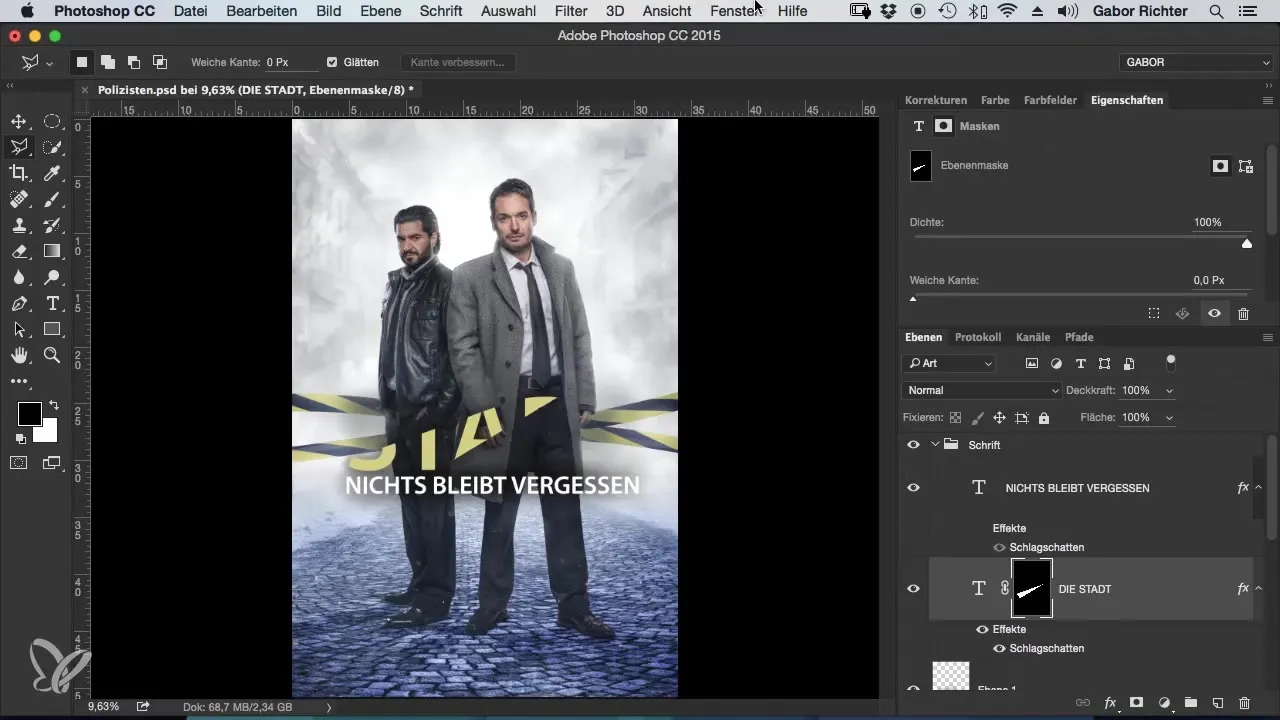
Don't worry if you accidentally move the mask. With a simple click, you can restore the connection between the text and the mask. This gives you the flexibility to adjust your text at any time.
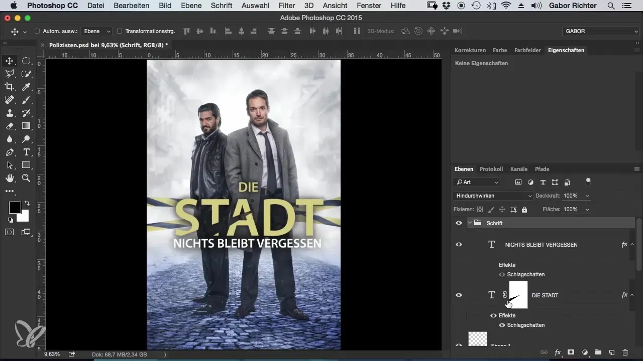
The final touch: Experiment with different textures and effects to get the most out of your image. Remember that you can always go back and make adjustments until you find the perfect look.
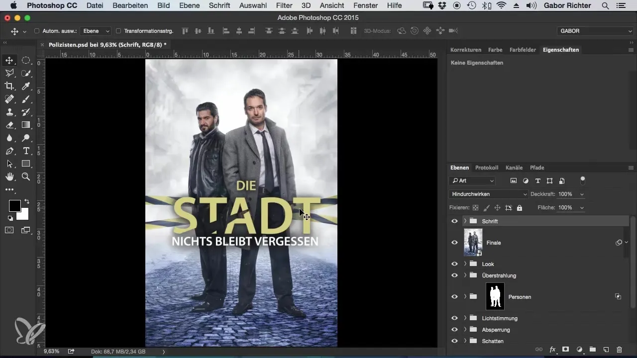
Summary – The Crime Look – Workflow in Photoshop – 16 Fonts
Skillfully integrating your text into an image requires some practice and imagination. The steps presented will help you create an image that not only looks appealing but also tells a story. Use the diverse possibilities of Photoshop and experiment creatively.
Frequently Asked Questions
What is the first step to integrating text into an image in Photoshop?Create a new group and select the text tool.
How can I improve the readability of my text?Add a new blank layer and use a brush with low opacity to create shadows.
How do I choose the right color for my text?Use the eyedropper tool to select colors from the image that are harmonious.
How can I simulate a broken text effect?Use the polygon lasso tool to mask parts of your text and adjust them creatively.
Can I change the drop shadow settings afterward?Yes, you can adjust the drop shadow through the layer style options whenever you want.

