
If you have combined two image elements into one background, a glance at the colors often gives you away: one green glows, the other looks dull and dark, and the composite looks like a patchwork quilt. This is exactly the problem we solve in this tutorial. You will learn how to match the green tones and the remaining color values of two images with non-destructive adjustment layers and clipping masks, so that two halves become a coherent overall image.
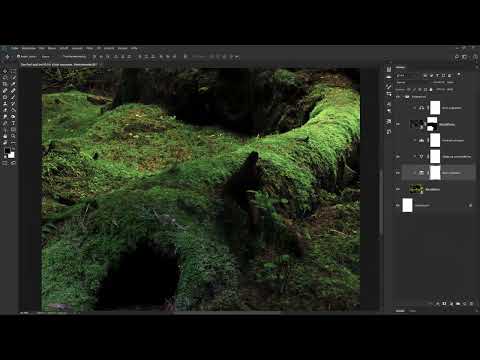
The video is only loaded from YouTube when you play it – data (including your IP address) is then transmitted to YouTube/Google. More in the privacy policy
The video is just under four and a half minutes long. However, the method is so fundamental that you can apply it to any compositing where colors and contrasts differ.
Key Takeaways
Matching does not mean making everything the same. You adjust the colors so that they fit together and no individual parts stand out anymore.
Adjustment layers are ideal for this because you can adjust or hide each correction again at any time later.
With clipping masks, you limit each adjustment layer to exactly one image layer. This way you specifically affect only the element you want to correct.
Several small corrections usually look more natural than a single strong change.
Step-by-Step Guide
Step 1: Analyze the Starting Point
Before you change anything, take a close look at the two image elements. In the video, it is immediately noticeable that the upper green is very bright and highly saturated, while the lower green appears less saturated and somewhat darker. Note which differences you notice: saturation, brightness, contrast, or color cast. Only then will you know later which settings you actually need.

The goal is a harmonious overall result in which the background looks seamless. So you will not try to match the upper image exactly to the lower one, but rather bring both elements into a common look.

Step 2: Create Adjustment Layers
In the Layers panel, select the layer above which your adjustment should sit. Then click the icon for new adjustment layers at the bottom of the Layers panel, the half-filled circle. In the menu, choose, for example, Selective Color. The new layer appears directly above the selected layer.

By double-clicking the layer name, you can rename the layer. That sounds trivial, but it helps you enormously with more complex files. Name the layer so that you can see at a glance what it does, such as "Match Green" or "Saturation Top". At the same time, the controls for this adjustment open in the Properties panel.

Step 3: Limit the Effect with a Clipping Mask
By default, an adjustment layer affects all layers beneath it. This is not always desired. If you want to apply a correction only to a specific image, you create a clipping mask. To do this, click the clipping mask icon in the Properties panel. Alternatively, hold down the Alt key while clicking the dividing line between the adjustment layer and the image layer.
From this moment on, all settings affect only the layer below. The video shows this very clearly: the adjustment layers you see above the image affect only this one image. The rest of the background remains untouched.

Step 4: Check the Effect and Show and Hide Layers
To check what an adjustment actually does, hide the layer using the visibility icon and show it again. This way you can see in a before-and-after comparison how much the image changes. This step is indispensable because your eye is easily fooled when it comes to colors.
In the example, the first adjustment layer is deleted and then shown again. This makes it possible to see exactly what contribution this correction makes. Don't hesitate to delete layers if they contribute nothing useful. A tidy Layers panel makes your further work easier.

Step 5: Matching green and yellow tones with Selective Color
Selective Color works on specific color ranges. In the Properties panel, you first choose the desired color range, such as the yellow tones or the green tones. Then you shift the proportions of the ink colors cyan, magenta, yellow, and black. In this example, the yellow tones are mixed with a bit more cyan and magenta and slightly darkened by adding black.
For the green tones, you proceed in a similar way, but add magenta to tame the oversaturated green. Here, too, the result may be slightly darkened. In this case, you leave the other color ranges unchanged. Be careful to shift only as much as necessary. Small steps preserve naturalness.

Step 6: Matching the saturation
In the next step, you reduce the saturation of the vivid image. A Vibrance adjustment layer is particularly well suited for this. You also use it as a clipping mask so that it affects only the upper image. Then you drag the Vibrance slider to the left.
The comparison shows how strongly the color impression changes: before, the image looks garish; afterward, it looks much calmer. With saturation, you therefore remove the biggest difference from the lower image. The two elements already look much more similar afterward.

Step 7: Reducing the contrast and tonal values
Another difference lies in the contrast. To reduce it, you work with the Levels. In the video, the output sliders for black and white are moved: the deepest black shifts toward gray, and the brightest white becomes a very light gray. The darkest and brightest image areas are thus no longer at the extremes, and the image looks flatter and softer.
You can become aware of the effect by toggling the adjustment layer on and off. Make sure the image doesn't become too flat. The goal is to match the counterpart, not to wipe out the detail.

Step 8: Adjusting midtones with Color Balance
In the lower image, what bothers you most is the overall green impression, because almost only green tones can be seen there. The upper image, by contrast, also contains brown and yellowish areas. To correct this, you use a Color Balance adjustment layer.
It is important that in Color Balance you edit only the midtones and leave shadows and highlights untouched. In the example, you add a bit of magenta and a bit of yellow. The result: the green tones are matched, and the lower image now also shows warmer brown tones. This brings you closer to the color mood of the upper image without distorting the highlights or shadows.

Step 9: Checking the result
Finally, you hide all adjustment layers one after another and show them again. This way you can see how the background has changed step by step. The initial state looks very garish, while the matched version works as a unit. Feel free to show the layers in a different order as well, to see which correction has the greatest effect.

Summary ??? Photoshop Matching Background Colors: Harmony in Compositing
You have seen that different green tones and image brightness levels can be harmonized with simple means. Create a separate adjustment layer for each correction, name it sensibly, and limit its effect to the desired image with a clipping mask. Combine Selective Color, Vibrance, Levels, and Color Balance in small steps and check the result again and again by toggling visibility. This produces a background that works as a coherent whole.
FAQ
Why do I need adjustment layers instead of direct image corrections?Adjustment layers do not change the original image, so you can adjust or remove any correction at any time.
How do I create a clipping mask for an adjustment layer?Click the clipping mask icon in the Properties panel, or hold down the Alt key and click the dividing line between the adjustment layer and the image layer.
What does Selective Color do?It changes only certain color ranges, such as yellow or green tones, by shifting the proportions of cyan, magenta, yellow, and black.
Why should I reduce the saturation?Highly saturated colors often look intrusive and differ noticeably from less saturated image areas. Reducing them creates more calm and uniformity.
Which adjustment is suitable for midtones?Color Balance can be applied separately to shadows, midtones, and highlights. It is ideal for color casts in the mid-brightness range.
How do I check whether my correction is working?Hide and show the adjustment layer several times using the visibility icon and compare the result directly.


