

Imagine you're standing in your favorite store, holding a paper carrier bag in your hand and thinking: This bag stays with me, it won't end up in the paper recycling. Bags like this come about through the interplay of a well-thought-out layout, cleanly placed crop marks, and a print template that the print shop can process without follow-up questions. In this tutorial, you'll follow the path from the template at Saxoprint to the finished PDF export in Adobe InDesign. Using the example of a stylish fashion bag in flat design, you'll learn which areas you must observe, how to set up colors for print, and what you should pay attention to with folds, cord eyelets, and safety margins.
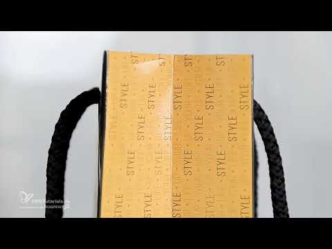
The video is only loaded from YouTube when you play it – data (including your IP address) is then transmitted to YouTube/Google. More in the privacy policy
Key Takeaways
- Always work with the print template from the print service provider, as it is tailored to the requirements of offset printing.
- Set up guides for trim, fold, and safety areas before you begin designing.
- Create colors in CMYK mode, since printing does not work in the RGB color space.
- Plan fold areas with a safety margin of 1 mm so that no light flashes appear when folding.
- Take the cord eyelets and punchings into account so that your design isn't pierced through.
- Check ink coverage and proof before you export.
Step-by-Step Guide
Step 1: Select and configure the template at Saxoprint
Open saxoprint.de and navigate via the top products to the paper carrier bags. Choose a variant with a fabric cord and hand length, as it offers a large design area. In the calculation area, you set the format width, depth, and height. A 240 g/m² matte picture printing paper is suitable as the material, as it is sturdy and feels high-quality. You can choose the cord with a 9 mm band thickness and in the color black. Finishes such as gloss are optional, but quite appealing for the result.

Step 2: Check the data sheet and open the print template
Before you get started, open the data sheet in a new window. There you'll find a graphic with explanations of the final format, closed final format, and data format. This legend is important because it shows you where the visible area begins and which areas must remain free of color. Then download the print template, unzip the folder, and open the INDD file in InDesign. The IDML file is the backward-compatible variant and is suitable if you're working with an older version of InDesign.

Step 3: Clean up swatches and create CMYK colors
In the Swatches panel, remove all colors you don't need. That way you keep only the tones you actually work with. Then create new swatches and make sure you're working in CMYK color mode and not RGB. For a dark black tone, you can use, for example, the values C15, M15, Y25, and K95. Next, you create a yellow tone with C18, M42, Y91, and K0. For a darker mustard-yellow tone, you reduce the black value to K35. For all colors, pay attention to good contrast, because it is precisely this that determines whether the design will have an impact later.

Step 4: Set guides for the areas
Drag vertical guides from the ruler and set them manually to the values from the template. The first line at 10 mm marks the beginning of the non-visible area, which must remain free of color because it is where gluing takes place. Additional lines at 20 mm and 30 mm help you mark off the area in which you place text. Also set lines at 250 mm, 260 mm, 360 mm, and 600 mm. This divides the bag into front, side panels, back, and bottom, and you keep your bearings at all times during the design.

Step 5: Add fold lines with a 1 mm safety margin
At the fold points, you need to add additional lines. Set one guide each at 261 mm and at 359 mm. The millimeter in between is tiny, but crucial: if you extend color into the fold area at this point, light flashes appear when folding, which significantly detracts from the result. To do this, zoom in close to the line with the Zoom tool so that you can work precisely. Once you've set all the vertical guides, the basic framework of your layout is complete.

Step 6: Fill areas with color
Draw a rectangle with the Rectangle tool and fill it with the dark black tone. Align the edges to the guides and, if necessary, drag the rectangle beyond the edges so that no white slivers appear. For the yellow side panels, copy the rectangle by holding down the Alt and Shift keys, adjust the size, and assign it the lighter yellow tone. In flat design, you deliberately do without gradients, reflections, and shadows, because the clear, flat design looks contemporary and elegant. When moving, pay particular attention to precision at the fold edges.

Step 7: Prepare and place the back image
For the back, you can prepare an image in Photoshop. Create the file at 300 dpi and use the same color that you also use in InDesign. A black-and-white adjustment layer ensures that the motif looks monochrome. With a levels adjustment, you can even out harsh edges. Save the file as a PSD and place it in InDesign using Ctrl+D. The advantage: changes you save in Photoshop are updated live in InDesign. Then fill the frame proportionally and position the image content with the Hand tool. Finally, reduce the opacity to about 10 to 20 percent so that the motif fades subtly into the background.

Step 8: Design the typography on the front
Place a large, striking lettering on the front. A light typeface in capitals looks elegant, for example set at 20 points and right-aligned. Remove the distractingly large spacing between individual lines with Alt and the arrow keys until the line spacing looks harmonious. Add a hashtag or dress code as a small detail and place a thin line in the light color next to it. For the main lettering, you choose a bold typeface in mustard yellow and shrink or enlarge it until it sits exactly between the guides. With Ctrl+Zero, you adjust the view to check the result.

Step 9: Fine-tune text pattern and tracking
An effective stylistic device is a text pattern made of "Style up your Life", complemented by small bullet points. You can find special characters via Window, Type & Tables, then Glyphs. Set the text in the dark color, duplicate the master text frame several times with Ctrl+V, and rotate the whole thing by 90 degrees if needed. With a line spacing of about 19.5 points, a uniform grid is created. Through a slightly increased tracking of about 30, the pattern looks staggered like steps. Using the Align panel, you then center the pattern on the horizontal center axis.

Step 10: Consider the cord eyelets, place logo and stars
Before you place elements at the edges, think about the cord eyelets. They are located on the front on the left and right and must not pierce any important text or motifs. For a round logo, you use the Ellipse tool with a diameter of 77 mm and align it in the center. You create a subtle drop shadow via the Effects button with the option "Outer Glow" in Multiply mode. For the stars, you use the Polygon tool with five points and a star inset of about 30 percent. Copy the star, arrange it, and repeat the process for the arrangement until the logo looks harmonious.

Step 11: Build a stylized tie from simple shapes
For the back, you can assemble a tie from simple shapes. Draw a yellow rectangle, give it a skew of 20 degrees, and rotate it by 90 degrees until it resembles a knot. A second rectangle forms the shaft. With the Add Anchor Point tool and the Delete Anchor Point tool, you shape the edges until the tip and knot connect cleanly. Make sure there is a common axis so that the shape looks symmetrical. Afterwards, you can make the tie narrower by dragging the handle while holding down the Alt key. Flip the shape horizontally, color it in the dark tone, and group all parts with Ctrl+G.

Step 12: Check safety areas, create a proof, and export
Finally, check all areas. Full-bleed motifs should extend beyond the edge into the bleed, about 1 mm at the top, right, and bottom, and 5 mm on the left. You leave the ink-free area that will be glued blank. Under View, Proof Setup, you select the output profile, in the case of this print shop ISO Coated v2 300%. In the proof, you can see that the print looks more saturated and darker than the RGB screen. This deviation is normal; you can cushion it with finishes or stronger black values. In the Separations Preview, you check the total ink coverage and set the limit to 150 percent. For the export, you press Ctrl+E, assign a name, and set the specifications of your print shop, for example PDF/X-1a. For compression, you choose bicubic resampling at 300 and 450 dpi. Activate marks and bleed if the document requires them.

Summary – Designing a Paper Carrier Bag in InDesign Ready for Print
With a print template, properly set up CMYK colors, precise guides for the fold and safety areas, and a controlled export, you create a paper carrier bag that looks just as convincing in print as it does on screen. Pay particular attention to the cord eyelets, the fold millimeter, and the ink coverage. Then nothing stands in the way of your design project.
FAQ
Why should I work with the print shop's template?The template is precisely tailored to the requirements of offset printing and contains all relevant dimensions, markings, and areas.
Which color do I have to use for printing?Use the CMYK color mode, as printing does not work in the RGB color space.
Why do I need an additional millimeter at the fold lines?This area prevents light flashes of white from appearing when folding if color extends into the fold.
What do I need to consider with the cord eyelets?Text and important motifs must not be pierced by the cord eyelets, so you should keep the area around the eyelets clear.
How do I make sure the result matches the print?Use the proof with the print shop's output profile and check the ink coverage in the separation preview before you export.

