

A calendar is one of the most durable promotional items of all, because it hangs visibly in the office for months. This is exactly the goal you pursue in this tutorial: you create a 3-month calendar in Adobe InDesign for corporate clients, business partners and employees. You start by searching for a suitable template, design the background, header area and advertising messages, and prepare the result so that a print partner can process it without any follow-up questions. A fictional event agency with its own logo, claim and contact details serves as an example.
The video is only loaded from YouTube when you play it – data (including your IP address) is then transmitted to YouTube/Google. More in the privacy policy
Key Takeaways
- Get an overview of the template before designing. This includes the bleed, margins and the layer structure with a design layer and an information layer.
- Keep the background subtle. A vector texture stays sharp at any scale and does not disturb the calendar's effect.
- Work with few colors and use the house color consistently. A color picker helps you derive matching tones from an image.
- Place the logo, claim, advertising message and contact details so that they remain visible between the calendar segments and are not covered by the nail hole in the wall.
- Before exporting, remove any added guides and helper rectangles. Then export as PDF/X-1a and have the printer's data check run.
Step 1: Find and download the right template
You start in the browser. Open the viaprinto.de website, scroll down and select the 3-month calendar in the calendar section. There you will find several variants. For this project, the block variant, in which the calendar segments are arranged evenly, is suitable.
In the download area of the product page, file templates are available for Illustrator, Photoshop, PowerPoint, EPS and InDesign. Download the InDesign template and save it in a place where you can find it again.


Step 2: Open the template and analyze the document
Open the downloaded file in InDesign. Before you change anything, scroll through the entire document once. The template contains important notes that you should definitely follow. These include the bleed allowance, the trim edge and the recommended margin between text elements and the trim edge. Full-surface images and colors must extend beyond the bleed, otherwise white slivers will appear at the edge when cutting.
Also pay attention to the image resolution. It should be 300 ppi. You only need the target color profile when exporting, but make a note of it right away as a reminder.


Step 3: Understand the layers
Before you place elements, open the Layers panel. The template consists of two layers: a design layer and an information layer. The information layer shows the calendar areas, that is, the areas that will later be printed on by the print shop. Hide it once to see where your actual design area begins. With Ctrl + 0 (Mac: Command + 0) you fit the view to the document. You will work on the design layer later; turn the information layer back on afterwards.

Step 4: Clean up swatches and create the house color
In the Swatches panel, there are often colors hiding that you don't need. Select all unused swatches and delete them. This way you keep track when you assign colors later.
Then create your house color. In the example, it is a blackberry shade. Create a new swatch via the Swatches panel and enter the values in CMYK mode. Make sure you really choose CMYK, because printing does not work with RGB. Then confirm with OK.


Step 5: Design the background with a vector texture
Designers often place an image first. In the example, you use a polygon texture. A polygon is a many-sided shape, and the texture consists of many triangles that form a graphic background. The crucial thing is that you use the vector version (AI file). A vector file can be scaled without loss, whereas a pixel image becomes blurry or pixelated when greatly enlarged.
Place the file with Ctrl + D in the Place File dialog. Drag the frame beyond the edges, including into the bleed. Right-click the frame and choose Fitting, then Fill Frame Proportionally. If the texture looks stair-stepped on your screen, right-click, go to Display Performance, and activate the option High Quality Display.


Step 6: Subtly tone down the background
The background must not compete for attention, because the calendar areas sit on top of it. Therefore, copy the three calendar layers, select them with Ctrl + C, and paste them onto the design layer via Edit, Paste in Place. Then reduce the opacity of the background, for example to 50 percent. This lets you see how the segments sit above the background. That helps you with the placement of the elements. You can delete the calendar copy afterwards.
The texture creates a uniform surface. It works regardless of which image you place on it later, because the calendar segments no longer interrupt the area.

Step 7: Check image resolution and choose color harmony
Suppose you want to use a photo over a large area. Place the image with Ctrl + D and check the effective resolution. With an area of about 330 by 700 millimeters, the actual resolution of a normal photo quickly drops to around 111 ppi. That is not sufficient for printing. You then have two options: Either you use an image that is large enough, or you work with a vector file as in the previous step.
For a coherent color scheme, you can also use the Eyedropper tool. Click with it on a spot in the background image. InDesign adds the color to your swatches. If you repeatedly use equivalent colors, the layout looks harmonious. Alternatively, you can choose a custom color, as was done in the example with the blackberry tone.

Step 8: Design the header area with logo and branding
The header area offers space for a message and your branding. Use the Ellipse tool to draw an ellipse that extends across the upper area. Fill it with white and reduce the opacity to about 60 percent. The polygon background will then show through slightly.
Duplicate the ellipse with Ctrl + C and Edit, Paste in Place. Set the upper ellipse to 80 percent opacity and, in the Effects panel, assign it a soft gradient feather with a radial gradient. The edges become soft, the center stays white. Then give the element a drop shadow with an offset of about 1.5 millimeters in your corporate color. Reduce the opacity of the shadow to about 20 percent so that it doesn't look obtrusive.


For the finishing touch, duplicate the ellipse again, move it down, and replace the fill with a white stroke about three points thick. Remove the soft gradient feather from this copy. With Ctrl + Alt + Shift and the arrow keys, you move the copies at even intervals. This creates the layered look.

Once all elements are in place, select them and lock them with Ctrl + L. This way you won't accidentally move the background while continuing to work.
Step 9: Use typography for the title and claim
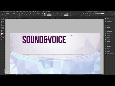
Choose an easily legible font for the header, ideally your corporate font. In the example, the font Bebas is used. Enter the title, for example "Sound and Voice", and set the font size to about 110 points. Align the text frames across the entire calendar width and center them.
You can achieve an appealing effect with different font styles. For example, set the first word in Regular and the second in Light. This makes the title look more lively. You add the claim as a separate text frame, whose font size you reduce appropriately and also set in the Light style.


Step 10: Add a divider line and contact details
A fine divider line between the title and the claim creates order. With the Line tool, draw a line about 200 millimeters long with a stroke weight of two points. Color it in the company color and also apply a radial soft gradient edge. The ends then fade out softly instead of being cut off sharply.
For the contact details, the web address is sufficient in most cases. Set it at about 20 points. So that the text does not look cramped, increase the tracking in the Character panel, for example to 275. This look is reminiscent of movie posters and makes the text appear more refined.


Step 11: Integrate photos in circle shapes
If the company wants to show pictures of employees, machines, or events, circles are a good option. Draw an ellipse about 77 millimeters in diameter and give it a white stroke of about six points. Align the circle to the edge of your layout using the smart guides.
Then place the image with Ctrl + D and choose Fitting, Fill Frame Proportionally. Holding down the Alt and Shift keys, drag the copy to the right or to the center. For more depth, reduce only the stroke opacity in the Effects panel, to about 50 percent. Make sure to align the stroke to the outside so that it does not cover the image.


If you later replace an image with another one, place it again with Ctrl + D into the existing frame. This way the arrangement is preserved.
Step 12: Check the layout from a bird's-eye view
Keep looking at the overall layout. A calendar hangs on a nail, which leaves an opening in the paper. To check this, show the information layer again and move it upward as a test to see the spot where the nail sits. Check whether the logo or text are covered by it. If so, move the affected elements a little lower. If necessary, reduce the overall opacity of the design layer so that you can better see the position.

Step 13: Design an advertising area with a soft edge
The gaps between the calendar segments allow you to place an advertising message. To do this, draw a rectangle in your company color and drag it up to the edge of the calendar. Work with the guides so that everything sits exactly.
The edge on the side where the rectangle ends is important. If you pull it into the bleed, a hard edge can appear as soon as the print shop trims the layout. Therefore, limit the width to the width of the calendar and apply a soft gradient edge with a radial gradient.


Then place a text frame on this rectangle, up to the edge of the calendar. Choose a font, for example 80 points in Regular, and the color white. Center the text. A drop shadow with a one-point offset improves readability. Holding down the Shift key, you align the element to the center axis.


Keywords that immediately show what the sender offers are suitable as content. A wholesaler could write, for example, "24-hour delivery," a photographer "wedding photography." Copy the text elements downward with Alt and Shift and change the text. Make sure that the distance to the bleed remains sufficient.

Step 14: Remove helper objects and export as PDF
Before you export, remove all helper rectangles and guides. They must not end up in the print. Select the rectangles and delete them. You can also delete the layer with the guides.
Then open the export dialog via File, Export. Enter a file name and choose PDF/X-1a as the format. Adopt the template's settings: you use marks and bleed with the document's bleed settings. For the color settings, you choose the output Convert to Destination with the profile ISO Coated v2 300% ECI. The fonts are fully embedded. For transparency flattening, you choose high resolution and ignore deviations on the printed sheet.


Step 15: Data check, upload, and order
On the print shop's website, you upload the PDF via drag and drop. The preview shows you all the calendar pages. Use the arrow keys to click through the segments and check whether your advertising messages appear in the right place.
For the version, choose the multi-block calendar. The printing is four-color, the back remains unprinted, and the format is designed for the practical B4 scoring. Enter the quantity, for example 1000 pieces. The tiered prices appear directly in the order process.


The paid professional data check automatically checks ink coverage, image resolutions, transparencies, spot colors, and font colors. For a high-quality order, this step is worthwhile, because it prevents costly mistakes. If everything is green, you go to the shopping cart, enter cost centers or voucher codes if applicable, and complete the order.


At the end, you can view a preview of your calendar in the 3D showroom. This helps you especially if you can't yet picture the finished product well.
Summary ??? Designing a 3-month calendar in InDesign: From template to print-ready PDF
In this tutorial, you learned how to download a calendar template from the shop, get your bearings in the document, and design with layers, colors, and textures. You built a header area with soft gradients and shadows, placed photos in circles, and created an advertising area with a clear message. Finally, you exported the file as PDF/X-1a and prepared it for ordering. With this workflow, you can create any calendar for business clients at a consistently high quality.
FAQ
Do I need a specific version of InDesign for this template?The template can be opened without any problems with current versions of Adobe InDesign. Make sure your program supports the file formats of the template and the vector texture.
Why should I use a vector texture instead of a photo?A vector file can be scaled without loss of quality. A low-resolution photo, on the other hand, looks pixelated or blurry when used over a large area.
What happens if I don't remove the guides?Guides and helper rectangles can be noticeable in print or during the print shop's inspection. Therefore, delete them before exporting.
What resolution do images need for print?For print, images should have a resolution of about 300 ppi at the actual output size.
Can I skip the data check?That is possible, but for larger print runs the professional data check is recommended. It finds errors that you can easily overlook while designing.
Do I have to print phone numbers on the calendar?No. A web address is sufficient in many cases, since interested people today usually search for information on the internet.
Why isn't the title placed in the layer with the calendar?The information layer contains the calendar areas that are printed on by the print shop. If you design on the design layer, everything stays in the right place.

