

At first glance, a beach flag looks like a simple poster on a stand, but the curved teardrop shape presents you with special challenges when designing. In this tutorial, I will guide you step by step through the entire process: from the suitable print template through the structure of the design to the finished PDF for the print shop. Using a fictional 24-hour pharmacy as an example, I will also show you how to not only design the shape, but also use it effectively.
The video is only loaded from YouTube when you play it – data (including your IP address) is then transmitted to YouTube/Google. More in the privacy policy
Key Takeaways
- A ready-made print template with final format, seam, hem, and safety margin saves a lot of time and avoids trimming errors.
- Set up the design layer in a light color such as light blue so that you can easily recognize rectangles and paths.
- For a beach flag, work in a very reduced, bold style with large fonts, because it is only perceived from a distance.
- Draw symmetrical elements horizontally aligned first and only rotate them afterward so that the symmetry is preserved.
- Export the file as PDF/X-3 or PDF/X-1a in the Standard 1.3 format and remove all auxiliary layers and visualizations beforehand.
Step-by-Step Guide
Step 1: Choose the suitable template from the print shop
Start at the print shop, because that is where you will already find the ready-made template for your beach flag. In the example, Saxoprint is used. In the advertising technology section, open the Beachflex entry and choose the teardrop shape. Then scroll down in the product area to check properties such as weight, opacity, and weather resistance. The flag in the example weighs 100 g per square meter, is not opaque, and is UV-resistant.

Step 2: Open the print template and set the parameters
In the calculation, enter the version Beachflag, the shape teardrop, and the size M. The total height is then about 2.50 meters. In the print templates section, you download the matching InDesign template. Save it in a fixed location, because you will open it as a basis in a moment.

Step 3: Understand the structure of the template
The template already contains the final format, the contour of the cut, the seam, and the hem. The gray area of about 50 mm represents the safety margin. Anything you place in this area may be lost during cutting. This preliminary work completely takes the calculation of the format off your hands. So you only have to take care of the design.
Step 4: Consider the base and the wind strength
Before you start designing, it is worth taking a look at the base. The suitable size depends on the place of use, and this in turn depends on the wind strength. The Beaufort scale helps with this classification. Wind force 4 corresponds to roughly a moderate breeze, wind force 5 already to a fresh breeze. So it is better to plan the base generously if the beach flag is to stand outside and unprotected.
Step 5: Create a working layer and color it light blue
Lock the template layer so that you do not move it accidentally. Create your own layer above it, on which you will design. I recommend setting the layer color to light blue. White is hard to see on a white work area, and this way your rectangles and paths also look better.

Step 6: Draw the graphic with the Pen tool
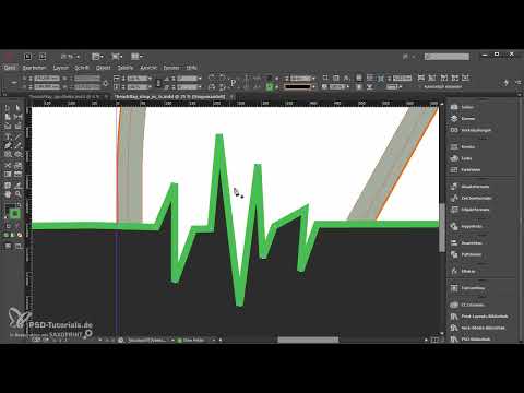
Select the Pen tool and zoom in on the desired spot. Set anchor points to draw a line that is reminiscent of an ECG. While drawing, keep the line on one axis as much as possible so that the course looks calm. By holding down the Control key, you can move individual points afterward. Close the path at the end so that you get a closed shape that you can process further later.

Step 7: Define the color and stroke of the path
Create a new swatch and assign a suitable shade of green. For a beach flag, it makes sense to work with strong, clear colors. Give the path a stroke so that it remains clearly recognizable. In the Stroke panel, under the corner options, you will find the option to round off hard edges. This looks softer and more pleasing. Try both variants and decide which fits your design.

Step 8: Create a subtle gradient with the gradient feather
Open the Effects panel and select the gradient feather. Set the left color stop to 70 percent opacity and the position to about 40 percent. Set the right stop to 100 percent opacity and the position to 90 percent. The middle stop can be set to about 20. An angle of 145 degrees provides a suitable alignment. Then adjust the values until the gradient looks harmonious.

Step 9: Simplify the visualization and cut out the shape
Since the layer with effects and paths quickly becomes cluttered, tidy up first. Remove all auxiliary paths you no longer need and keep only the line that will later serve as the boundary. Copy this path and paste it in place. Place a large white rectangle over it and move it all the way to the bottom of the layer order. Then select the path and the rectangle before clicking the subtract option in the Pathfinder. This creates a cleanly cut-out shape.

Step 10: Design the typography for long-distance visibility
A beach flag must be legible from a distance. Therefore, use large fonts and little text. In the example, the word Apotheke is set in the font Big Noodle Titling at a very large point size. Below it follows the web address in Nexa Bold so that the most important information stands out. Make sure that black areas are not colored with pure black, but with a rich black of about 95 percent. By the way, the font Big Noodle Titling is freely available and can be downloaded for free.

Step 11: Build circles with effects and symmetry
For the symbols in the lower area, first draw a circle measuring 165 mm by 165 mm and fill it with a color. Copy the gradient effect from the path by dragging and dropping the effect onto the circle, and set it to radial. Duplicate the circles by holding down the Alt and Shift keys. Then align the three circles horizontally using guides and distribute them evenly.

The order is important for symmetrical arrangements. First align the objects horizontally and then rotate the entire group. If you rotate first and then align again, you lose the symmetry because InDesign does not automatically recognize such arrangements.

Step 12: Insert icons from the Creative Cloud elements
You can find the symbols via the Creative Cloud in the Elements section. Search for a term such as heart or cross and add the graphics to your library. Since SVG files cannot be placed directly in InDesign, open the file in Illustrator, copy it into a new document, and then drag and drop it into InDesign. There you can then freely adjust the color. Set the icons to white, center them, and pay attention to the optical center. A heart looks slightly larger when it is shifted slightly to the right than when it is mathematically exactly centered.

With line icons, make sure that all symbols have the same style. A filled cross next to a line icon stands out immediately.

Step 13: Export the print template
Before exporting, remove all auxiliary objects and hide linked visualizations that do not belong in the print. The file may only contain what is actually to be printed later. In the export dialog, select the PDF format and set PDF/X-3 or PDF/X-1a as the standard. Version Standard 1.3 is common for print data. Make sure to flatten transparencies and to use the document's marks and bleed. Color output is in CMYK.

Step 14: Complete the order and data upload
Go back to the product, select the teardrop shape and size M again, and enter the color, base, and washing option. For the data check, select the professional data check. This way you will be informed before the file goes to print if something is not right. Give your order a name, complete the order, and upload the PDF file in the Upload Center.

Step 15: Check the result and assemble it
After the delivery arrives, you should check all the parts carefully. In the example, the base and the pole consist of several elements that are plugged into each other. The flag is pushed through the hem and tensioned at the bottom with the elastic band. At 2.50 meters, the beach flag has an impressive height, and you can quickly see whether colors, fonts, and proportions turned out as you planned them.

Summary ??? Designing and printing a teardrop-shaped beach flag in InDesign
With a suitable print template, a clear layer structure, and clear design principles, you create a beach flag that makes an impact even from a distance. Pay particular attention to the safety margin, the symmetrical alignment, the large fonts, and the correct PDF export. If you keep these points in mind, you will get a printed product that implements your design cleanly.

FAQ
How long does a beach flag last with good care?With good care, a beach flag lasts about two to three years. It should be washed every two to three months, at 30 degrees and ideally separately from strongly colored laundry.
Why should the flag not be opaque?The flag is deliberately not opaque so that the advertising message can be read from both sides.
What font size is suitable for a beach flag?Very large font sizes are suitable for the main term, in the example around 680 points. Additional information such as a web address should be set significantly smaller, in the example at 120 points.
Which file format should I use for printing?Use the PDF format with the PDF/X-3 or PDF/X-1a setting in the 1.3 standard. The color output is in CMYK.
Do I have to open icons from the Creative Cloud via Illustrator?Yes, SVG files cannot be placed directly in InDesign. The detour via Illustrator is currently necessary so that you can then adjust the color in InDesign.

