

A menu is often the first thing guests get in their hands from a restaurant. It has to be legible, fit the brand, and still withstand a lot, because it passes from hand to hand. In this guide you will learn how to plan and design a double-sided DIN long portrait-format menu with a single fold in Adobe InDesign. You will learn how to build a consistent layout with guides, color swatches, and typography, how to incorporate image motifs without cutting them out, and how to export and check the file for print.
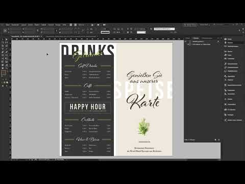
The video is only loaded from YouTube when you play it – data (including your IP address) is then transmitted to YouTube/Google. More in the privacy policy
The basis is a ready-made InDesign template from the print service provider viaprinto. The result is a menu printed in 4/4 color on water-repellent synthetic paper with a weight of 234 g/m².
Key Takeaways
- Start with the right template and the right format before you design. This saves you a lot of correction work later.
- Work with layers and lock finished elements so they don't shift accidentally.
- Keep distances from the bleed (3 mm) and the safety margin (4 mm), and set up guides to orient yourself by.
- Large, cropped type such as "Speise" creates a dynamic look. The word remains legible even when letters are cut off at the edge.
- Create consistent color swatches and use them across the entire menu so that a calm, uniform appearance emerges.
- Use shading, paragraph rules, and the flush space to align prices and categories precisely and repeatably.
- Before exporting, check the separation preview and the image resolution, and verify the finished file with your print service provider's data check.
Step-by-Step Guide
Step 1: Choose the Right Format
The starting point is your print service provider's online shop. There, choose the menu with a single fold, that is, a sheet that is folded once in the middle. In the configurator, make sure to select the DIN long portrait format. The figure 105 stands for the width in millimeters. The format corresponds to 105 × 210 mm when folded and 210 × 105 mm as a sheet. In the data sheet you will find all the notes on print preparation that you will need later.

Step 2: Download and Open the Template
Download the InDesign template directly from the shop and open it in InDesign. The advantage: the file already contains pages, layers, colors, and notes. So you don't have to create a new file or make any basic settings. First take a look at the existing color swatches. It's best to delete unneeded swatches right away so that your color palette stays clear.
Step 3: Organize Layers and Manage Notes
The template works with several layers. The design layer is intended for your elements. In InDesign's default setting it is light blue. By double-clicking the layer you can change the color, in case you don't like red. The information layer contains notes and help for each page. You can show and hide it. Important: this layer is not output during export. So you can safely refer to it without notes showing up in the PDF later.

Step 4: Understand Bleed and Safety Margin
Before you place the first elements, you should know the edge properties. The template sets a bleed of 3 mm. This is the area that the cutting blade trims off later during cutting. Color areas that extend to the edge must therefore be pulled beyond this line so that no white slivers appear. The safety margin is 4 mm. Important elements such as text or logos should not come closer to the edge. You will find these values under "Layout" and then "Margins and Columns". Check them once before you get started.
Step 5: Set Up Guides for a Clean Structure
Guides are your most important tool for a precise layout. It's best to create them on their own layer called "Hilfslinie". Drag them out of the ruler and place them at the values that matter for your design. On the center axis there is a line at 105 mm. Further lines at 10, 50, 55, and 95 mm help you with the horizontal structure. On the cross axis, you orient yourself by 22 mm and 202 mm. The line at 202 mm also marks the lower safety area. Lock the guide layer as soon as all lines are in place so that you don't move them accidentally.
Step 6: Define Color Swatches and Create the Background
Create a new color swatch for every color you want to use. Make sure it is a process color in CMYK mode, because only then is printing in the 4/4 process correct. With the Rectangle tool, you then drag out an area from the edge to the middle and fill it with the desired color. If an icon with a prohibition sign appears while dragging, you are probably on the wrong layer. Once the background is in place, lock the layer with Ctrl + L (on macOS Command + L). This way you can't accidentally move anything while continuing to work.

Step 7: Using Large Type as a Design Element
Now typography comes into play. Use the Type tool to draw a wide frame and write the word "Speise" in it. The sans-serif Bebas Neue in Bold is a suitable typeface. Set the size to 130 pt and the tracking to 100. The color is white. The trick of this layout is that the word extends beyond the edge and is cropped. Move the text box so that the E and the S are still recognizable. The viewer's brain automatically fills in the rest.

Step 8: Cropping Letters and Checking the Effective Area
To check whether the word is still legible, you can switch the view between Preview and Normal mode. To do this, press the W key. If you want to use a different word, you can increase or decrease the spacing between the letters using the tracking. This way you adjust the shape until it looks harmonious. This principle of cropping is a recurring design element throughout the entire menu.
Step 9: Using Script Type and Overlapping
A flowing script typeface works well as a contrast to the bold block lettering. In the example, Alfresco in Regular at 47 pt is used. The font is available via Typekit, but using it requires a Creative Cloud subscription. Alternatively, you can find numerous suitable script fonts on free font portals. Center the text and adjust the line spacing. Let the text slightly overlap the word "Speise". This is explicitly intended, because the overlap creates the dynamic effect. Just make sure that not too much is covered.
Step 10: Adding Color Accents and Duplicating Elements
Add a second color from your color palette and use it for the word "Karte", which you place below the script text. The font size here is 100 pt. To create identical elements, hold down the Alt key while moving an element. This creates a copy with the same parameters. You don't have to reinvent the wheel every time. This principle saves a lot of time, especially with recurring elements.
Step 11: Adding Address Details and Decorative Elements
The name of the restaurant and the address belong at the end of the front side. To do this, draw a text box across the entire width and center the text. The font Baskerville Regular at 12 pt works well. Adjust the line spacing manually, because with a default value of 14.4 pt it quickly looks restless. A hatched line serves as a decorative element. Draw it with the Line tool and hold down the Shift key so that it becomes straight. Set its width to 20 mm, with a stroke weight of 6 pt. Choose the same color for the line and the text so that the look runs consistently throughout the menu.

Step 12: Inserting and Isolating a Plant Motif
The image of a rosemary sprig is a subtle color accent in green that picks up the menu's contrast color. Download the image for free from an image portal such as Pixabay. Place it with Ctrl + D (or Command + D). Reduce the frame of the image until you have the desired crop. The problem: the photo was taken on a white background. Instead of isolating it in Photoshop, you can use the blend mode. In the Effects panel, select the Multiply mode. This mode removes all white values so that only the green sprigs remain visible. However, the mode only works well if the motif has a pure white background.

Step 13: Building the Back Side
The back side follows the same principle. Use the Rectangle tool to draw a dark area at the bottom edge that extends into the bleed. Create a new color swatch for this. The values in the example are 24, 20, 20, and 88 in CMYK. Drag the area up to the guide so that an even margin results. Pay particular attention to the sides. The margin on the left and right should be symmetrical, so you use the guide at 4 mm. Then lock the area again.

Step 14: Aligning the Drink Names Precisely
For the drinks menu, you copy the word "Speise" from the front side and replace it with "Drinks". Change the color to the new black value. The font size is 107 pt. For fine-tuning, you can move elements in small steps with the arrow keys. If gaps between the letters are noticeable, kerning helps. To do this, hold down the Alt key and use the left arrow key to reduce the spacing between the letters. A value around -80 often leads to a clean result. The word remains easily legible even though the edges are cropped.

Step 15: Create Dynamics Through Rotation
The word "Getränke" gets its own color from the palette. Make the text box smaller and rotate it slightly, by about 7 to 10 degrees. The rotation brings movement into the design. Place the word so that it slightly overlaps the word "Drinks" but still remains legible. This step shows how much a small angle can contribute to the character of a layout.

Step 16: Design Categories with Shading and Paragraph Borders
For the beverage categories, you need a consistent appearance. To do this, apply black shading over the text box. By double-clicking the handle, you adjust the box to the length of the text. For lateral spacing, you use paragraph borders and shading. Give the border an offset of 5 mm each on the left and right. With this method, the distance to the text box always stays the same, no matter how long the category name is. This makes repetition much easier.

Step 17: Right-Align Prices and Structure Products Cleanly
A single entry consists of a product name and a price that should be right-aligned. For this, you use the right-indent tab (flush space). Activate the hidden characters to see it. The key combination Shift + Tab inserts the character. Everything to the left of it stays left-aligned, everything to the right of it is aligned to the right. Write the product name, for example "Coca-Cola", and after it the right-indent tab with the price, such as "2,95 €". The font size is 8 to 9 points, the color is white. Copy the entry for the other products. You set the line spacing to about 16 points so the list doesn't look cramped.

Step 18: Duplicate Segments and Add Accents
Once a segment is finished, you can duplicate it on the screen with Alt + Shift. Then group the elements and place the groups one below the other. For the "Kaffee" category, you repeat the same procedure. A design tip: Delicate outlines of 0.5 points look more refined than thick lines. You can place such an outline around a frame, for example to highlight the Happy Hour. Set the title "Happy Hour" in the font Bebas Neue Bold at 40 points, tracking 100, in white and centered. Below it follows the description with the times, which you can highlight in color.

Step 19: Design the Inside Pages Using the Same Principles
The inside pages take over the guides from the outside. To do this, copy them via the clipboard to the original position. Since the right page will be filled with text, you adjust some lines. Drag new guides at 109 mm, 115 mm, and 200 mm. You move the top guide from 22 to 19 mm. Then you create the areas, a white one on the left and a black one on the right side. This creates a high-contrast structure. You can copy the text elements from the front, rewrite them, and place them in their respective positions.

Step 20: Structure Dishes and Ingredients
For the dishes, you work with a second formatting style. The heading, for example "Starters", gets a larger font with tracking, while the dishes are set in Semibold. You set the ingredients below in Italic and reduce the size to the necessary minimum. Make sure that all texts stay flush. An E that protrudes beyond the edge can be corrected with tracking or kerning. For the food labeling, you place small white circles with an outline and numbers inside them. You set the notes in a very subtle color, about 60% black, at the edge. This way they are present without dominating the design.

Step 21: Check the File for Printing
Before you export, check the color values. Open the Separations Preview via the Window menu and set a limit of 300% ink coverage. If no area is above it, everything is fine. Also check the resolution of placed images in the "Links" panel. For the rosemary image, the effective resolution is about 379 PPI, which is sufficient for printing.

Step 22: Export PDF
Open the export dialog with Ctrl + E. Choose "Adobe PDF (Print)" as the format and the PDF/X-1a standard. The parameters your print shop requires are usually listed on its website. In the example, the document's marks and bleed settings are used, the image resolution is 300 dpi, and the output uses the ISO Coated v2 300 % (ECI) profile. Also check the advanced options, such as the high resolution for transparency flattening. The result is a reproducible PDF that can be printed.

Step 23: Data check and order
Upload the PDF in your print service provider's shop. There you will see a preview of all pages in a 3D view. This preview helps you check whether the front and back are set up correctly. Then start the data check. The system checks the file completely and shows you whether it is reproducible. If everything is green, you can put the order in the shopping cart. You can enter an order reference, redeem voucher codes, and complete the order.

Summary – Designing a menu in InDesign: Double-sided DL card from template to print
You have now learned a complete workflow for creating a double-sided menu in DL format. You begin with the right format and a template, set up layers and guides, and secure the bleed and safety margin. Then you work with color swatches, large block lettering, script fonts, and overlays that give the layout dynamism. With flexible spaces (right-indent tabs), shading, and paragraph rules/borders, you align prices and categories precisely. Before exporting, you check ink coverage and resolution, and with the print service provider's data check, you make sure the file is ready for print. If you practice these steps, every further card will be produced faster.
FAQ
Do I need Adobe InDesign to design this menu?Yes, the tutorial is based on InDesign. You can only follow the design with this program or comparable software, since features such as flexible spaces and paragraph borders are described specifically for InDesign.
Do I have to use the Alfresco font?No, it is not mandatory. Alfresco is available via Typekit and requires a Creative Cloud subscription. You can use any other flowing script font you like, for example from free font portals.
Why should I use guides?Guides ensure precise alignment and even spacing. They show you the bleed, safety margin, and center axis, and help you place elements on the card consistently.
How do I remove the white background of an image without Photoshop?You can use the Multiply blend mode. It removes the white areas so that only the dark or colored parts of the subject remain visible. However, this only works with images that have a pure white background.
What is a flexible space (right-indent tab) and what do I need it for?You insert the flexible space with Shift + Tab. The text before it stays left-aligned, and the text after it is right-aligned. This is handy for prices that should be on the right while the product name stays on the left.
What settings do I need for the PDF export?In the export dialog, choose PDF/X-1a and adopt your print shop's specifications. Pay attention to 300 dpi for images, the appropriate color profile, and the document's marks and bleed settings. You can usually find the exact specifications on the print service provider's website.
What does the data check in the shop do?The data check automatically examines the uploaded file and shows you whether it is reproducible for printing. If everything is green, you can safely complete the order. You can also view the file in a 3D preview.

