

An empty table tells guests little, while a well-designed table tent says quite a lot. With this guide, you will create the layout and final artwork of a three-sided table tent in Adobe InDesign, from the template to the print-ready PDF. The tutorial comes from Stefan Riedel and was created with the kind support of viaprinto.
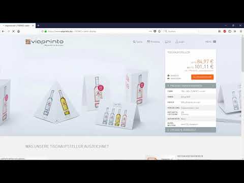
The video is only loaded from YouTube when you play it – data (including your IP address) is then transmitted to YouTube/Google. More in the privacy policy
Introduction
For this project you need a template from the print shop, a few colors, two or three fonts, and some patience when aligning. The table tent is a format with special features: the tabs and fold edges determine which areas are visible and which are not. I will show you exactly these peculiarities in the following steps. I assume you are familiar with basics such as layers, text formatting, and color swatches.
Key Takeaways
- Download the print template directly from the print service provider before you start the layout.
- Set up guides for fold edges, safety margins, and bleed before you place elements.
- Load the corporate identity color swatches as a file instead of creating them manually.
- Design only the visible areas and fill the tabs with the background color so that everything connects cleanly.
- Before exporting, check image resolution, separation, and ink coverage, and export as PDF/X-1a.
- Use the printer's data check before you order.
Step-by-Step Guide
Download the template and prepare the document
Start on the print shop's website in the gastronomy section. There you will find the table tent in the size 100 x 148 mm. In the product's context menu, there is the matching template as an InDesign file. A click on the ID icon downloads it. Then open the file in InDesign.

Clean up color swatches and check layers
Open the Swatches panel and remove all unused colors so that your palette stays clear. Then switch to the Layers panel. There you will find an information layer and the die line. Neither is output in print and can therefore be ignored. You work exclusively on the design layer.

Set guides for fold, safety margin, and bleed
Pull guides out of the ruler before you start designing. Set the vertical lines at 20 mm, 119 mm, 219 mm, and 320 mm. The 20 mm marks the fold edge, the other lines the further fold points of the tent. In addition, you need placeholder lines at 29 mm and 310 mm, which define a safety margin of 10 mm from the bleed. A horizontal guide at 143 mm helps you with vertical alignment. The lines are your most important orientation, so take your time placing them.

Load the corporate identity color swatches
Instead of creating the colors by hand, you load the client's color swatches. In the material catalog, the CMYK values for all five colors are listed. For this example, an ASE file is available. Load it via the Swatches panel. This way you adopt all color values in one step and avoid deviations.
Create the ivory area as a foundation
With the Rectangle tool, draw an area that docks exactly to the guides and the fold edge. Remove the stroke and fill the area with the ivory tone from your color palette. Make sure the area extends beyond the bleed so that no white slivers appear when cutting. Then lock the layer with Control + L so that you don't accidentally move it while continuing to work.
Design the headline "Cocktails"
The left side of the design is dedicated to cocktails. Set the word "Cocktails" in the font Bebas Neue, for example at size 77 pt and with slightly increased tracking. The color is white. Set the alignment to justified with overset so that the word is stretched. Position it in the center so that the first and last letters are slightly cut off on the left and right. This is not a mistake but a deliberately used design element that gives the design dynamism.

Add the headline "Lippenbekenntnisse"
For the line above, you use the font Alfresco in the Regular style at 40 pt in brown. First write the word "köstliche" and copy the text frame for the word "Lippenbekenntnisse". You align both frames centered and position them above the cocktail lettering. They should be slightly cut off so that the composition looks lively. The result is an eye-catching opening that prepares the following list.
Formatting the Cocktail Descriptions
For the drink names, choose the font Bakerville in Semibold at 8 pt, also in brown. Enter the name of the first cocktail, for example "Sex on the Beach", and insert a paragraph with the description below it. You format this description in Bakerville Italic. Align the entire text box to the center. To do this, select the text box and the background element in the Layers panel together and choose the "Align" tool, option "Align horizontal centers". Afterwards, lock the layers again.

Adding Divider Lines with the Line Tool
Divider lines go between the drinks. With the Line tool, draw a vertical line from top to bottom, set the stroke weight to 6 pt, the color to green, and choose a straight hatching. Position the line, duplicate it in the desired direction by holding Alt and Shift, and adjust the spacing. Then select the entire formatting and copy it downward with Alt and Shift. This way you repeat the design for each entry without rebuilding every element.

Adding the Third Drink and Designing the Center
As the third classic, you choose the Long Island Ice Tea. Replace the text in the existing text box; the formatting is retained. Then you place the cocktail image in the center. Insert the image with Control + D, send it to the background, and scale it down proportionally until it fits the design. Because the image has a white background, set the blend mode to "Multiply" in effects mode. The white values are then removed, and the cocktail looks cut out.

Placing the Price Tag in a Circle
With the Ellipse tool and the Shift key held down, you draw a circle. The fill color is green, the stroke is white at 1 point. Place the circle next to the drink and insert the price "8,90 €". To keep the price tag easy to read, make sure it is large enough, but also that it does not overpower the main message.

Coloring the Tab Area on the Left Side Black
The left side has an area that lies beyond the fold edge and is later tucked into the tabs. This area is not visible. Draw a rectangle there that extends to the edge, and fill it with graphite black. This way you are on the safe side in case something shifts during folding. The design area itself only begins after the fold edge and remains unaffected by this.

Setting the Headline "Afterwork Party"
The large headline on the left side consists of the word "Afterwork" at 116 pt and the word "Party" at 86 pt. For "Afterwork" you use the color green, and for the line above it a font size of 52 pt. Place the elements each centered within the visible area and do not use the tab as a reference. A large word only looks balanced if the distance to the edges is right.

Designing the Info Box with Date and Appointments
For the note about "every first Thursday of the month", you create a text box with 29 pt font size and 35 pt line spacing. The larger line spacing provides room between the lines. You set the most important word in green. Then you give the text box a white stroke of 0.5 pt. Under Text Frame Options, you set an inset spacing of 4 mm so the text does not stick to the edge. Afterwards, enlarge the text box until the content fits completely.

Adding the Note About Closing Time
At the bottom of the left side is the information that the venue is open for partying until 10 pm. For this, you use the font Bakerville Regular at 8 pt in white and center the text. Then reduce the text box to the necessary size. Stay out of the subordinate guide line, because it marks an additional safety margin to the bleed. Then align the box to the center, just like the heading above it.

Starting the right side with the large number "3"
The right side of the table tent follows the same principle. Here, too, you take over the tab area by dragging the rectangle over the area that is not visible. Then you add the large number "3" at 160 pt. This number is the link to the headline "heißkalten 3". Copy an existing formatting for this, which saves a lot of time and ensures consistency.

Setting the headline "heißkalten 3" and the body text
The headline "heißkalten 3" gets a font size of 40 pt and a line spacing of 32 pt. Below it is the text for the desserts, such as "Schokoladensuffle mit Maracuja" or "hausgemachtes Tiramisu". Make sure you position the line in relation to the tabs so that the content does not slip into the invisible area. The desserts should always stay within the design area.

Designing the circle with the index number
For the index number, you use the circle tool again with a diameter of 14.5 mm and green as the fill color. Place the circle on the left guide so that it is neatly aligned. If you have created colors twice, remove the superfluous swatches in the Swatches panel and replace them with the original green. You set the numeral "1" in 46.5 pt in white, centered in the circle. For the prices of the desserts, you can use the same circle with different values.

Entering the desserts with prices
Each dessert description gets a price. In the example, these are "Schokoladensuffle mit Maracuja, 6,90 €", "hausgemachtes Tiramisu aus feinster Mascarpone, 6,90 €" and "feinste Panna cotta mit Erdbeersoße, 6,90 €". Make sure the texts are aligned consistently. At the very end, you add the name of the restaurant or location. This strengthens recognition.

Pasting elements in their original position
If you need to take over elements from another document, you use the function "Edit, Paste in Place". The elements then land exactly at the position where they were in the original document. This is especially handy if you have adjusted alignments and want to keep them.

Checking image resolution and layers before export
Before you export, you check the embedded graphics in the Links panel. There you can see the actual resolution in relation to the output size. In the example, the value is about 1269 ppi, which is more than sufficient for printing. Then you hide or remove the information layer and the die-cut contour. They should not be printed.

Setting up separation and proof
Open the Separations Preview to check the ink coverage. In the example, the value should be 300%. A minimal excess is not critical, as the print shop reduces it automatically. For a more realistic display, you can set up a proof. Under "Custom," select the profile ISO Coated v2 300%. Then you can see how the paper tones down the colors. Keep in mind that screens look bright, whereas paper reflects light and makes colors appear somewhat flatter.

Exporting the print-ready PDF
Open the export dialog with Control + E and select PDF/X-1a:2003 as the format. Export all pages and set the compression to 300 and 450. For marks and bleed, you use the document's bleed settings. As the output profile, you choose ISO Coated v2 300%, unless your print shop requires something else. Ask about this beforehand, because every print shop has its own specifications. You should check spelling thoroughly before exporting, because print shops do not check texts.

Defining the print parameters at viaprinto
In the order process, you select the format 100 x 148 mm and the color mode 4/0 color. The back remains white, since only one side is printed. As paper, you choose 300 g/m² glossy-art matte and as finishing, matte dispersion varnish. The varnish protects the surface from fingerprints and minor damage, for example when a noodle goes astray during a meal. Set the quantity to 100 pieces.
Run the data check and save the project
Upload your PDF to the Pro data check. The system automatically compares all relevant criteria. In the example, green check marks appear everywhere, only the minimal ink coverage is shown as a note, and that is automatically reduced anyway. Then save the project, because you can share it with customers via the "My Projects" menu item. The customer then sees a 3D view and can check the order directly.

Summary – Designing a three-sided table tent in InDesign: A guide for the restaurant industry
You have now learned all the steps for a three-sided table tent, from the template through guides and color swatches to the print-ready PDF. The most important points are clean preparation with guides, filling the tab areas with background color, and the data check before ordering. With this workflow, you can reliably implement your own restaurant designs and deliver to the print shop without any rework.
FAQ
What size is the table tent in the example?The format is 100 x 148 mm, printed on 300 g/m² matte coated picture paper.
Why should you fill the tab area with black or color?The tabs are not visible after folding. A uniform fill prevents light or distracting areas from showing through when the pieces are assembled.
What resolution do images need for print?Relative to the printed size, images should have at least 300 ppi. In the example, the value is about 1269 ppi, which is well above that.
Why should you load color swatches instead of creating them manually?Loaded color swatches come directly from the customer's corporate identity. This way you avoid deviations and save time.
Which PDF format is recommended for the print shop?In the example, PDF/X-1a:2003 with the ISO Coated v2 300 % profile is used. However, always ask your print shop in advance about the exact specifications.
What does the data check mean?The Pro data check automatically checks the uploaded file against all relevant print criteria and immediately shows whether anything needs to be corrected.

