

Paragraph styles are most powerful when they are related to one another. You set them up cleanly once, and after that the typesetting almost runs by itself. In this tutorial, you build a two-column article step by step with a headline (H1), an introductory text (lead), and body text. Along the way, you learn how to combine styles using the Control panel and the Paragraph Styles dialog, use a drop cap, and chain the styles together so that InDesign automatically chooses the right style for the next paragraph as you write.
The video is only loaded from YouTube when you play it – data (including your IP address) is then transmitted to YouTube/Google. More in the privacy policy
Key Takeaways
You can quickly preformat paragraph styles in the Control panel and then refine them in the Paragraph Styles dialog. Combining both saves the most time.
With styles that you duplicate from other styles, you save work and keep track of dependencies.
The "Next Style" option determines which style follows after the paragraph. This lets you set text continuously without manual reformatting.
Body text with and without indent, drop caps, and span columns are fixed building blocks of an article. Create them once and use them again and again.
Step 1: Prepare Design Elements
First, create two new pages in the Pages panel. Then draw a frame at the top of the page as a design element. Give the frame on the left a subtle stroke in gold with a weight of about 1 mm. Slim lines look more high-quality than thick, clunky shapes. If you duplicate the frame, you get a second element that you can reuse for designing the page.

Next, place your images into the image frames using Ctrl + D. Adjust them proportionally so they look uniform. Make sure that individual images do not look too large. Hold down the Shift key to scale the frame without the content shifting. To do this, briefly hold down the mouse button so you can see the preview of the content.

Step 2: Create a Text Frame and Understand the Two Approaches
Now draw a text frame that takes up most of the area. Before you get started, you should know that there are two ways to define styles. The first is through the Control panel. There you enter font, size, color, and tracking directly and see the change immediately. The second way is through the "Paragraph Styles" dialog. There, all settings are available to you, such as indents, spacing, columns, and rules.
In practice, you combine both ways. I usually start in the Control panel with the rough settings, because that is very fast, and then refine in the dialog.

Step 3: Format the H1 Headline
Write a test text in the text frame and select it. In the Control panel, set the font to Essence Display Light at 36 pt. Make sure that "None" is set in the field for paragraph and character style. Otherwise, you will overwrite existing styles and distort the display.
Choose gold as the color and set the tracking to -30. This makes the headline look more compact and high-quality.
Pay attention to the correct characters when typing. The hyphen on the keyboard is a minus sign and not a dash. In typography, you use the en dash (–) as a dash. You can find it under "Type" and "Insert Special Character". The em dash (—), on the other hand, is a longer dash that occurs less often in German typesetting.

When all settings are in place, you create a paragraph style from them. To do this, click "New Paragraph Style" in the "Paragraph Styles" panel and name it "Headline H1". Confirm, and the style is applied to your paragraph.

Step 4: Add Paragraph Rule and Offset
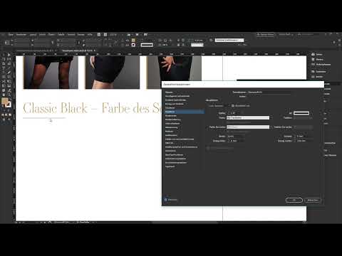
The headline should have a line underneath it. To do this, open the "Headline H1" style by double-clicking it. In the dialog, activate the option for paragraph rules. Choose a rule below the paragraph with a weight of one point. Set the offset to 5 mm so that the line does not stick to the text. Set the right indent to 130 mm so that the line fills only part of the width.
Confirm the format, and the first part of the text block is almost done.

Step 5: Create the introductory text (lead)
Place a new paragraph below the heading and do not select a style for it. Write a test text and set Source Serif Pro Light at 12 pt in the Control panel. Set the color to 90% black. The lead usually spans two to three lines and summarizes the content of the article. You can use a placeholder text for this and shorten it to three lines.
Create the style as "Lead Einleitungstext" and confirm it. Arrange the styles in the palette in logical order: heading, lead, body text. This way you keep an overview.

Step 6: Correct the spacing between heading and lead
Right now the lead sits very close to the heading line. Open the style "Überschrift H1" and go to the "Indents and Spacing" section. Under "Space After," enter a value of about 8 mm. This value creates a balanced symmetry between heading and text.

Step 7: Body text without indent and with initial
The body text forms the actual article. First create the style "Mengentext ohne Einzug" and paste a longer text from the clipboard into it. Then duplicate the style via right-click and name the copy "Mengentext mit Initial". With duplicates in particular, it pays off that you don't lose the starting point.

For the initial, open the "Drop Caps and Nested Styles" settings in the paragraph style dialog. Specify there that the first letter is three lines high. So that the letter doesn't get lost in the text flow, choose its own character style. To do this, create a new character style named "Initial" via the dialog. There you choose Essence Display Light as the font style. This is important because the parent paragraph style is defined with Source Serif Pro. Without its own specification, the character style would adopt this font.

Since only one paragraph in an article has an initial, you set the remaining text back to "Mengentext ohne Einzug".
Step 8: Body text with indent and baseline grid
From the second paragraph on, each paragraph typographically begins with an indent. To do this, duplicate the style "Mengentext ohne Einzug" and name it "Mengentext mit Einzug". In the dialog under "Indents and Spacing," set the first-line value to 4 mm. Apply the style to the paragraphs that follow the first paragraph.

One detail quickly stands out: the spacing of the lead and the heading doesn't match the grid of the body text. Activate the display of the baseline grid and choose the spacing so that it fits grid steps. With spacing that is not aligned to the grid, the text in the next column shifts by a whole line. A spacing of 6 mm, on the other hand, fits in neatly. Therefore, adjust the spacing of the lead style accordingly.

Step 9: Link styles together
Now comes the crucial step. Open the style "Überschrift H1" and select the lead under "Next Style." Then go to the "Lead" style and set "Next Style" to the body text with initial. In the body text with initial, you set the body text with indent as the next style. In the body text with indent, you again set the body text with indent as the next style.
This way InDesign knows which style follows which. When you press the Enter key while writing, the style changes automatically. This linking is the real potential of paragraph styles.

Step 10: Set up columns and span headings across columns
The body text should appear in two columns. Click the text frame and open the Text Frame Options via Ctrl + B. Set the number of columns to 3, since with six columns in the grid you will later use only two columns per text. Set the column gutter to 6 mm.

Headline and lead should run across the entire width. Therefore, open the "Headline H1" style and set the "Span Columns" option in the "Paragraph Layout" section. This ignores the individual columns and lets the text run across the entire width of the text frame. Repeat this step for the lead style.

Step 11: Test the system
Draw a new text frame and make sure that the first style is Headline H1. Type "I am a headline", press the Enter key and then type "I am the introductory text". You can see how the styling changes automatically with each paragraph. Then add placeholder text.
In my test, the body text with the initial shifted. This is usually caused by placeholder texts that mess up styles. In this case, check the chaining of the styles and the assignment of the next style. With this method, your text frame stays organized, and you set texts quickly and consistently.

Summary – Building InDesign paragraph styles: chaining headline, lead and body text
You have built an article consisting of a single text box with three clearly defined styles. The headline H1 has a paragraph rule and a space after. The lead is set in a smaller font and follows the grid. The body text appears in two columns, begins with an initial and then switches to paragraphs with indents. The chaining via "Next Style" ensures that InDesign automatically assigns the styles as you write. With this approach, you save a lot of time with every further article.
FAQ
Do I always have to create paragraph styles in the dialog?No, you can make the basic settings in the Control panel and then save them as a style. You then use the dialog for details such as rules, spacing and columns.
Why should I duplicate a style instead of creating a new one?Duplicates adopt existing settings. You only change the part that differs, such as the indent. This keeps your styles consistent.
What is the difference between a hyphen and a dash?The hyphen is a short dividing line for compound words. The dash (en dash) separates parts of a sentence from one another. You can find it directly in the typographic special characters menu.
What is the character style for the initial used for?With the character style, you give the first letter its own font and color without changing the rest of the paragraph.
What does "Next Style" mean?With this setting, you define which paragraph style automatically follows after pressing the Enter key. This way you no longer have to reformat manually.
Why should I pay attention to the baseline grid?The grid ensures that lines in multiple columns sit at the same height. Spacing that does not fit the grid shifts the text and looks uneven.

