

Fonts in InDesign are far more than a selection in the menu. If you master typography, you create layouts that look professional. In this tutorial, you will learn how to create text frames, use font styles deliberately, find fonts using filters and favorites, and control the order of your elements with the Layers panel. At the end, you will be able to build a small business card with multiple fonts, layers, and formatting yourself.
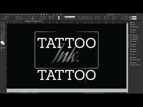
The video is only loaded from YouTube when you play it – data (including your IP address) is then transmitted to YouTube/Google. More in the privacy policy
Key Takeaways
- True font styles such as Medium, Semibold, or Bold are always preferable to manually slanted or distorted variants.
- The filters in the font menu, favorites marked with a star, and the list of recently used fonts save you a lot of search time.
- You display overset text with Story Editor mode, Ctrl+Y or Command+Y on a Mac.
- The Layers panel determines which element is on top and which is at the bottom. You can also lock and hide layers there.
- With the Ctrl key and the Shift key, you scale text and frames together and keep the proportions.
Creating text frames and understanding the default font
Select the Type tool on the left in the toolbar or simply press the T key. Then drag out a frame. By default, InDesign uses the font Minion Pro, which Adobe developed itself. It is preset as soon as no document is open. Don't let that confuse you. The font selection can be changed at any time in the Control panel.

Using font styles correctly
Many beginners only know the Bold and Italic commands from Word. In InDesign, you work with font styles instead. These are professionally crafted variants of a font with different stroke weights. With Minion Pro, for example, you will find Regular, Italic, Medium, Semibold, Bold, and Condensed. Try them out on a large word, for example at 28 points, and compare the effect. You will notice that Medium and Semibold look significantly heavier, while Condensed is more compressed.
Avoid setting slants by hand, for example 12 degrees for an italic effect. This only tilts the font mathematically, and the typographic fine-tuning is lost. A font with many styles gives you more freedom as a designer. Therefore, the rule is: the more styles a family has, the better.
Using font filters for serif and sans-serif fonts
The font list in InDesign accesses all fonts installed on your system. This can quickly become confusing. Newer versions therefore offer a filter with which you can search specifically by category, for example for serif fonts. Serifs are the small cross strokes at the ends of the letters that appear in fonts like Essence. Sans-serif fonts do not have these strokes. You can reset or expand the filter at any time, depending on how you want to search.

Using recently used fonts
In the font menu, you will find the recently used fonts at the top. InDesign shows you the last ten fonts you used right at the beginning of the list. Especially for recurring projects, this saves you a lot of time because you don't have to search for your favorite fonts again.

Marking favorites
In addition to recently used fonts, you can deliberately set favorites. To do this, click the star next to a font in the font list. Afterwards, you can activate the filter for favorites. Then you only see your marked fonts. My practical tip: mark your favorite fonts consistently, because with large collections you quickly lose track. Some fonts are so unusable that you only look at them with an eye roll. They shouldn't shine with a star, but they still show up in the list.
Finding similar fonts
If you like a font but are looking for an alternative, the option for similar fonts helps. InDesign then suggests suitable variants, for example Times New Roman Italic or Cardo Italic for a Bascaville. The suggestions are not always perfect, but they quickly give you starting points that you then check yourself.

Loading fonts via Typekit
The Typekit service belongs to Adobe and provides a large selection of fonts that can be used directly in InDesign. With the filter for Typekit fonts, you see only this selection. One example is Alfresco, a script font that looks like handwriting. Most fonts on your computer, on the other hand, are free fonts, for example from Google Fonts or Font Squirrel. I will show how to load additional fonts in a separate short training.

Character formatting in the Control panel
In the Control panel, you set the font size and the line spacing. You will also find options there such as all caps, small caps, superscript and subscript, as well as strikethrough. With these tools you can experiment a lot creatively. Use them deliberately and not indiscriminately, because calm in a layout usually looks more professional than too many effects at once.

Choose a slab serif font and use capital letters
As an example for a headline, you choose the font Sanchez. It has two styles, and the term slab serif means that the serifs are particularly strong and blocky. Choose the bold style, activate all caps, and confirm with Escape. Your text box now shows the text in the selected font and capitalization.

Recognize overset text and adjust the text
If you write text into a frame that is too small, InDesign displays a small cross on the frame. This means overset text. The content no longer fits into the frame. You can enlarge the frame until the text is fully visible again. With longer texts, however, that is often not enough.

Use Story Editor
For more extensive texts, you activate Story Editor with Ctrl+Y. On a Mac, it is Command+Y. You can also find the option in the menu under Edit, where it is called Edit in Layout View. In this mode, you see the text without formatting and can edit it precisely. Overset text becomes visible in the process. Remove the excess character, and the text fits into the frame again. Afterwards, you resize the frame to the required size by double-clicking the handle.

Center the text frame
To center a text frame exactly, you can use a center line as a guide. You can also take the outer edge of a box as a reference, because then you know it is centered. Afterwards, you align the text to center using the alignment options.
Add a script font as a contrast
For an accent, you add a second font. To do this, draw a new text frame in an empty spot, because otherwise you might open an existing frame. Choose a script font such as Agua Fina Script and enter the name. InDesign also recognizes parts of the font name, so you can work through the list faster. Set the font size to 50 points and adjust the frame size. Afterwards, you color the text with a black gradient. To do this, select the text and choose the gradient as the color. A gradient on the fill works similarly but looks different.
Arrange elements in the Layers panel
The Layers panel is your command center. There you see all elements of a document in the order of their stacking. The topmost element is at the very front. If, for example, you want the word Tattoo to be above the word Ink, you simply move the layers accordingly in the panel. There you can also hide elements if you temporarily do not need them.

Arrange objects with the context menu
You can also change the order directly on the page. Right-click an object and choose under Arrange the option Bring to Front, Bring Forward, Send Backward, or Send to Back. Note that an object that you send to the back can disappear beneath large-area elements. Then you can no longer see it. Bring it back up via the Layers panel or the context menu.

Duplicate elements
For clean fine-tuning, you like to copy elements. To do this, hold down Alt and Shift and drag the object. This creates a copy. Afterwards, you can edit the copy with a double-click. With Ctrl+A you select all the text in the frame. Reduce the font size, for example to seven points, and place the text underneath.

Adjusting Tracking Deliberately
Tracking determines the spacing between all characters of a word. Set it in the Control panel or the Character panel. You can change it using the arrow keys in combination with Alt, or enter a value directly. A value of 300 produces a striking, letter-spaced lettering that works well for business cards. Make sure the result looks cohesive overall.
Designing the Second Page and Setting Capital Letters
On the second page, you create a line with the font Sanchez in Regular. To do this, drag a frame across the entire width, center the text, and set the color to white. A font size of ten points works well for business cards, and seven points is the lower limit. Don't type the text in capital letters; instead, activate the function in the Control panel. This way the text remains correctly captured in the document.

Adding Date and Time with a Sans-Serif Font
A sans-serif font such as Ubuntu in Regular is well suited for body text. Write the date and time in a frame at ten points and adjust the size by double-clicking. With Shift and a right arrow, you can move the element precisely. Duplicated text frames can be quickly used for further details.

Grouping Elements
Multiple elements can be combined into a group. Select them and press Ctrl+G. In the Layers panel, you can recognize the group by the small arrow with which you can expand the contents. If you want to ungroup it later, right-click on it and select Ungroup.

Locking Backgrounds
It's easy to accidentally select the background when dragging out a frame. You prevent this by locking the background. To do so, click the lock icon next to the layer in the Layers panel. After that, the background can no longer be selected or moved. This also works for individual paths; for those, use the shortcut Ctrl+L or Command+L on a Mac.

Scaling Elements Proportionally
If you shrink a frame by its handle, the font size remains unchanged. This merely results in overset text. If you want the frame and text to become smaller together, also hold down the Ctrl key. For proportional scaling without distortion, add the Shift key. Take care not to distort the proportions when scaling, as this quickly looks unattractive.

Inserting Addresses and Automatically Adjusting the Size
For address details, you copy text into a new frame. The automatic font size is often too small, so you should readjust it manually. To do this, double-click the top handle. The frame then adjusts to the desired size and aligns with the bottom edge. This way the address sits cleanly on the edge.

Summary ??? Using Fonts in InDesign: Font Styles and Layers
In this tutorial, you have learned how to select fonts deliberately in InDesign, use font styles instead of manual distortions, and use filters, favorites, and Typekit. You have gotten to know the Story Editor, with which you make overset text visible, and you know how to center text frames and combine fonts. You also master the Layers panel, arranging objects, duplicating, grouping, and locking, as well as proportional scaling. With this knowledge, you can build your own layouts step by step while keeping an overview at all times.
FAQ
How do I create a text frame in InDesign?Select the Type tool with the T key and drag a frame to the desired size with the mouse.
What do font styles mean?Font styles are professionally designed variants of a font such as Medium, Semibold, or Bold, which differ in stroke weight.
Why shouldn't I slant a font manually?A manually tilted font is only mathematically distorted. The true italic style, on the other hand, was carefully designed by the type designer.
What is overset text?Overset text occurs when the text no longer fits in the frame. InDesign indicates this with a small cross on the frame.
How do I display the Story Editor?Press Ctrl+Y, on a Mac Command+Y, or choose Edit Layout View under Edit to display the text without formatting.
How do I quickly find my favorite fonts?Mark the fonts with a star and then activate the favorites filter. In addition, the most recently used fonts are displayed at the top of the list.
What is the Layers panel for?In the Layers panel, you see all elements in their stacking order. There you can sort, hide, or lock them.
How do I quickly copy an object?Hold down Alt and Shift and drag the object. This creates a copy at a new position.
How do I scale text and frame together?Drag the handle while holding down the Ctrl key. With the Shift key added, the proportions are preserved.
How do I lock a background so that I don't accidentally select it?Click the lock icon of the layer in the Layers panel. The object then remains untouched when selecting.

