

Imagine you had to set every heading, every body text paragraph, and every emphasis individually by hand in a brochure. With around 60 recurring text styles, this quickly becomes a test of patience, and by the next round of corrections at the latest, the error is hiding somewhere in the details. This is exactly where paragraph and character styles come in. You define each style once and then apply it with a single click.
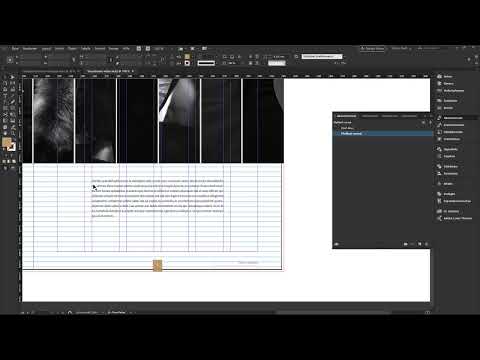
The video is only loaded from YouTube when you play it – data (including your IP address) is then transmitted to YouTube/Google. More in the privacy policy
Paragraph styles always affect a complete paragraph, whereas character styles only affect selected letters, words, or passages. In this tutorial, I will guide you step by step through creating a body text style, show you the most important settings, the baseline grid, character styles, as well as how to deal with overset text and text threading.
Key Takeaways
- Paragraph styles always apply to an entire paragraph, character styles only to selected text passages.
- The baseline grid determines which line spacing works cleanly. With a 12-point grid, 14.4 points is too large and causes lines to be skipped.
- A character style only stores the differences from the base style, not all settings.
- You can recognize overrides by the plus sign in the panel and reset them with "Apply" or accept them with "Redefine".
- Text threads let a text flow across multiple text frames. The rubber band shows you how the frames are connected to each other.
Step-by-Step Guide
Step 1: Prepare the Test Text
First, drag out a text frame that aligns to the grid. Then fill it with placeholder text. This gives you a completely unformatted text on which you can directly observe the effect of each setting.

Step 2: Open the Paragraph Styles Panel
So far, you have mostly done formatting via the Control panel. For styles, you switch to the "Paragraph Styles" panel. If it is not visible, you can find it in the menu under "Type". At the beginning, the list is empty.

Step 3: Create a New Paragraph Style
Via the context menu, you select "New Paragraph Style". At first glance, the dialog seems very extensive. But you don't have to know all the options, only where to set what. Initially, concentrate on the areas you need for body text.

Step 4: Name the Style and Define the Font
Give the style a meaningful name, for example "Body Text". Then select the font family and the font style. In this example, we use the fonts Kepler and Source Pro. For Source Pro, you define the desired font style. As long as you don't fill in the fields, the specifications are not taken into account in the text.

Step 5: Confirm the Style and Apply It to the Text
Confirm the dialog. If the text initially looks unchanged, it is usually because you haven't assigned the style yet. Click into the paragraph and select the style in the panel. Now all the saved settings take effect on the text. You can reopen the style at any time and fine-tune it.
Step 6: Align the Text to the Baseline Grid
To make the text orient itself to a baseline grid, open the "Indents and Spacing" section in the paragraph style. There, under "Align to Grid", you set whether only the first line or all lines should be aligned to the grid. Choose "All Lines" here and activate the option. The text now follows the grid.

Step 7: Adjust the Line Spacing to the Grid
If you notice that the text always skips a line, the cause is the line spacing. At 14.4 points, it is too large for a 12-point grid. Set the line spacing manually to 12 points, and you get one line of text per grid line. If you enter 12.5 or 13 points instead, the text jumps a line again. Only at 24 points or a multiple of it does it fit again. The principle is therefore simple: the line spacing should be a multiple of the grid.
Step 8: Set the font size and alignment
Set the line spacing to 12 pt and reduce the font size to 10 pt. For many body texts, this still looks too large, so you can go down to 8 pt. In the "Indents and Spacing" section, you then choose the alignment. Left-aligned is the usual default. Alternatively, you can choose justified and set the last line to left-aligned. This often looks particularly even.

Step 9: Try out paragraph rules and borders
In the style, you will find further design options such as tabs and paragraph rules. For example, activate the option for a rule above the paragraph and change its weight and offset. Feel free to test everything, because that is the fastest way to learn what each option does. Complete borders and shading are also possible. A reduced opacity of 20 percent creates a subtle background, as found in many textbooks.
Step 10: Control breaks, hyphenation, and spacing
In justified text, large gaps sometimes appear between words. You correct these holes under "Spacing" in the style. There you can set the word spacing to, for example, 80, 100, and 133 percent. In addition, letter spacing is available, for instance from minus 10 to plus 10. You should better not change the glyph scaling, as this is generally not recommended.
Step 11: Define the text color
Colors can also be stored in the paragraph style. A pure black at 100 percent often looks harsh in body text. A 90 percent black appears more homogeneous and is more pleasant to read. Then confirm the settings. The body text now has its finished paragraph style.
Step 12: Understand paragraph styles applied to individual paragraphs
Show the hidden characters via "Type". Then you will see the paragraph mark. A paragraph style always applies only to the paragraph to which you have assigned it. If you add a second paragraph, it remains without a style until you assign it as well. So the paragraph style only takes effect when you start a new paragraph with Enter and give the text the style.

Step 13: Create a character style
For individual words or passages, you need character styles. Open the "Character Styles" panel and create a new style. Give it a name that describes what it does, such as "colored highlight". Good names make it easier to find your way later, especially when many styles accumulate.

Step 14: Define the character color and add exceptions
In the character style, you only define the color gold. All other fields remain empty and change nothing in the text. Then select a passage and apply the character style. It does not affect the whole paragraph, but only the selected spot. If readability suffers, you open the character style again by double-clicking. There you can, for example, set the bold weight of the font family. With the preview, you see the change immediately.

Incidentally, the name of the paragraph style can also be adjusted. You could, for example, rename it to "Body text without indent" if you introduce further variants later.
Step 15: Detect and fix overrides
If you manually change the color in the selected text, a small plus sign appears in the panel. It indicates a deviation from the character style. So you have made a change that is not stored in the style. With a right-click on the style, you can choose "Redefine". Then the current look becomes the new default. Alternatively, you select the affected text and apply the original style again. This makes the deviation disappear.

Step 16: Recognize and understand overset text
If you make a text frame smaller, the text no longer fits into it. The red plus at the bottom of the text frame indicates that overset text is present. The text has not disappeared, it is just not visible. So you cannot lose it, you only have to direct it to another place.

Step 17: Thread text frames
Click the red plus icon and drag open another text frame. The text now flows from the first frame into the second. This connection is called text threading. To make it visible, you activate the option "Show Text Threads" under "View" and "Extras". Then a rubber band appears that shows the connection between the frames.
Step 18: Controlling Text Flow Across Multiple Columns
The rubber band moves along with you when you move frames or insert new paragraphs. Especially with columns that span multiple pages, it gives you a clear overview. If the frames are linked in the wrong order, the text flow ends up jumbled. Therefore, keep an eye on the links and check them after every major change.
Summary ??? Mastering InDesign Paragraph Styles: Automating Type Step by Step
With paragraph and character styles, you define text styles once and apply them wherever they are needed. Paragraph styles shape entire sections, while character styles format individual passages. The baseline grid ensures that your text stays neatly aligned, and text threading reliably guides the text across multiple frames. With a bit of practice and clear naming of your styles, you will work significantly faster and more consistently.
FAQ
What is the difference between a paragraph style and a character style?A paragraph style always affects an entire paragraph, while a character style only affects selected characters or words.
Why does the text always skip a line with the baseline grid?Usually the line spacing is too large for the grid. With a 12-point grid, the line spacing should be 12 points or a multiple of it.
Why does a plus sign appear in the Character Styles panel?The plus sign indicates that the text contains an override of the character style, that is, a change that is not stored in the style.
How do I get back text that doesn't completely fit into the text frame?You link the text frame to a new text frame via the red plus symbol, so that the text flows into the second frame.
What does the rubber band mean in text threading?The rubber band shows you which text frame is connected to which and helps you trace the text flow.

